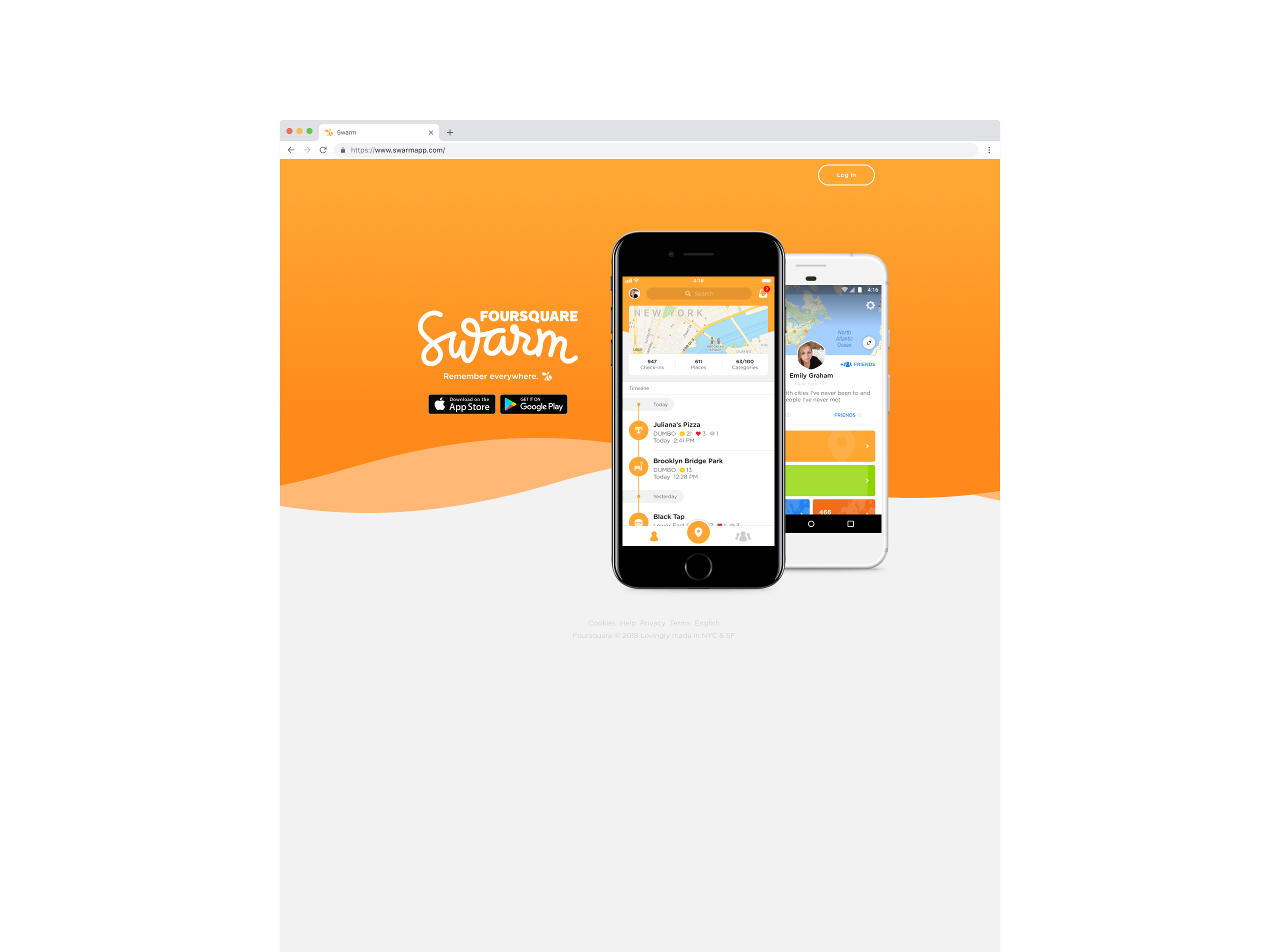
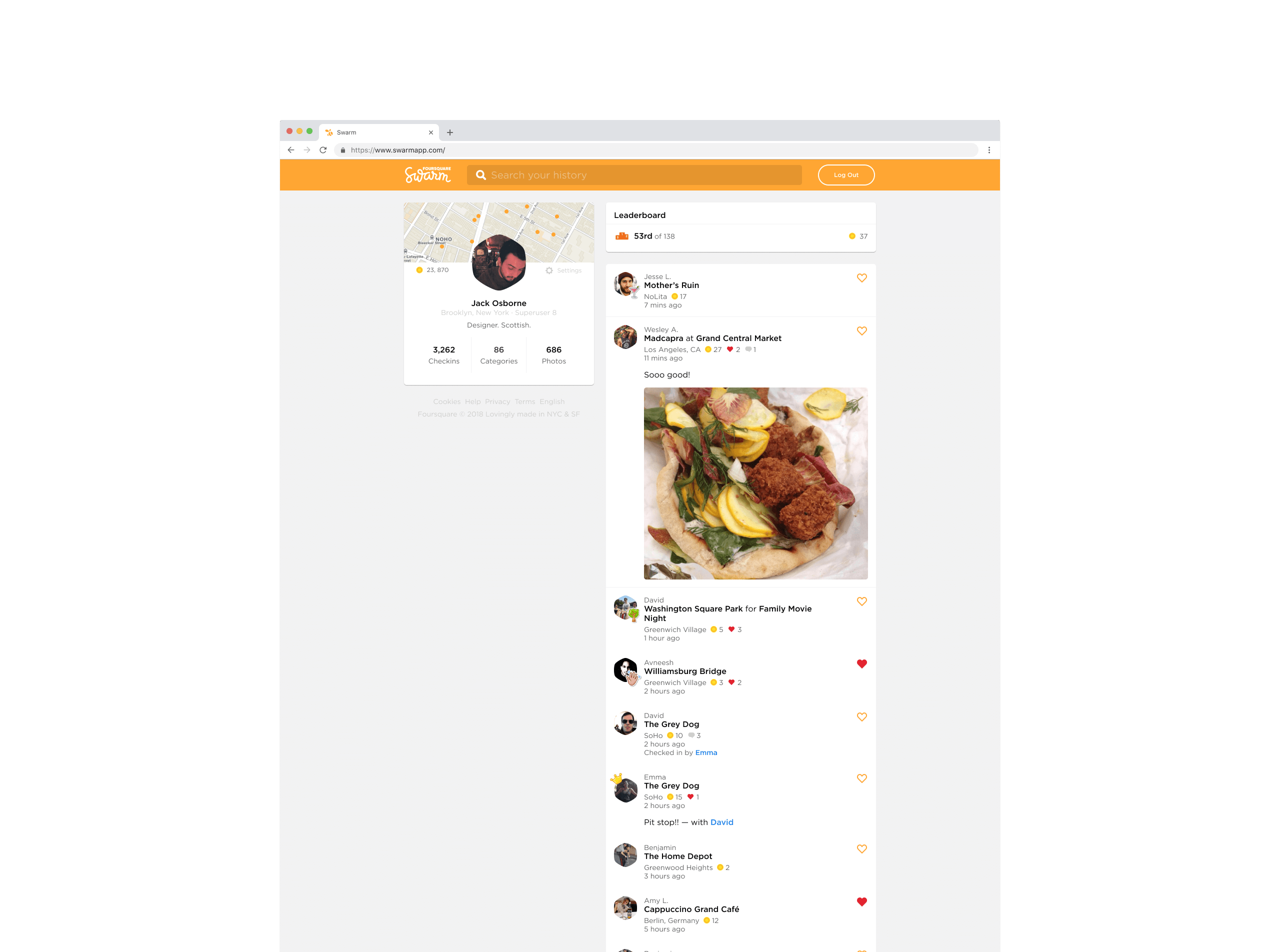
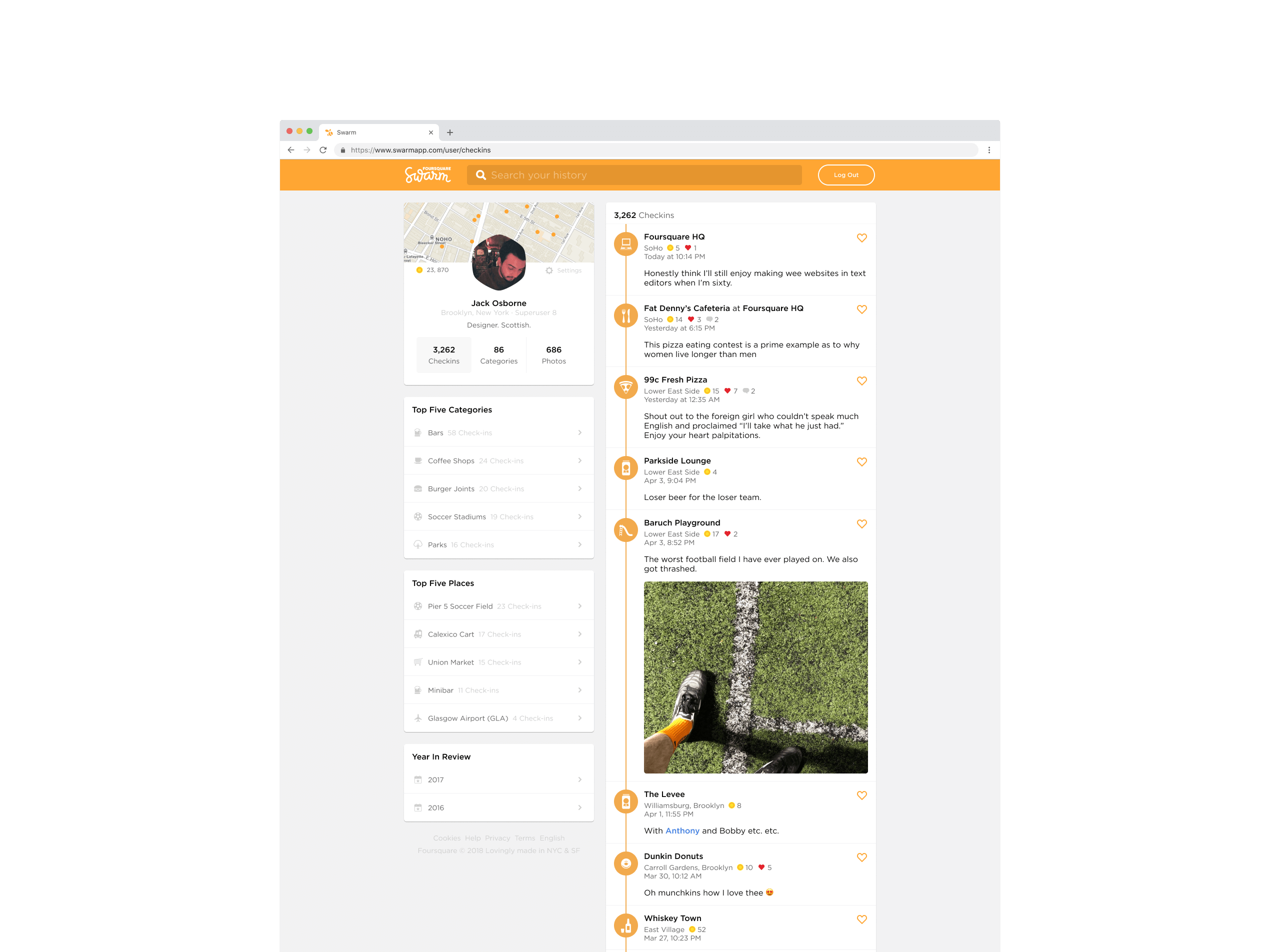
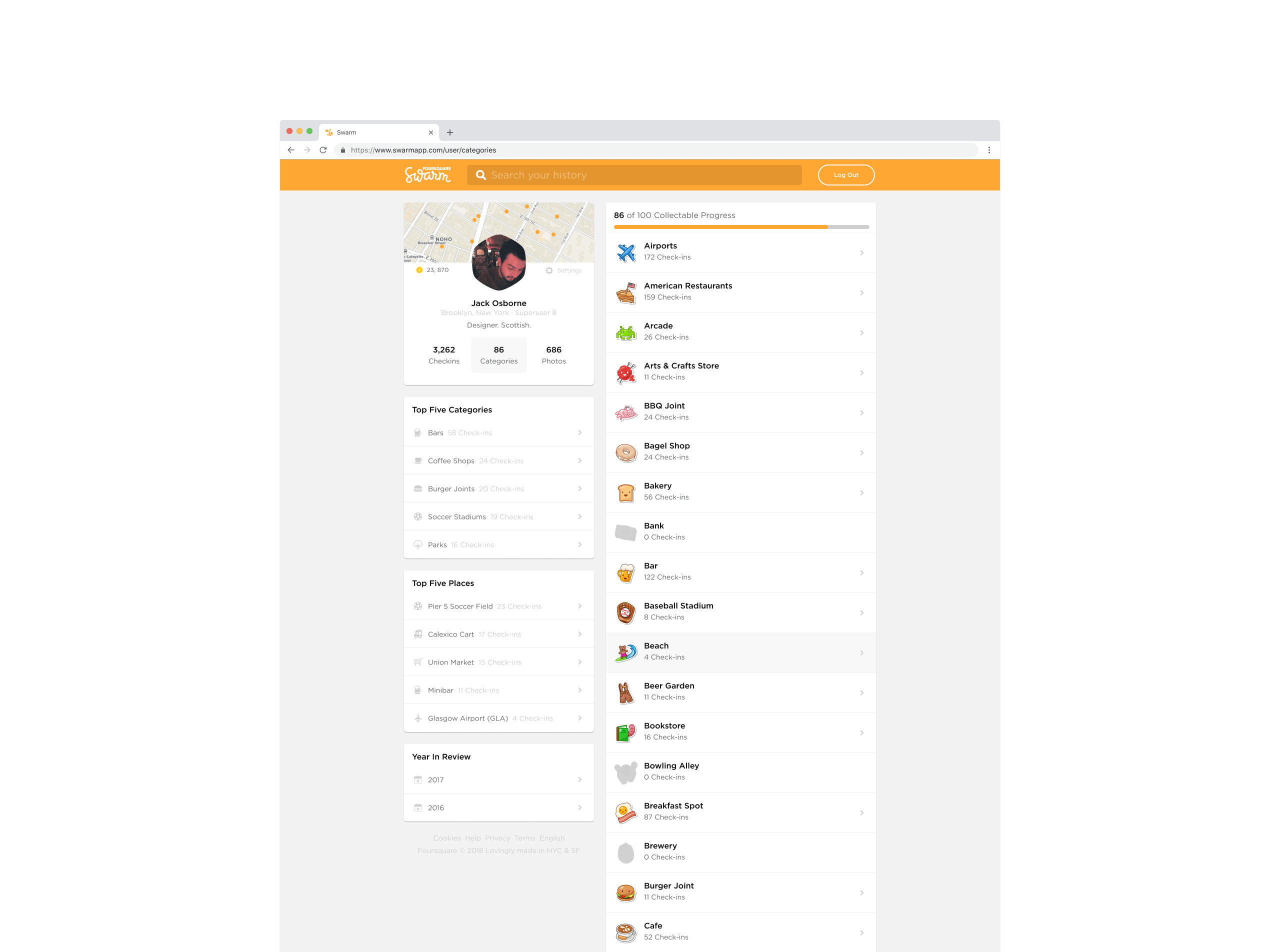
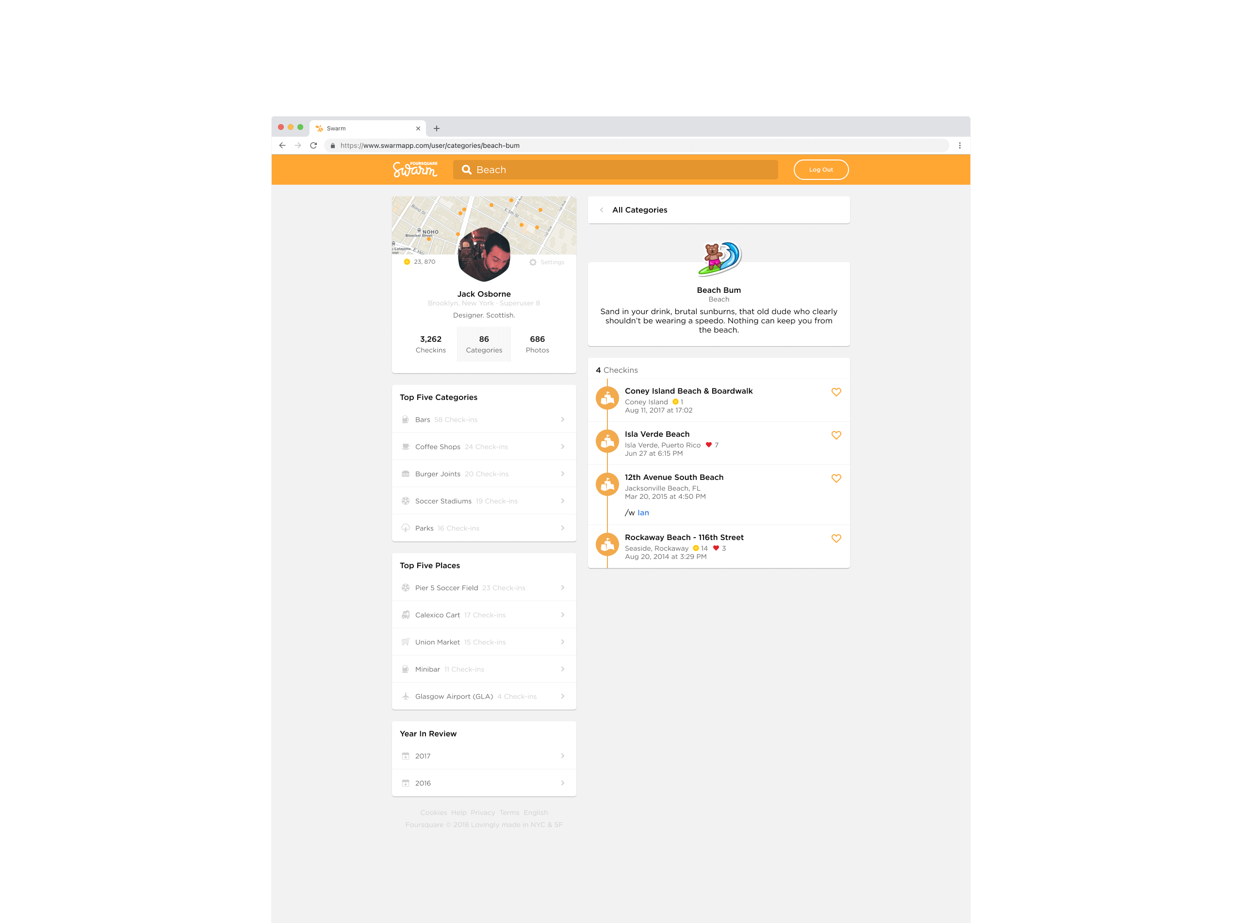
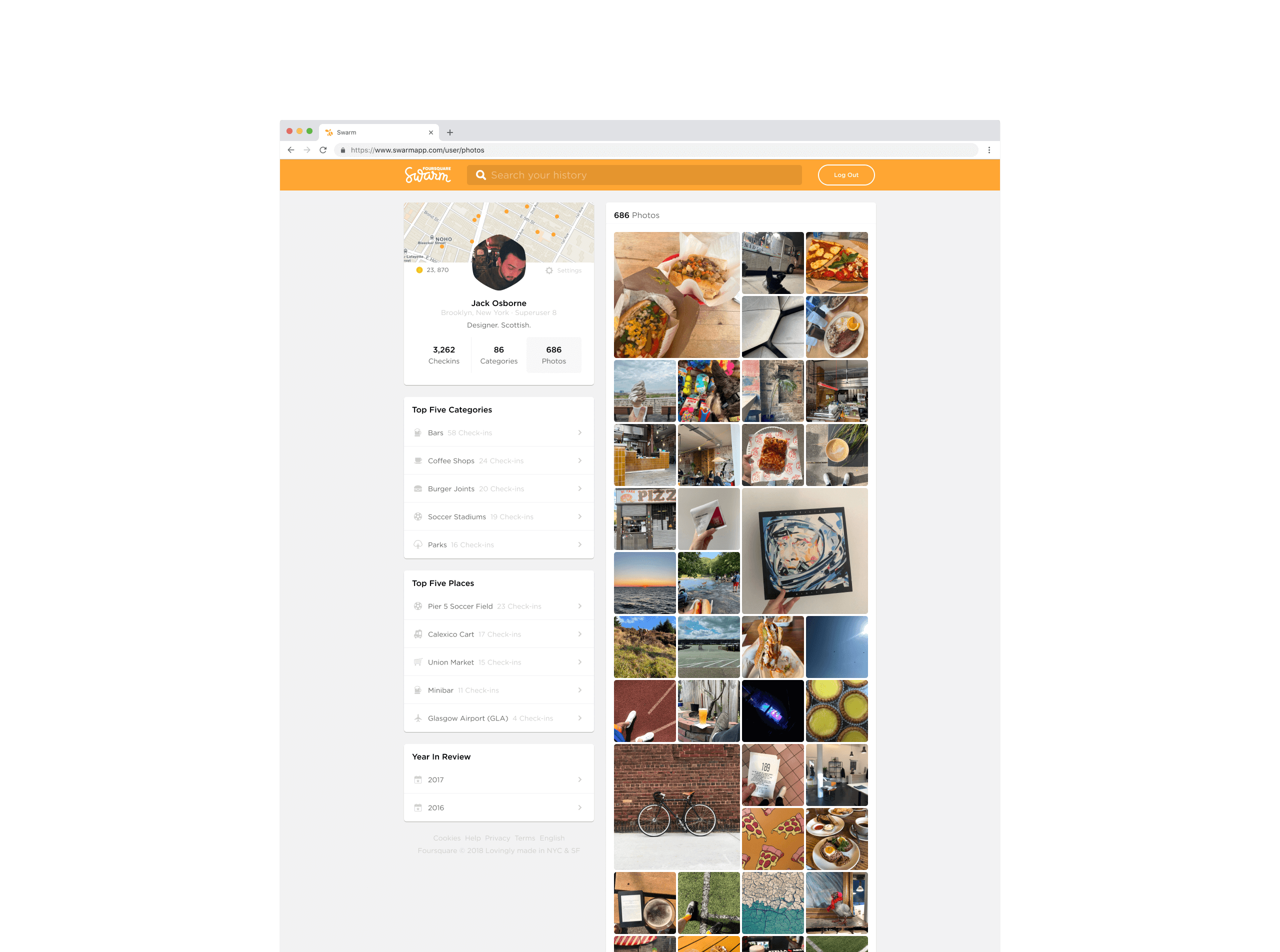
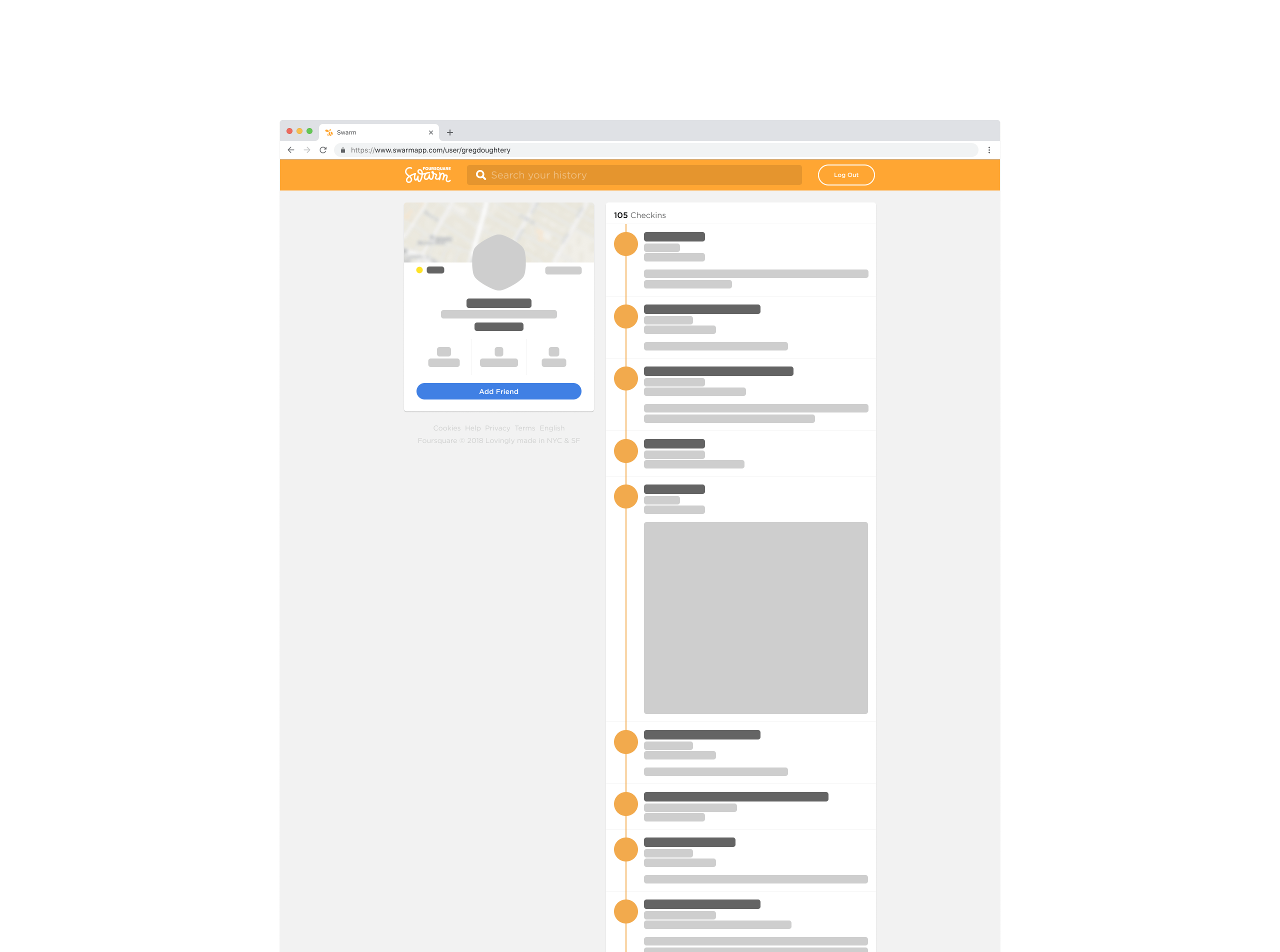
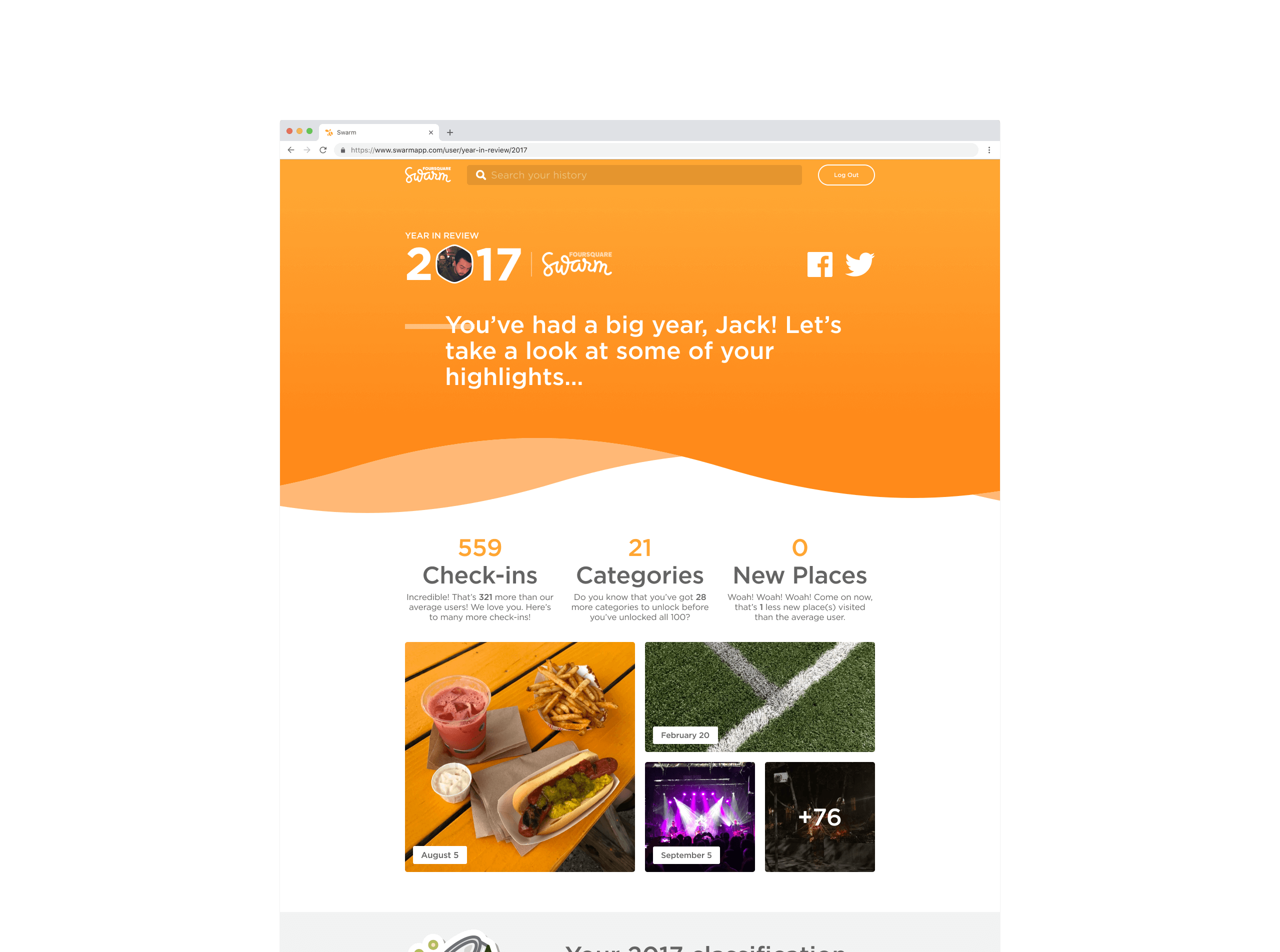
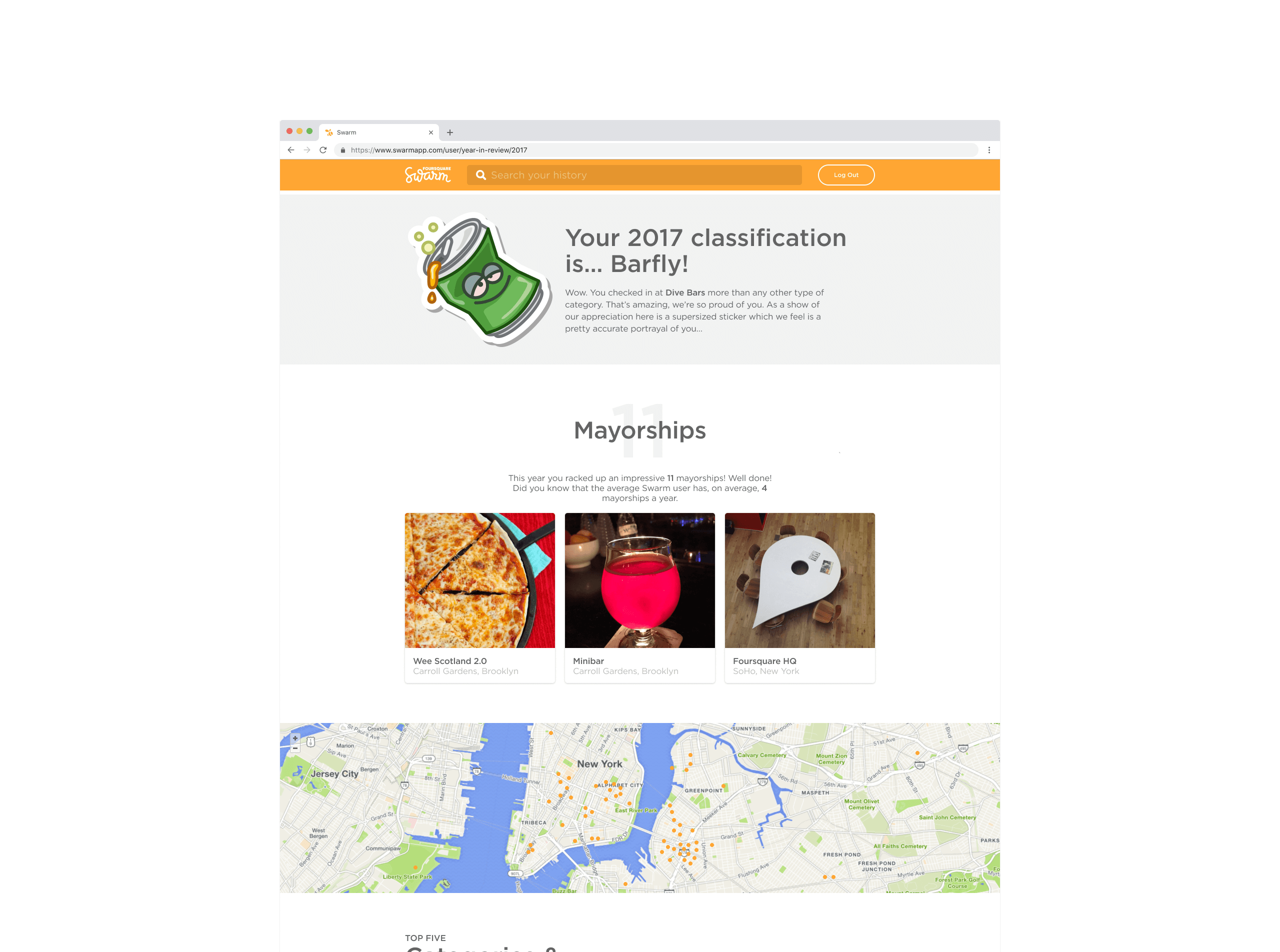
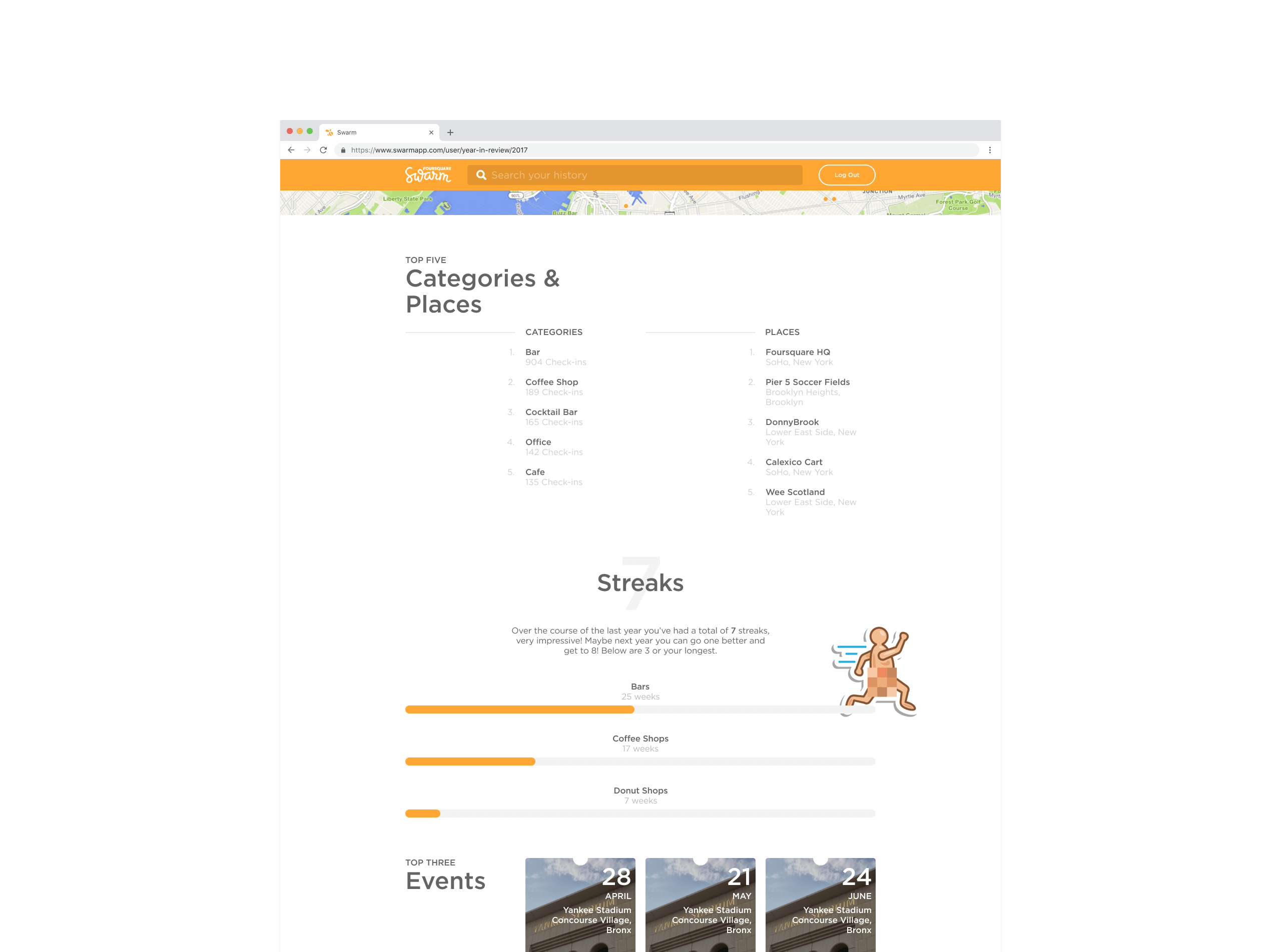
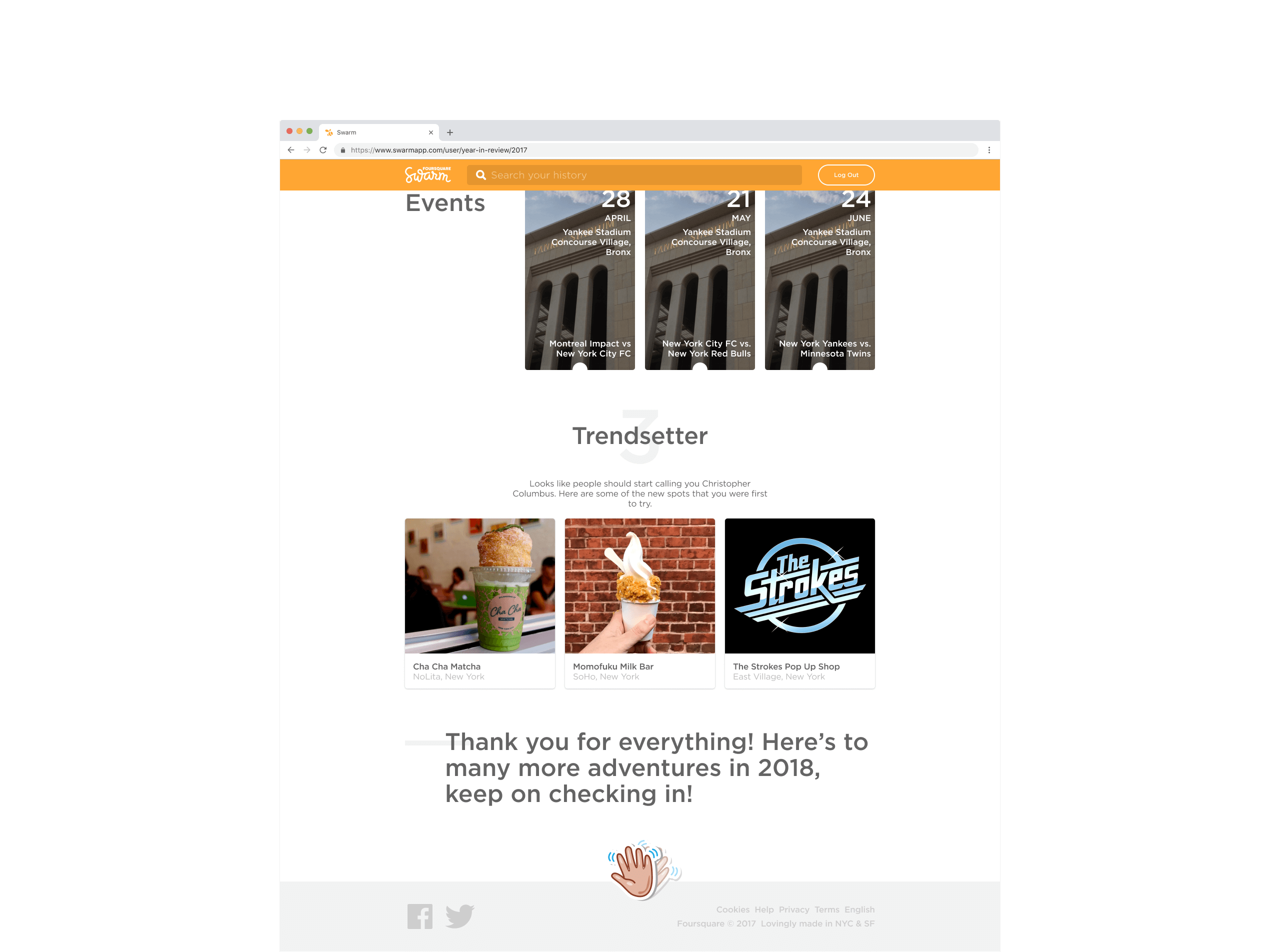
In transforming the website, we envisioned it as a natural extension of the Swarm mobile app, providing a dedicated space for users to interact with their data in new ways. This reimagined platform would enrich their engagement by offering a seamless, unified web experience that enhances the Swarm ecosystem.
01—Discover
Understanding the Problem
The original Swarm website primarily functioned as a basic redirect and a repository for legal documentation, meaning it failed to deliver the Swarm experience available on the mobile app.
We aimed to extend key features from the mobile app to the web, improving accessibility and creating a seamless bridge between platforms. By integrating essential features into the web platform, we aimed to provide a richer, more interactive experience.
02—Define
Assumptions and Risks
We assessed which features could seamlessly transition to a desktop environment from a backend perspective. This initial evaluation was crucial in identifying elements that could be effectively adapted to the desktop's technical architecture, ensuring a smooth transition before considering how they could fully leverage the desktop interface's enhanced capabilities and more significant screen real estate.
| Assumptions | Risks |
|---|---|
| Feature Adaptability We assumed that most mobile app features could be adapted to desktop without major redesigns. |
Feature Misalignment Features that performed well on mobile might not translate effectively to desktop. |
| User Behaviour Consistency We assumed that user behaviour patterns on mobile would carry over to desktop interactions. |
User Adaptation Users accustomed to mobile interactions might struggle to adjust to a desktop interface. |
| Technical Feasibility We assumed that the backend infrastructure could support additional functionalities for the desktop version. |
Technical Constraints Adapting the backend for desktop-specific functionalities could present unforeseen challenges. |
With a clearer understanding of what could be effectively adapted, we turned to user data from the mobile app, where we gained valuable insights into user preferences and engagement patterns by analysing the most frequently accessed screens. We also consulted a select group of 'Superusers'1 who provided their insights delivering an additional validation layer, helping us challenge assumptions and refine our priorities based on real-world feedback.
| Feature | Portable | Suitable | High-Traffic |
|---|---|---|---|
| Categories | |||
| Friends | |||
| Leaderboard | |||
| Photos | |||
| Profile (mayorships, stickers, streaks) | |||
| Saved/Visited Places | |||
| Search | |||
| Settings | |||
| Timelimes (me, social & check-ins) | |||
| Venue Page |
This combination of quantitative data and qualitative feedback helped mitigate feature adaptation risks and user acceptance risks. It gave us the confidence to prioritise the most impactful features first, ensuring the desktop experience remained intuitive and engaging for our diverse user base.
03—Ideate
Establishing a Baseline
As we built out our desktop offering, some aspects of the mobile app emerged as guiding stars, encapsulating the essence of the Swarm experience. Below is a curated selection of mobile app screens that inspired us.
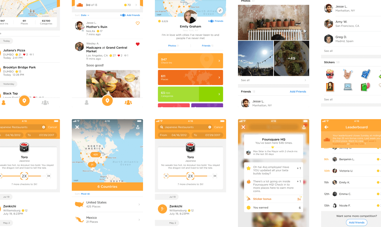
These visuals highlighted the design choices we aimed to preserve and served as benchmarks throughout our development process. They provided direction and consistency, acting as reference points whenever we encountered challenges or needed to realign our efforts, ensuring a seamless and engaging desktop experience.
From a structural perspective, the Swarm mobile app operates with a two-tab layout and several additional branching views. With this foundation in mind, I chose to reflect this design approach on the website by adopting a two-column layout and placing a search feature prominently at the top2.
To further ensure consistency and usability, I continued exploring existing UI patterns from the mobile app that could be effectively translated to the website. By identifying and adapting these familiar design elements, I aimed to create a cohesive user experience that leveraged proven interfaces and reinforced the continuity of the app's design language.
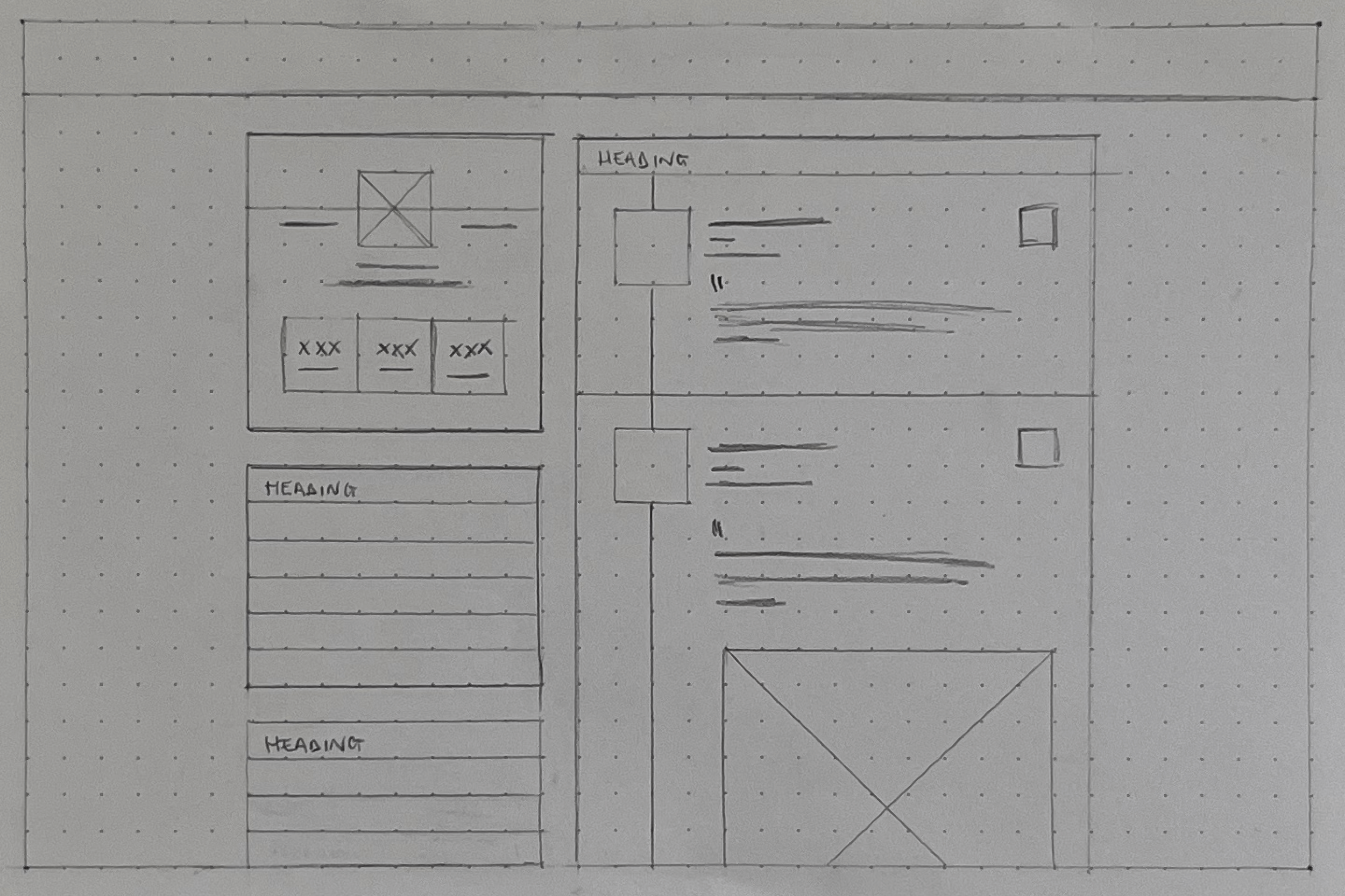
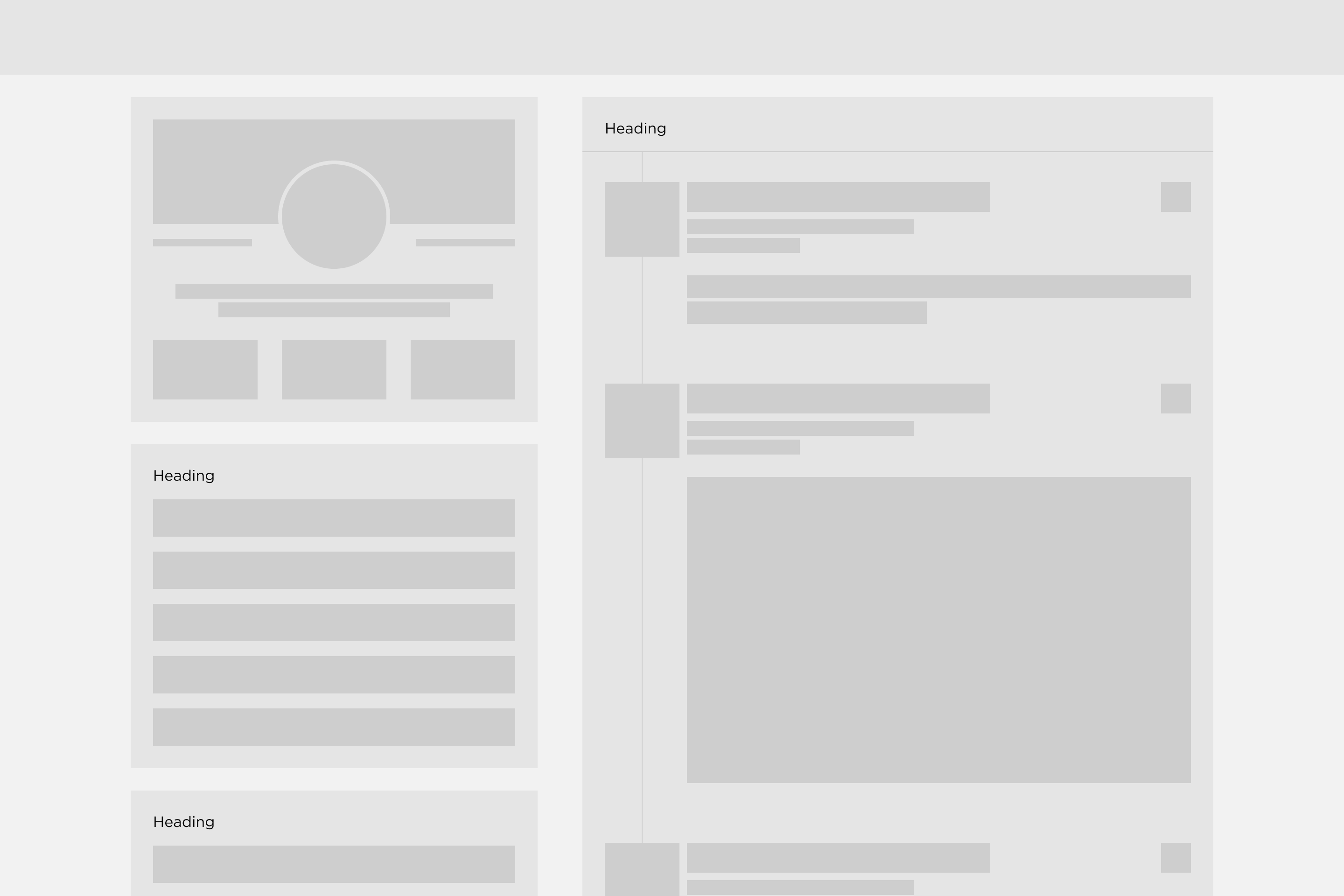
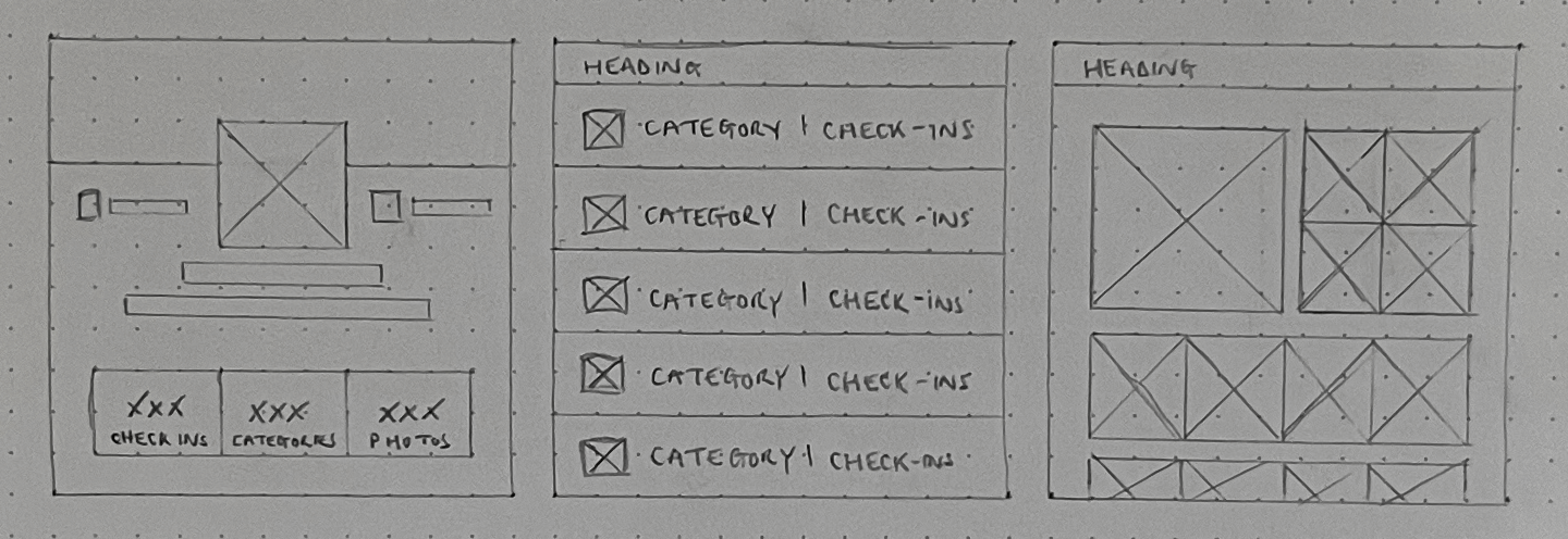

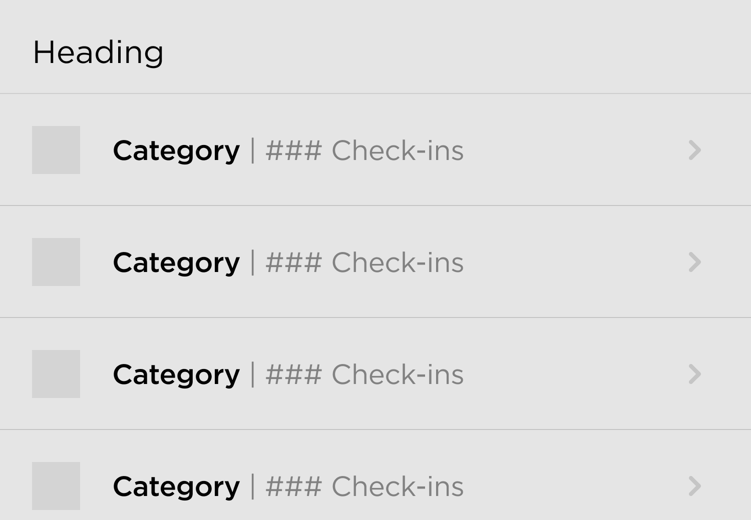

In the screenshot above, you can see a range of sketches and exploratory designs as I worked to translate key elements from mobile to desktop. These sketches include UI card lock-ups, buttons, call-to-actions (CTAs), upsell prompts, and list elements. Each iteration was a step towards ensuring that the design language established in the mobile app would seamlessly carry over to the web.
These visual explorations allowed me to evaluate how different components could be adapted while preserving the core functionality and aesthetic familiar to our users. By iterating on these sketches, I refined the design elements better to suit the desktop's more significant screen real estate while remaining true to Swarm's established identity.
Introducing Year in Review
Over the years, one piece of recurring feedback we received was the desire for a 'Year in Review' feature that would compile and showcase users' key metrics from the past year. However, resource constraints and shifting priorities have made it challenging to implement.
With this new initiative, we were finally able to conceptualise and develop a feature that highlights users' activity over the year and celebrates their unique journey within the app—offering personalised insights and milestones that genuinely resonate.
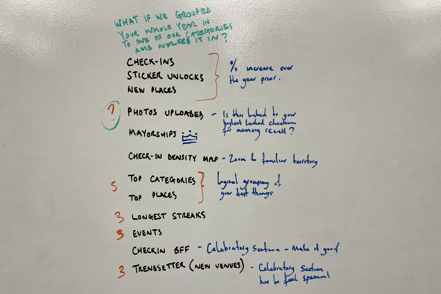
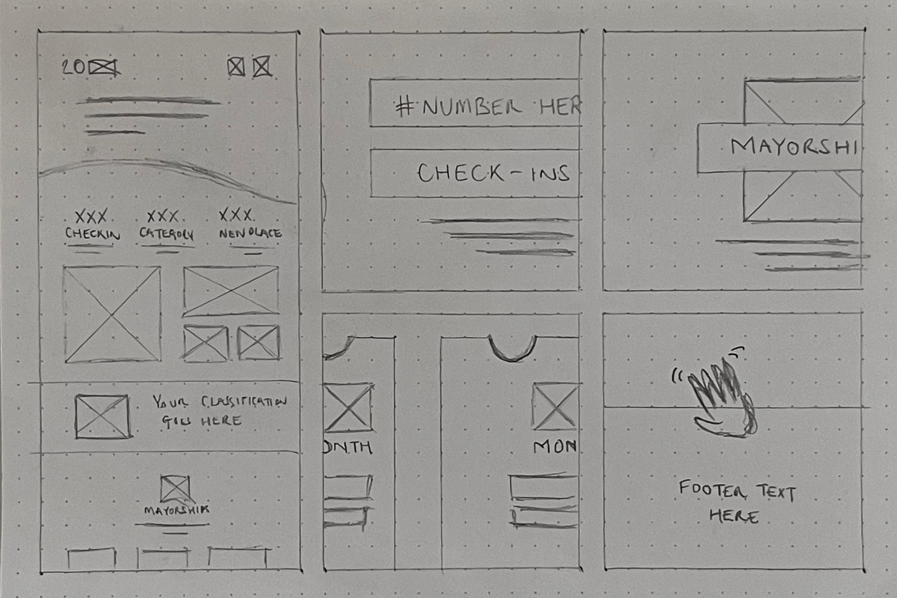
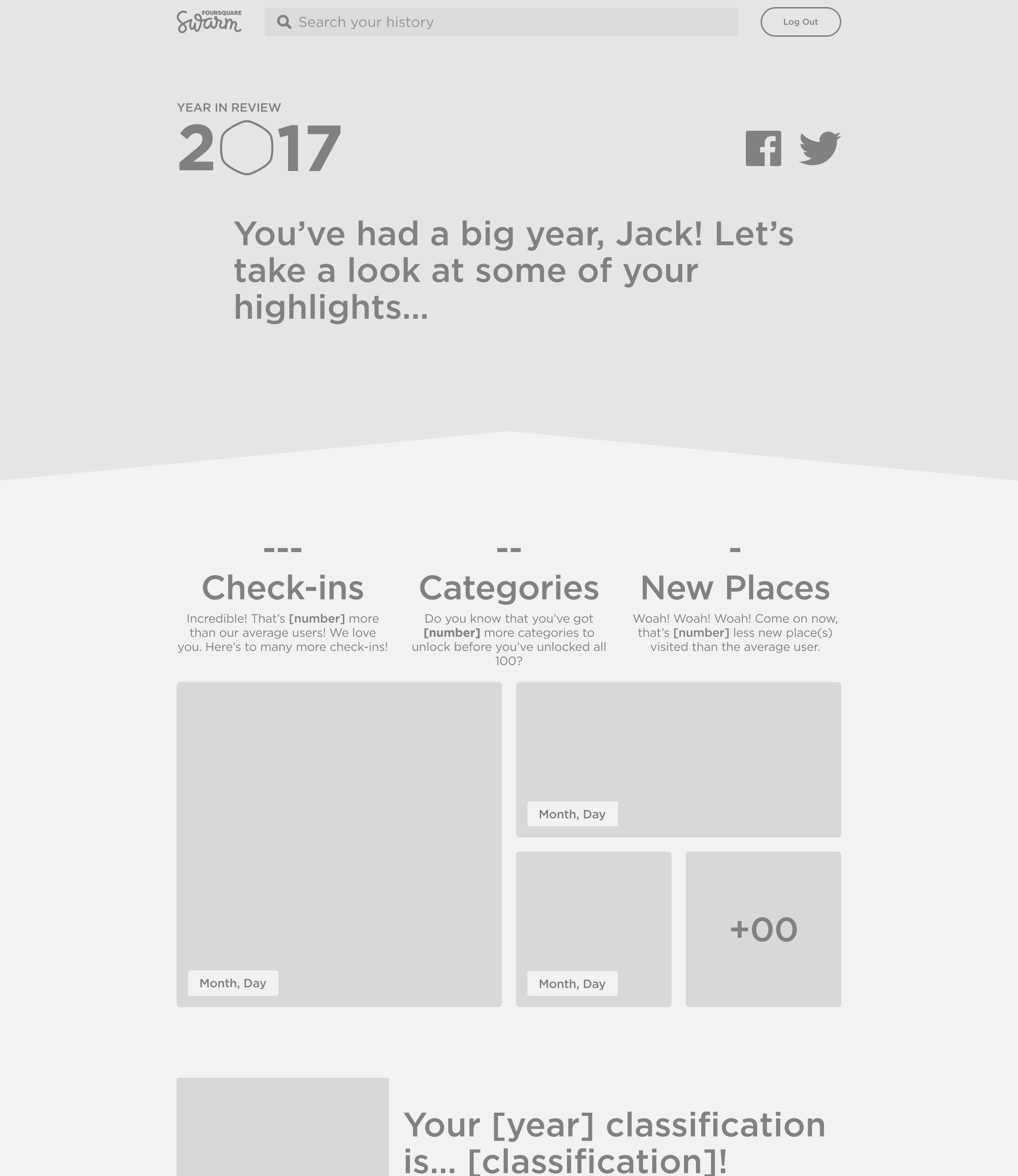
During our brainstorming session, captured in the whiteboard image above, we explored various concepts to ensure the 'Year in Review' feature was more than just a summary of user activity—it needed to be an engaging and memorable experience3.
We debated different approaches, from visual storytelling elements to personalised data insights, all aimed at making the feature informative and enjoyable. Key decisions from this session included highlighting personalised milestones—such as users' most visited locations or longest streaks—and incorporating celebratory elements like mayorships and sticker unlocks. These ideas formed the foundation of the feature, ensuring it was not just a data dump but a meaningful reflection of each user's journey within the app.
From this, we distilled the most impactful ideas and began translating them into the final design, always keeping our users' experiences and expectations at the forefront.
04—Test
Testing and Feedback
Since most users would continue engaging primarily with the mobile app, the website was designed as an additional layer, offering a new way to consume familiar content. Given that much of this content was available on mobile, we were confident in the website's rollout, informed by existing user patterns.
Rather than making a formal announcement, we opted for a quiet launch, allowing users to discover the site organically. This approach enabled us to observe user interactions without external influence. We used analytics tools to track behaviour and engagement, alongside on-site surveys to capture user feedback. These real-world insights guided future iterations, ensuring a seamless user experience.
05—Release
Room for Improvement
While the website successfully introduced a new interaction layer, some planned features didn't make the final release due to time and resource constraints. For instance, the ability to view saved or visited places—a key part of the mobile app experience—was omitted from the initial launch. Reintroducing this feature in future updates will be essential for maintaining platform consistency and enhancing the website's overall utility.
Additionally, we assumed that users familiar with the mobile app would intuitively navigate the website, leading us to hold back on extensive educational elements. However, some users may have required more guidance. We will introduce contextual support, such as subtle tooltips or onboarding prompts, to ensure a smooth and intuitive experience as users explore the site's features.
Footnotes
- A group of Foursquare users who are responsible for maintaining the accuracy and quality of the venue database. ↩
- This strategy was intended to anchor the user experience while fostering familiarity and cohesion. ↩
- Let me know if you discovered any of the little easter eggs that made it into the final product. ↩
