When the original Foursquare app was split into City Guide and Swarm, the idea was that both apps would coexist and seamlessly hand off to each other, simplifying the overall experience for our users. City Guide would handle discovery and content curation, including lists and saved places, while Swarm would serve as your personal lifelog, cataloguing check-ins and memories.
Over time, it became clear that this separation disrupted the flow for users who wanted a unified way to save and revisit places. As part of our broader effort to reintegrate key features like venue pages back into Swarm, we saw an opportunity to bring saved places back, making the app a more complete tool for personal exploration and reflection.
01—Discover
Understanding the Problem
The concept of 'saving' content draws inspiration from various sources, but within Swarm, our primary focus was fostering social discovery. However, the inability to save places directly in Swarm created a disconnect between discovering venues and revisiting them later. This gap became a significant challenge, as users actively engaged socially in the app but lacked a seamless way to share those places with others.
Legacy users, in particular, voiced frustration with the cumbersome hand-off process between City Guide and Swarm, especially when it came to saving venues. Their feedback led us to re-evaluate aspects of the original app split, seeking opportunities to streamline the user experience and better integrate key functionalities.
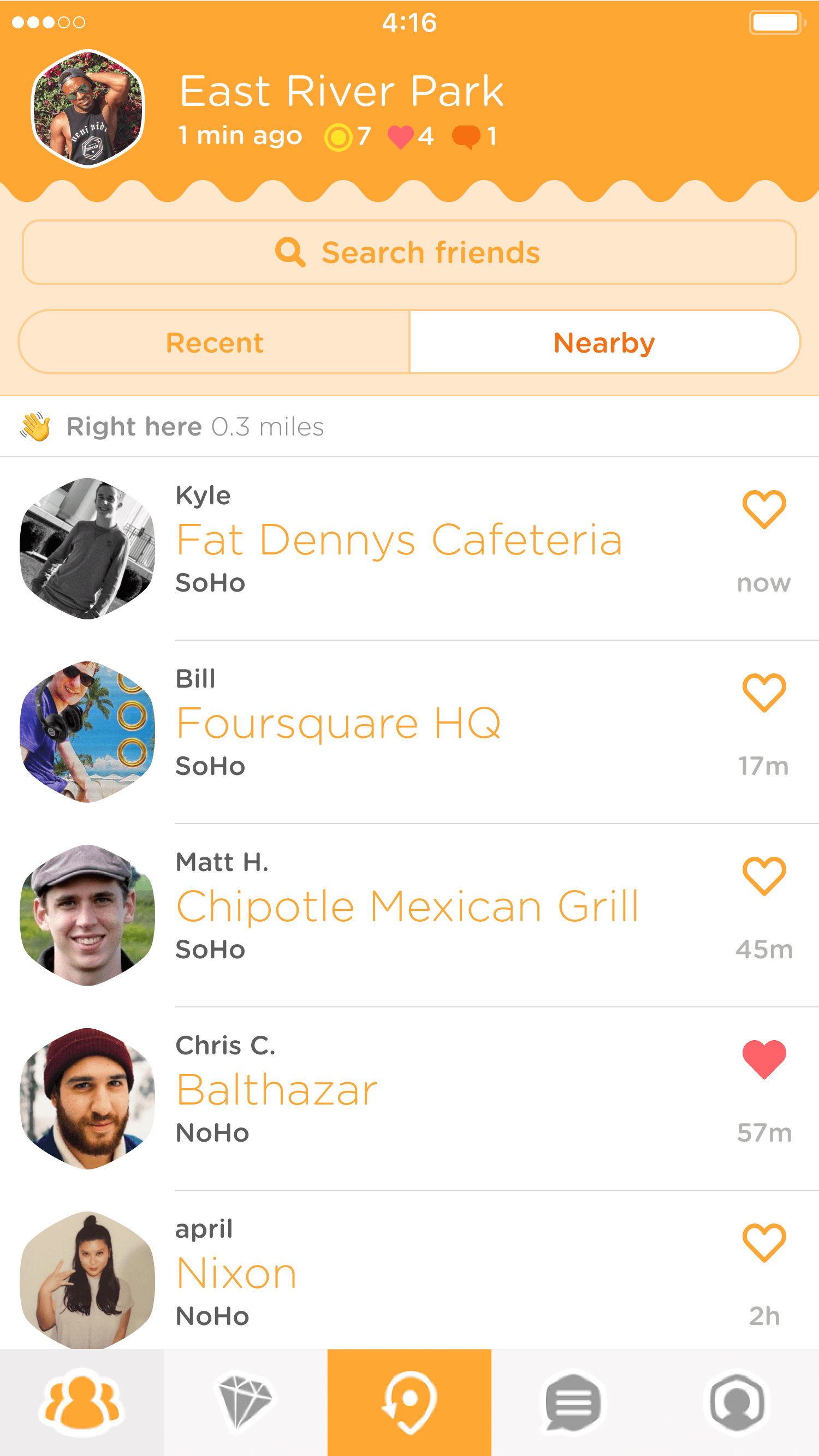
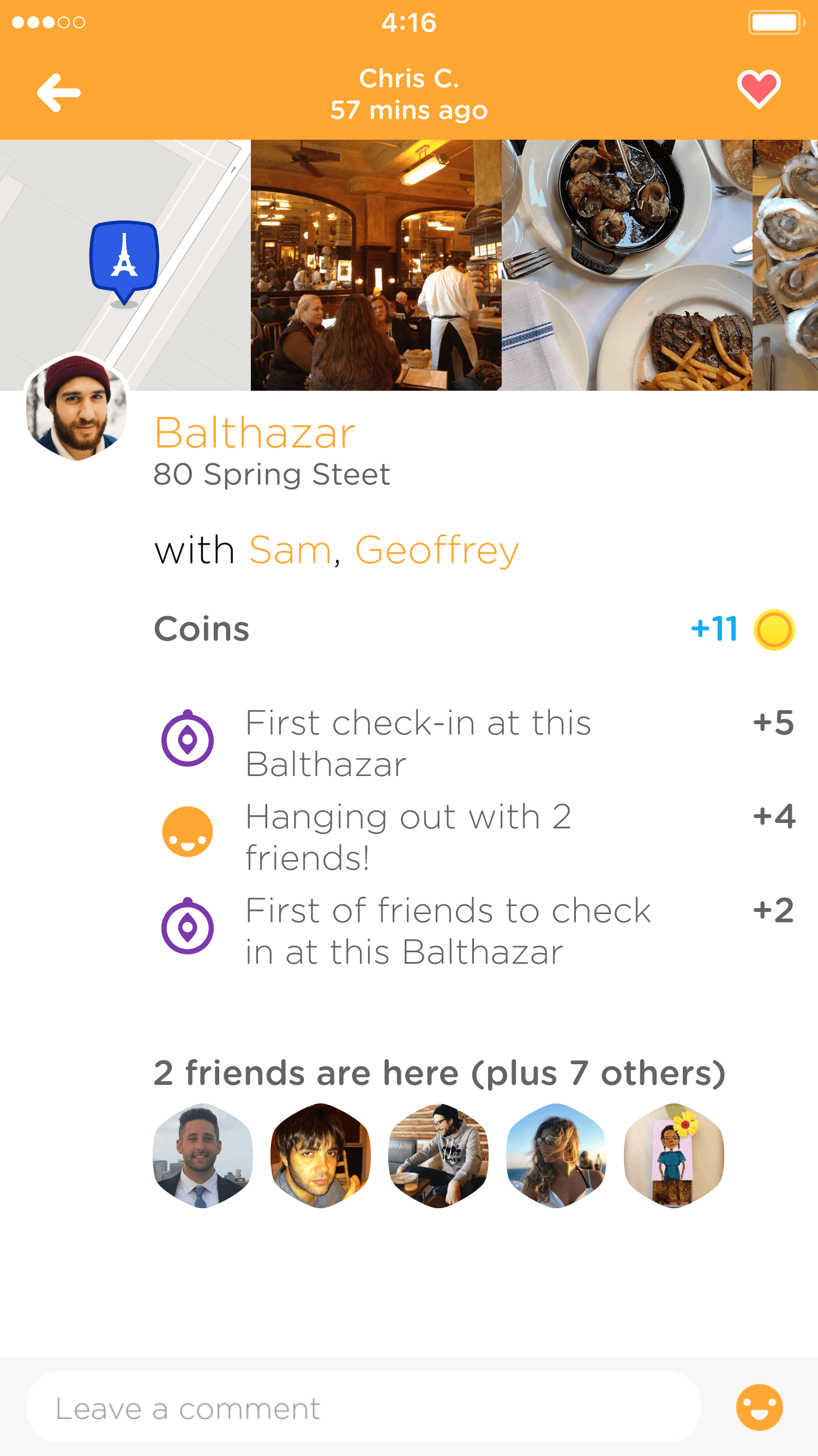
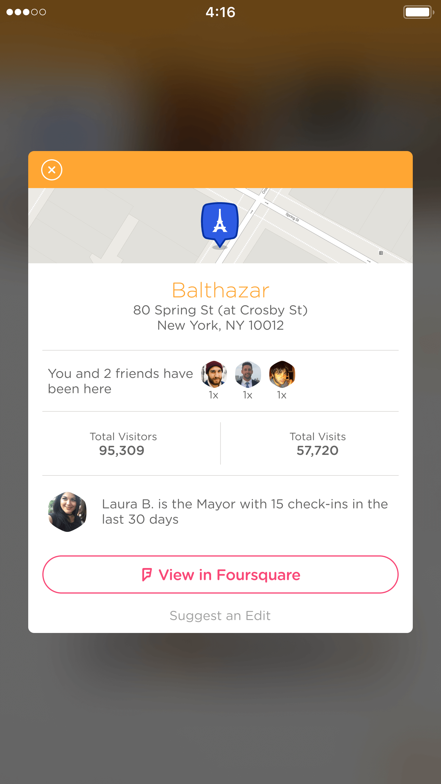
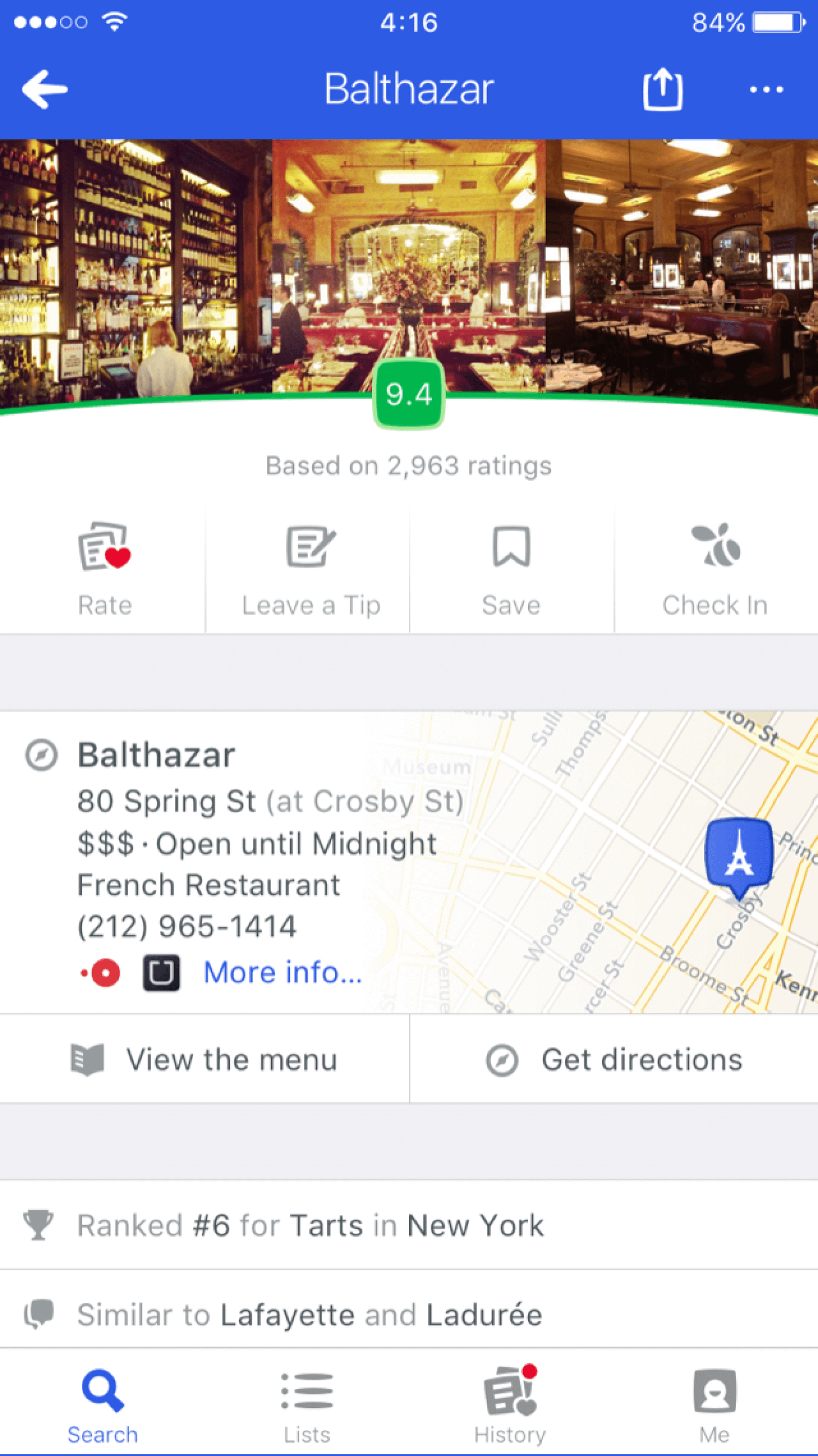
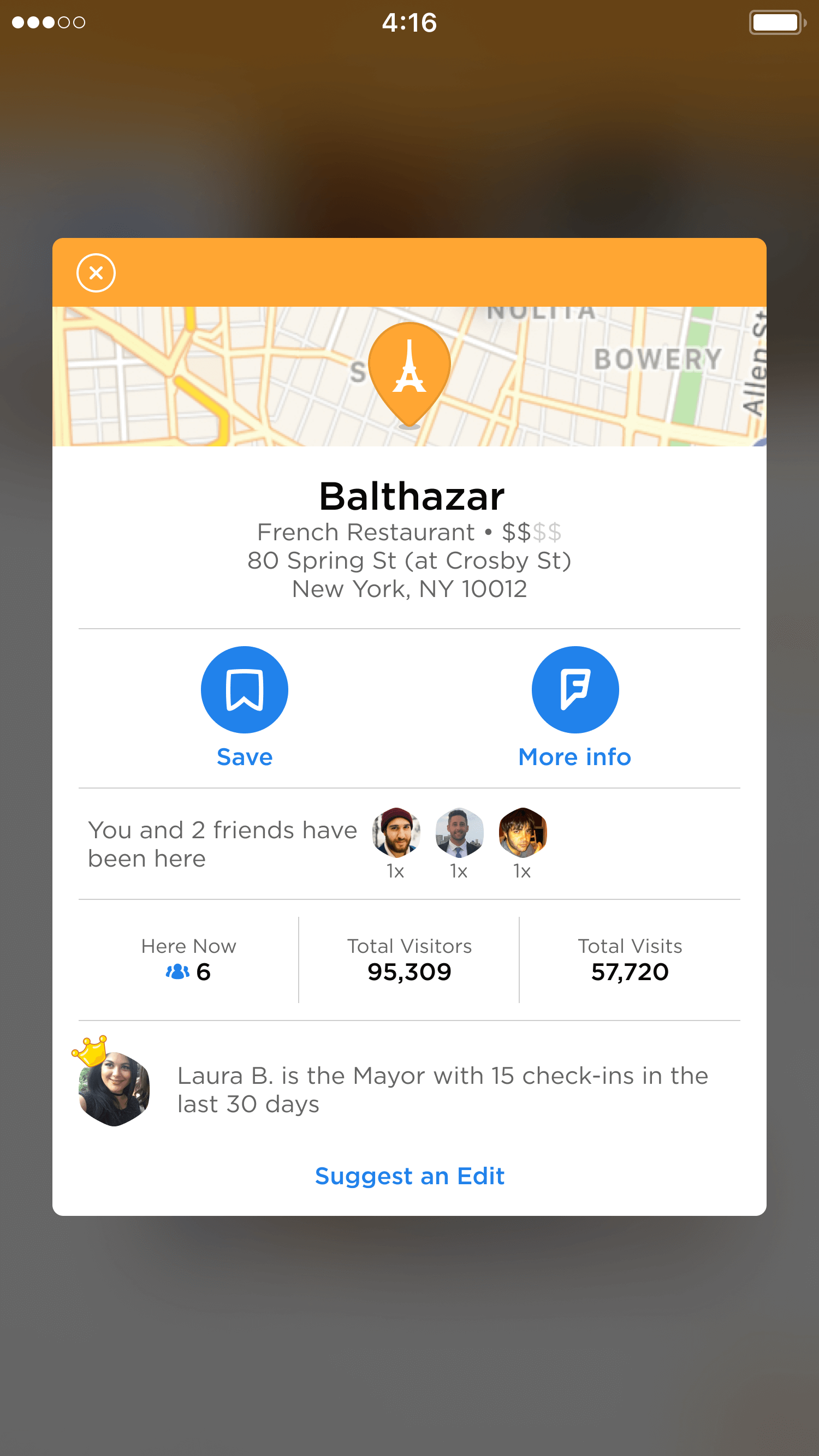
When users wanted to save a venue after seeing a friend's check-in on Swarm, the process was anything but seamless. They needed to click into the friend's check-in, tap the venue name to open a modal, and then select an option at the bottom to open the venue in the Foursquare City Guide app—only then could they save the venue. What should have taken one or two clicks required four, creating unnecessary friction.
While there were ways to shorten this flow, many users still felt the hand-off between apps took too long. This feedback made us question whether we could bring the same functionality directly into Swarm while preserving reasons for users to engage with our sister app, City Guide.
02—Define
User Research and Insights
User reviews from the app stores, along with insights from our community of Superusers1, played a pivotal role in defining this new feature. This feedback highlighted clear opportunities for improvement and underscored the need for a redesign that prioritised a seamless and intuitive experience for saving and sharing places.
-
★★☆☆☆
Love the app, but it's frustrating Why do I have to switch between City Guide and Swarm to save places my friends are checking in to? -
★☆☆☆☆
The app was amazing before they split it into two Now, it's just clunky. Saving places is unnecessarily complicated, and I've stopped bothering. -
★☆☆☆☆
Amazing before they split it into two I don't know what they were thinking when the split the apps, I just want everything back in one place. -
★☆☆☆☆
Used to be my favourite app for discovering new places through friends Now, the whole saving process is a mess.
I comprehensively analysed similar products to understand the competitive landscape better. Drawing from the latest industry trends, I curated mood boards to inform early visual directions and mapped out user flows to identify potential pain points. These exercises inspired fresh ideas and revealed overlooked opportunities, deepening our understanding of user needs and refining their journeys.
03—Ideate
Saving Venues
Striking the right balance between usability and visibility was critical in deciding where to place the save button within our existing UI. Three options stood out: embedding it in the check-in feed cell, housing it within the check-in detail, or placing it in our venue page modal.
Placing it in the check-in cell was the least favourable option, as it risked adding visual clutter to an already detailed component. It also competed with another key action we wanted to prioritise—encouraging users to like their friends' check-ins.

That left two options: placing the save button on the check-in detail view or retaining it within the modal. Upon closer evaluation, when discussing the check-in detail, we realised that a save action didn't align with the page's purpose. This page highlights where a user was, who they were with, their impressions, and achievements like stickers or stats. Adding a save button felt out of place, as it didn't contribute to the user's experience of the check-in itself.
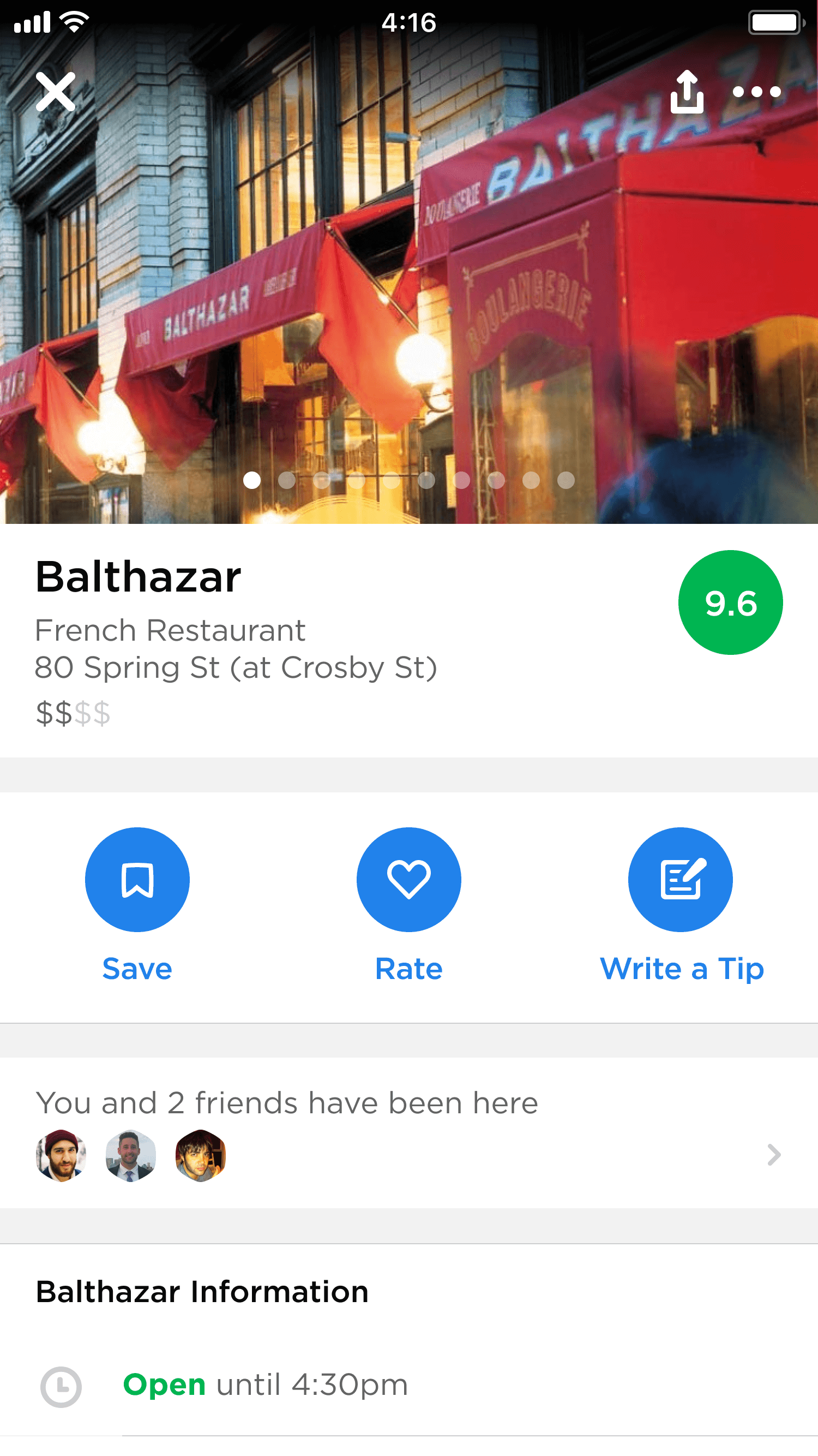
We then turned to the modal, giving a subtle visual refresh during a two-week experiment and introducing a more prominent save action. While this approach showed promising results, the modal's design still primarily reflected Swarm's older visual style. This prompted us to consider whether to overhaul the modal or move forward with a new, more discoverable venue page that better aligned with Swarm's focus on social discovery. Both options were explored, and ultimately, we chose the latter2.

Housing the Experience
Adopting a simplified perspective, Swarm operates as a two-tab app, with the user's profile accessible from the top-left corner of the navbar in both views. This streamlined design offers a clean user experience but inherently limits the available real estate for additional features. As a result, the placement options for this new functionality were somewhat constrained, requiring careful consideration to avoid disrupting the app's balance and usability.
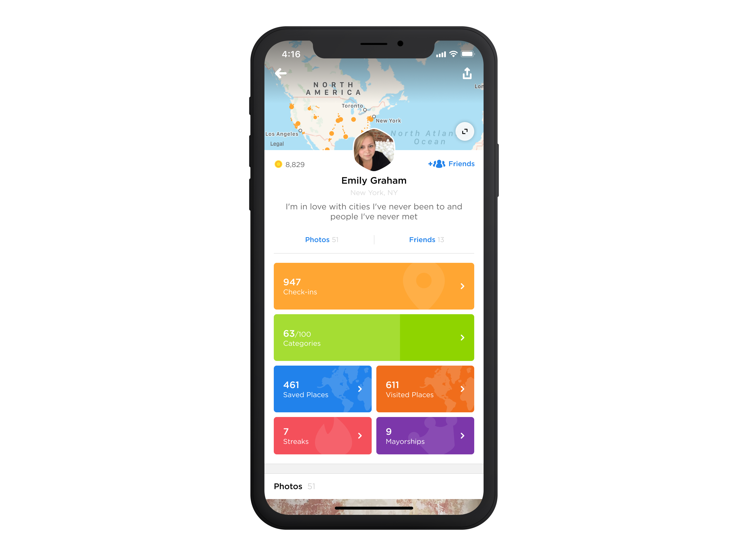
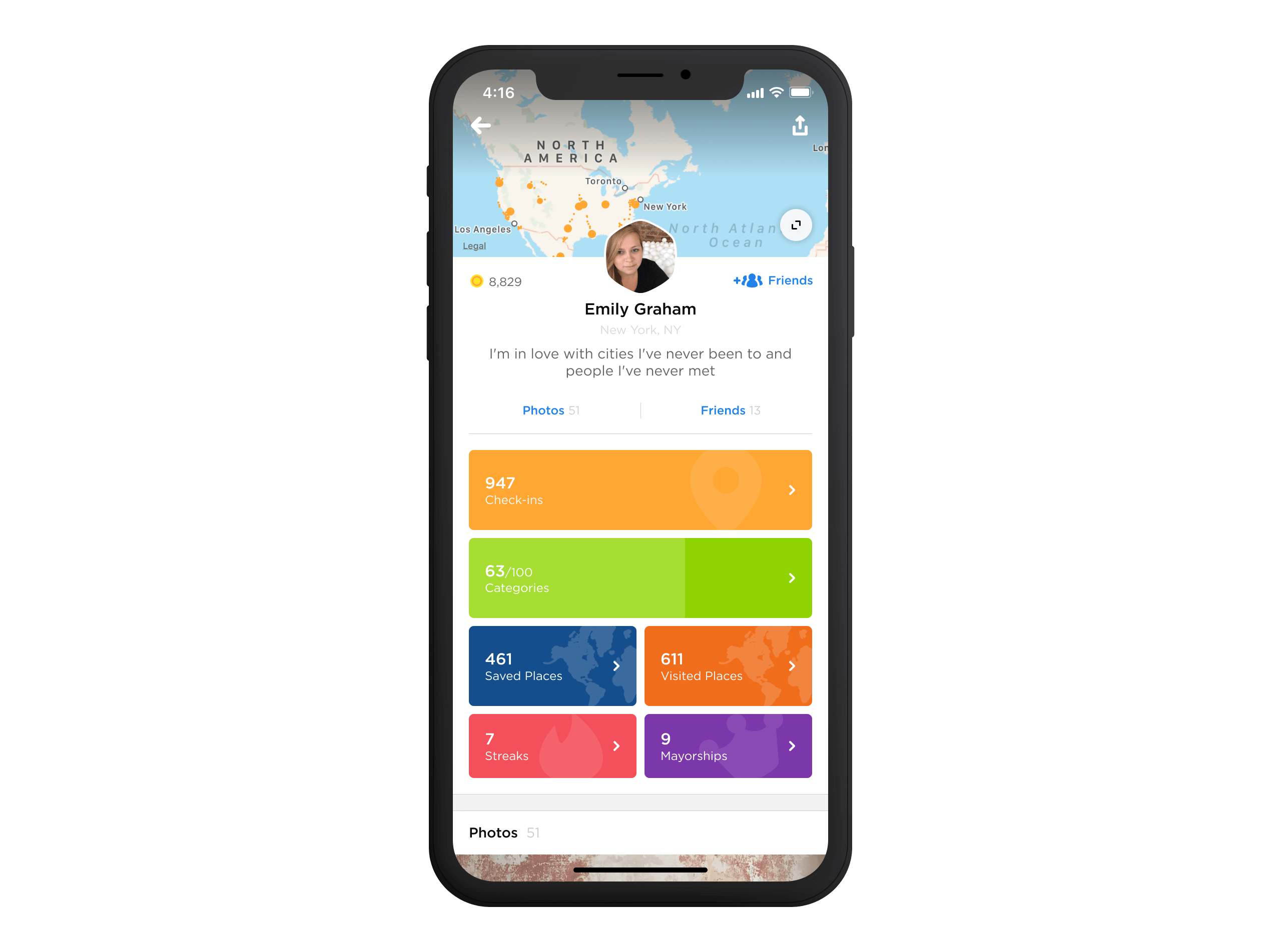
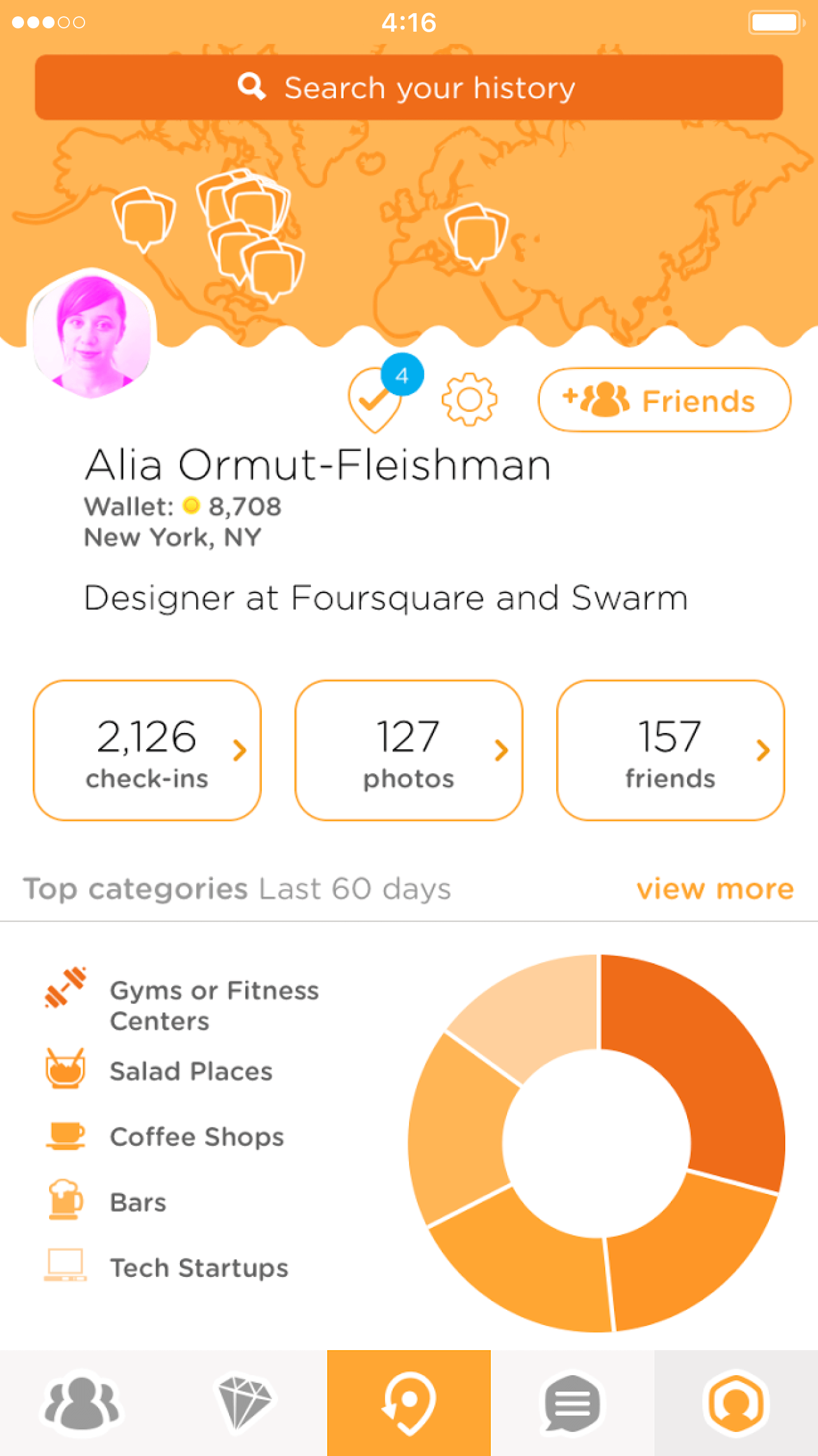
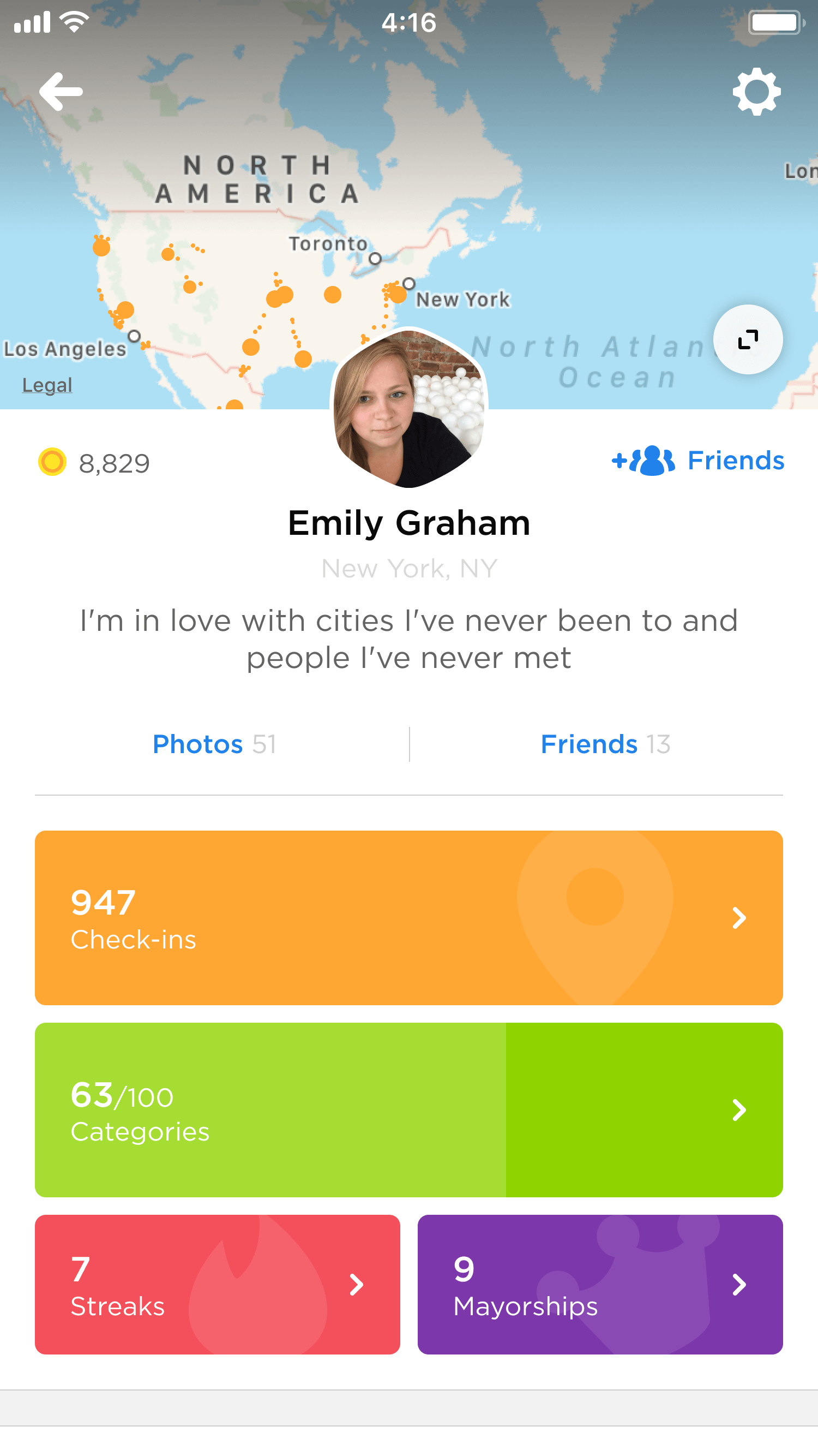
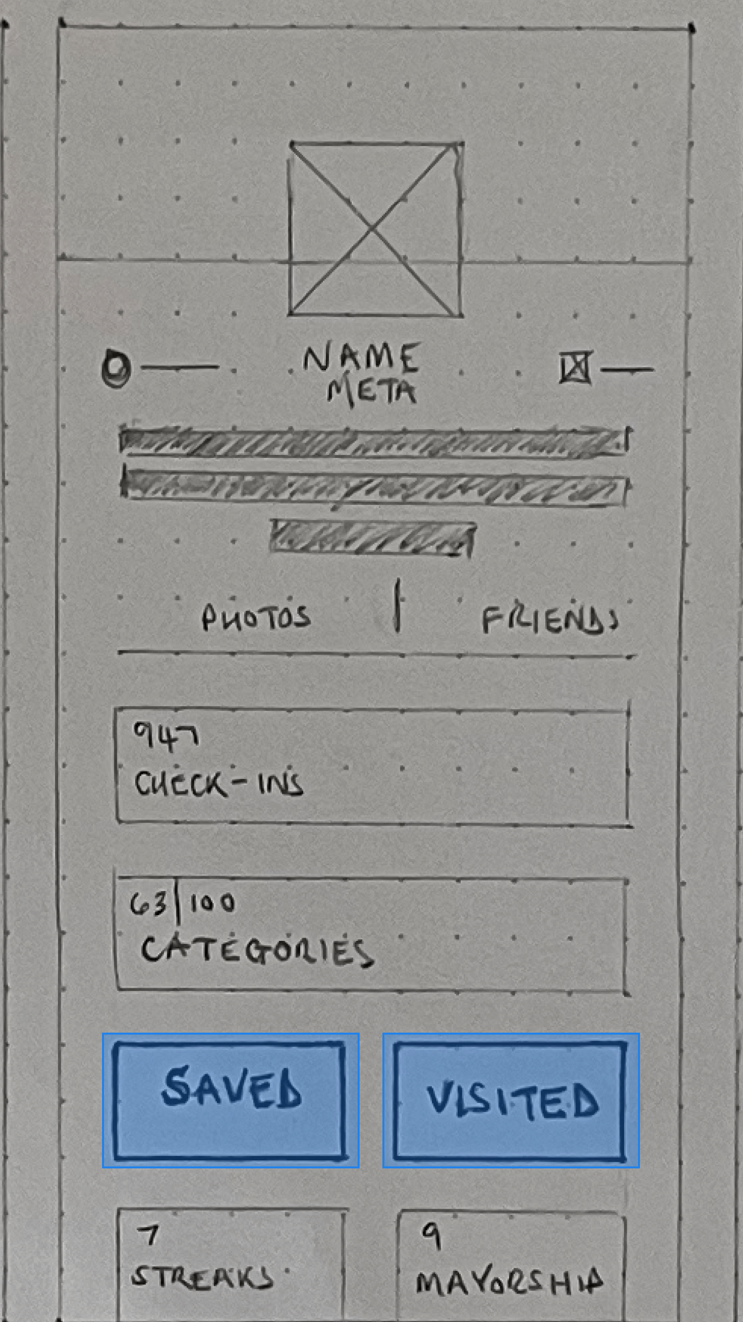
As a result, the user's profile emerged as a natural and prominent choice for this feature, as it already housed significant app usage information: photos, friends, check-ins3, categories, stickers, streaks, and mayorships.
Exploring Bottom Sheets
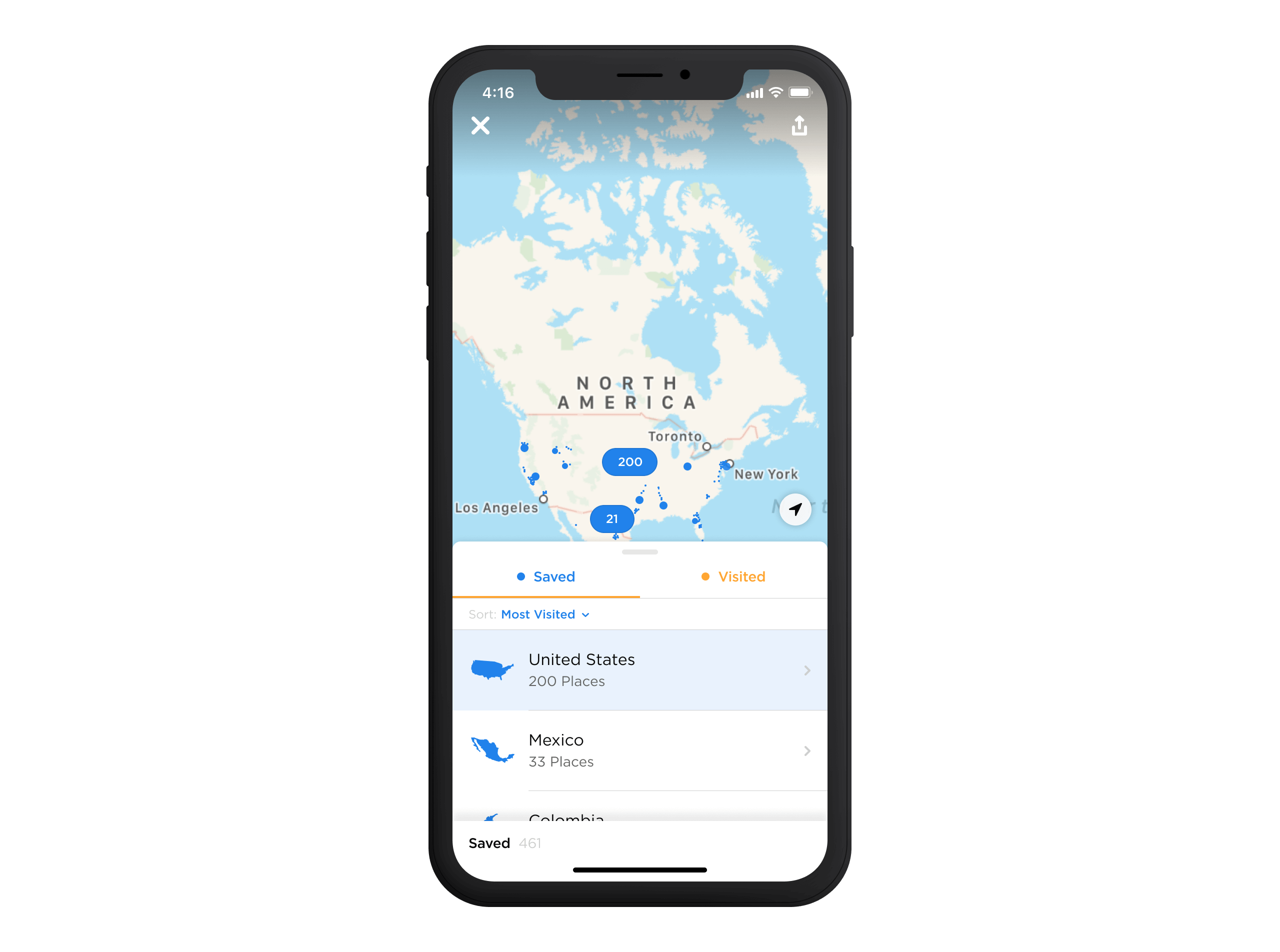
A few months before this project began, Android and iOS introduced bottom sheets, shifting interaction patterns from top-heavy to bottom-heavy layouts. These sheets quickly gained traction across apps, signalling their growing popularity and setting new industry trends. By allowing information to be presented seamlessly without disrupting the user's flow, they offered a promising solution to Foursquare's longstanding dilemma: "Do users prefer to browse via a list or a map?"4.
As part of the design process, we conducted weekly testing sessions to evaluate different iterations of bottom sheets. These sessions allowed users to engage with various layouts and explore how content was presented, giving us valuable insights into how they navigated and processed information.
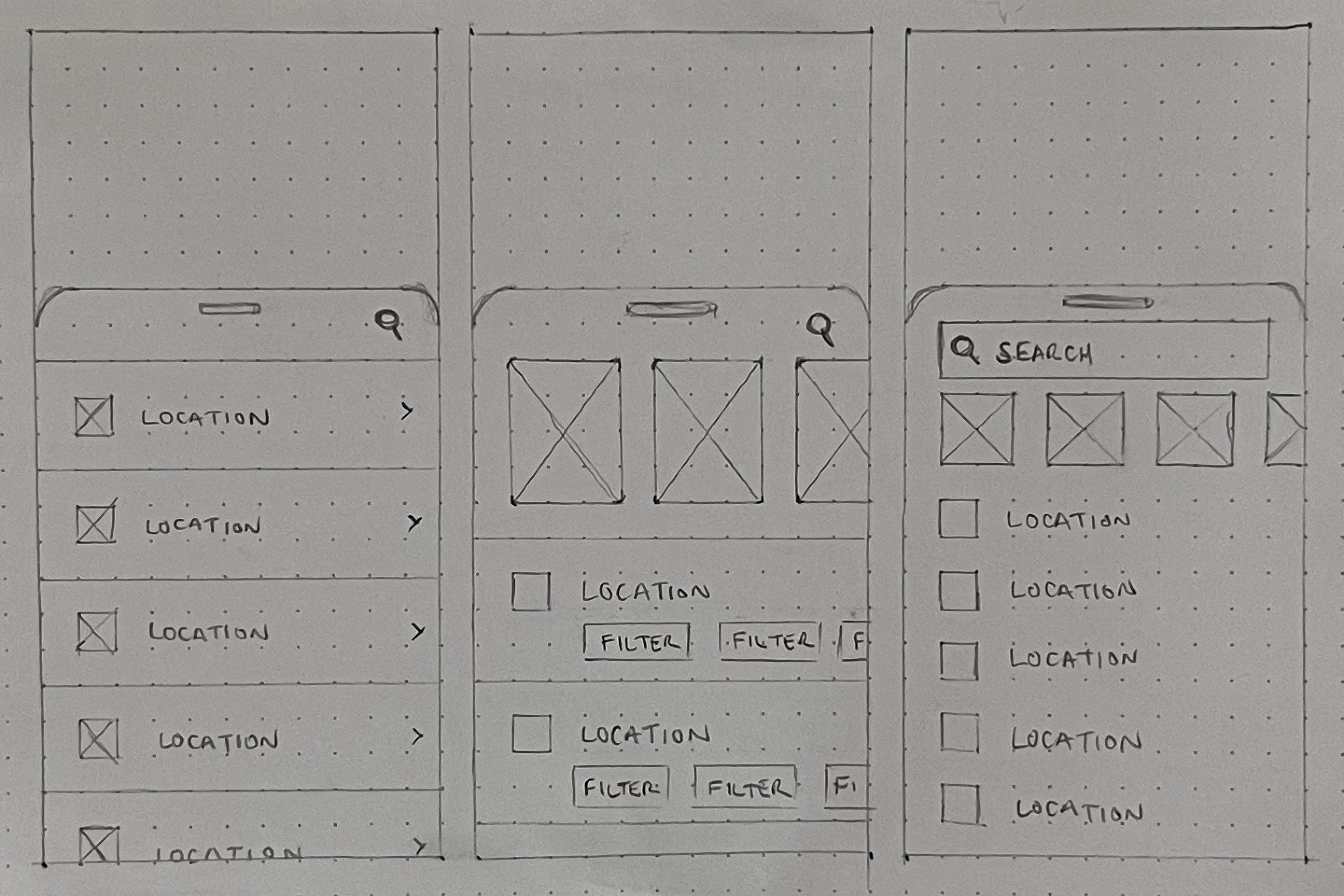
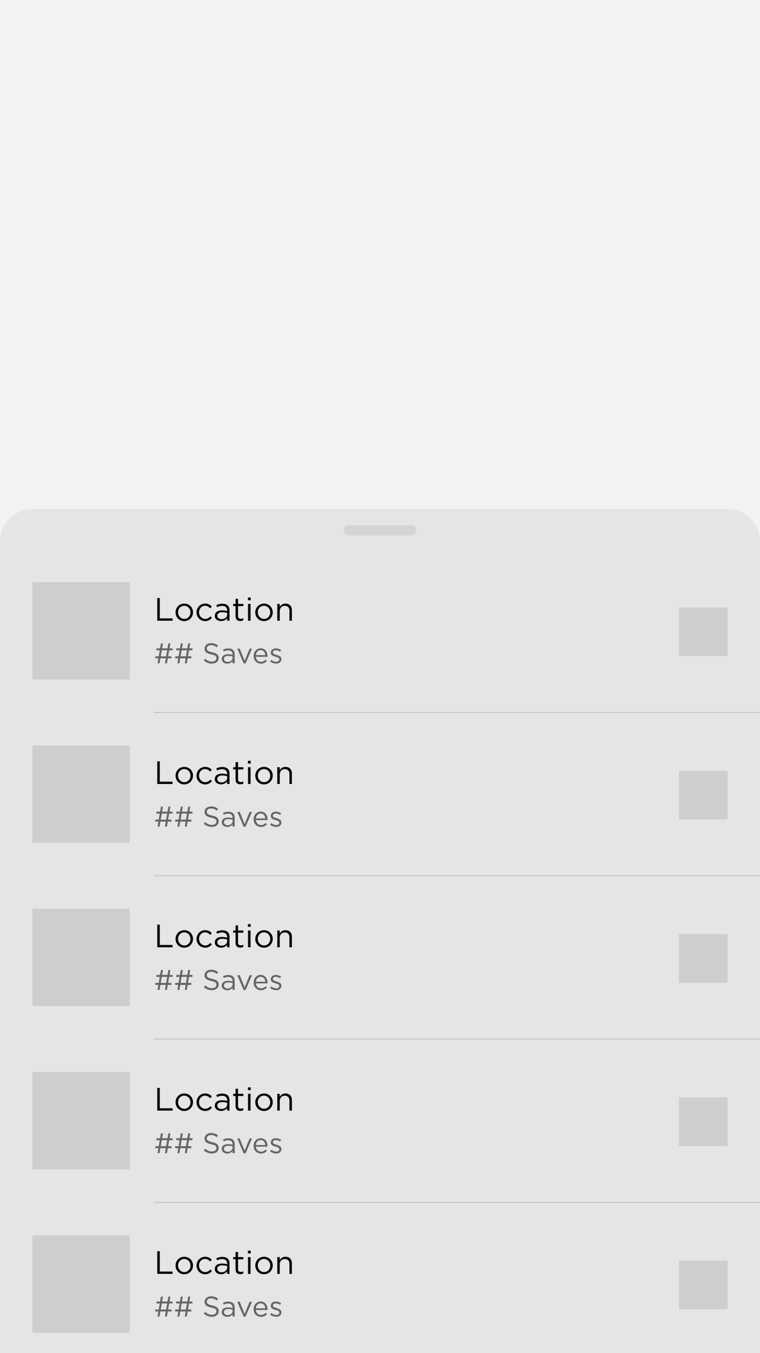
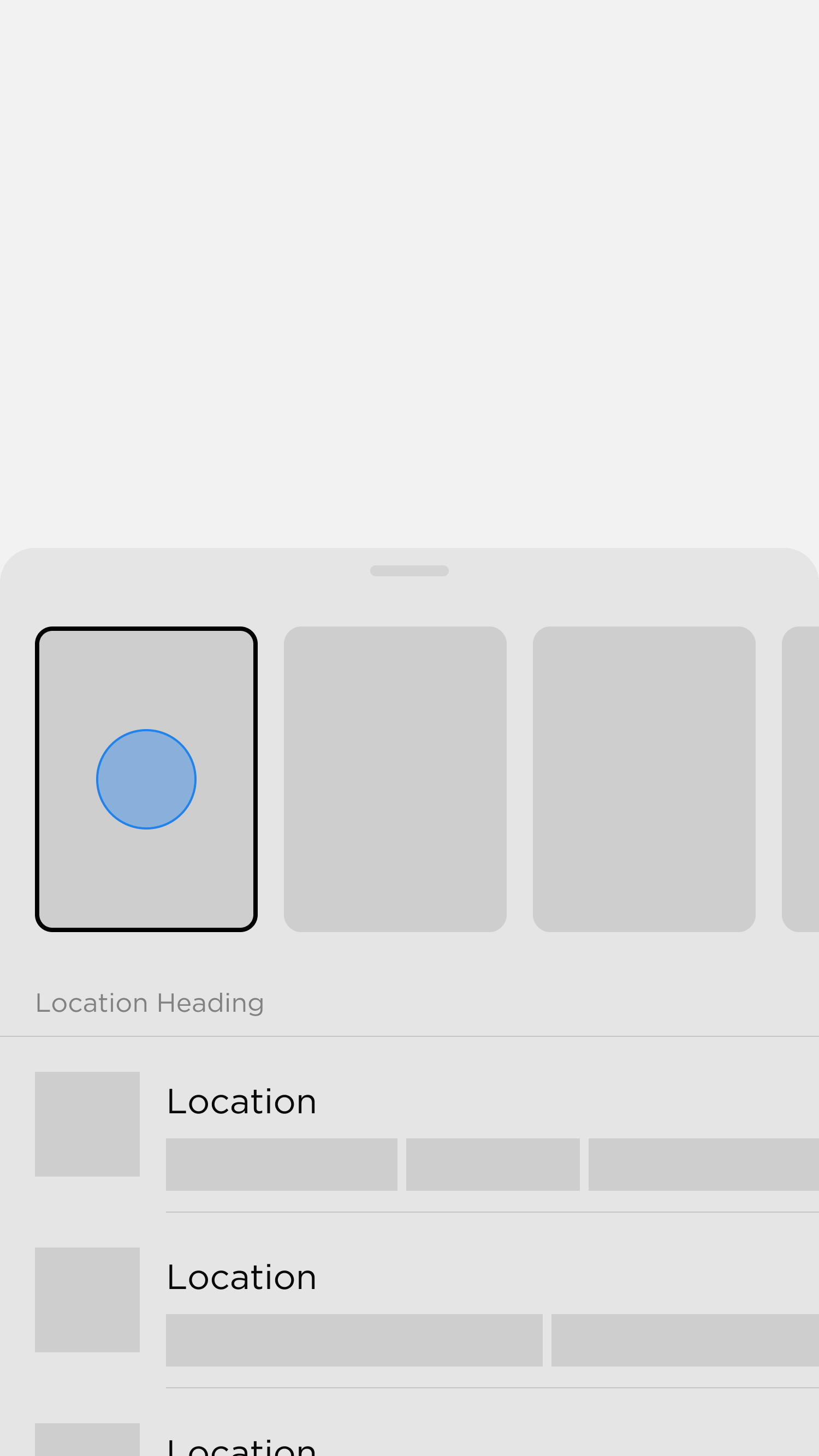
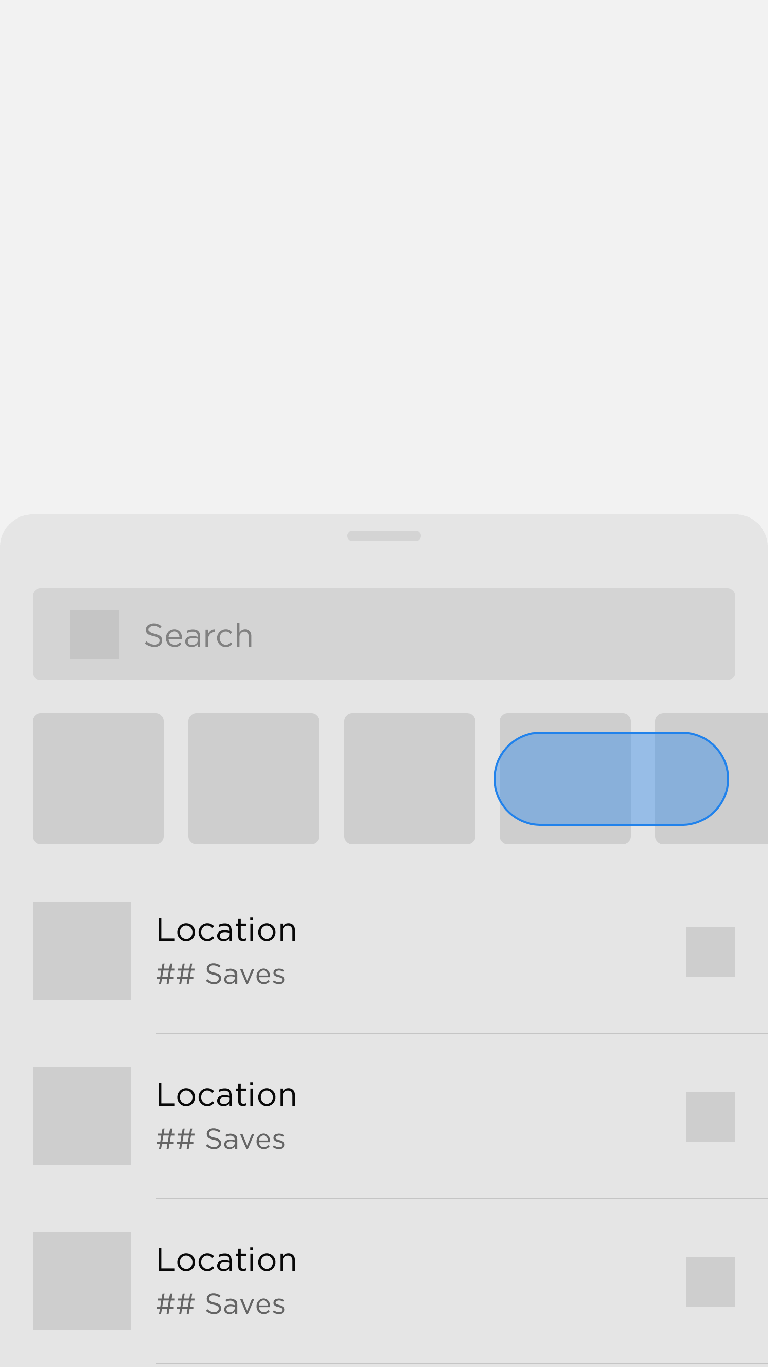
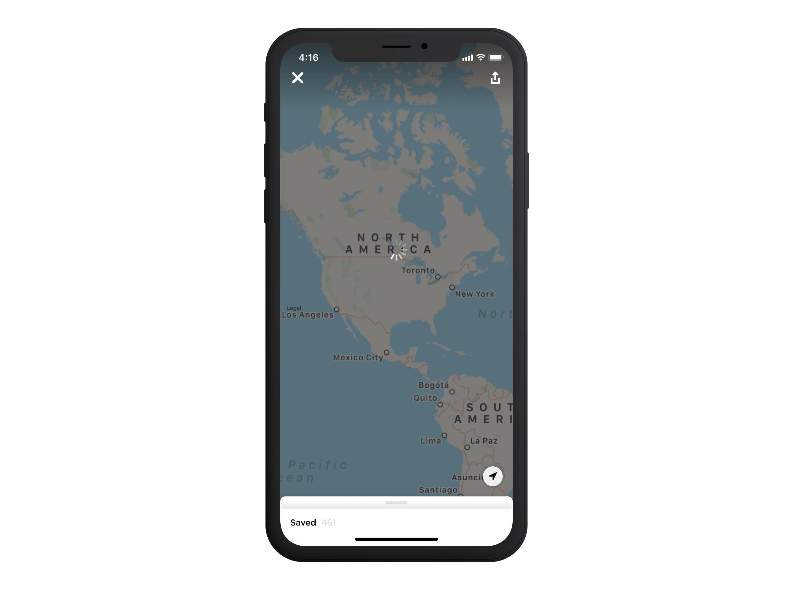
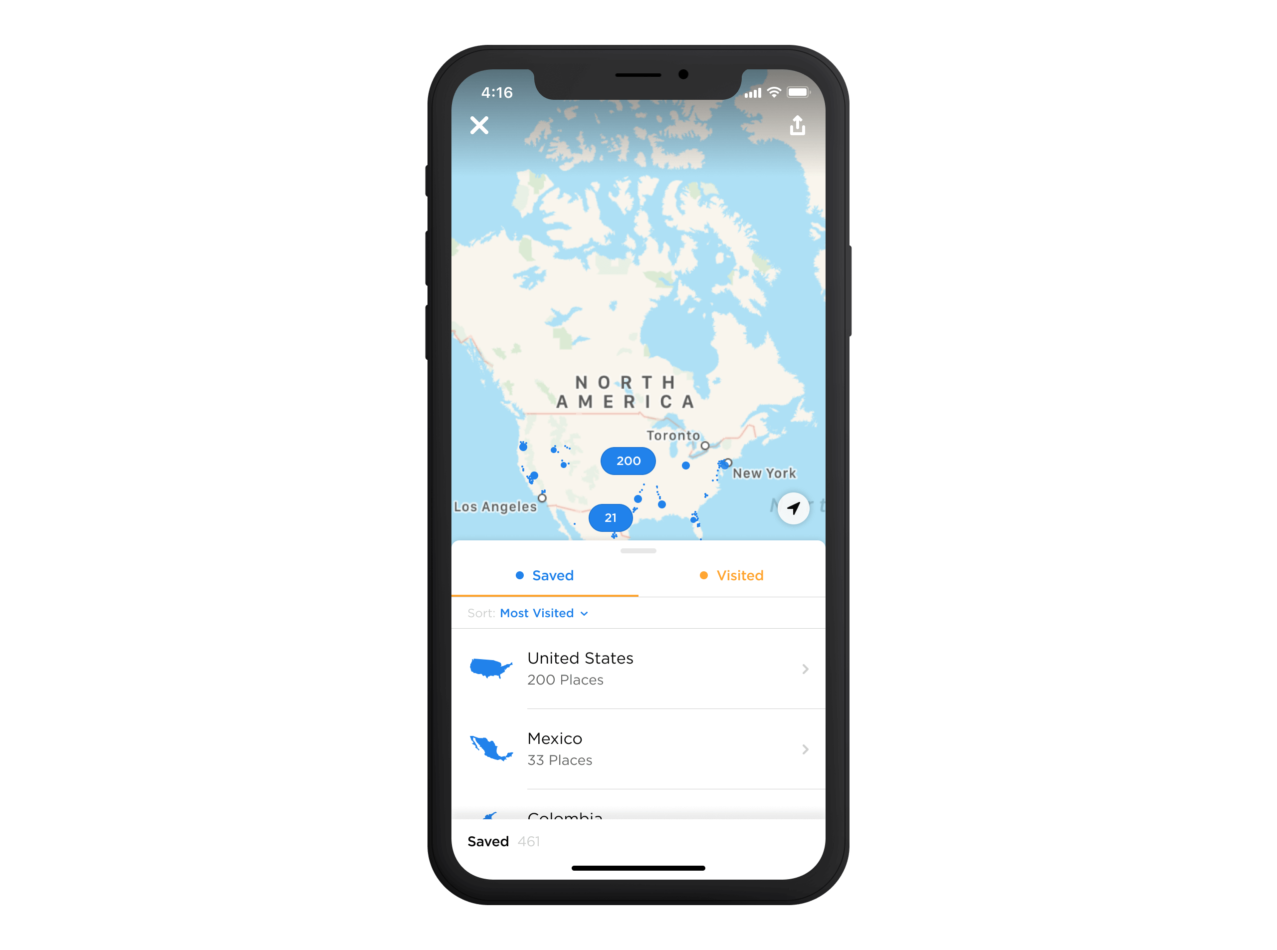
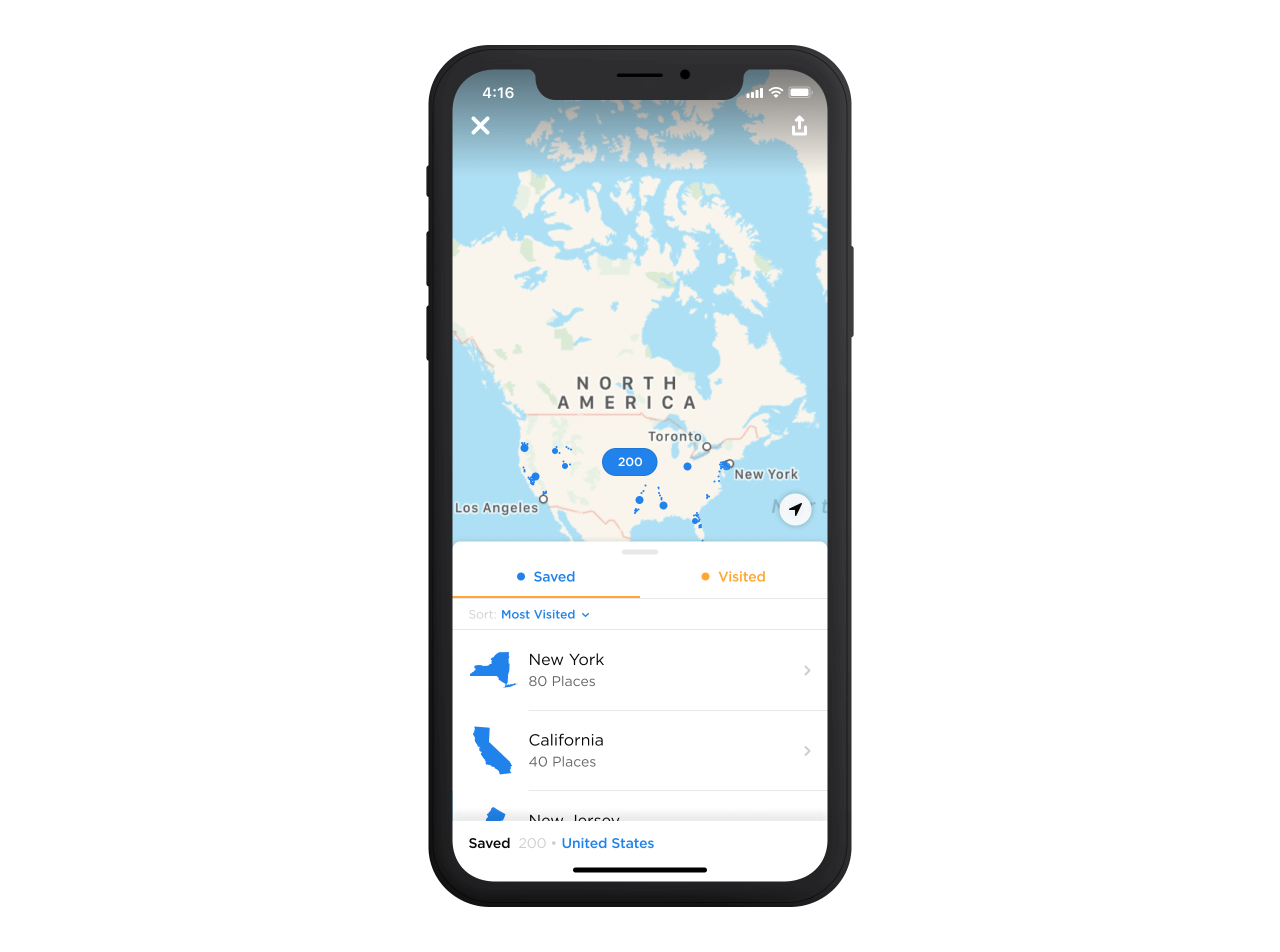
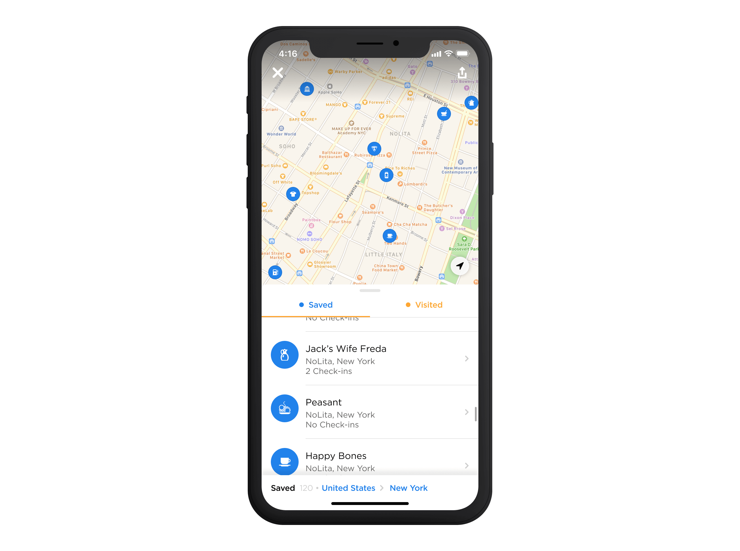
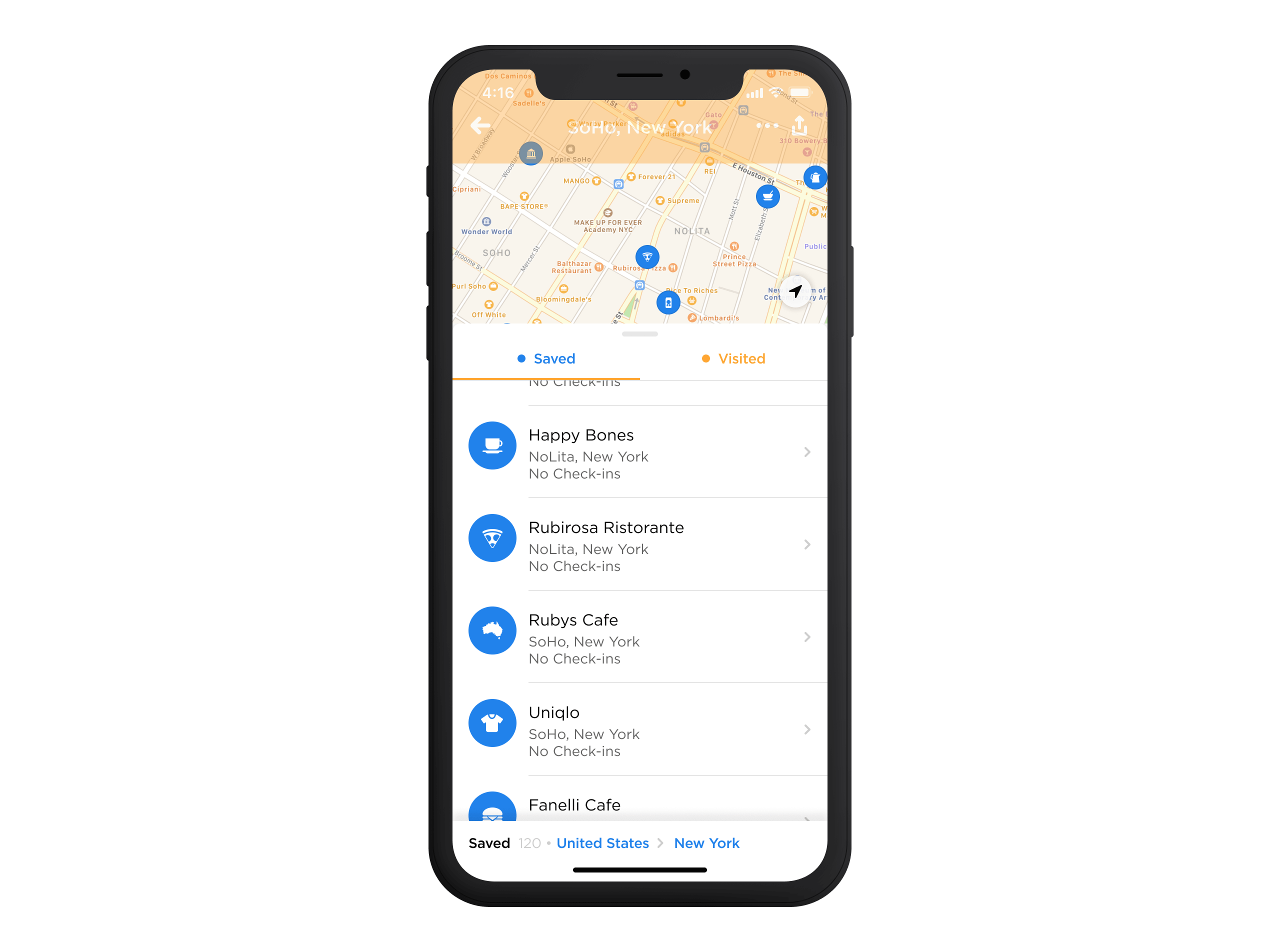
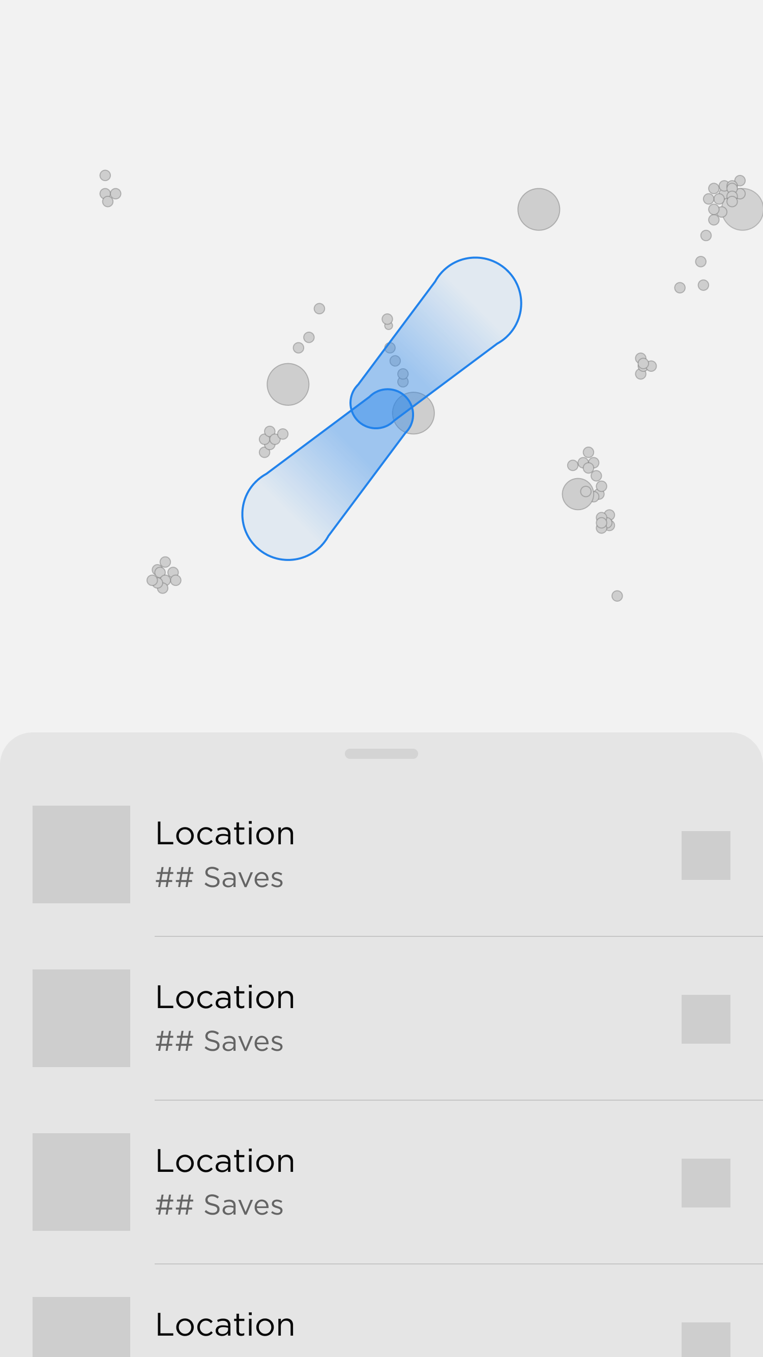
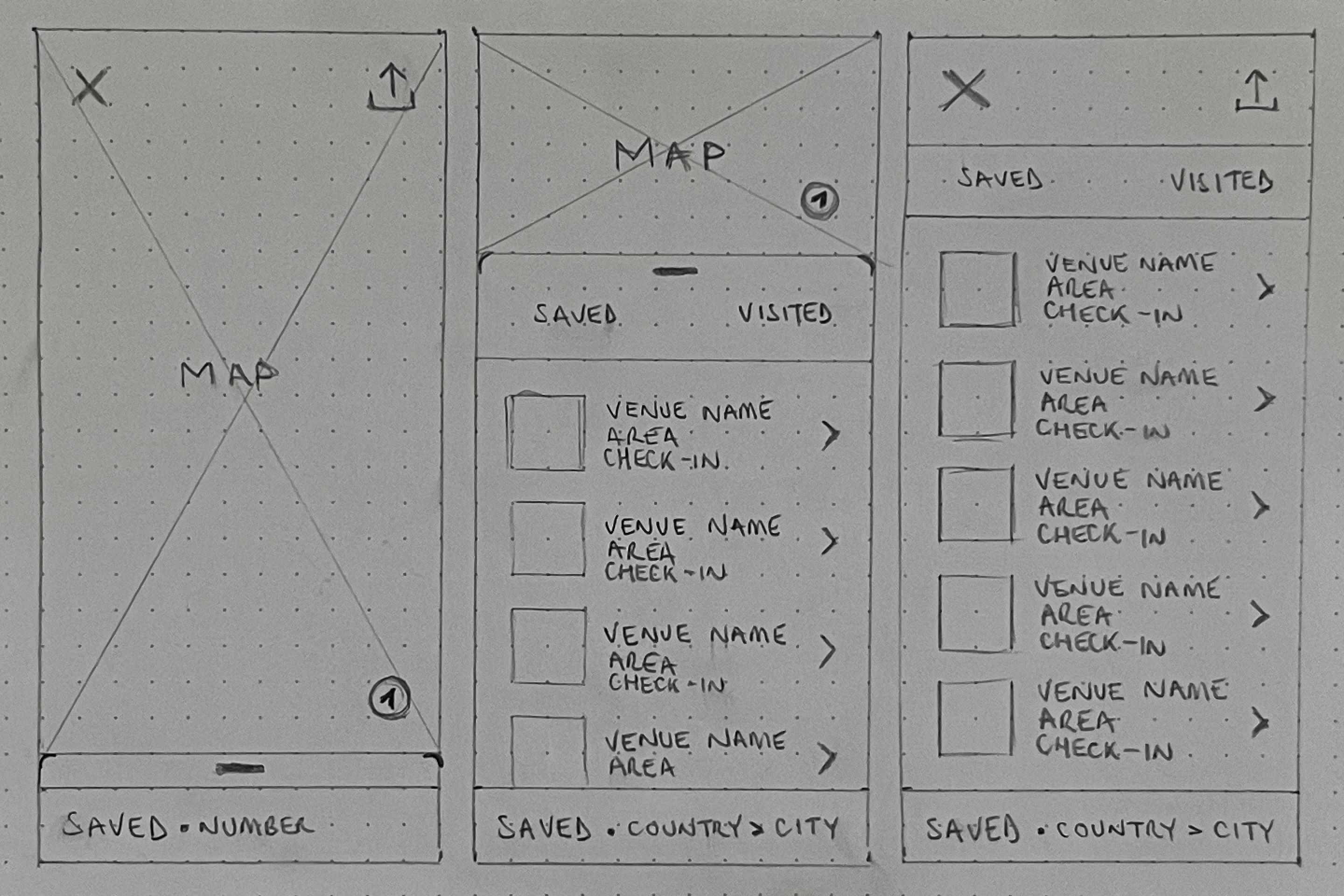
Insights from testing sessions reaffirmed that the map should be our compelling visual centrepiece. To achieve this, we designed the bottom sheet to render in a collapsed position before sliding to its default state. Testing revealed that showing the map first helped set the user context, especially when it was populated with more data. Once the bottom sheet slid up, it introduced an additional interaction layer, enabling users to dive deeper into the data through a detailed, list-based format.
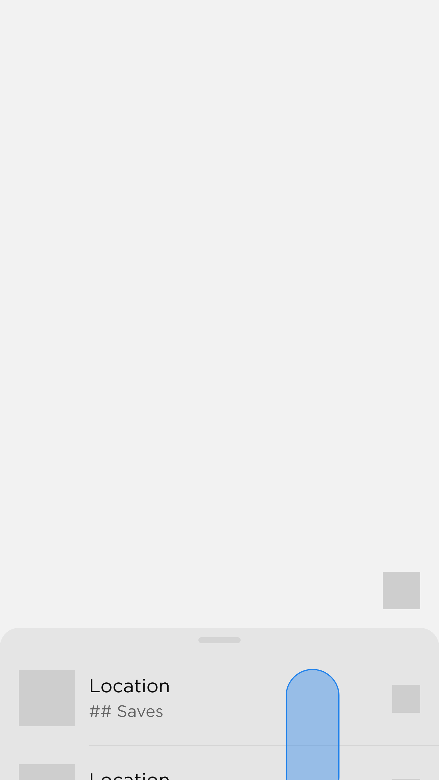
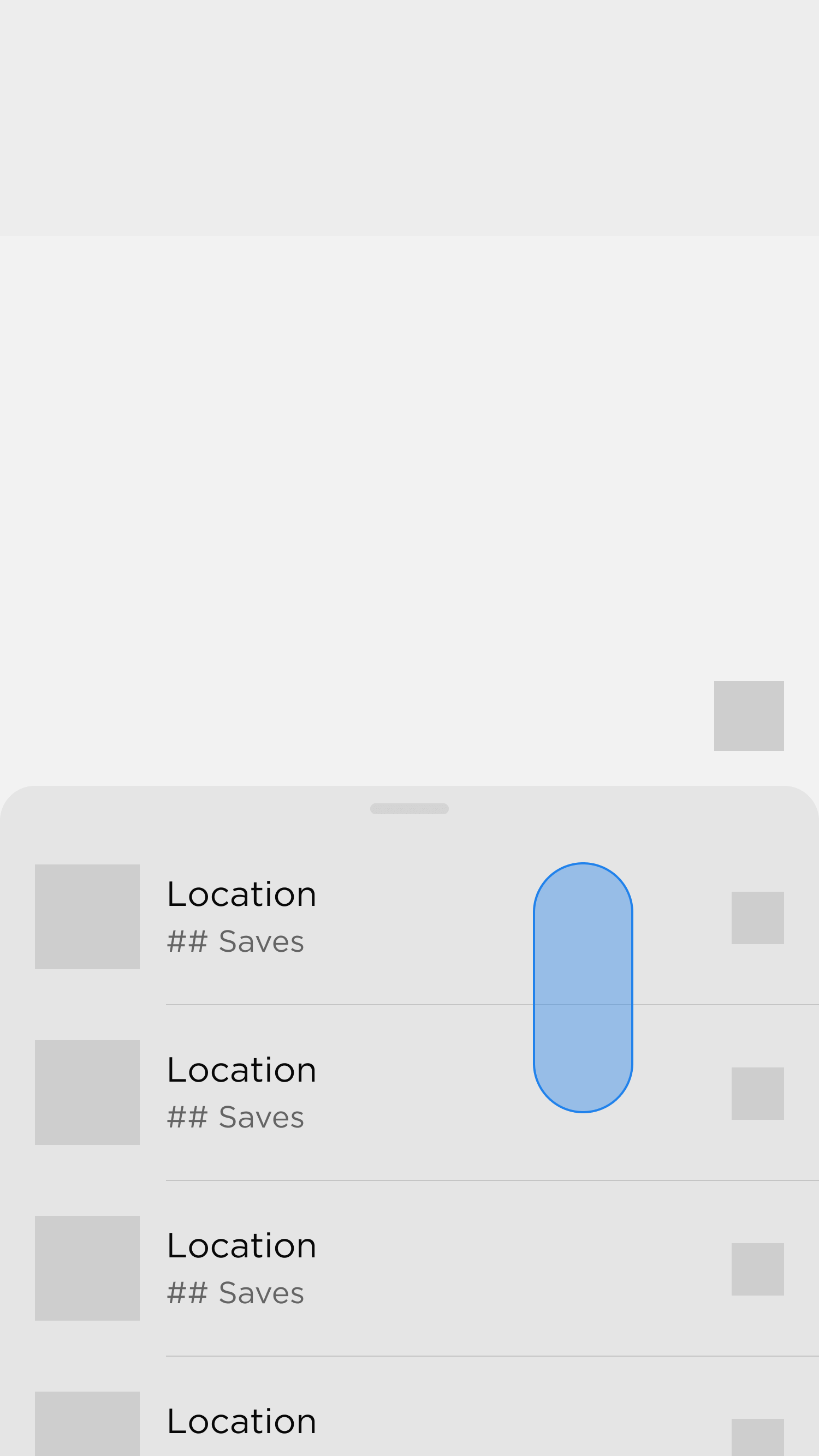
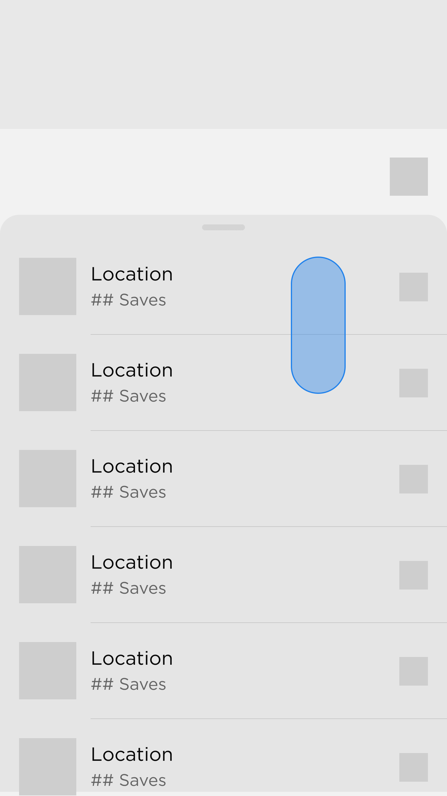
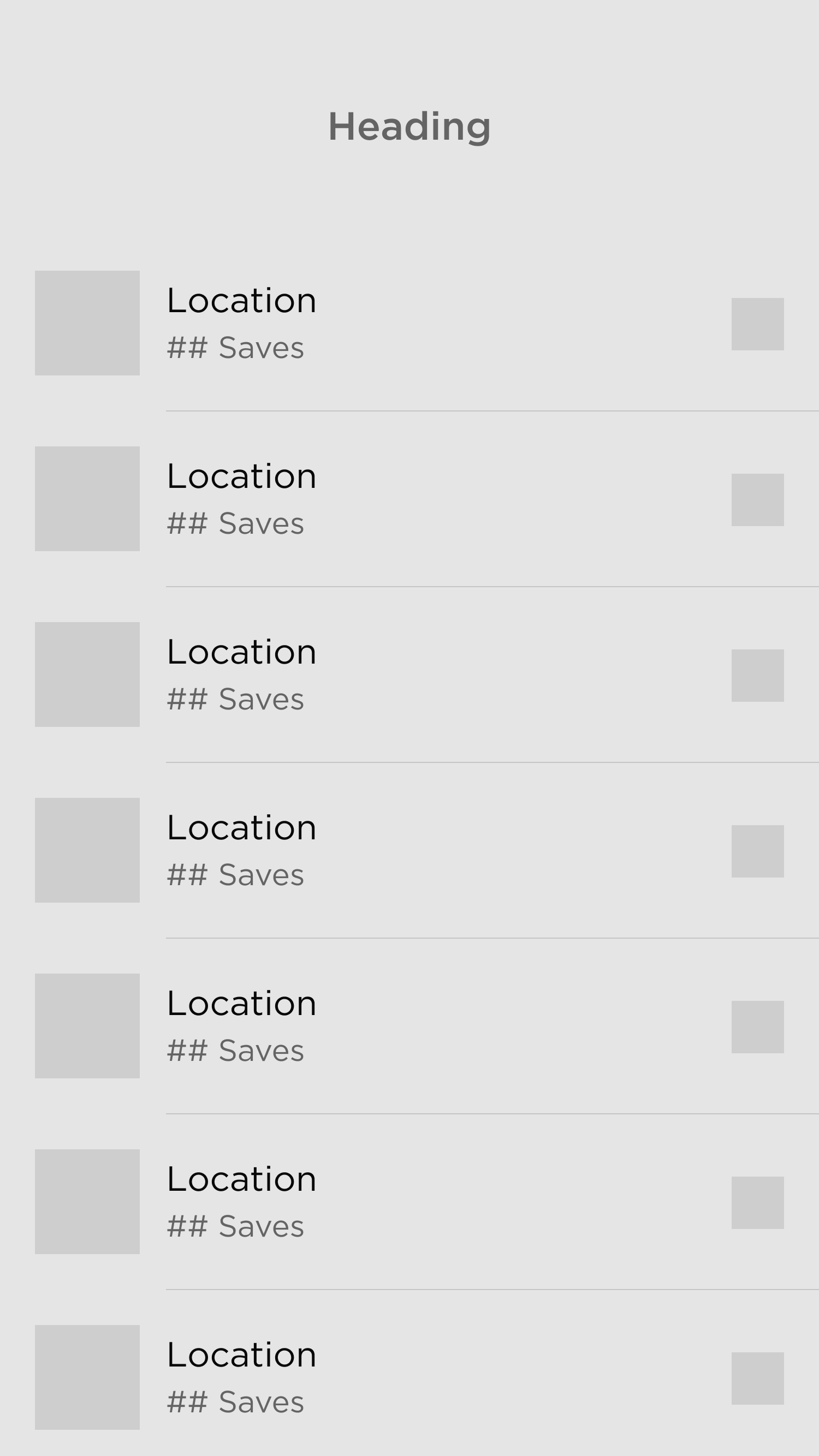
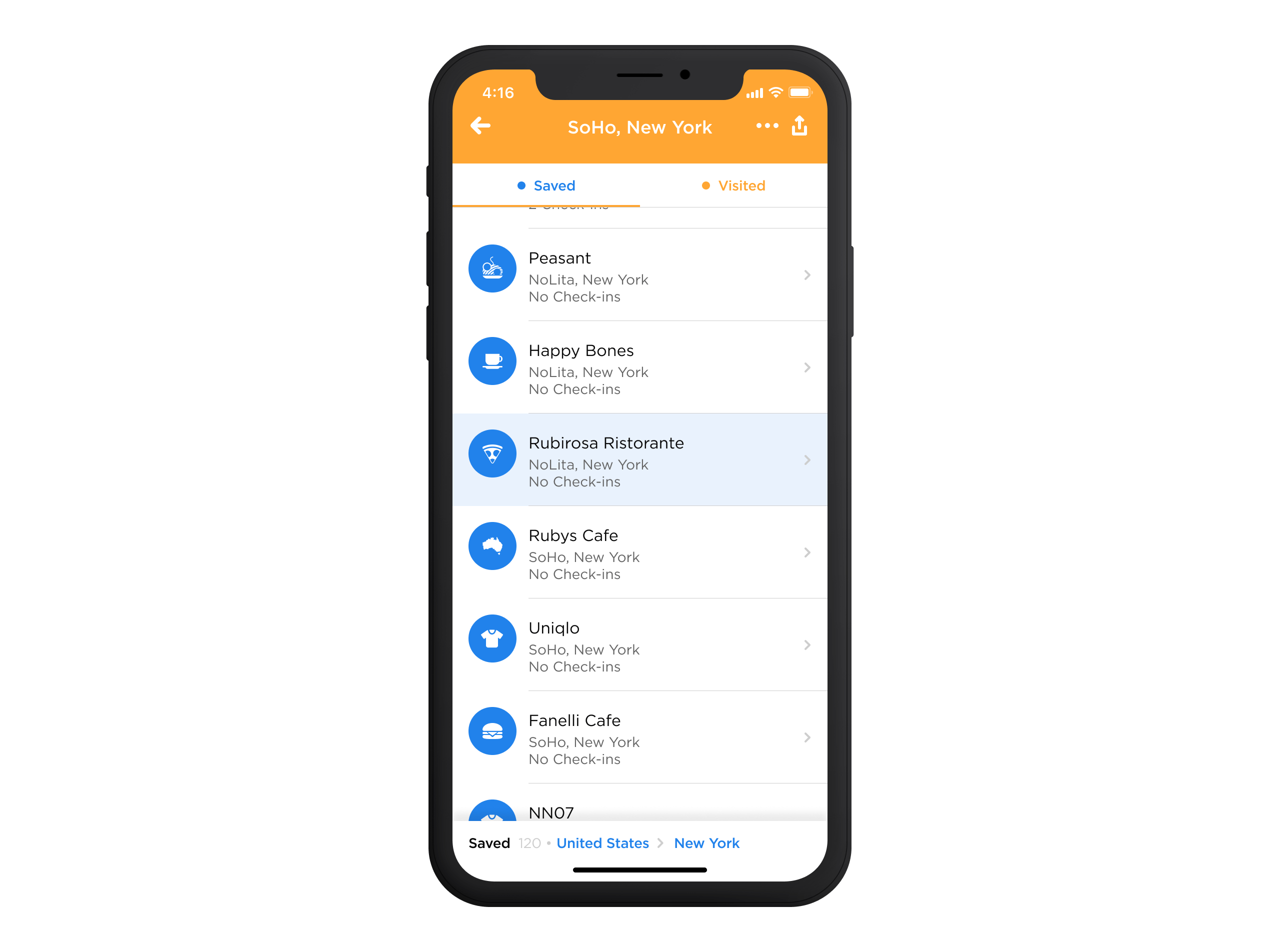
By allowing the map to occupy 70% of the vertical space on the page load, we signalled that the bottom sheet operated independently from the map and could be swiped upward. This design allowed users to explore the map while seamlessly transitioning to a full-page list view when the sheet was swiped up entirely. The dual interaction—map first, followed by the bottom sheet—reinforced the flexibility of navigating between map-based and list-based information without feeling disconnected.
Balancing Interactions
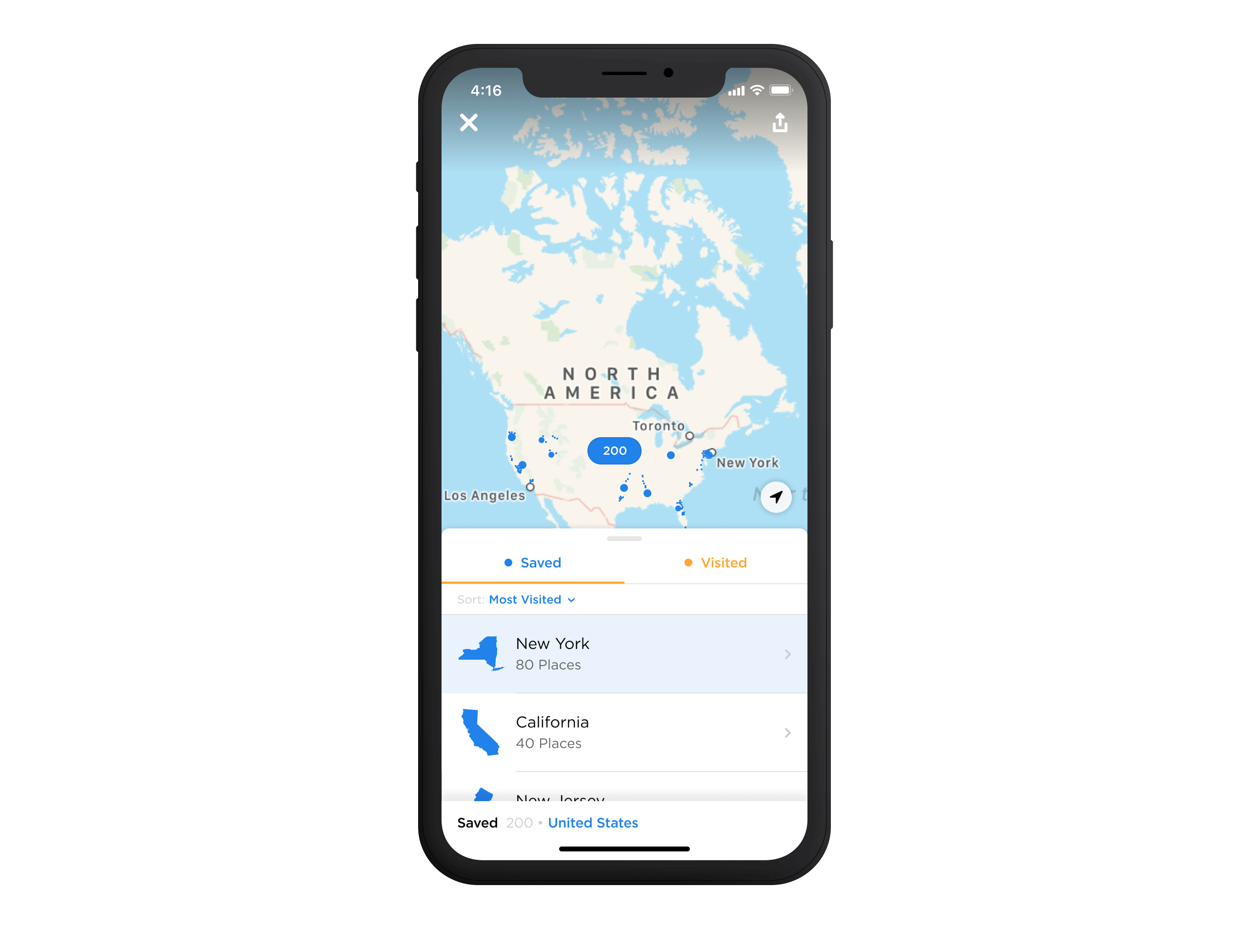
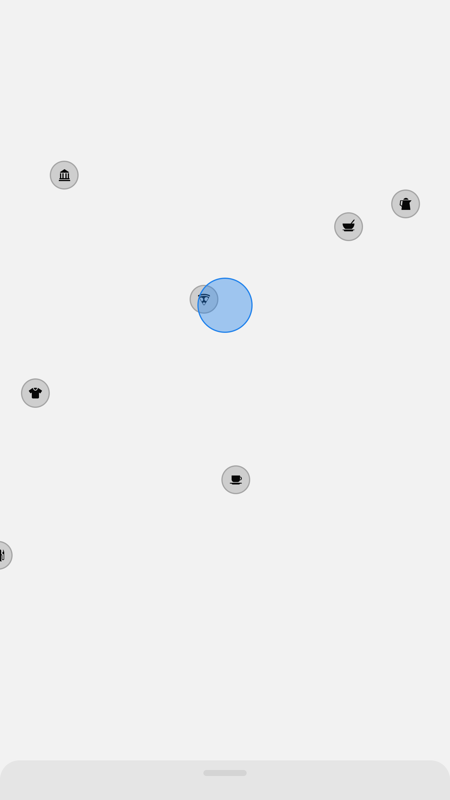
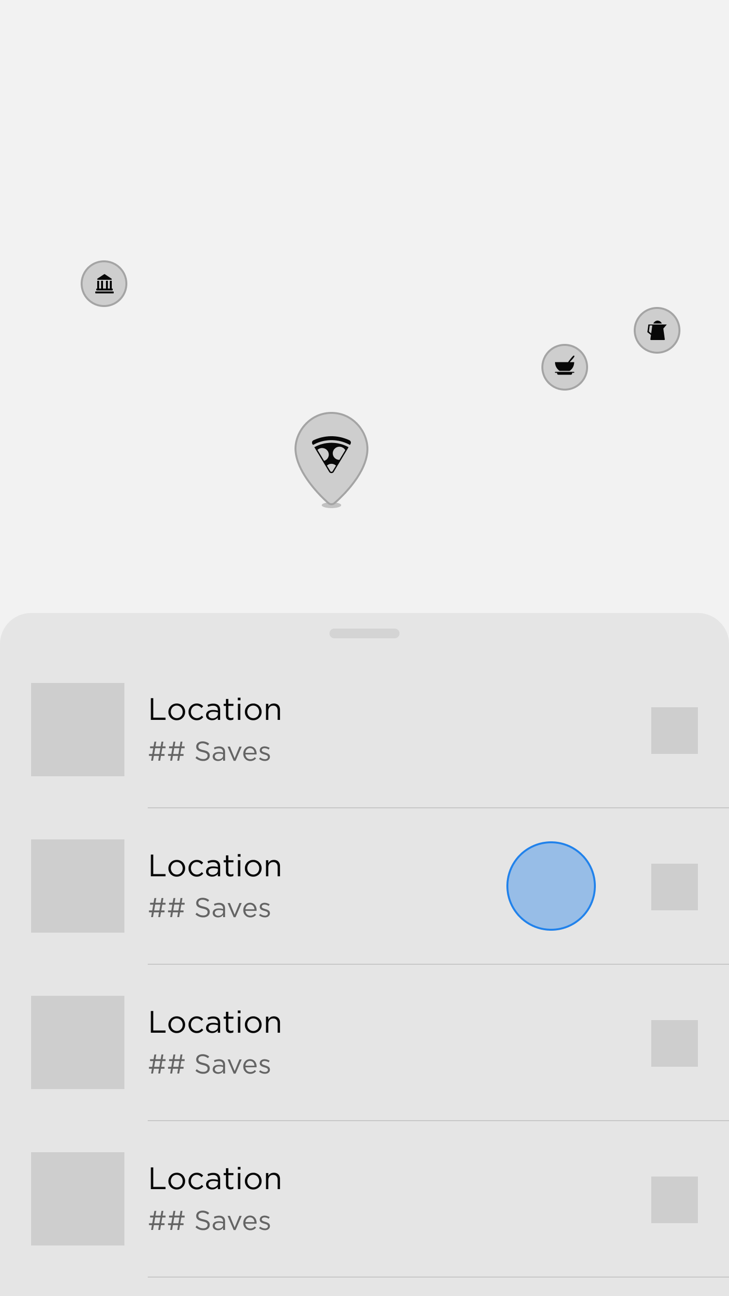
To reinforce the map as a compelling visual centrepiece, we needed to ensure that the bottom sheet adapted dynamically to user interactions. Whenever users engaged with the map, the bottom sheet would collapse, allowing the map to take over the entire screen and remain the focal point.
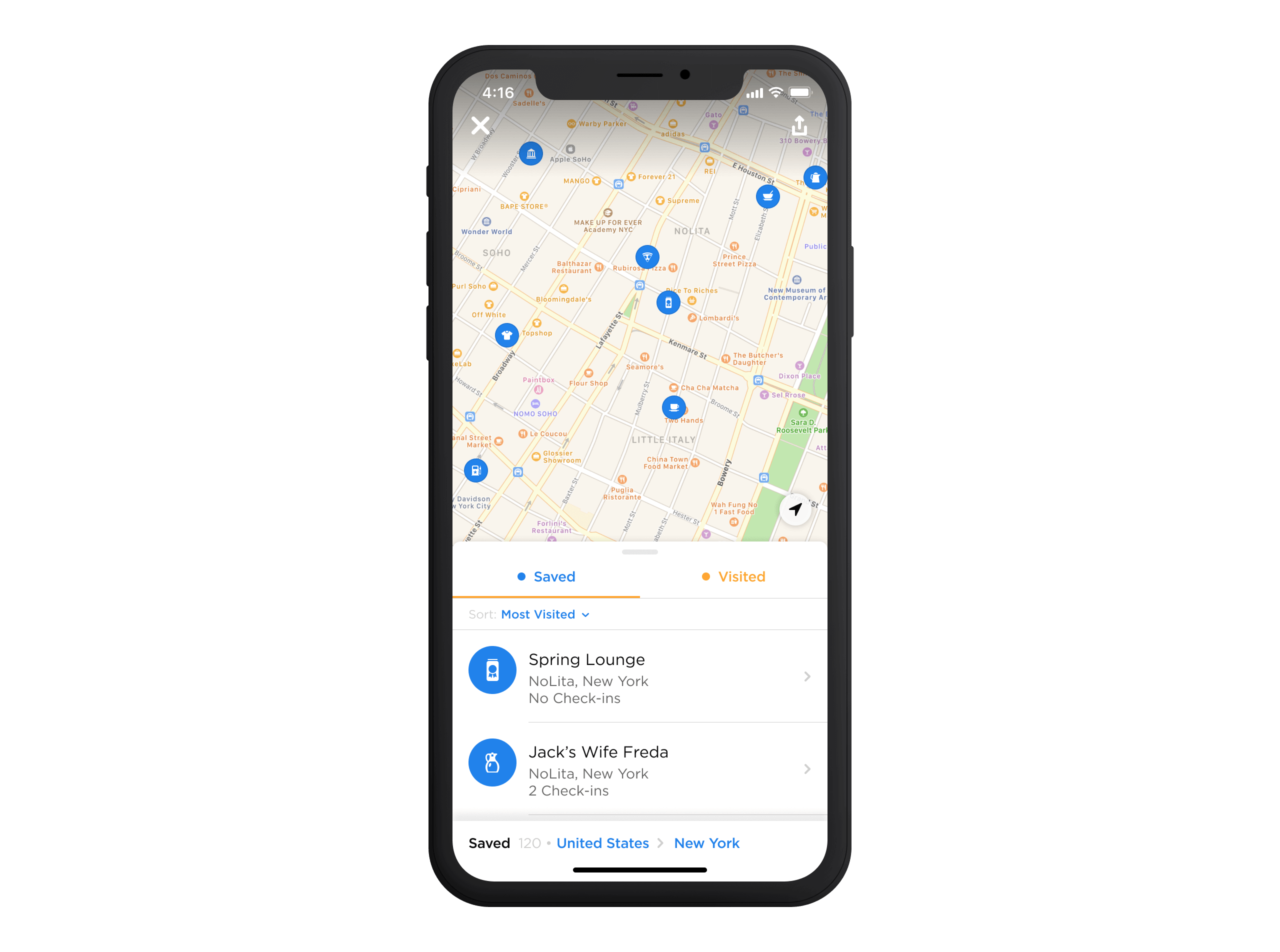
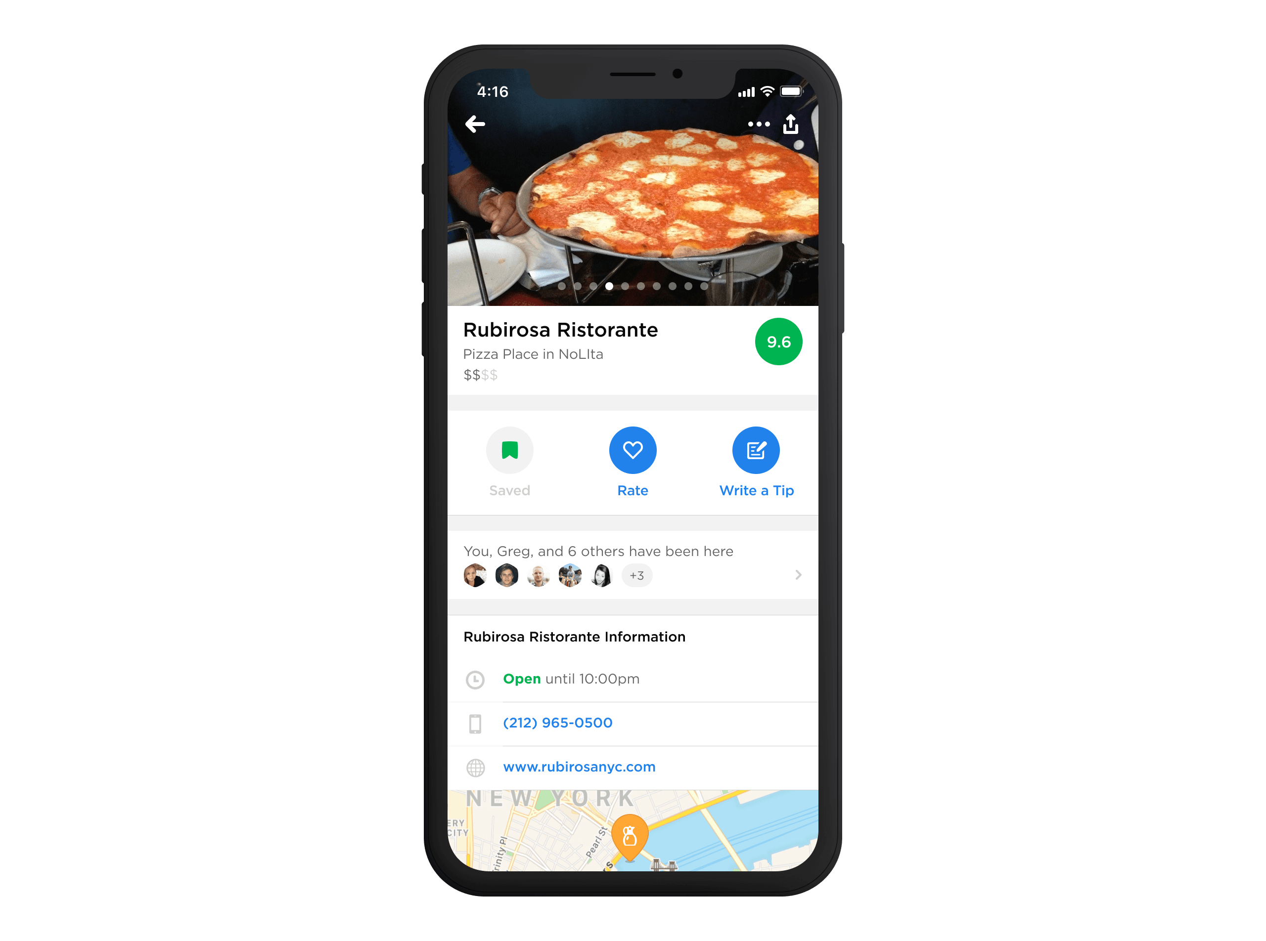
The bottom sheet would stay in its collapsed state until a map pin was selected. At that point, it would slide back up to display key details. From there, the user could tap on the venue cell to access the venue page.
04—Test
Testing and Feedback
Creating the Saved Places feature was an iterative process shaped by feedback from our team and the Foursquare community. Early on, I used low-fidelity black-and-white prototypes to focus on functionality and make quick changes. This helped us test ideas and refine the feature before moving to more polished designs.
As we progressed, we shared weekly builds with employees for internal feedback and bi-weekly builds with our Superuser community. Superusers shared screenshots and recordings through Slack, helping us spot usability issues and uncover new ideas. This combination of internal and external feedback gave us a well-rounded view of users' needs. It allowed us to improve the feature step by step and ensure it fits seamlessly into the app before launching.
Design Revisions
| Issue | Initial Design | Feedback | Change Implemented |
|---|---|---|---|
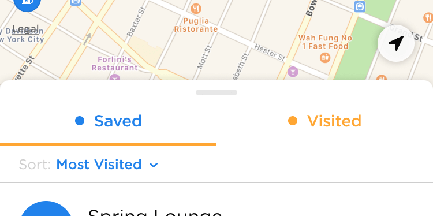
| Saved & Visited Views | Separate entry points pushed distinct pages. | Users found switching between the two views inconvenient due to their similarity. | Introduced a tab bar at the top of the bottom sheet for seamless toggling. |
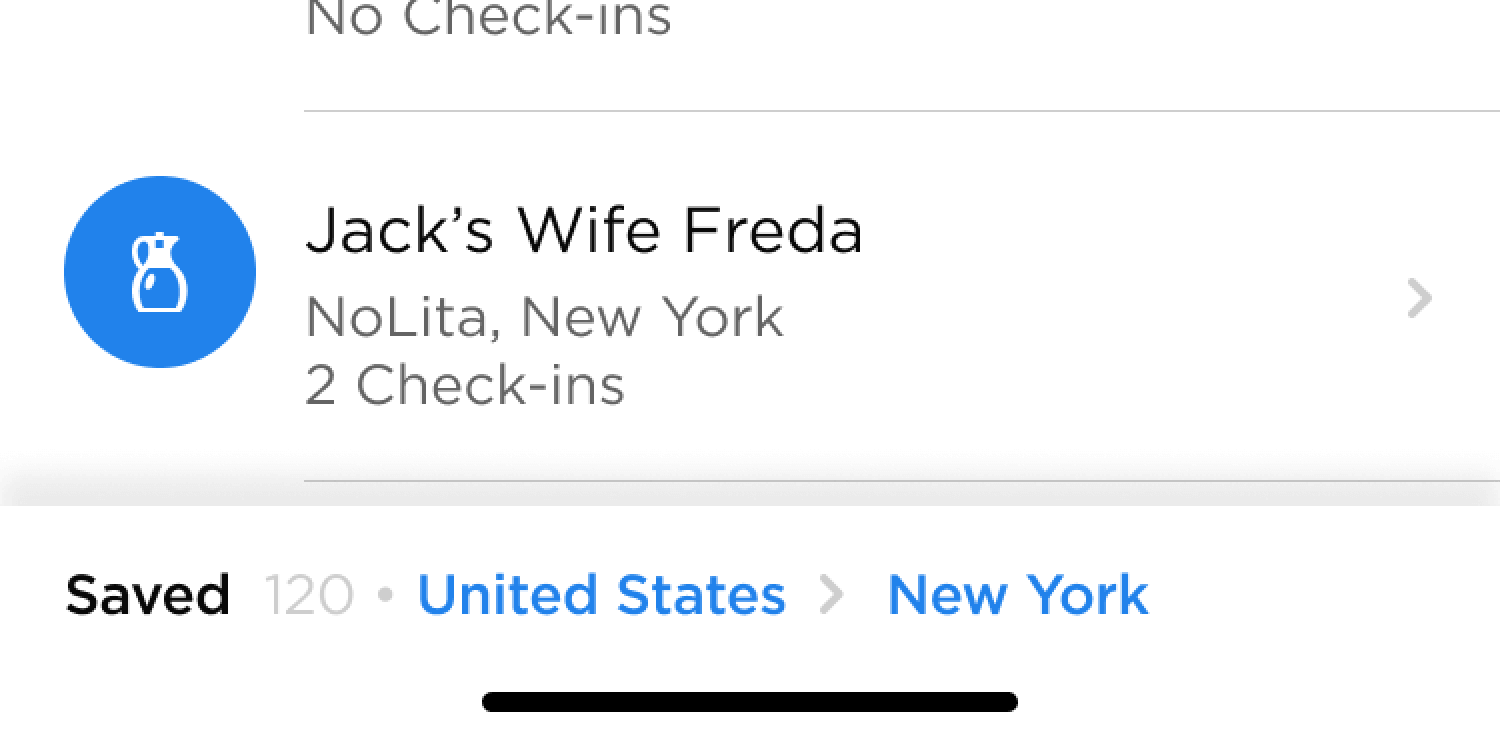
| Bottom Sheet Navigation | Collapsed when the map was panned, fetching new data and reactivating slowly. | Users described this process as slow and cumbersome, with no easy way to return to a previous state. | Added a breadcrumb menu to anchor navigation, enabling users to return to previous states without relying on the map. |
05—Release
Room For Improvement
As we reflect on the recent launch of our new feature, we recognise that there are areas for improvement to enhance the overall user experience. One notable limitation is the inability to create separate lists directly; users must rely on the City Guide for this functionality.
Furthermore, we have noted occasional slowness in page interactions, and we understand the importance of optimising the app's speed to ensure a seamless user journey. While innovative, the smart grouping of places based on locale has raised questions about its effectiveness, and we are actively considering adjustments to ensure a more intuitive and user-friendly grouping system.
Finally, we recognise the need for more diverse sorting options in list and map views, which would provide users with greater flexibility in organising and accessing their saved content.
Footnotes
- Superusers (SUs) are the passionate backbone of the Foursquare community, dedicated to maintaining the accuracy and quality of the company's places database. ↩
- If you're curious about our decision-making process, you can dive into the details in this case study. ↩
- The key distinction between Check-ins and Visited Places lies in their focus: while Check-ins provided a chronological list of all your activities, Visited Places would consolidate multiple check-ins at the same venue into a single grouping. ↩
- Research had consistently shown our users being firmly divided between the two approaches: lists vs. maps. ↩
