
In the summer of 2018, after six years in SoHo, Foursquare relocated to the Flatiron District—a new space, a fresh start, and a layout three times the size of the old office. Employees received tote bags filled with swag and a commemorative newspaper featuring interviews, crossword puzzles, and a complete pull-out floor plan of the new space to celebrate the move.
But, as with most paper maps, they were quickly forgotten—tossed in recycling bins or buried under desk clutter. Within days, employees wandered the halls, asking each other the same question: "Where's my next meeting?"
01—Discover
A Bigger Office, a Bigger Problem
When my colleague David Weissler and I noticed how often employees struggled to find rooms, we began exploring ways to make the floor plan more accessible. With the office already in full use, we needed a solution to be built and deployed quickly.
At first, we considered porting the simple static directory from the newspaper, but that wouldn't solve the core issue—employees needed more than just a list of rooms. They needed a way to orient themselves within the space.
Around this time, Augmented Reality (AR) was gaining traction in tech circles. Apple's release of ARKit1 marked a turning point, dramatically simplifying AR development for iPhones and iPads. With features like improved plane detection and real-world anchoring, AR suddenly became a practical solution for real-time navigation.
Overlaying directional information into the real world wasn't just an exciting technological advancement—it directly addressed our core challenge: giving employees real-time spatial awareness of their surroundings in a way that static directories couldn't. It also provided an excellent opportunity for David and me to experiment with this emerging technology from a design and engineering perspective. With that in mind, we looked to rapidly build and host a prototype on an internal server for employees to download and use.
02—Define
Finding Our Way
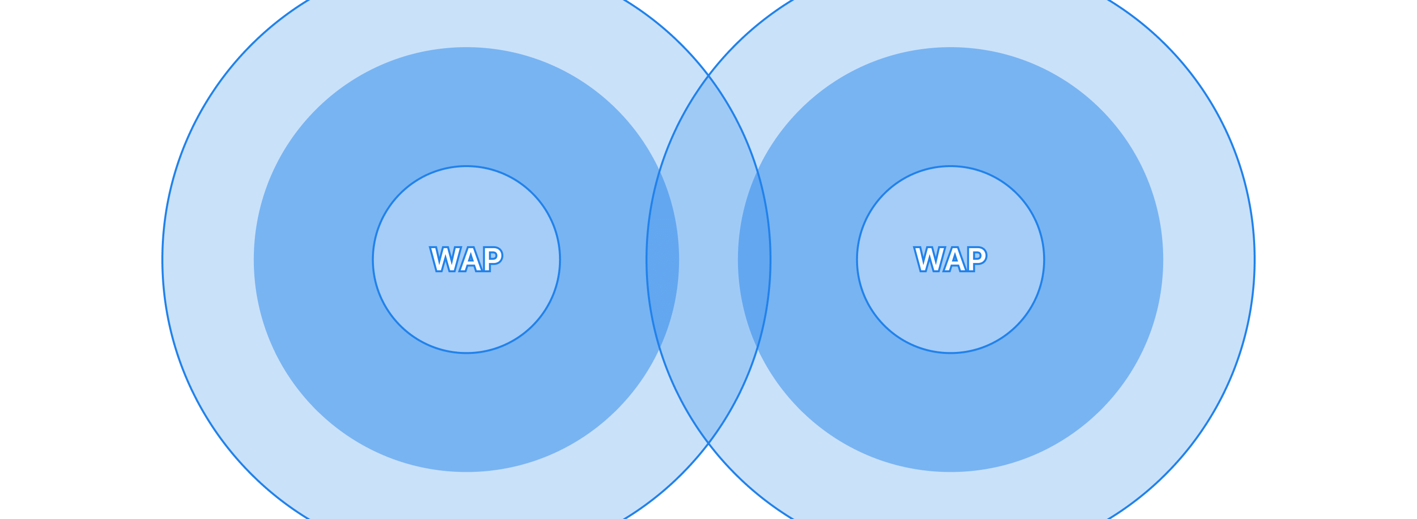
The following weekend, armed with a copy of the office's architectural drawings, we set out to map the space. We documented every Wireless Access Point (WAP), marking each on our map, capturing its MAC address, and recording its approximate latitude and longitude using a simple app David had put together.
Next, we visited all forty-five conference rooms, positioning our phones at the approximate centre of each one and pausing briefly—to minimise GPS drift—before capturing another set of lat-long coordinates. The goal was to map room-to-WAP connections, allowing the app to snap users to the strongest signal for more precise positioning.
| Latitude | Longitude | Conference Room | Cardinal Direction | Room ID |
|---|---|---|---|---|
| * | * | Ski Lift | South | 809 |
| * | * | Dog Run | North | 810 |
| -- | -- | -- | -- | -- |
| * | * | Discotheque | North | 863 |
| * | * | Auto Garage | South | 864 |
After collecting the data, we returned to our desks, eager to see how well our mapping had worked. Instead, we ran into an unexpected challenge: GPS drift. Despite our best efforts, the location data jumped inconsistently—sometimes placing a room several feet from its actual location.
We needed a simple and effective solution since this was a quick hack project. Rather than relying on hard-set lat-long coordinates, we extended each WAP's radius by approximately twenty feet. This adjustment helped compensate for drift, allowing rooms to snap to a backup WAP when necessary—ensuring employees could get close enough for usable in-office navigation. While imperfect, this trade-off aimed to strike the right balance between accuracy and feasibility, enabling us to move forward.
With the back-end logic in place to estimate a user's location, the next challenge was making that information intuitive and actionable. Knowing which WAP an employee was closest to was one thing—but how could they use that data to navigate the office physically? A simple list of rooms and locations wouldn't be enough. Employees needed a way to translate coordinates into real spatial awareness.
03—Ideate
Navigating Without a Map
With our foundational data points collected, David focused on developing the iOS app while I focused on design. My challenge was clear: how could I ensure employees could instinctively navigate the office using AR while keeping the UI intuitive and lightweight?
Since this was an internal-only app, I saw an opportunity to experiment with Apple's well-established aesthetic. With the Human Interface Guidelines (HIG) shifting towards a more minimal design, I wanted to explore how these principles could translate into an AR-driven experience. I rapidly iterated on designs using Apple's Graphical User Interface (GUI) components while staying aligned with iOS design standards. Leveraging existing UI elements rather than designing from scratch also meant we could focus more on how AR could be integrated effectively.
Establishing the Interface
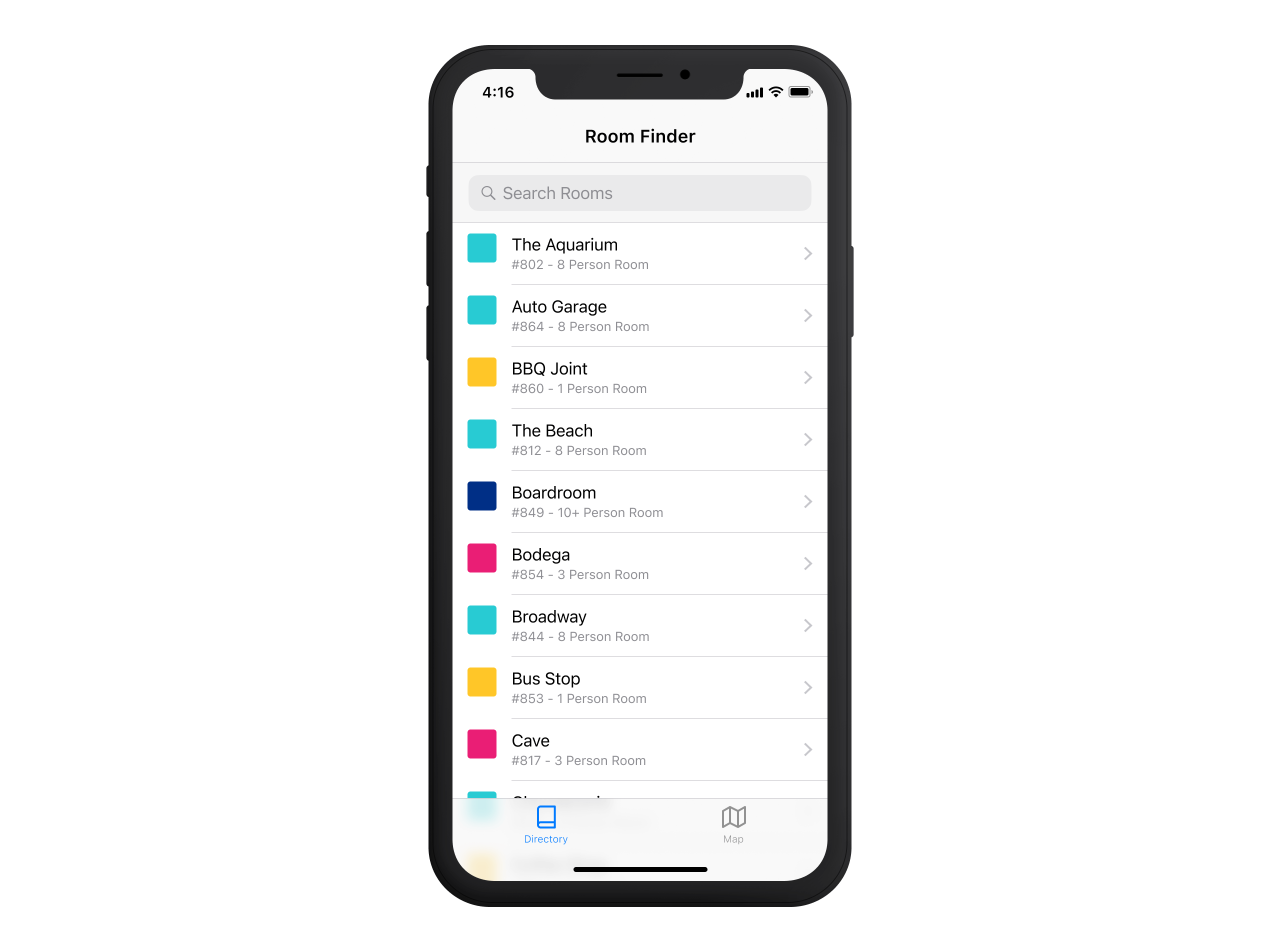
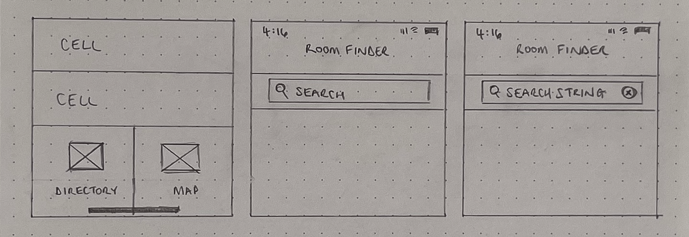
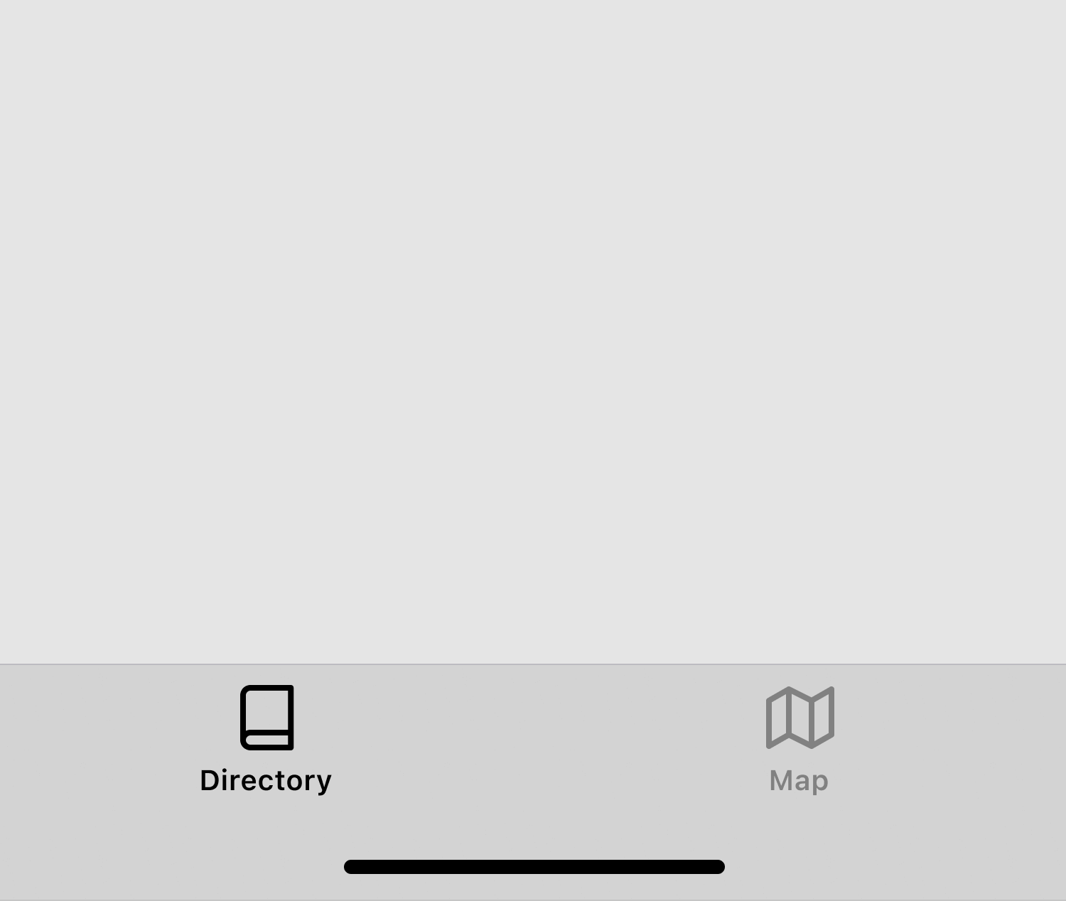
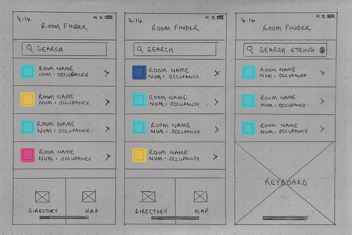
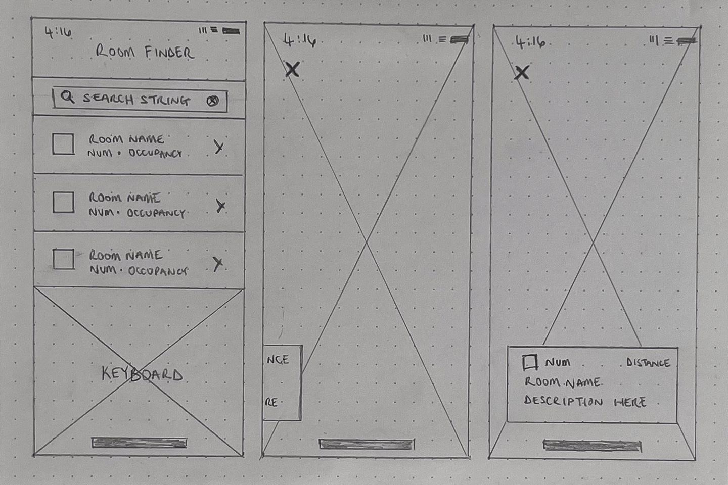
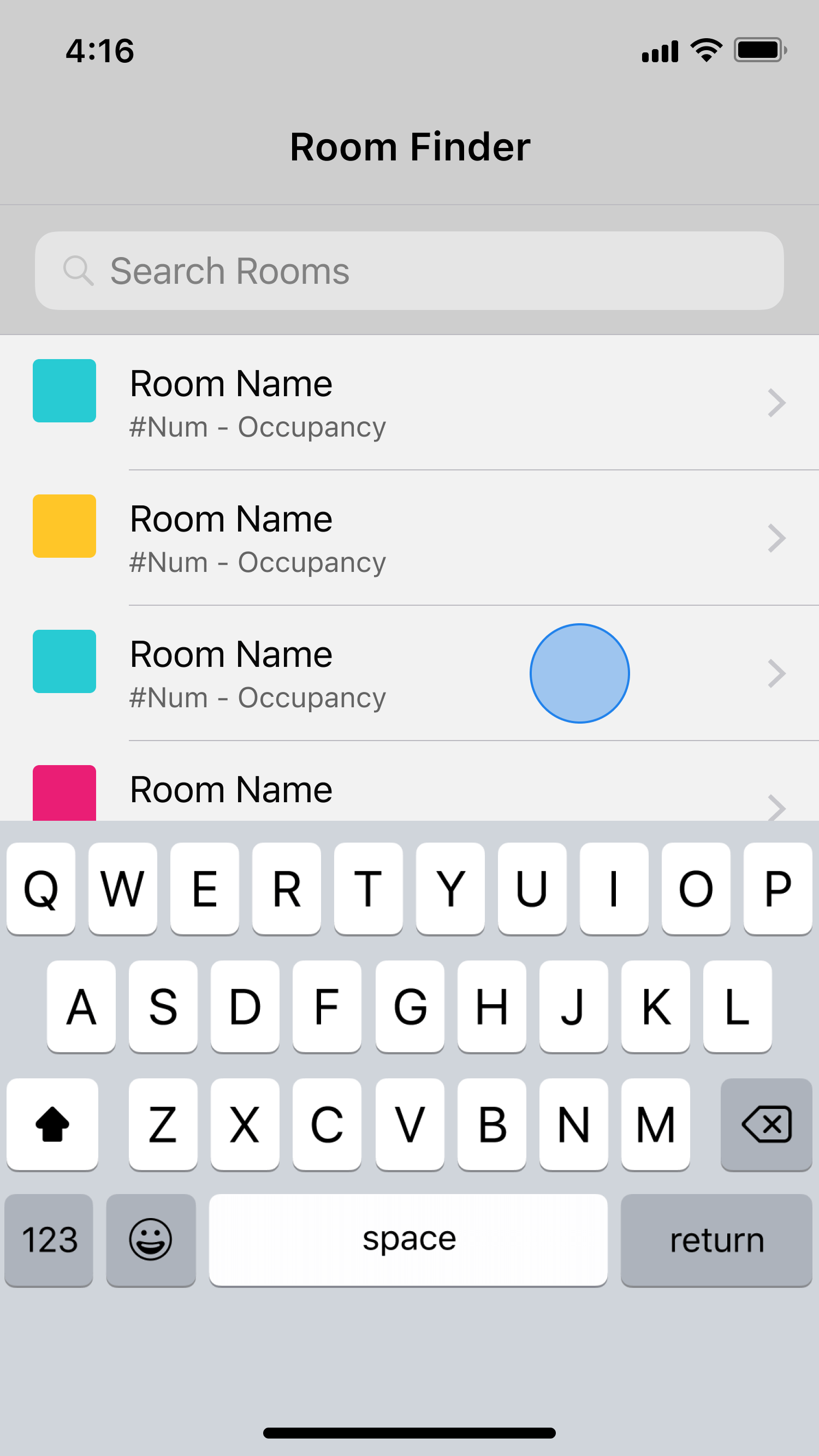
As I explored different layouts, it became clear that a two-tab structure would work best for this app. Simplicity was key—employees searching for a conference room were often in a rush, and we wanted to eliminate any unnecessary friction. The goal was to make finding a room as quick and intuitive as possible through AR-powered navigation or a more traditional approach.
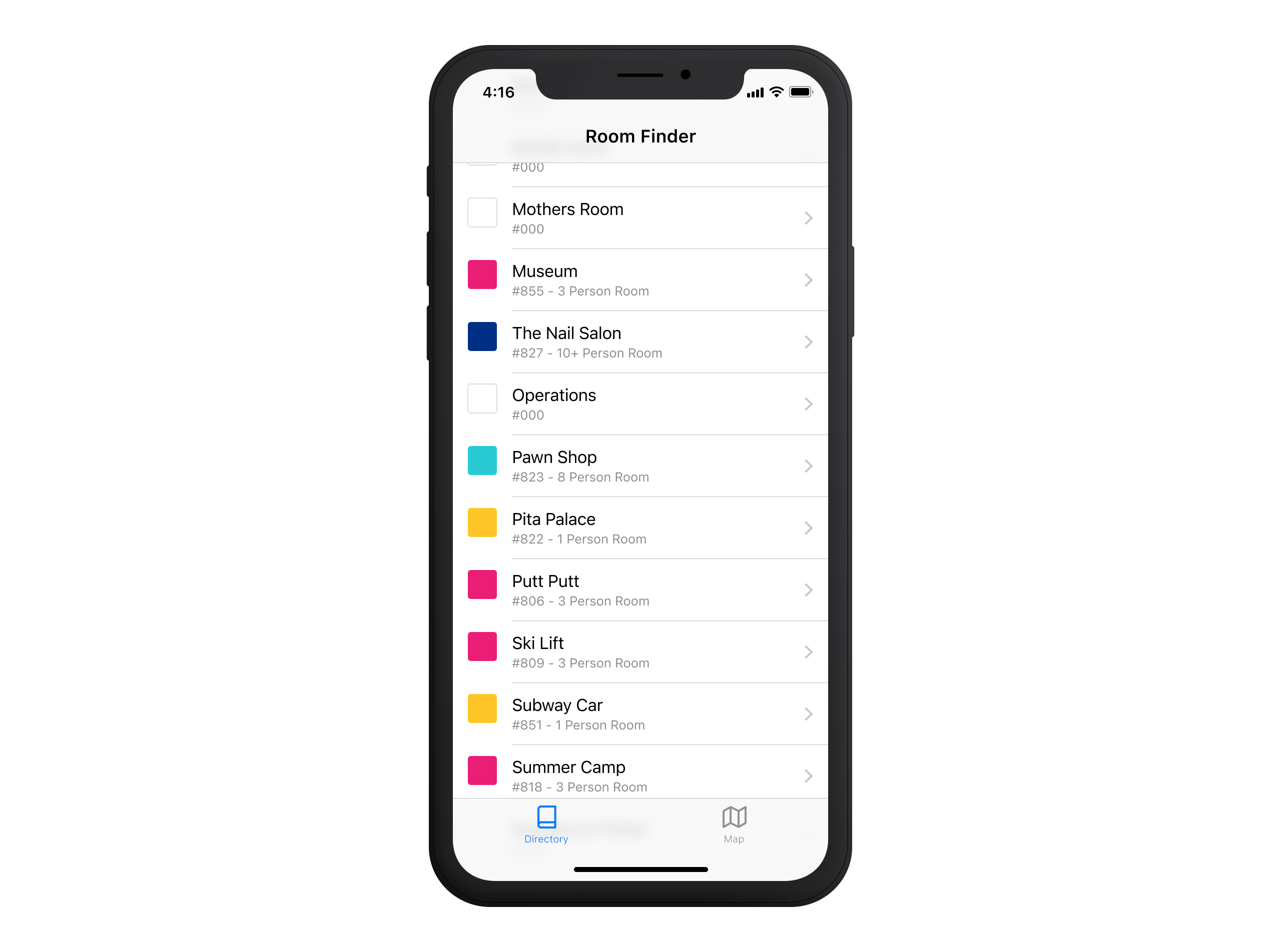
While AR was the core focus of the app, the directory list also needed to stand on its own. Employees should be able to browse, search quickly, or filter rooms without relying on AR mode every time. This led to the creation of two distinct tabs:
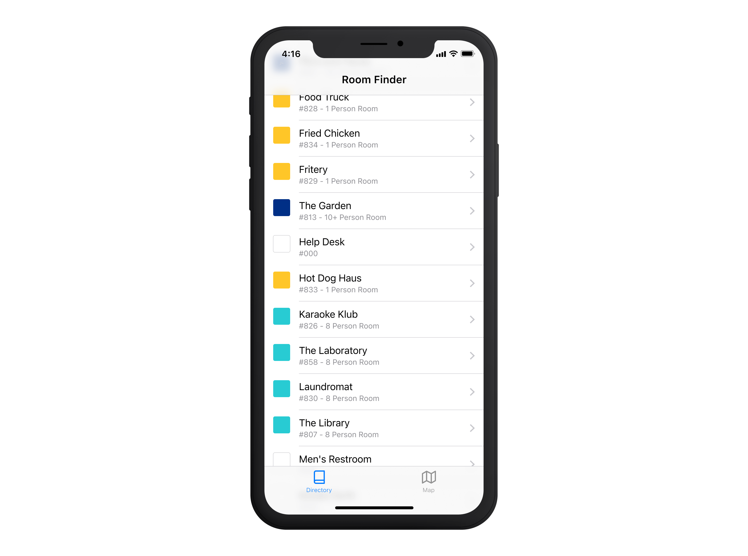
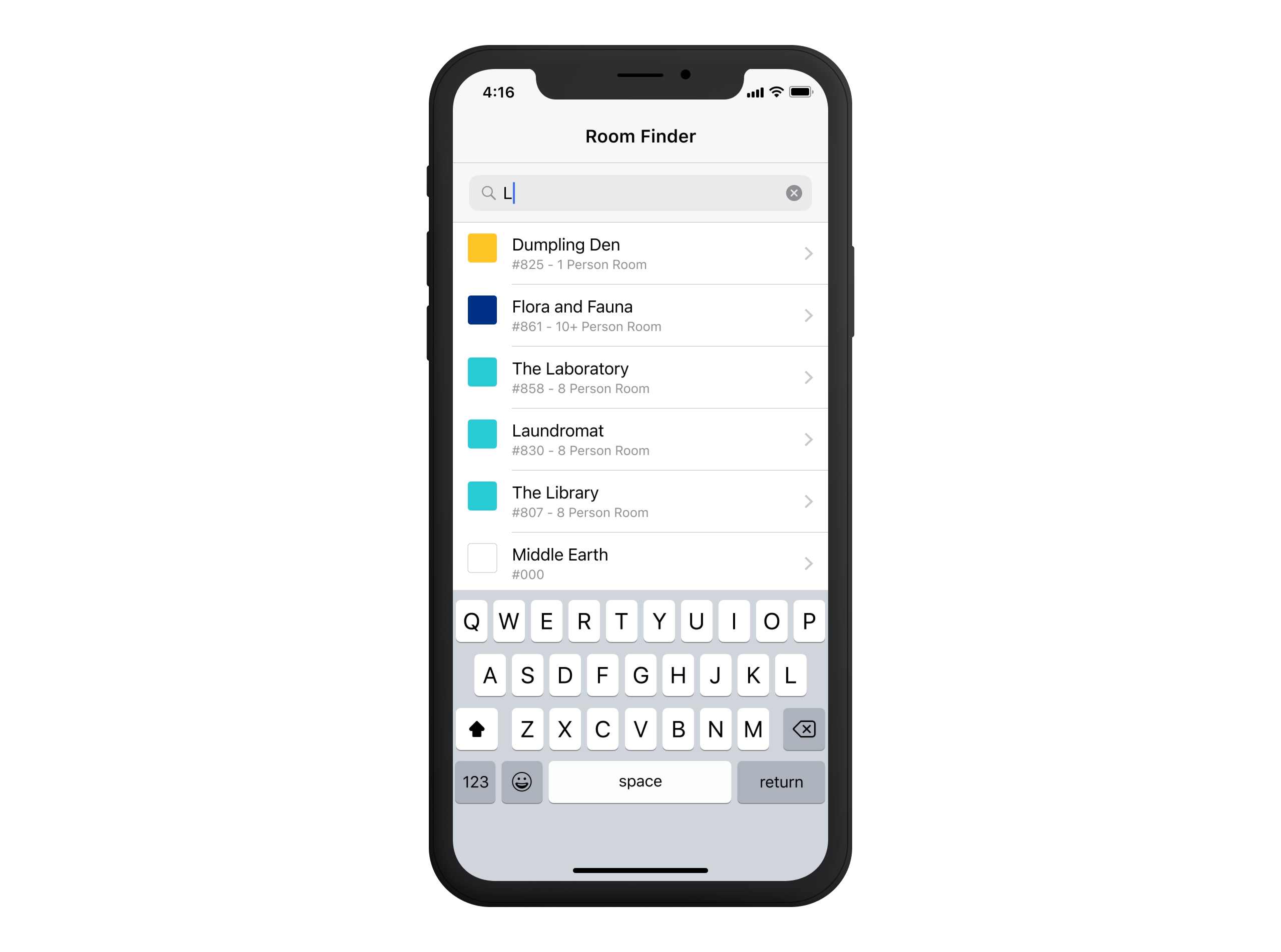
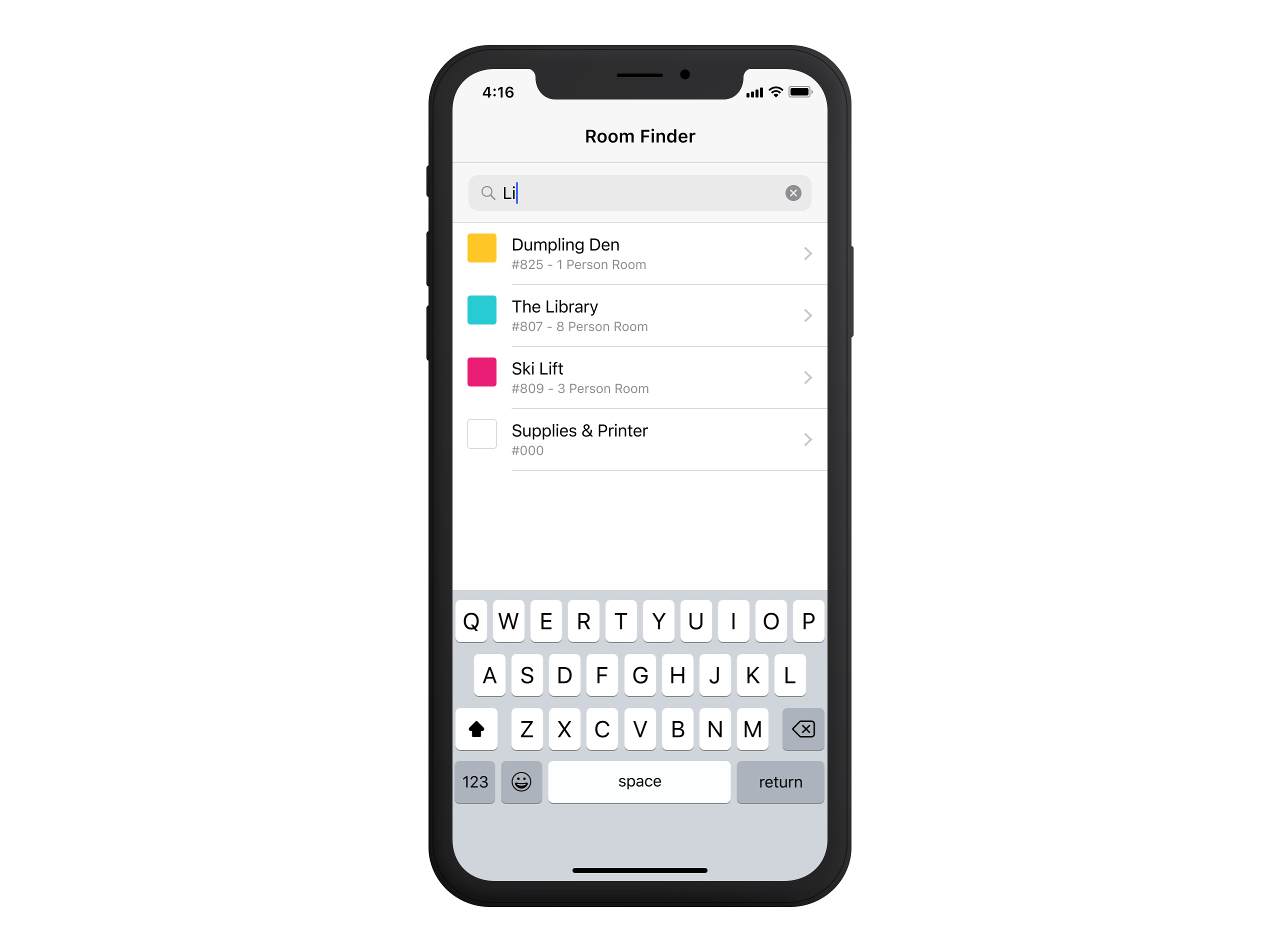
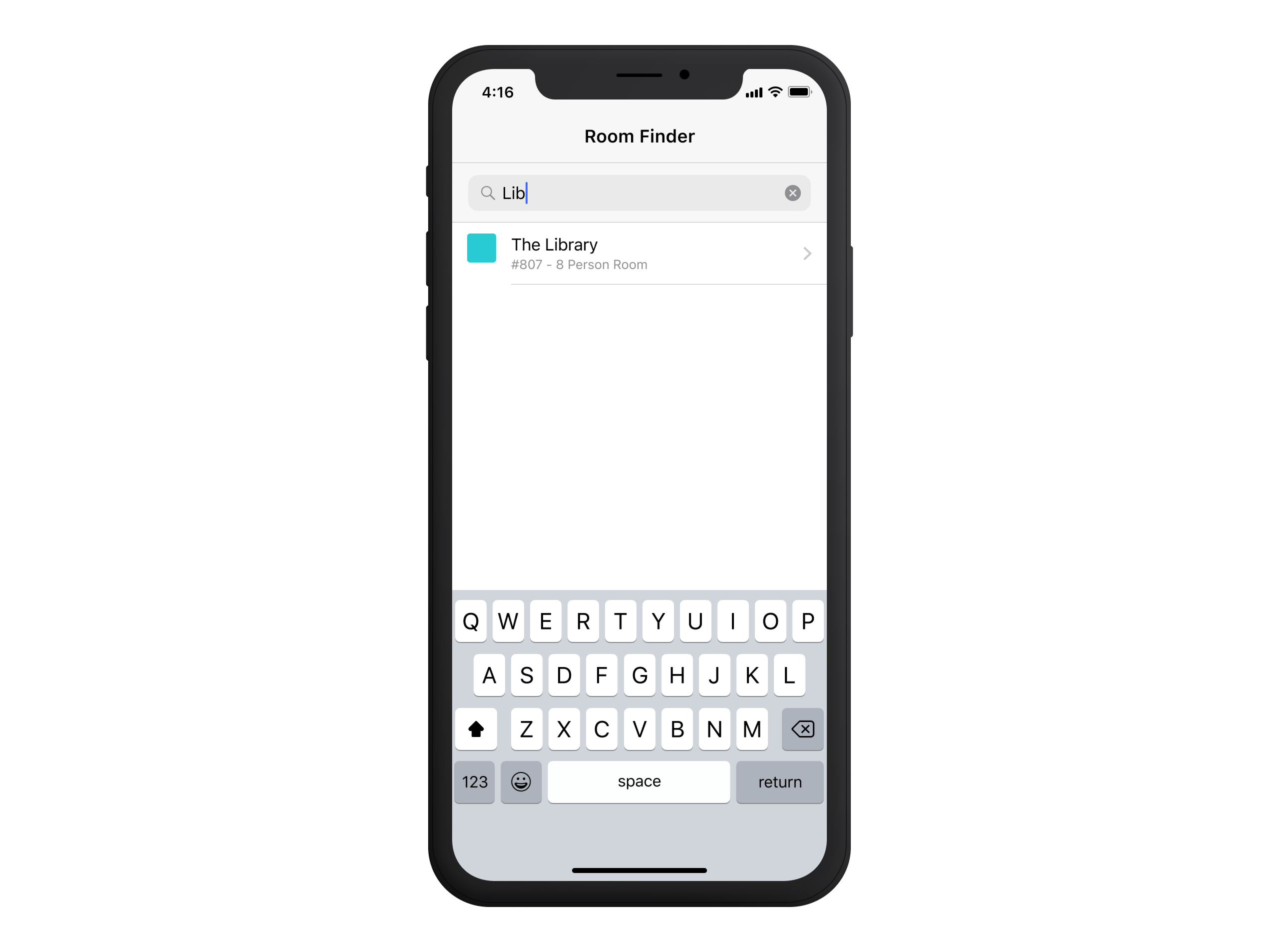
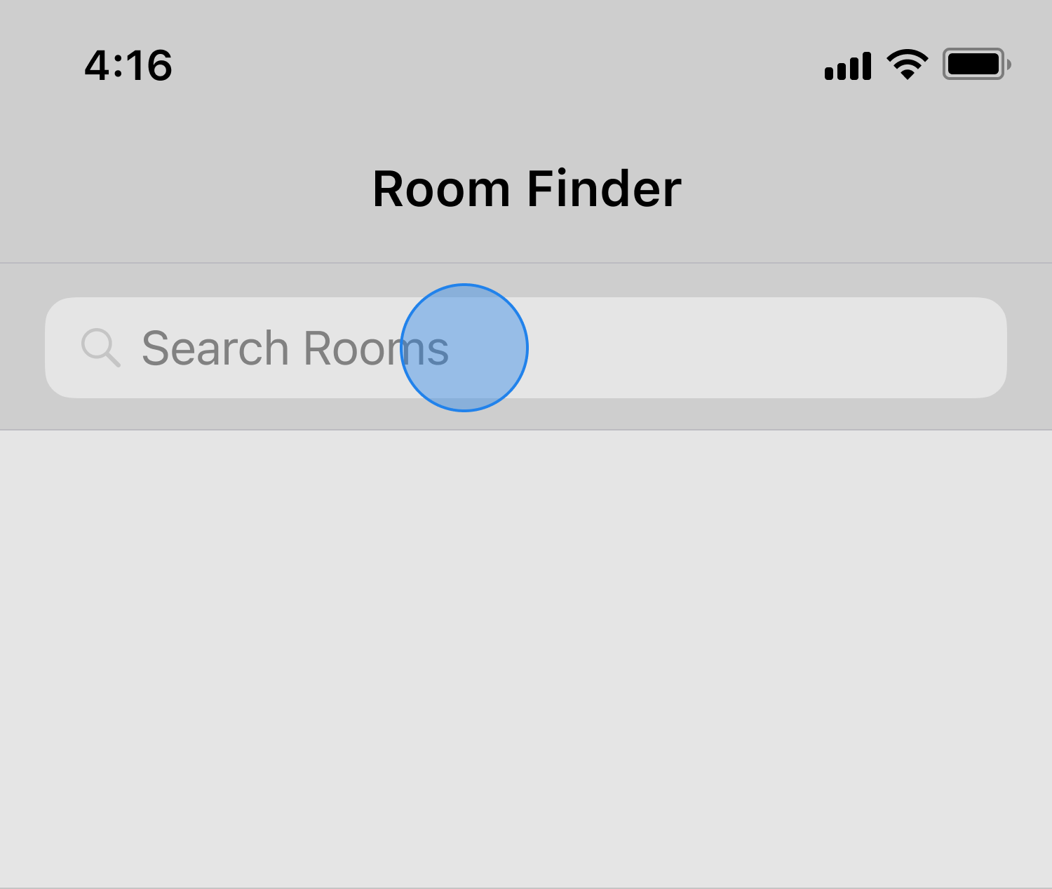
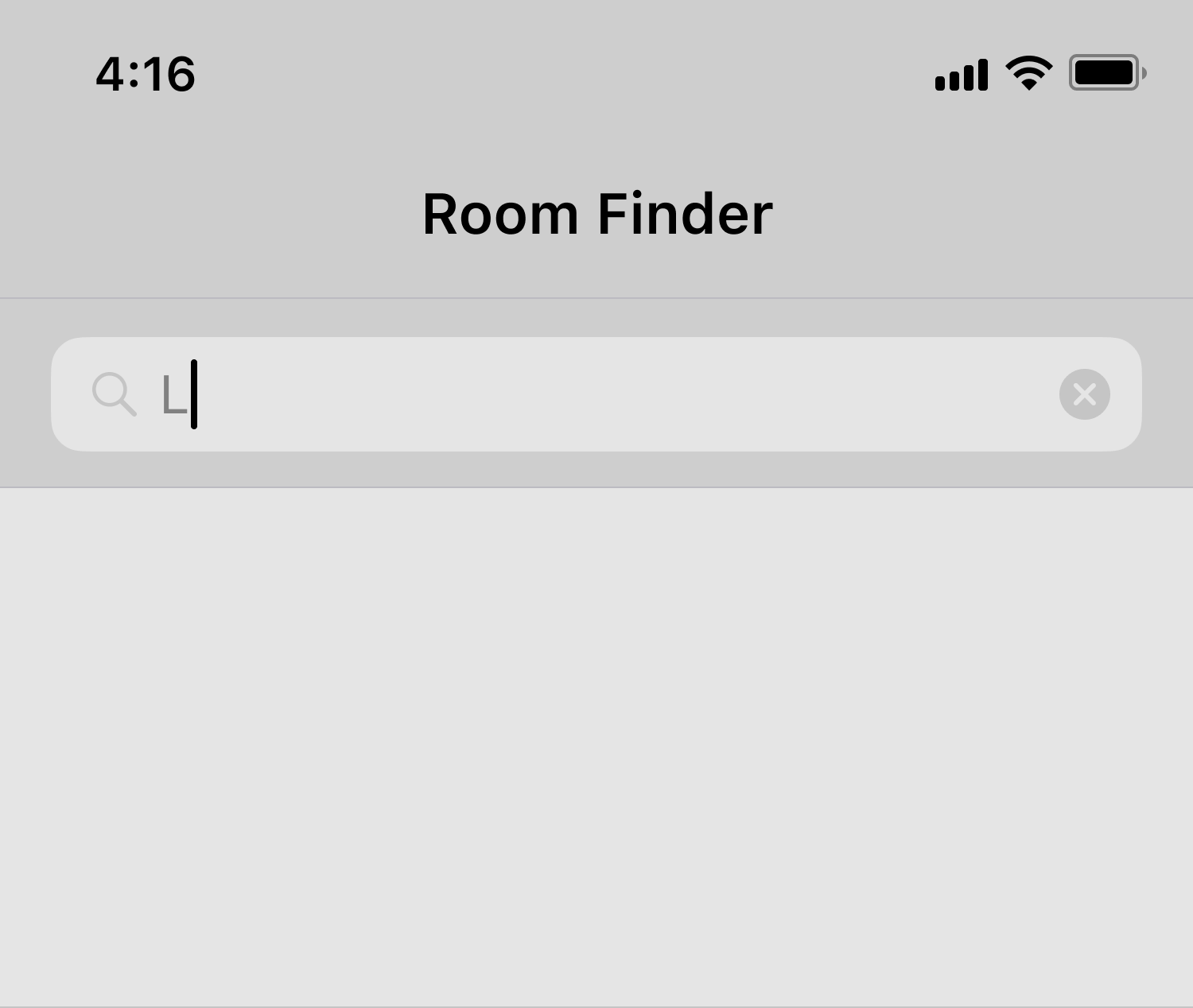
- Directory List View: This is a scrollable, searchable list built using Apple's UI List Style (UITableViewCells) for fast browsing. Users can either scroll manually or use the search bar at the top to filter by room name.
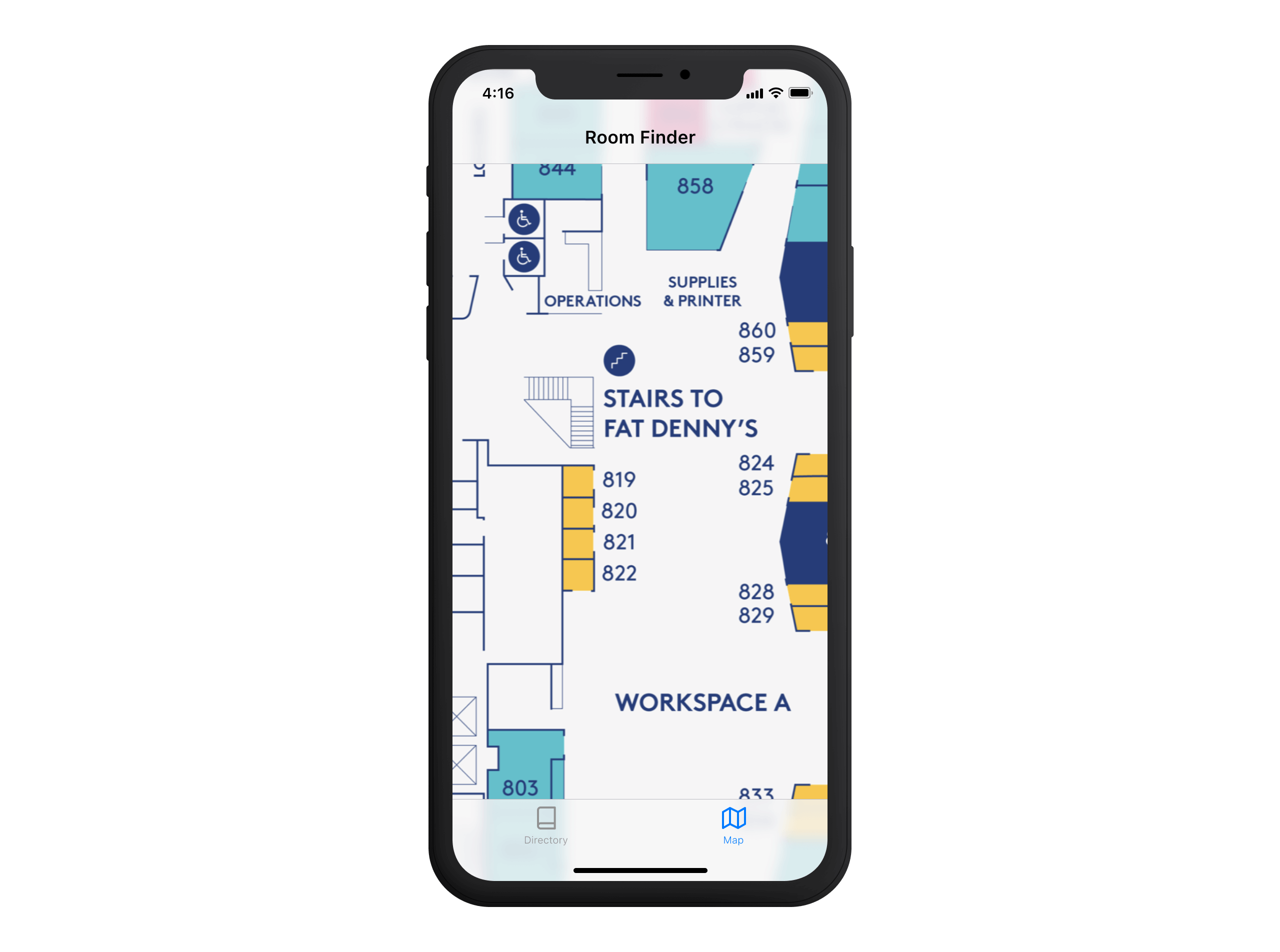
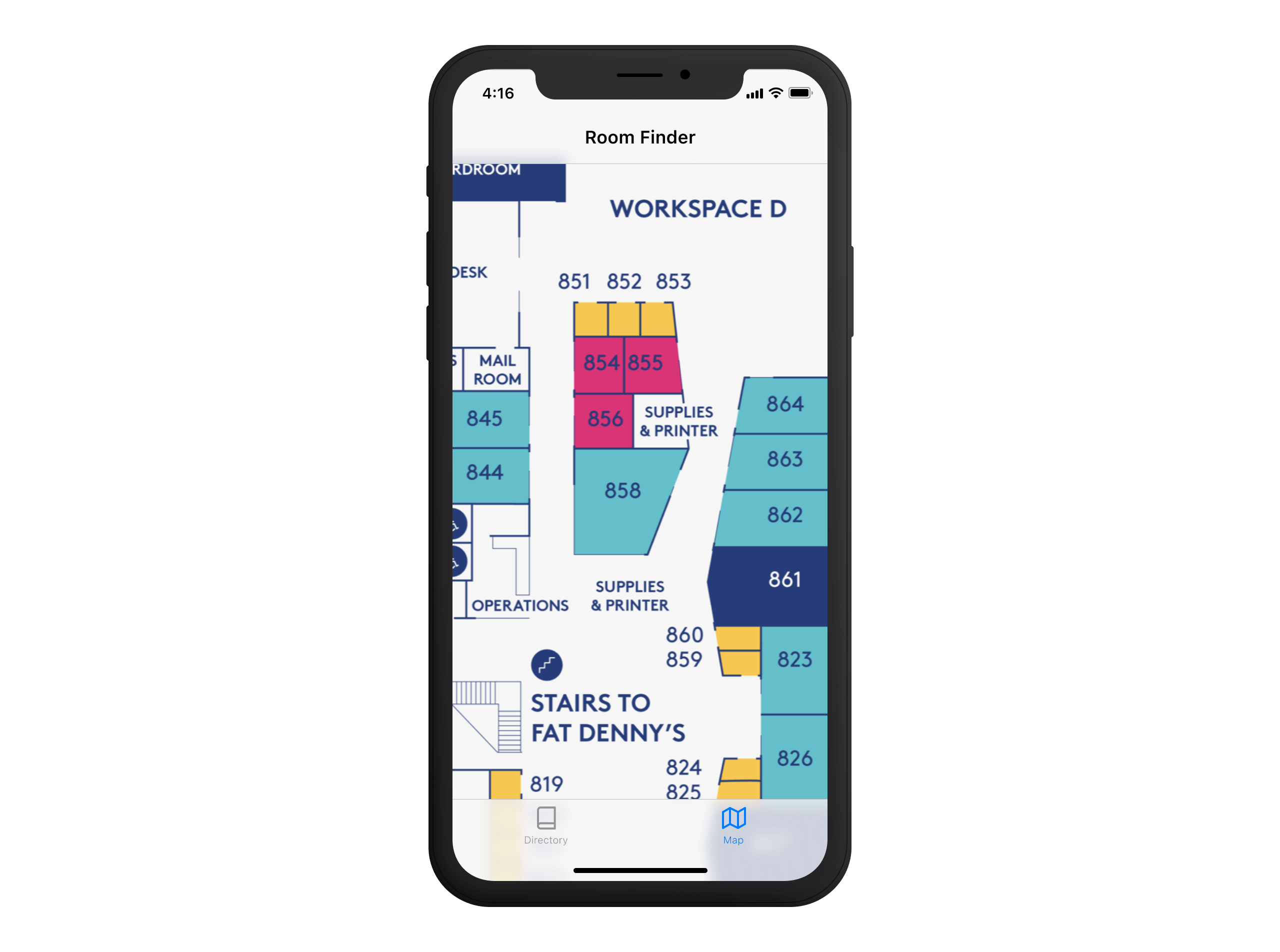
- Map View: Since many employees were already familiar with the printed floor plan from the commemorative newspaper, we digitised it as the second tab. This ensured that those with an existing mental model of the office layout could navigate naturally and familiarly.
By offering both options, users had the flexibility to navigate in the most natural way—whether through AR-powered guidance or the traditional floor plan they already knew.
Colour-Coded
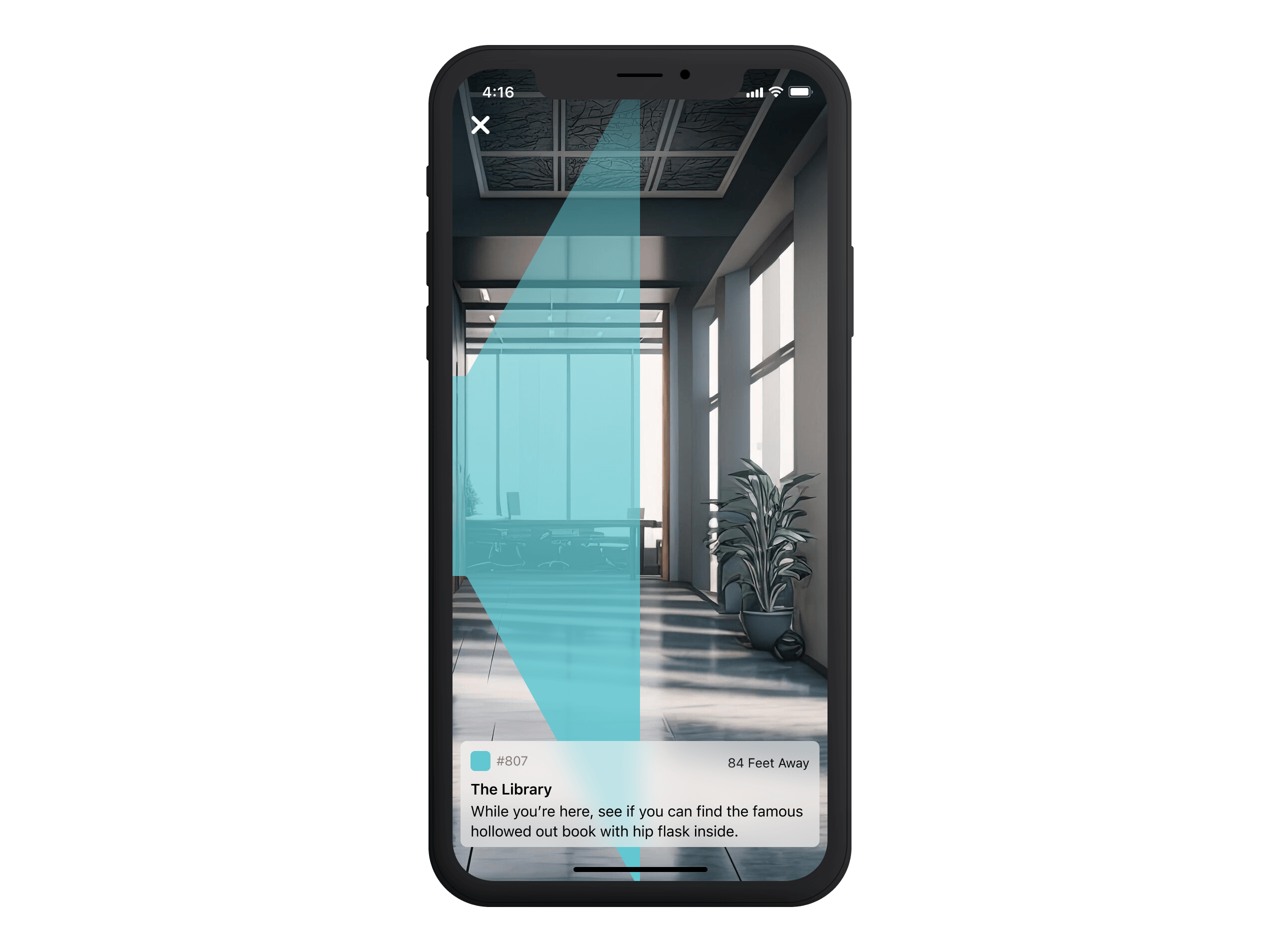
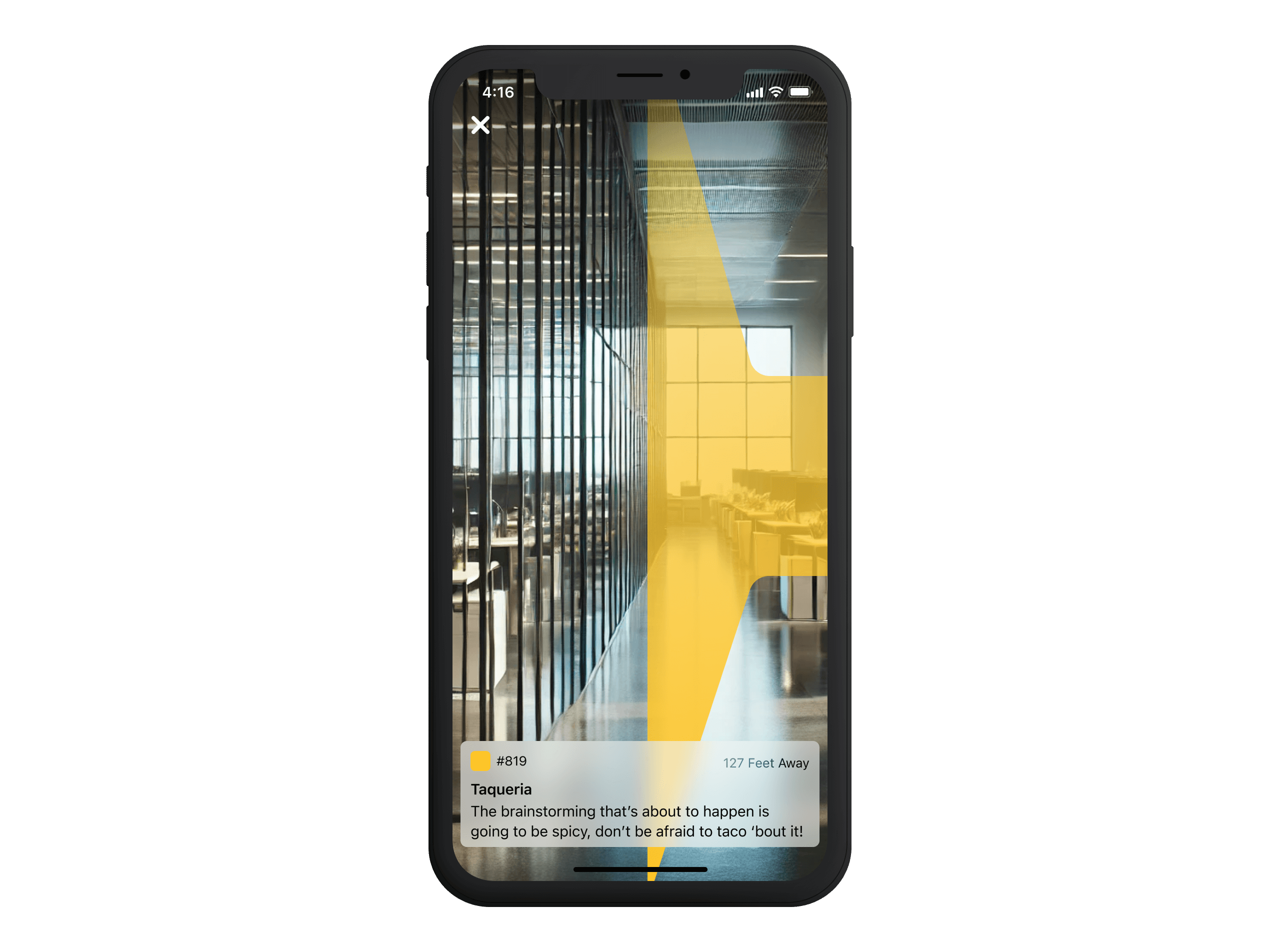
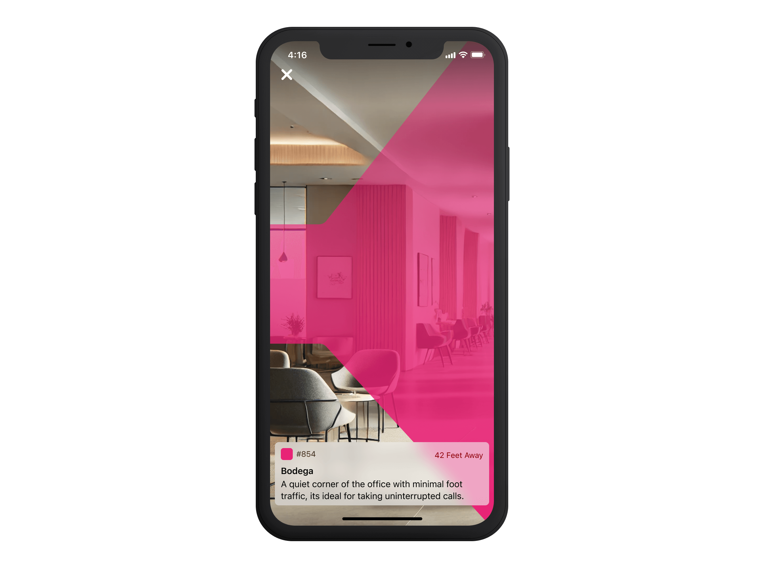
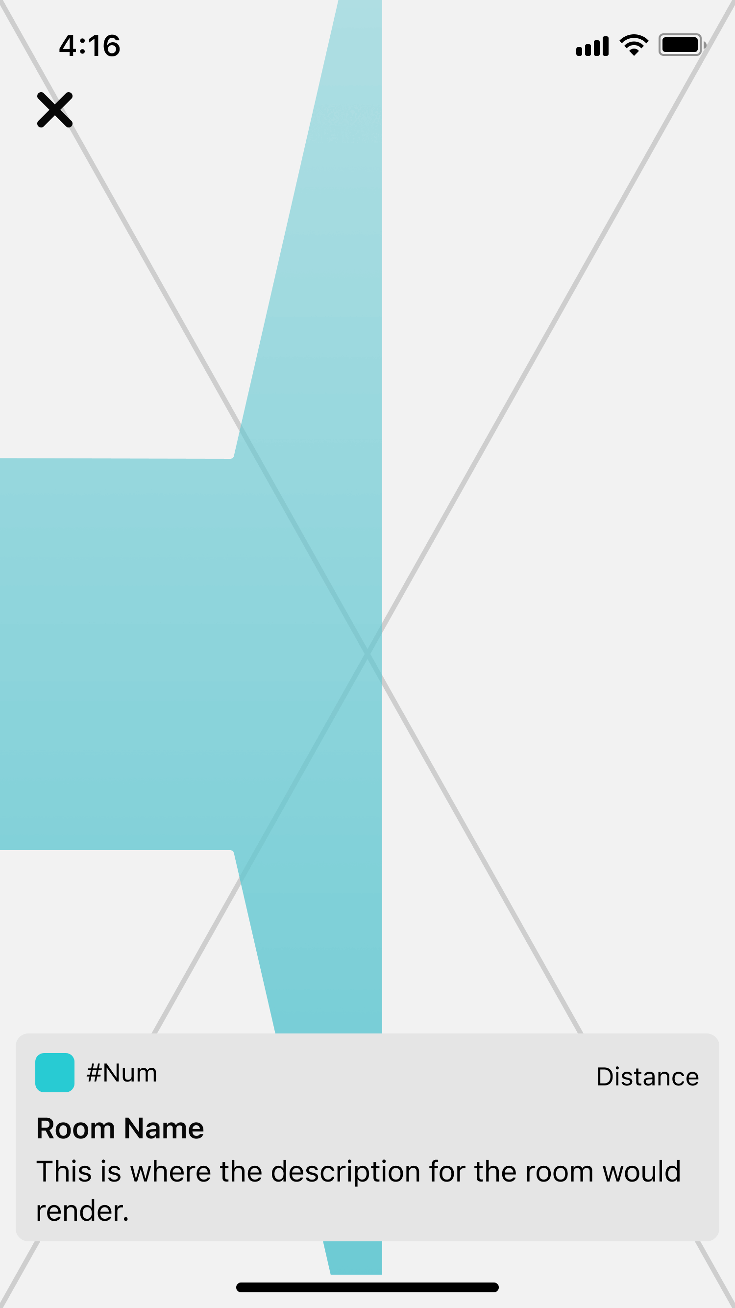
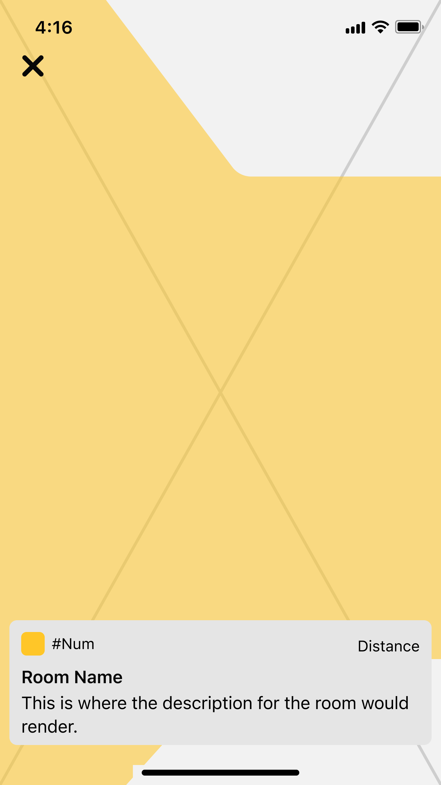
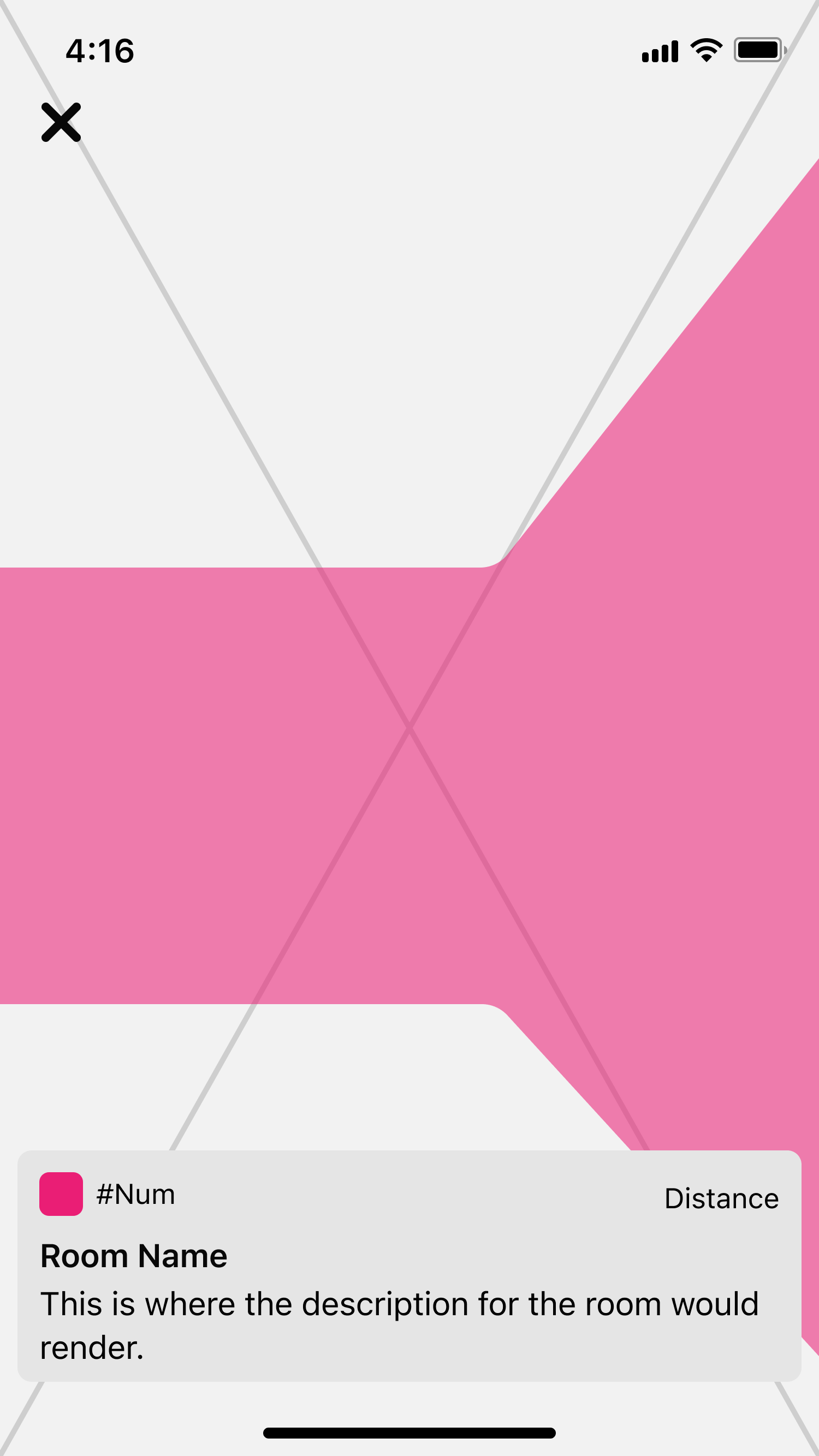
While reviewing the architectural drawings, I noticed that occupancy numbers were colour-coded to help employees recognise room capacity at a glance. Teal, yellow, dark blue, watermelon, and white indicated rooms ranging from single-person spaces to larger ten-person rooms.
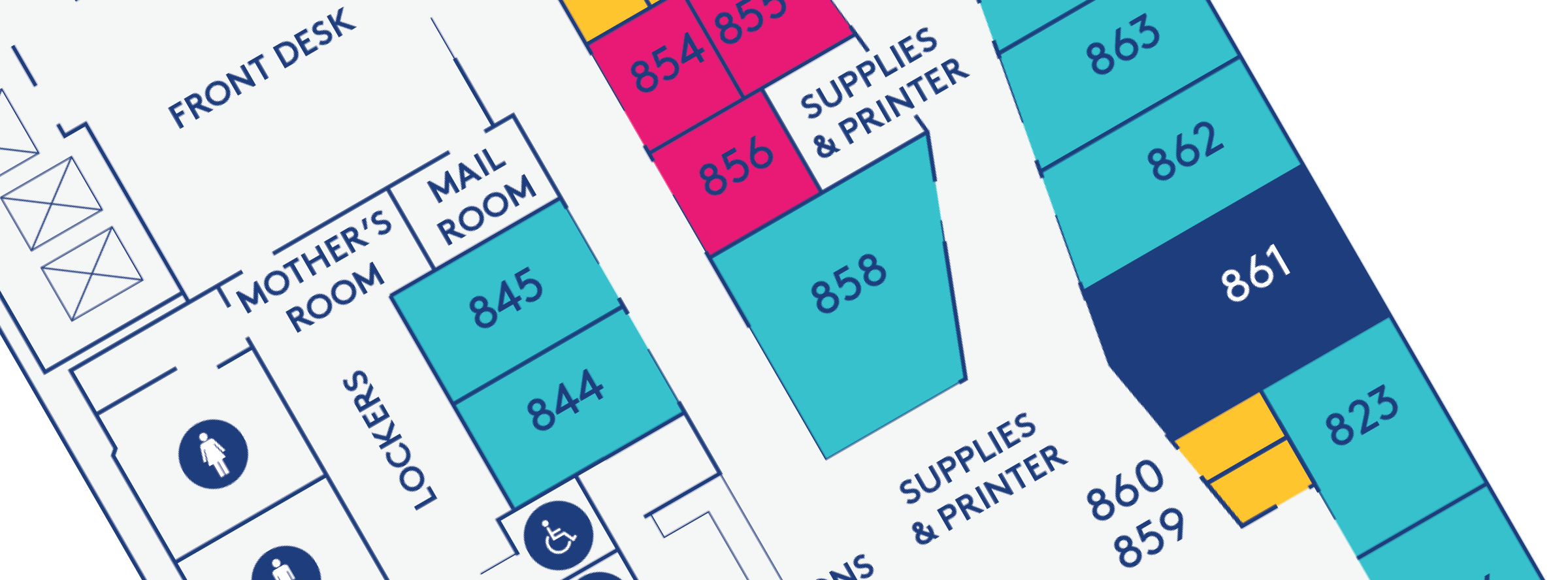
Rather than introducing a new visual system, we carried this colour-coding into the directory list view. Apple's UITableViewCells support a small rectangular indicator on the left side of each list item, which we used to mirror the colour-coded system from the printed map. This approach offered several advantages:
- Familiarity: Users were already accustomed to associating colours with room sizes from the paper map.
- Faster Recognition: Users could quickly scan the list and identify a room by its colour instead of relying solely on text.
- Minimal UI Disruption: The colour markers provided an extra context in a subtle, non-intrusive way, keeping the UI clean and uncluttered.
Experimenting with Navigation Experiences
Our challenge when designing the AR mode was to provide clear and intuitive directional guidance in real-world space without overwhelming users. AR was still an emerging technology at the time, and while Apple provided UI components, there were few industry examples of its use in indoor navigation. Most AR applications focused on gaming and object placement, so we had to experiment with Apple's GUI to find a solution that worked for us.
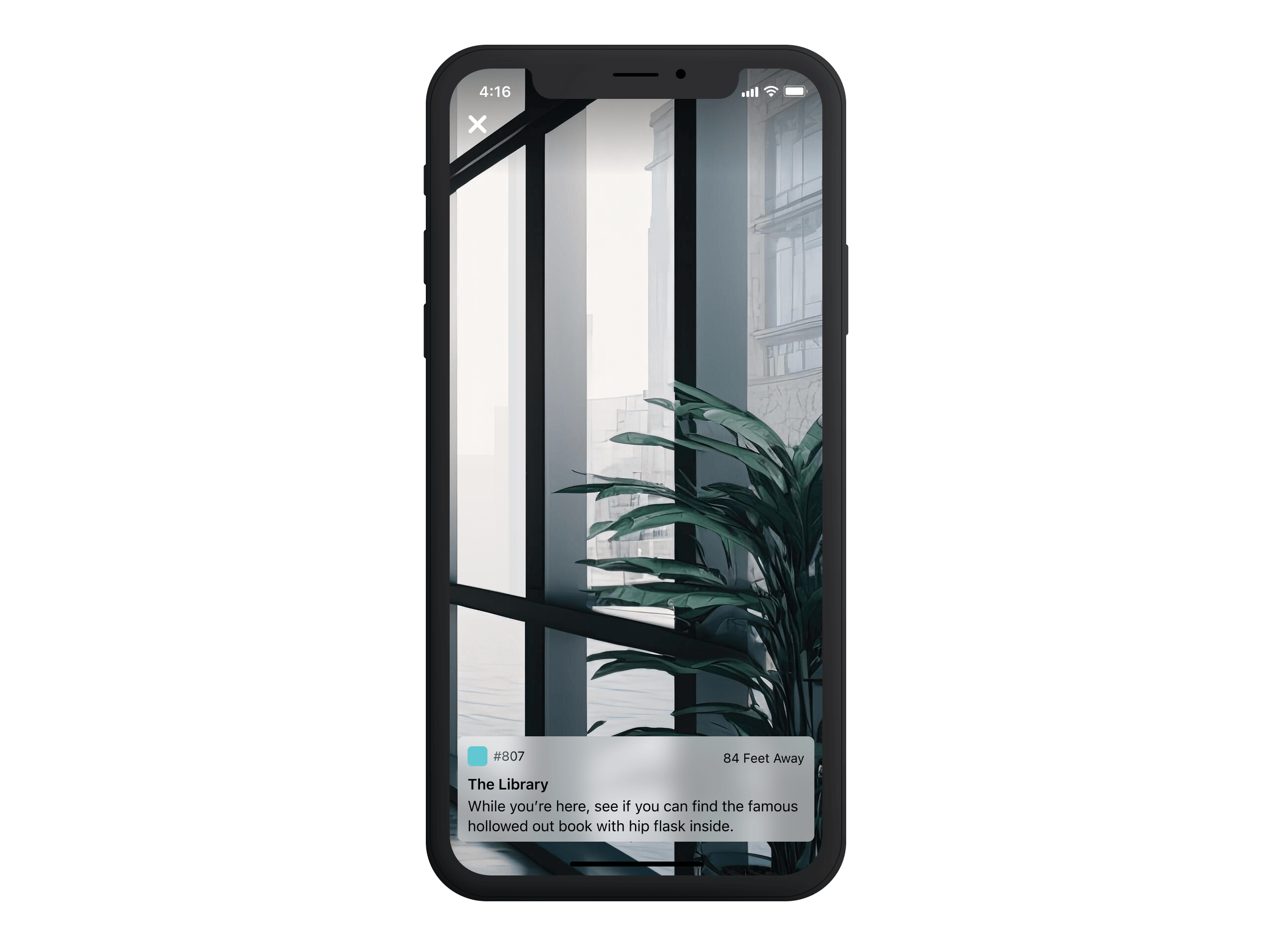
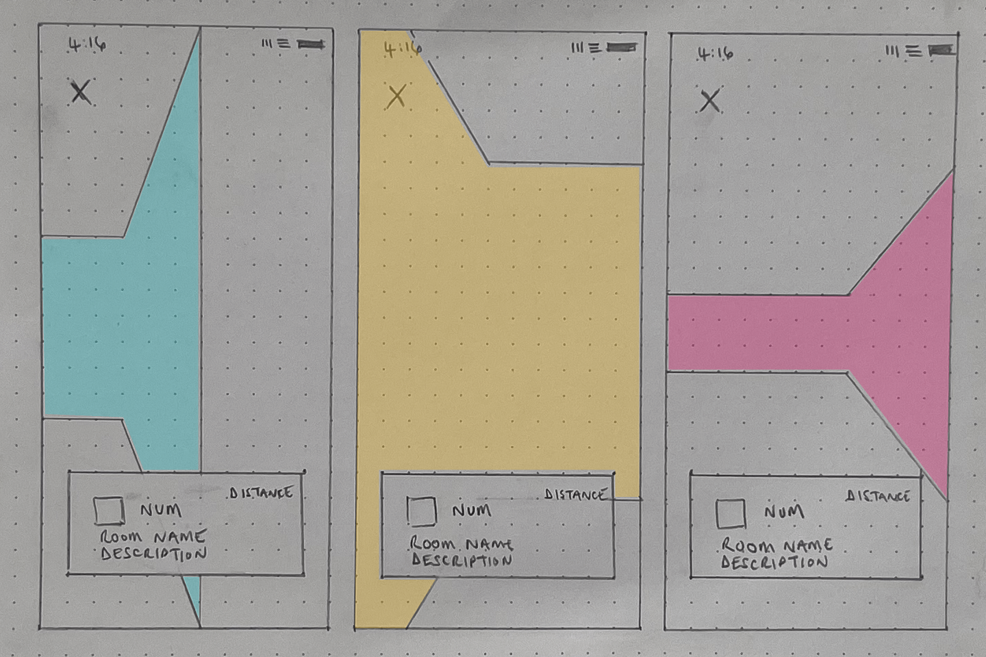
Rather than building something from scratch, I explored Apple's built-in UI components to see what could be repurposed. I needed something small but impactful, customisable, and unobtrusive—a UI element that could provide navigation cues without cluttering the screen. That's when I landed on Apple's notification-style widget.
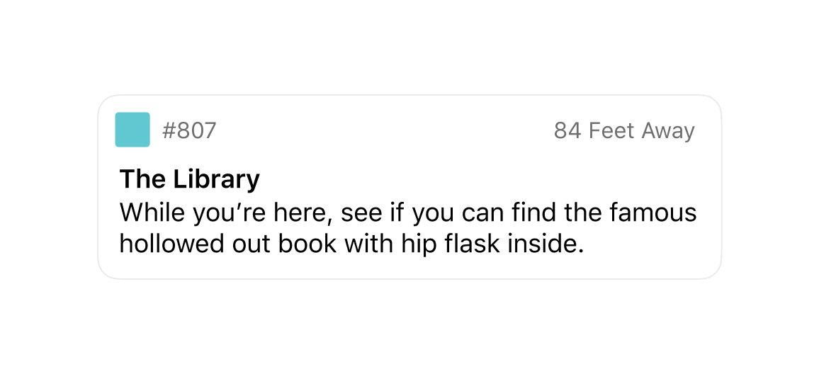
Designed to deliver glanceable information, it was surprisingly flexible. We could use its heading space for the room name, carry over the colour indicator for visual continuity, and add a description area for extra context. Most importantly, the widget could float on the AR view, ensuring the experience remained lightweight and intuitive.
However, early testing revealed a significant usability issue—users often weren't sure if the app was working. When transitioning from the list view to AR mode, they wouldn't see anything if facing the wrong direction. Since the notification widget only appeared in the direction of their destination, users had to rotate their phones until they spotted it manually.
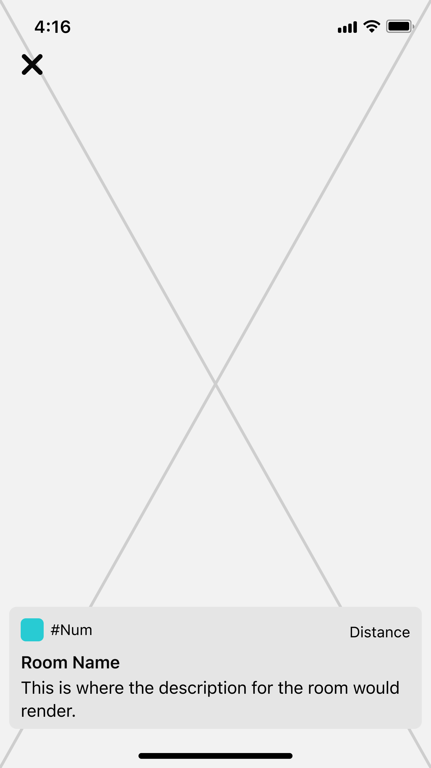
This confusion led some users to assume the app was broken. We quickly realised that while the notification widget provided useful contextual information, it wasn't actively guiding users—it required them to face the right direction.
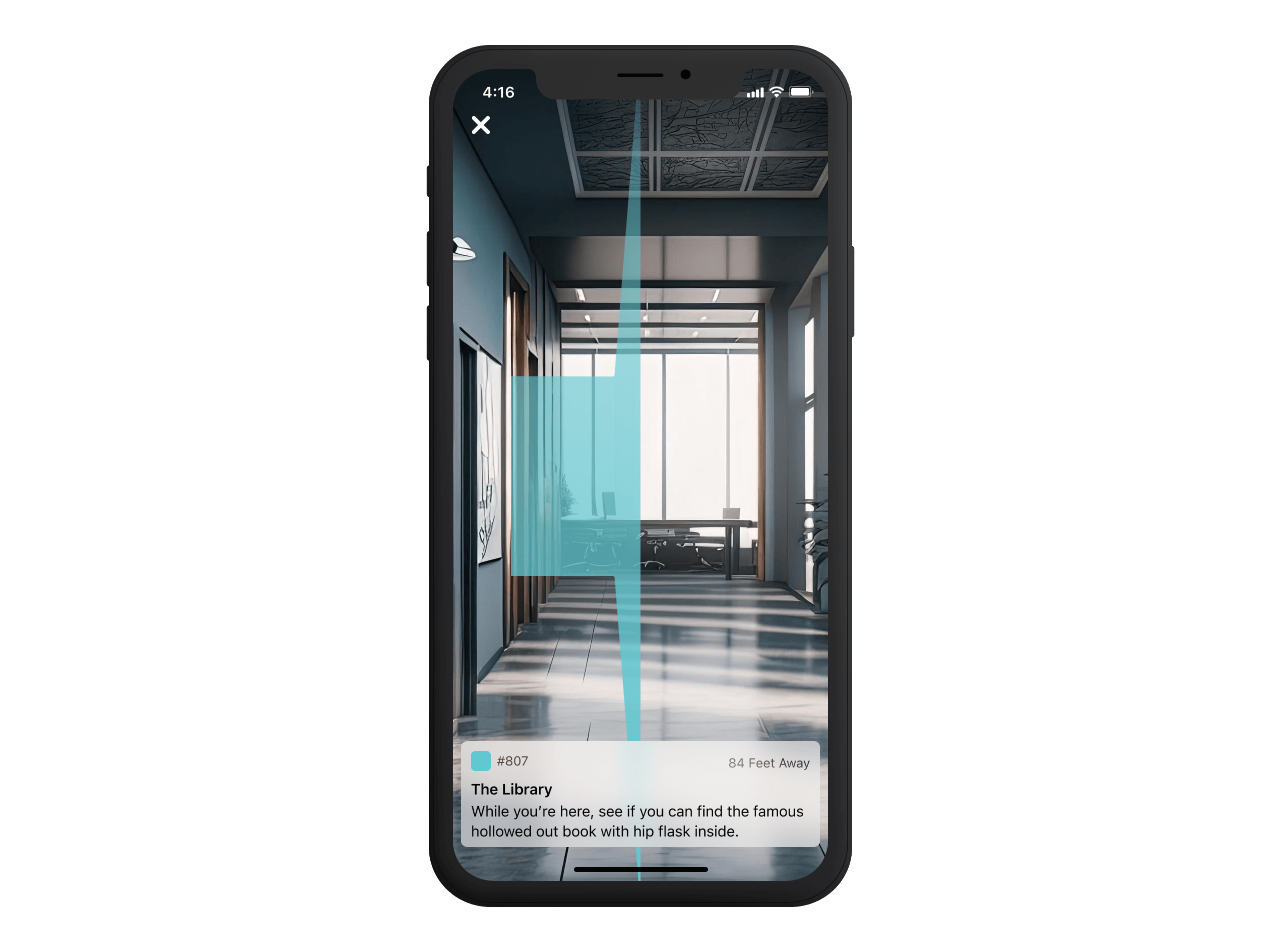
To solve this, we made a key design change: instead of floating freely in space, the widget would always remain anchored to the bottom of the screen. This ensured that even if users entered AR mode facing the wrong way, they would still see a prompt immediately, eliminating uncertainty.
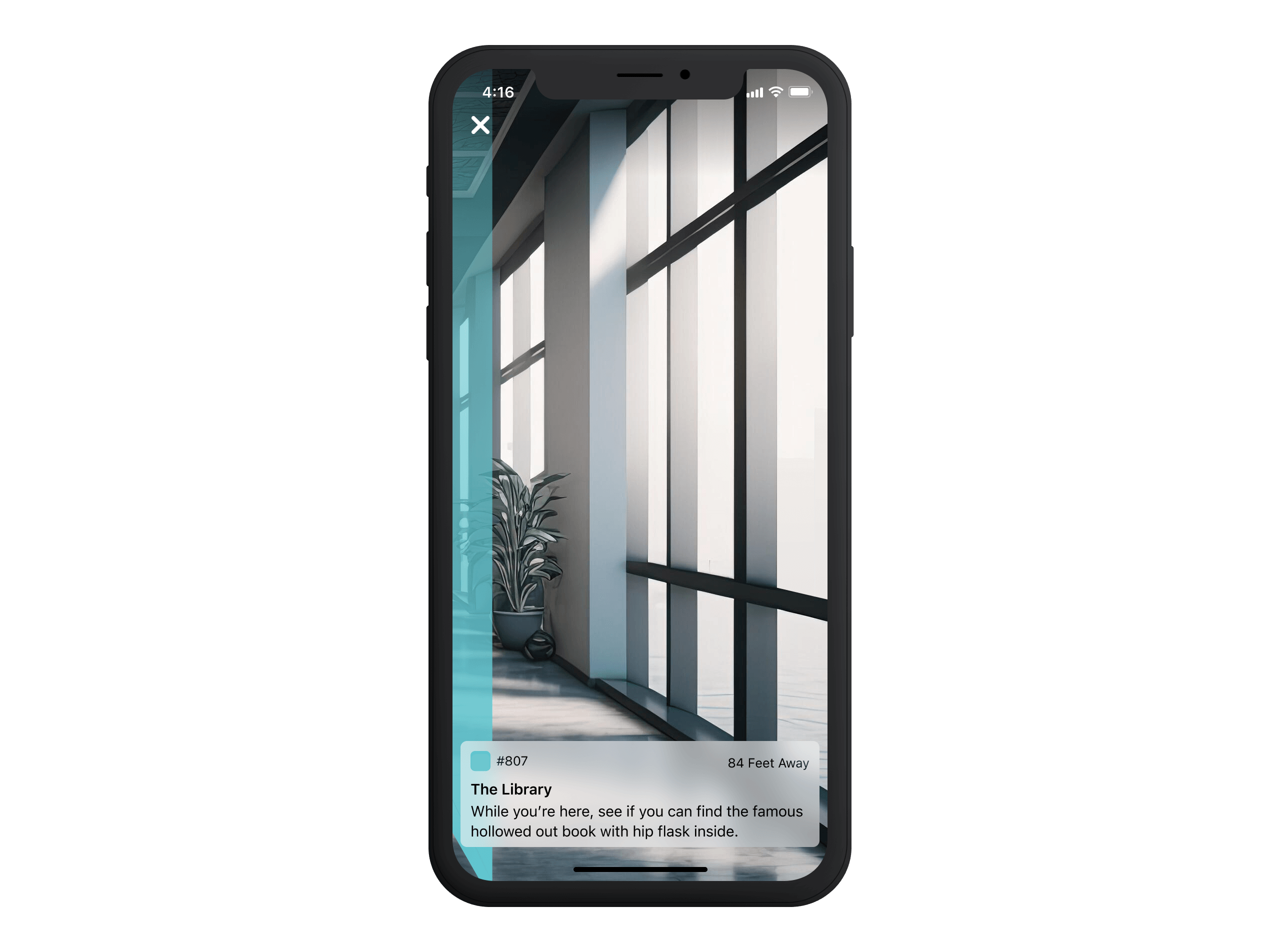
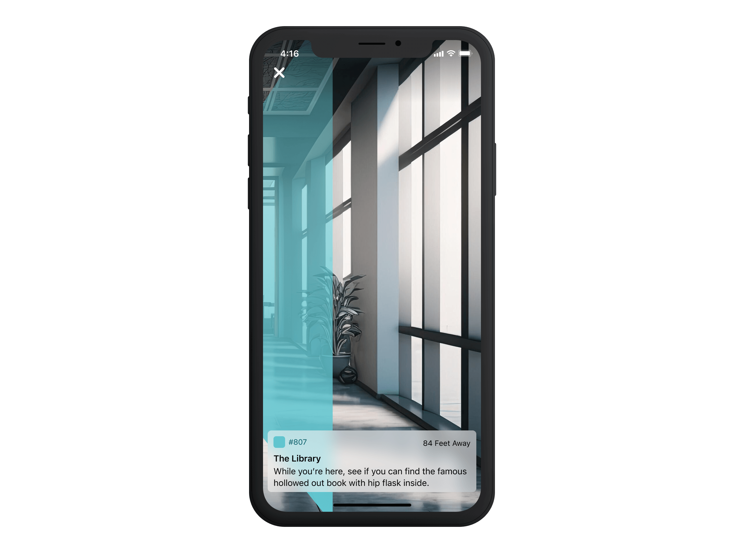
While this guaranteed the widget was always visible, it introduced a new problem—users still lacked a clear directional cue. The widget told them where they needed to go but didn't show them how to get there. This led us to explore a more dynamic way to reinforce movement and direction without cluttering the screen. That's when we turned to an unexpected yet perfect source of inspiration: Tron.
Illuminating the Way
Ever since I first saw the Tron Lightcycle race, I have been drawn to its powerful visual language—vehicles racing across a grid, leaving behind a high-contrast, glowing path.
The idea was simple: as soon as an employee entered AR mode, employees would look for that same brilliant streak of light, allowing them to trace the exact path they needed to take. Instead of scanning their surroundings for a sign, they'd see a clear, dynamic trail guiding them. These trails would be colour-coded, carrying through the same visual system from the original printed map and directory list UI, ensuring a consistent experience across the app.
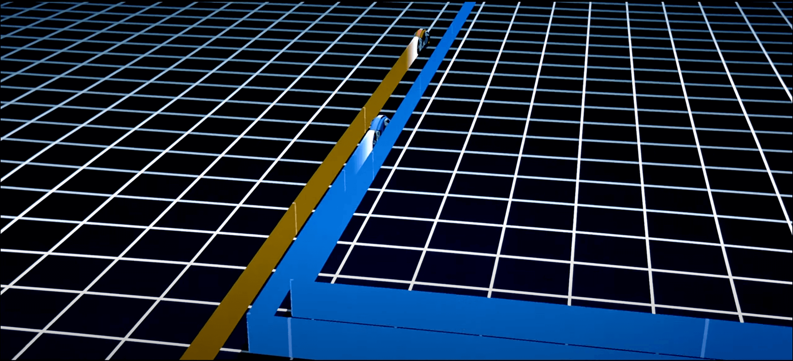
Beyond simply serving as a directional guide, the light trails introduced a sense of movement and progression within AR.
- As users approached their destination, the trails could dynamically shift in scale or brightness, reinforcing a sense of progress while integrating with the accelerometer-driven distance indicator.
- To further enhance spatial awareness, subtle perspective effects could make the trails appear more prominent in the foreground and gradually shrink into the distance, creating a natural sense of depth.
This fluid motion solved what the static notification widget couldn't—it transformed AR navigation from a passive, information-based interface into a visually dynamic and immersive experience. By making movement feel intuitive, it reinforced directionality in real-world space.
04—Test
Testing, What Testing?
Unlike a traditional product launch, this was an internal tool designed specifically for employees, eliminating the need for an extensive testing phase. Instead of formal usability studies, we hosted the app on the internal server and let employees explore it freely.
Feedback was organic—colleagues experimented with the AR navigation, sharing their thoughts in person or through a dedicated Slack channel. This informal rollout allowed us to observe real-world usage in a live office environment without the constraints of structured testing.
05—Release
Room for Improvement
While the app successfully provided an intuitive way for employees to navigate the office, several areas could have been refined with more time. Relying solely on Wireless Access Points (WAPs) for positioning had its limitations—exploring Bluetooth beacons could have offered greater accuracy in determining real-time location.
Beyond functionality, there was also room to polish the overall experience further. Refining the AR interface to be lighter and more intuitive would have made adoption even more seamless.
Despite these areas for refinement, the project was an incredible learning opportunity—both in technical execution and rethinking how AR could be applied to real-world navigation. What began as a simple hack project evolved into a fascinating exploration of spatial computing, intuitive wayfinding, and the role of digital layers in enhancing physical spaces.
One More Thing
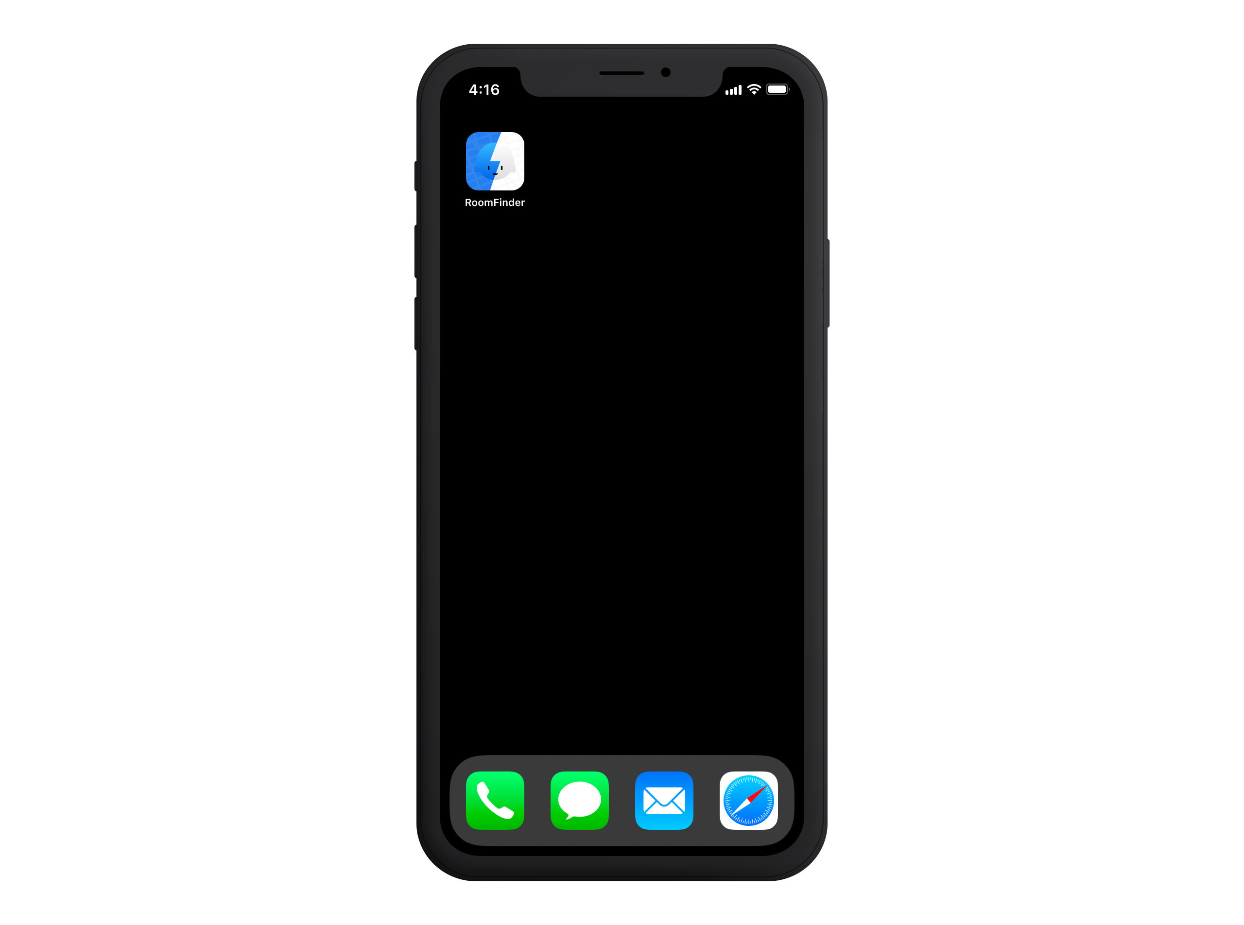
To round out the project, the app needed an icon—and there was only one direction to go. Internally, Foursquare has a beloved mascot named Marsbot, a character who has become a cult hero within the company. She's appeared across various Foursquare products, from the original Foursquare app to Swarm, and even starred in her own text-message-based app.
For this project, I wanted to pay homage to Marsbot while giving her a subtle visual refresh that aligned with the purpose of our AR navigation tool. It was a small touch, but it tied everything together—making the experience feel more personal and distinctly Foursquare.
Footnotes
- ARKit was released as part of iOS 11 in September 2017 ↩