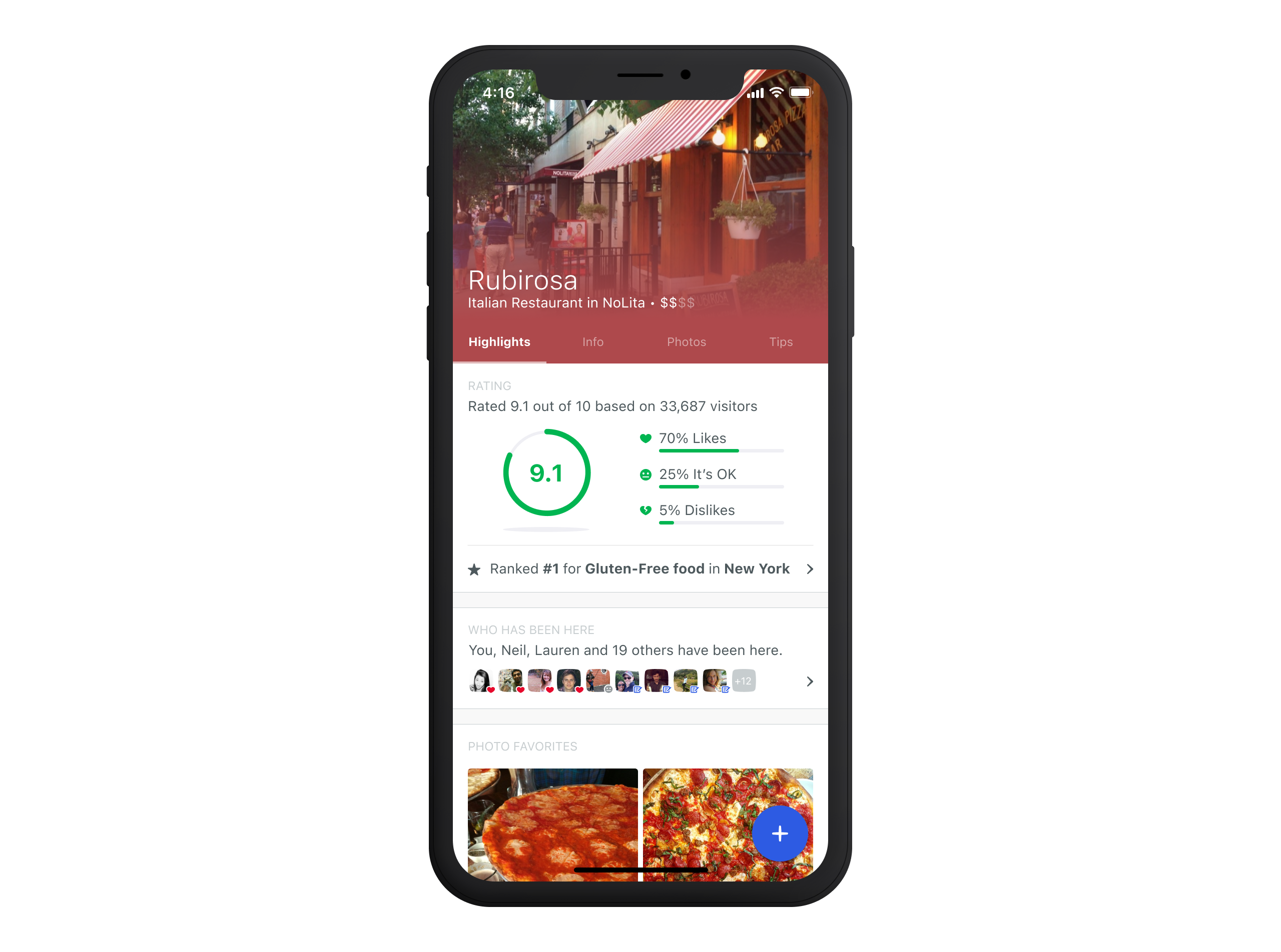
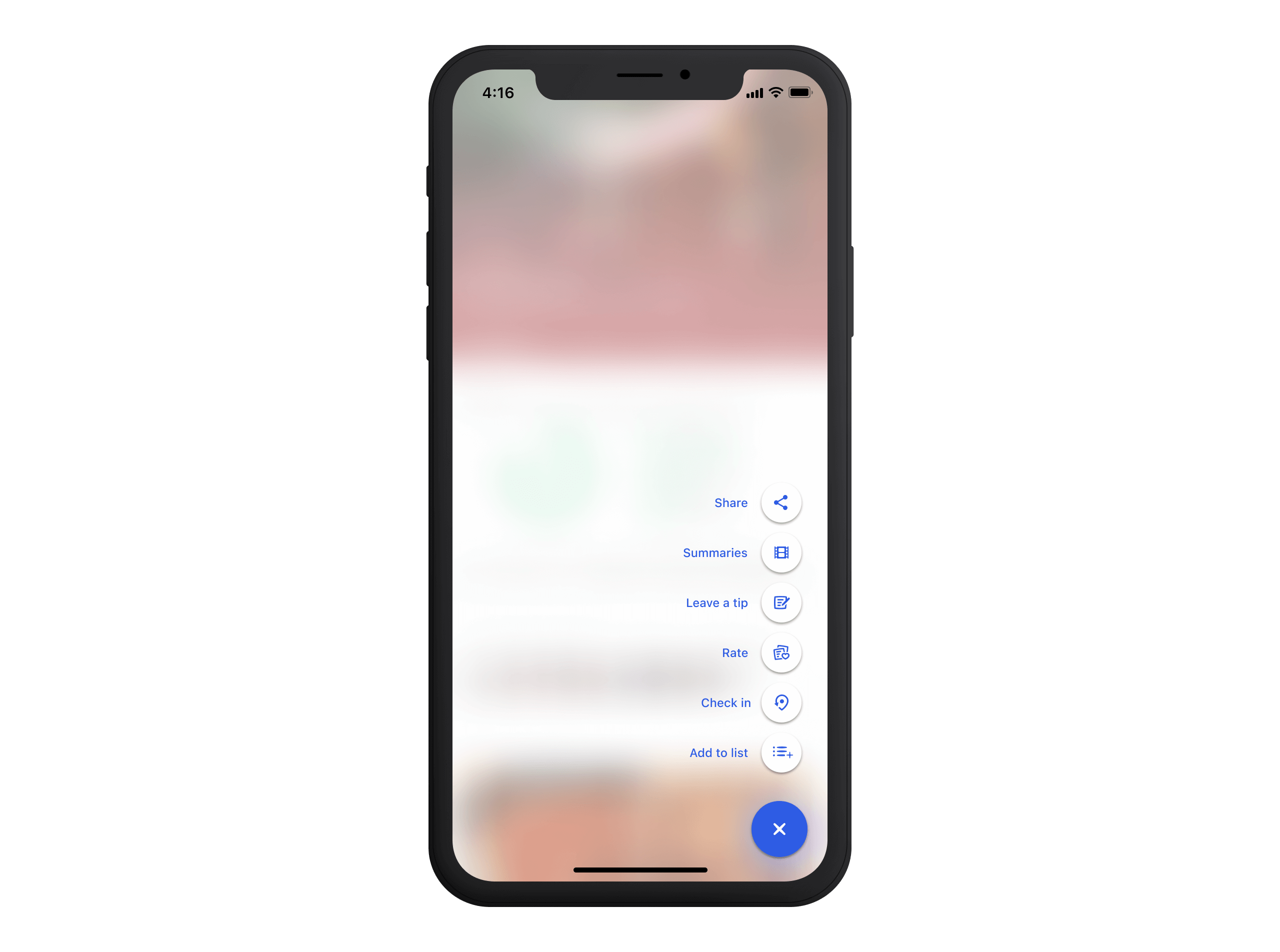
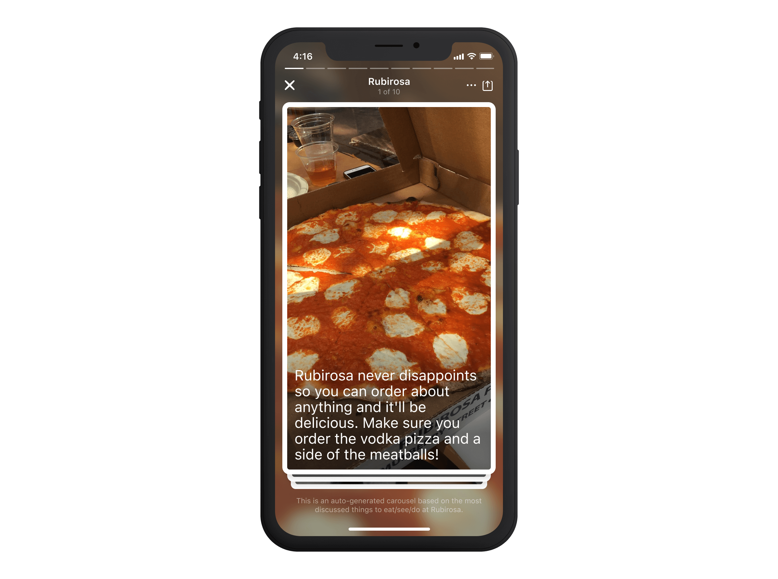
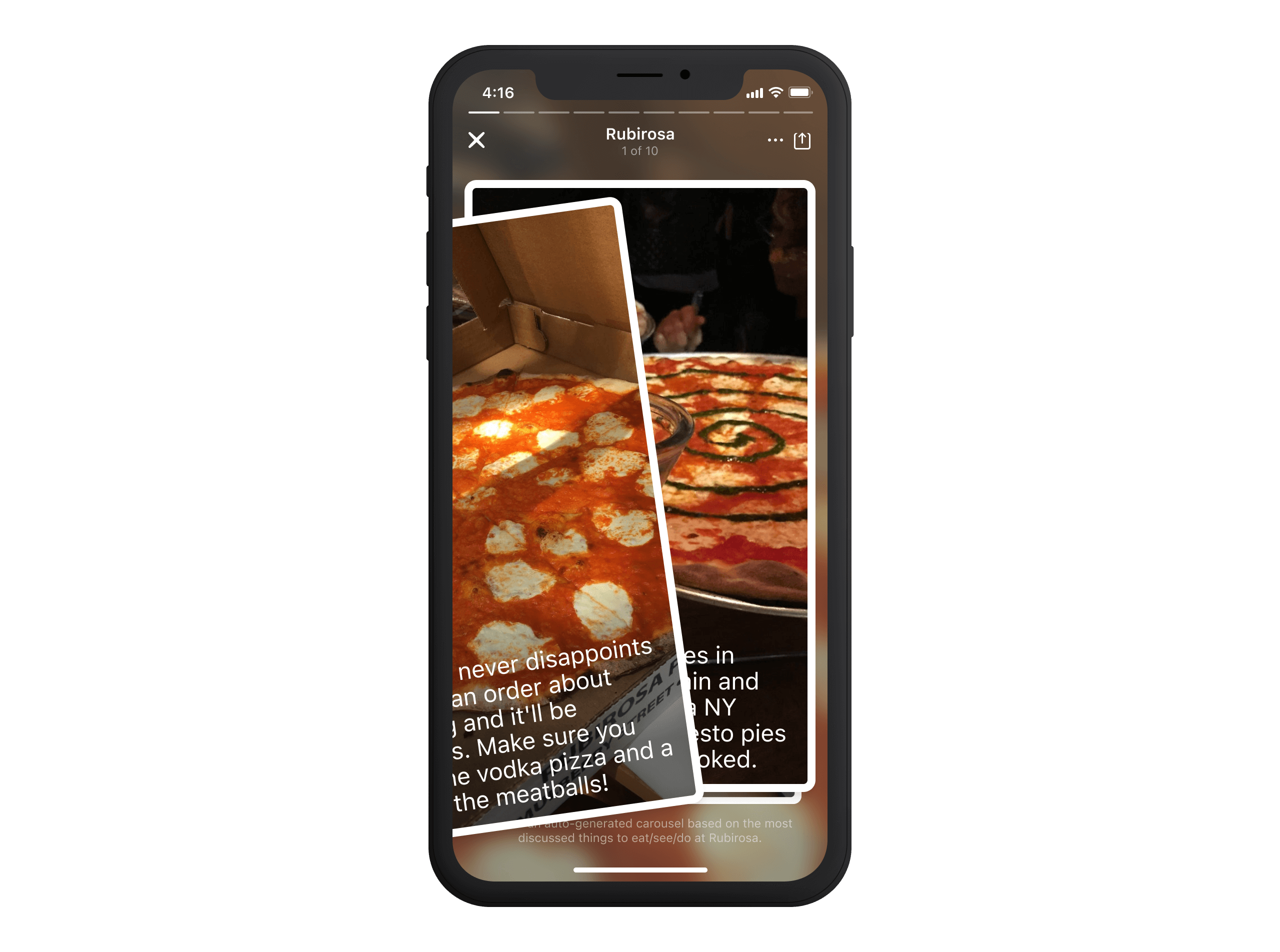
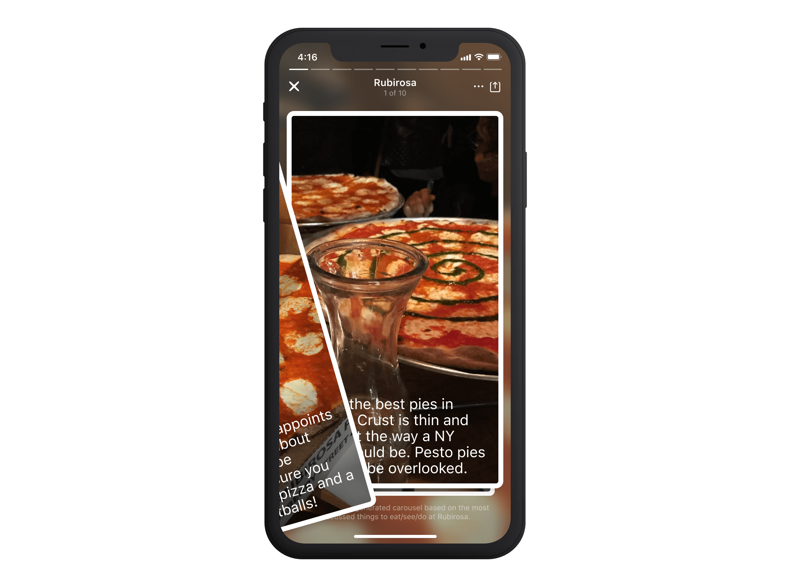
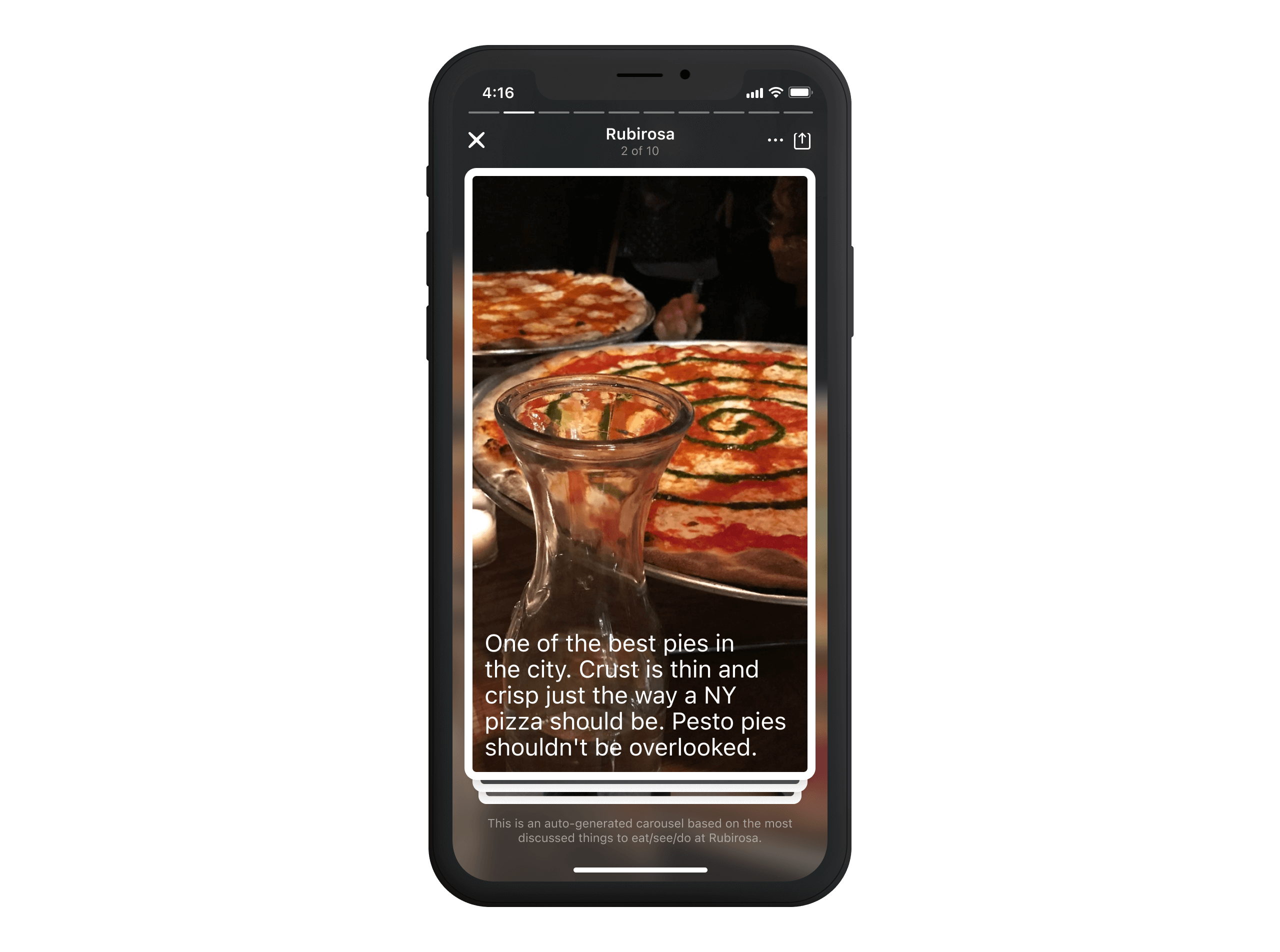
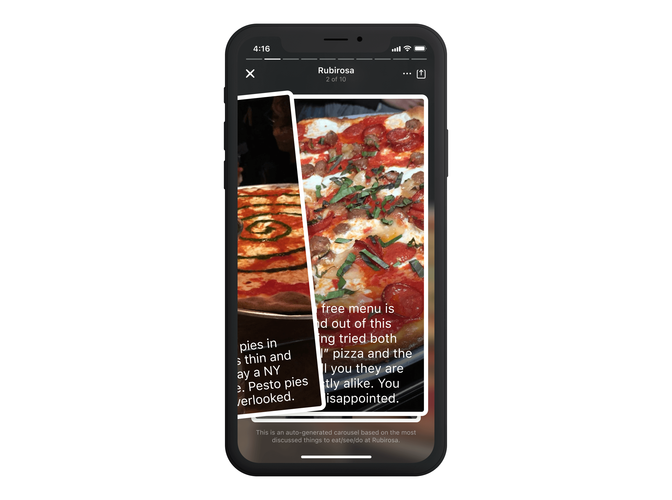
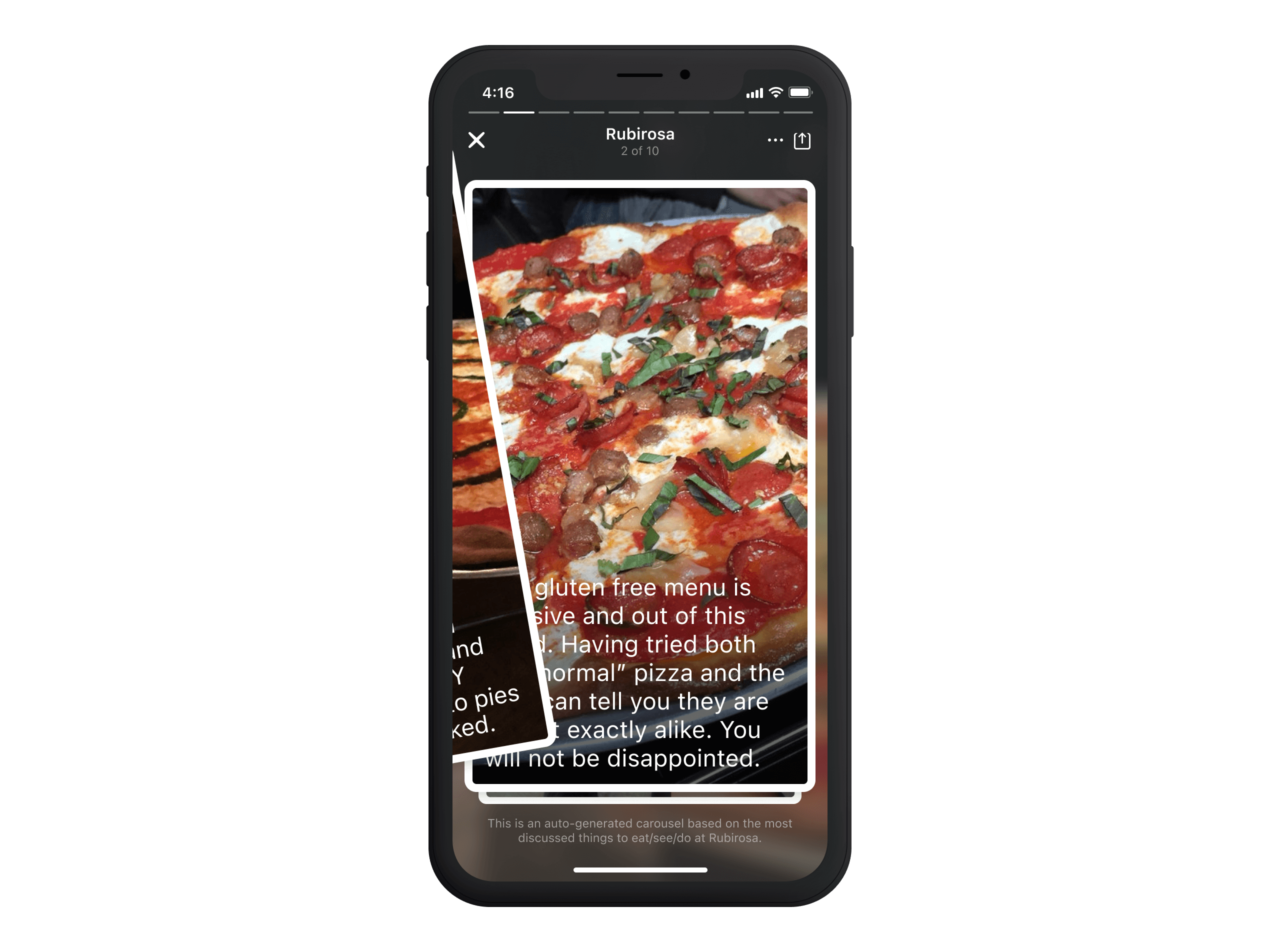
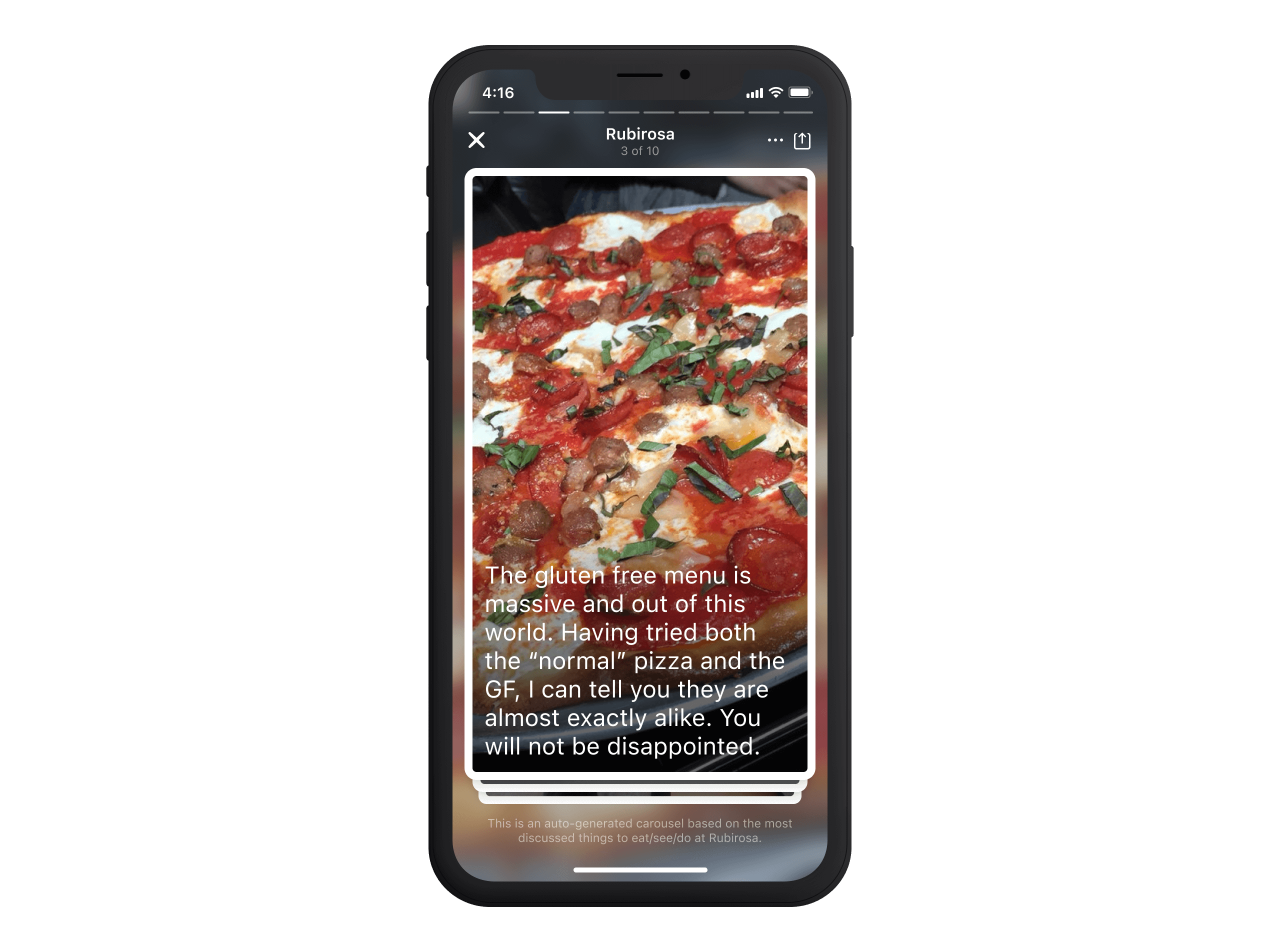
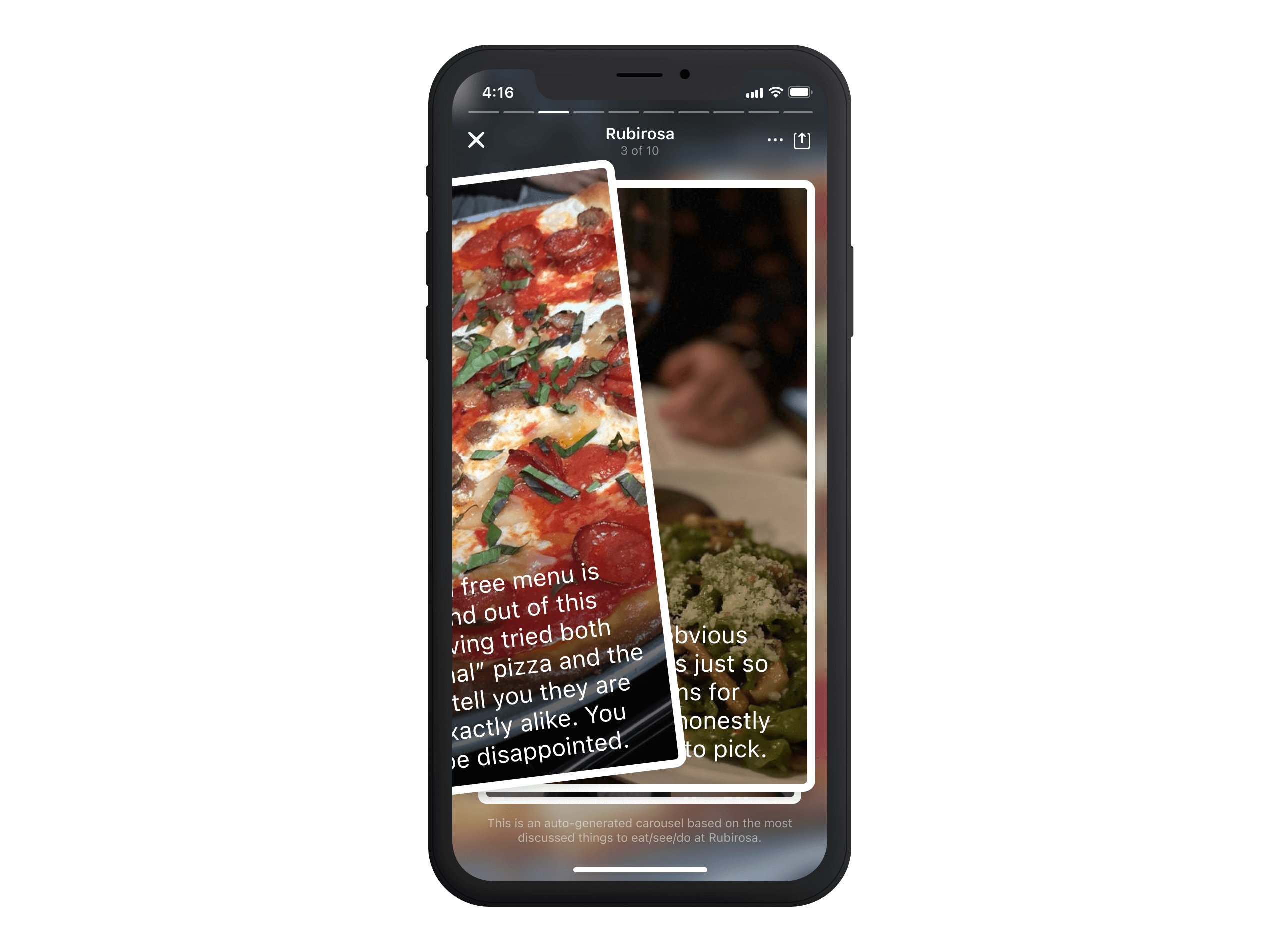
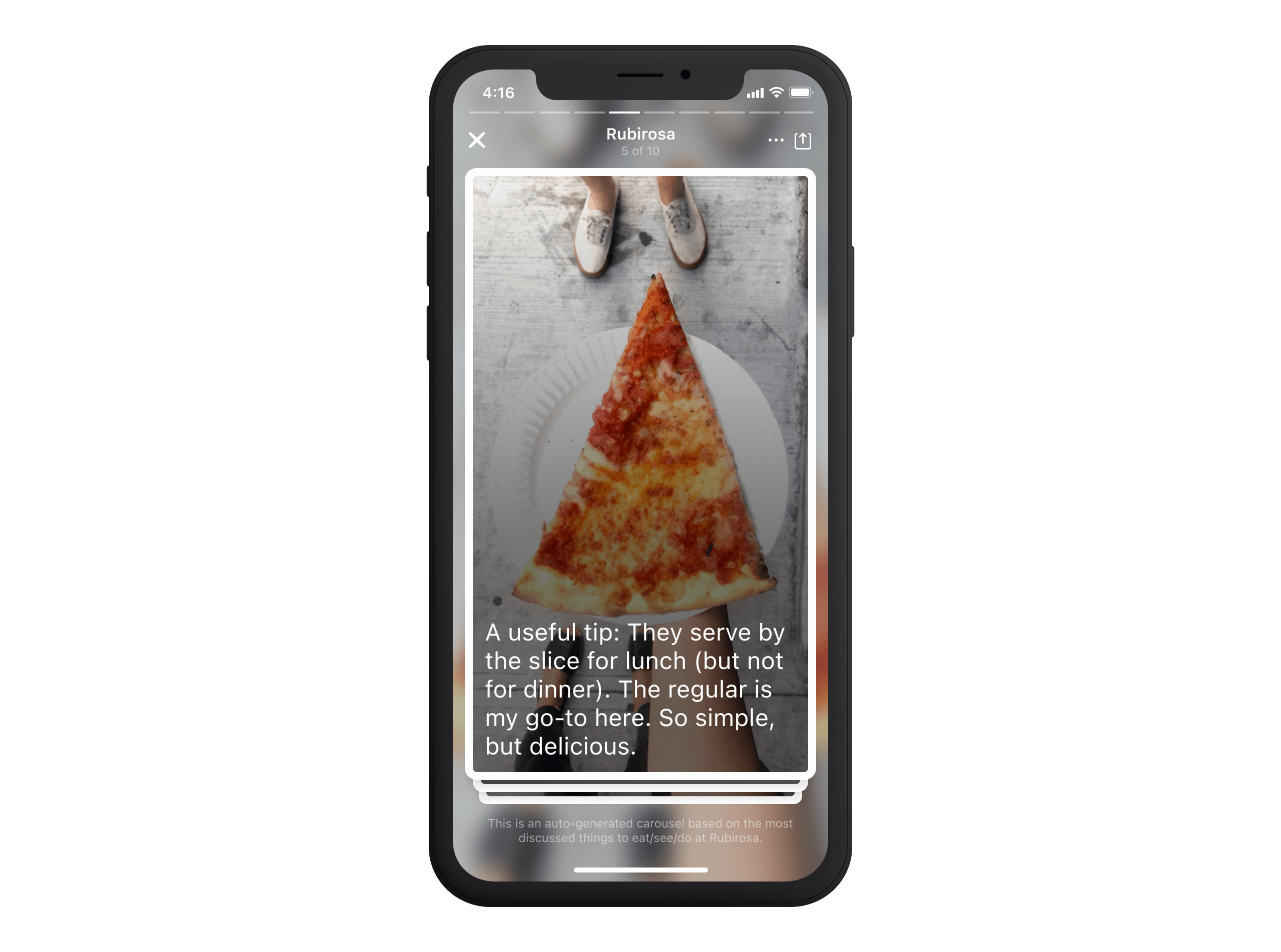
Great tips could sell an experience but often lacked impact without photos. A must-try dish or a hidden gem was only as strong as a user's ability to visualise it. At the same time, the way people consumed content was shifting—quicker, more visual, less effort. This feature aimed to combine those two ideas, using machine learning to match popular tips with venue photos and reformatting them into an easy-to-digest, highly visual experience.
01—Discover
Identifying the Opportunity
This feature wasn't born from a roadmap; it started at Hack Week. The idea stemmed from a simple observation: City Guide had an incredible wealth of user-generated insights, but much wasn't reaching its full potential. Tips were packed with valuable recommendations, yet without images, they often failed to capture attention. Meanwhile, photos showcased a venue's atmosphere but lacked the context that made them valuable.
Some of the app's best content was overlooked—not because it was outdated, but because users assumed it was. A must-try dish, a signature drink, or a hidden gem didn't expire just because time had passed. The challenge wasn't about creating new content but unlocking what was already there in a timely, effortless, and engaging format.
02—Define
Turning Excitement into Action
With excitement building internally, the next step was to define what this feature would look like in its first iteration. The response from early internal demos was overwhelmingly positive, with designers, engineers, and product teams quickly seeing the potential of surfacing venue content in a more structured, visual way.
Beyond internal enthusiasm, there were strong signals that this solved a real problem. In other areas of the app, we saw that users engaged more with content that was quick, visual, and effortless1 to consume. Yet, venue pages still required much scrolling and searching to get the most relevant insights. To stay focused, we defined a set of guiding principles as our North Star:
- Instant Understanding: Users should grasp what makes a place unique within seconds. No deep dives are required.
- Effortless Engagement: Consuming content should feel natural, with lightweight interactions that don't add friction.
- Intelligently Curated: High-quality tips should be surfaced dynamically, pairing seamlessly with the best venue photos.
- Repackaging, Not Reinventing: Great content already existed—our job was to reformat it fresh and relevantly.
- Enhance, Don't Overcomplicate: The experience should integrate smoothly into venue pages without overwhelming the user.
03—Ideate
A High-Density Exploration
One of the first ideas I explored was a dynamic grid layout designed to provide high-density discovery at a glance while allowing users to tap into highlights for a full-screen takeover experience.
This format prioritised scannability, giving users an overview of multiple venue highlights in one view. Instead of using a static grid, I explored a model where popular highlights were dynamically sized—larger tiles for the most engaging tips and smaller tiles for standard insights.
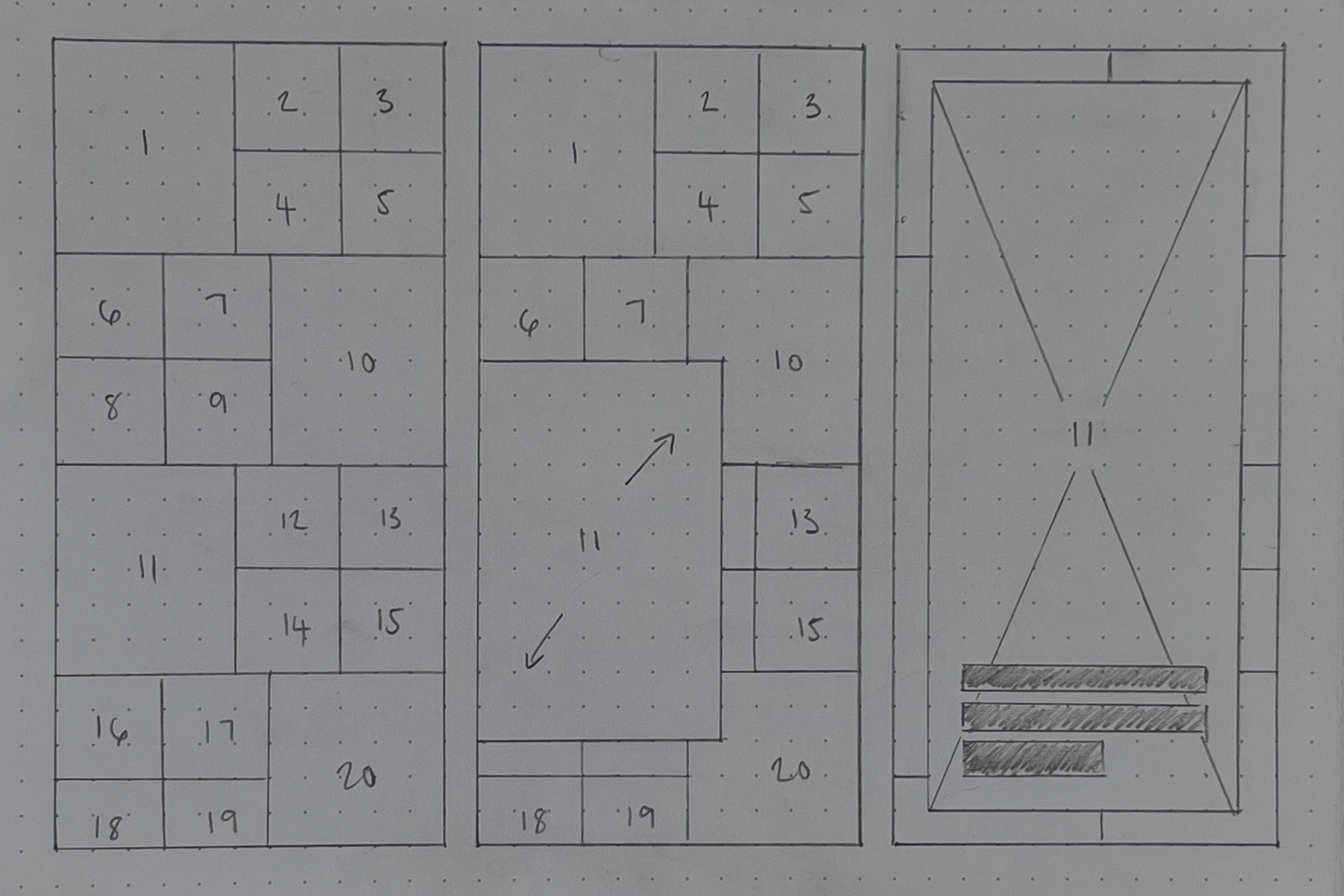


While the grid allowed for quick discovery, it lacked a clear narrative structure—users had to manually choose what to engage with rather than being guided through a story. This led me to explore a more fluid consumption model.
A Scroll-Based Narrative
The following exploration moved away from manual selection into a structured storytelling experience. Inspired by the intuitive consumption of platforms like TikTok and vertical carousels, this design allowed users to scroll through venue highlights effortlessly, with each section snapping into place.
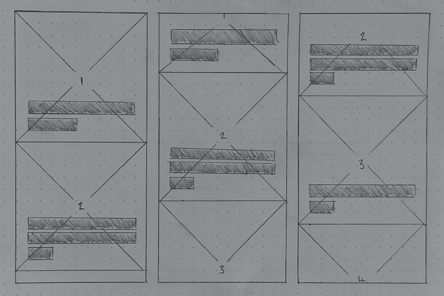


This format created a smooth, immersive way to consume content, with each highlight snapping into place as users scrolled. It worked well for guiding users through a structured experience. Still, the vertical format introduced subtle friction—users had to move in a fixed sequence, one highlight at a time, even if they wanted to skip ahead or revisit something they'd already seen.
While this approach encouraged engagement, it didn't fully capture discovery's effortless, lightweight nature. The next iteration shifted towards a swipe-based model, making it easier to move through highlights quickly while still keeping the interaction simple and intuitive. Instead of progressing in a linear flow, users could advance at their own pace—one card at a time—while maintaining the focus and clarity of a structured experience.
A Card-Story Hybrid
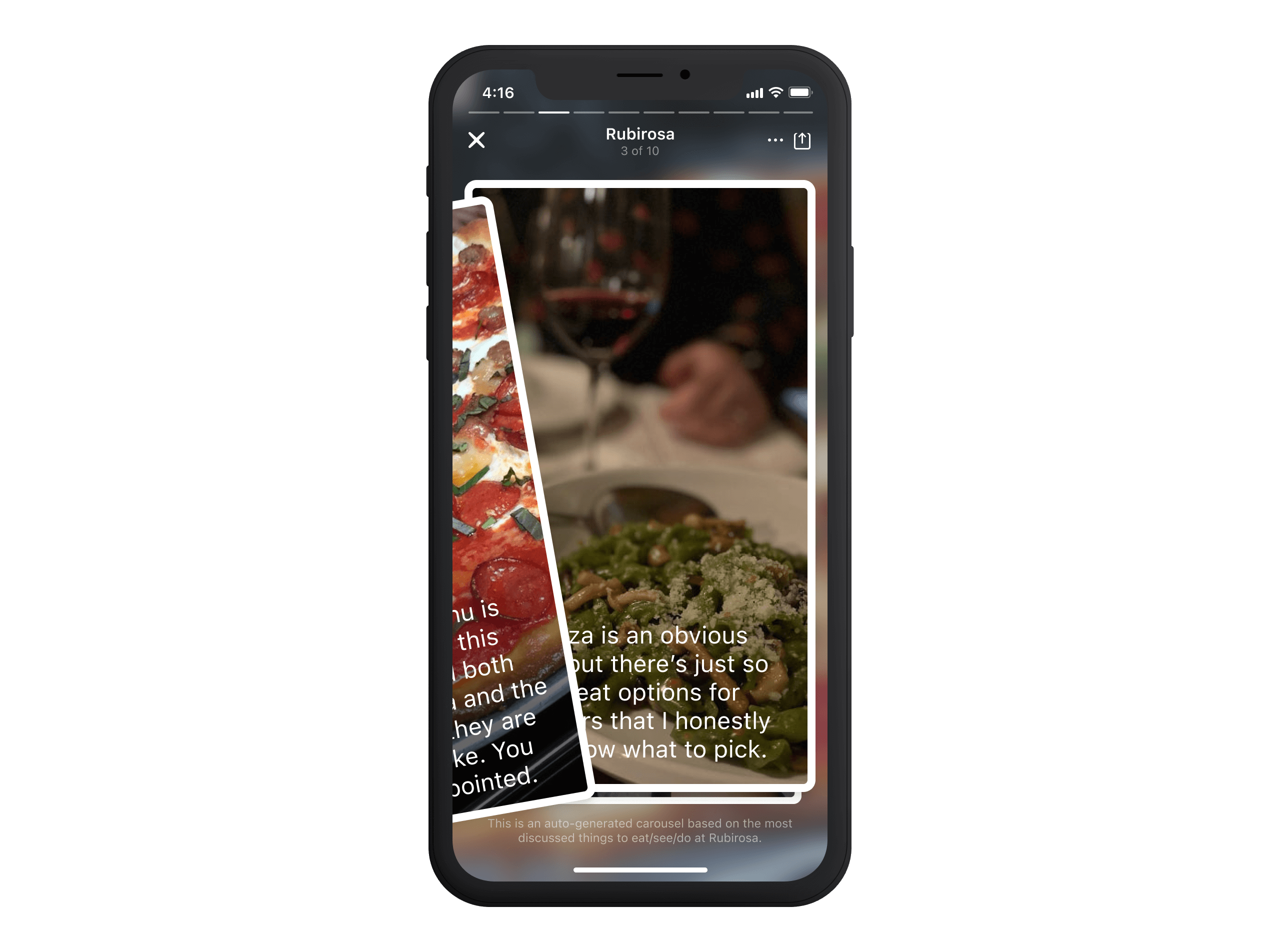
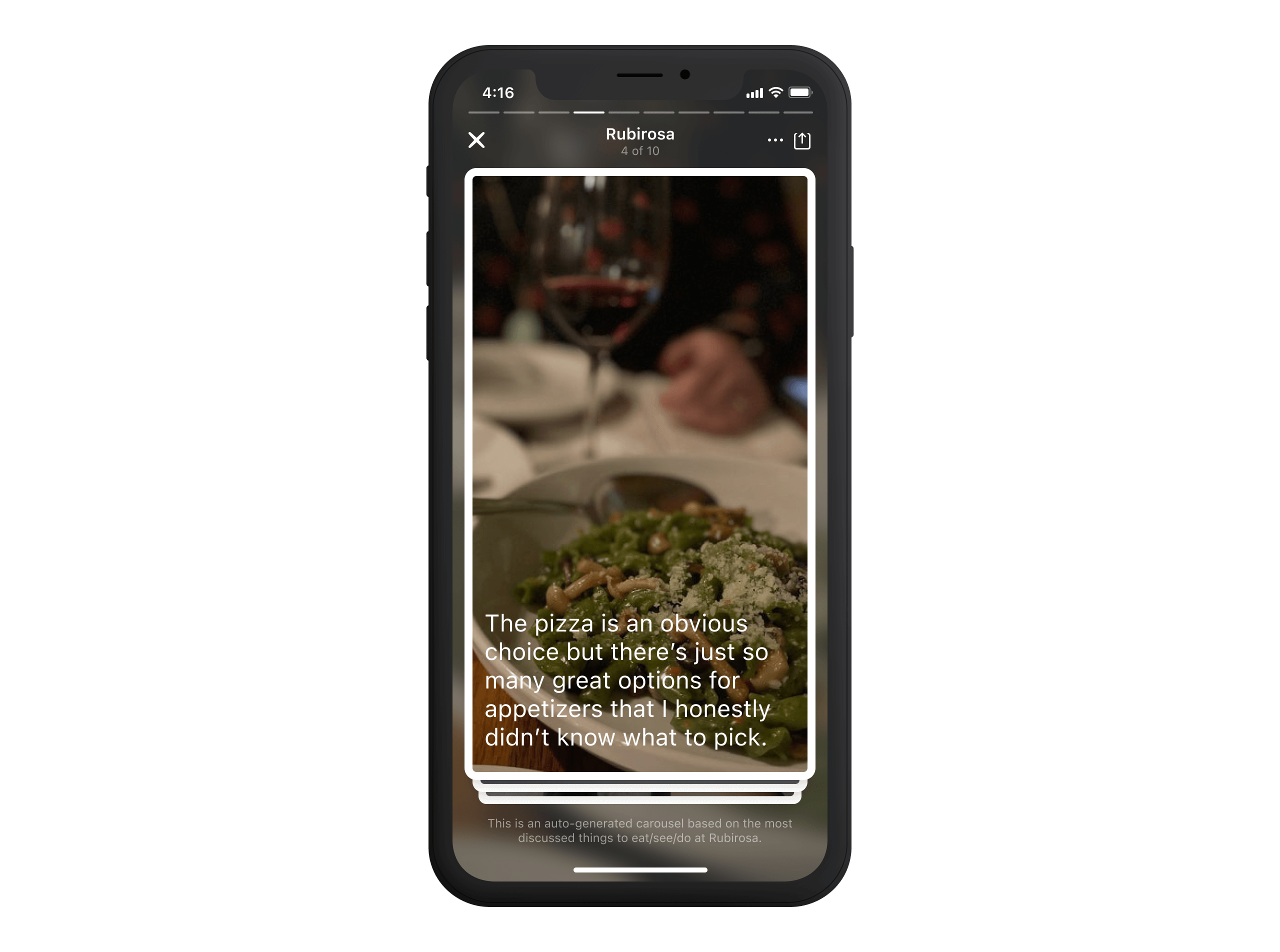
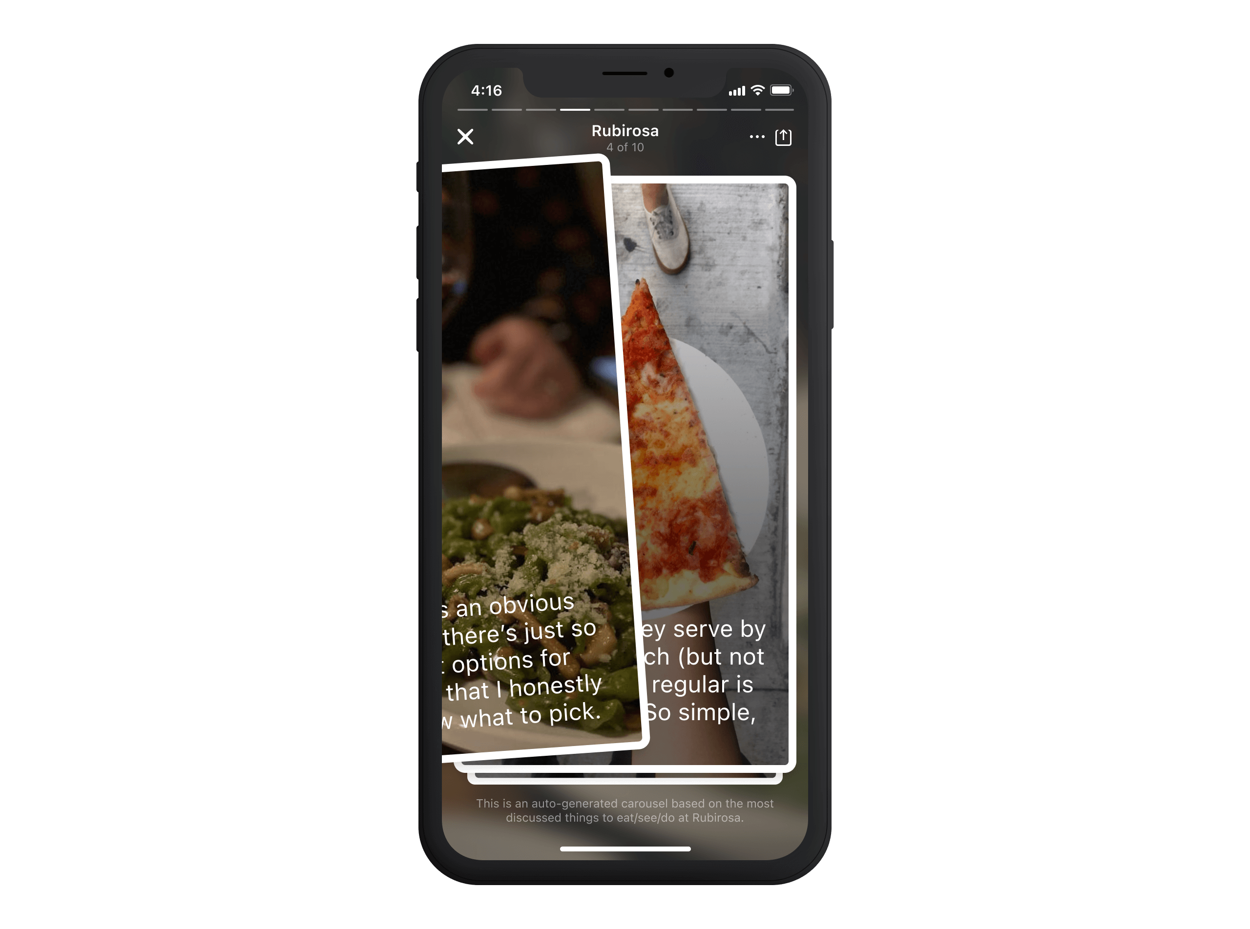
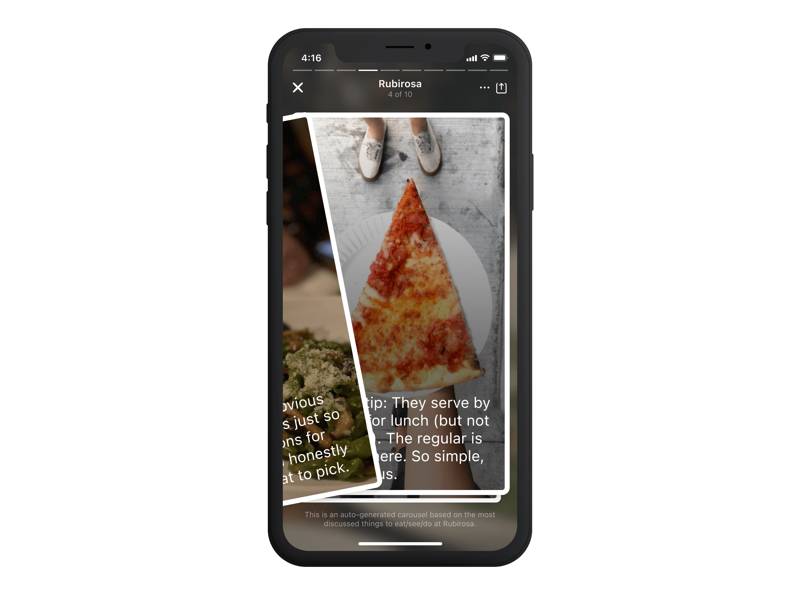
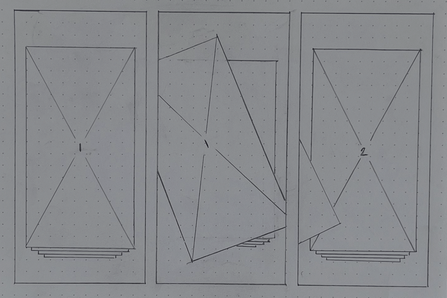
Building on the need for an intuitive, frictionless way to engage with highlights, the final exploration blended the effortless navigation of Instagram Stories with the lightweight interactivity of Tinder's swipeable cards. Instead of progressing through a continuous vertical feed, this model distilled each highlight into its focused moment—allowing users to move at their own pace without feeling locked into a structured sequence.
This format made discovery feel instant and effortless. Users could quickly explore one highlight at a time, tapping the edges to navigate back and forth or swiping to dismiss. It struck the right balance between structured storytelling and interactivity—guiding users through key venue insights while keeping engagement lightweight and unobtrusive. The final design aligned perfectly with the North Star principles defined earlier, reinforcing the goal of delivering meaningful venue content naturally and engagingly.


04—Test
Testing and Feedback
Early prototypes were embedded into internal app builds, allowing teams across design, engineering, and product to test the feature in real-world conditions. This wasn't just about identifying bugs but observing how people engaged with the swiping experience, whether interactions felt intuitive, and whether the feature surfaced high-quality, meaningful insights.
Internal testing was fast and iterative. Feedback loops were short, and frequent updates were rolled out to refine gesture responsiveness, content selection logic, and UI clarity. Every interaction detail—from the speed of swipes to how highlights transitioned between cards—was fine-tuned based on what we learned. When we expanded testing beyond the company, we had a version we felt confident in.
Superusers helped validate what we had learned while surfacing new insights about content relevance and engagement patterns. Were the most essential tips consistently being surfaced? Did the feature highlight what mattered about a venue? This feedback helped us refine how we paired tips with photos, ensuring that what users saw was high-value and contextually relevant. With these continued adjustments, we moved into a staged rollout, gradually expanding access while monitoring user behaviour and qualitative feedback.
Design Revisions
We identified several areas where improvements were needed throughout internal and external testing. The table below outlines key issues, the initial design, the feedback received, and the changes implemented to refine the final experience.
| Issue | Initial Design | Feedback | Change Implemented |
|---|---|---|---|
| Lack of pagination/flow awareness | No visible indicator of progress through highlights. | Users felt unsure how many highlights remained or how far they were in the experience. | Introduced a subtle progress bar at the top (similar to Instagram Stories) to indicate position. |
| No way to return to previous highlight | Swiping was one-directional (forward only). | Users wanted a way to go back if they moved too quickly. | Enabled tap to go back (left edge of the screen) to revisit the previous highlight. |
| Disclaimer | N/A. | People wondered how this content was sourced, organised and compiled. | A disclaimer was introduced at the bottom of the view that stayed throughout the experience. |
| Auto-selected tips didn't always feel relevant | Tips and photos were automatically paired based on engagement data. | Some Superusers noted that certain pairings felt random or less valuable. | Improved content ranking algorithm prioritises recent, high-quality tips with strong engagement. |


05—Release
Room for improvement
While this feature successfully introduced a more visual and digestible way to explore venue highlights, there were still opportunities to take it further. Two key areas stood out as potential next steps:
Smarter Tip & Photo Pairing: The automatic pairing of tips with photos was designed to highlight the most relevant venue insights, but in some cases, the connections felt arbitrary. Because pairings relied primarily on engagement metrics, they didn't always capture the proper relationship between a tip and its corresponding image. A more context-aware approach could improve this by:
- Using AI-powered contextual analysis to match tips with photos that visually reinforce the description.
- Prioritising high-quality, recent contributions rather than simply surfacing the most popular tips.
Bringing Tastes to Venue Highlights: With this first iteration, every user sees the same set of venue highlights, regardless of their preferences. However, Foursquare already has a powerful Personalisation engine in Tastes2. There's an opportunity to leverage that to create a more customised experience. Possible Enhancements:
- Tastes as a Visual Layer: When a user has Tastes added to their profile, venue and search pages could display relevant results to the user. We could take this further by inserting the tastes within the image, making it easier to spot dishes and experiences that match their interests.
- Segmented Content Views: Introduce a toggle, allowing users to switch between "Top Highlights" (general venue insights) and "Your Highlights" (content tailored to their taste preferences)
- One-Tap Taste Saving: Users could tap a Taste within a highlight to instantly add it to their profile, turning passive exploration into active personalisation.
Footnotes
- The Opinionator feature, for example, had already demonstrated the power of this approach. ↩
- Tastes extracts themes from venue tips and allows users to add their preferences to their profile. ↩
