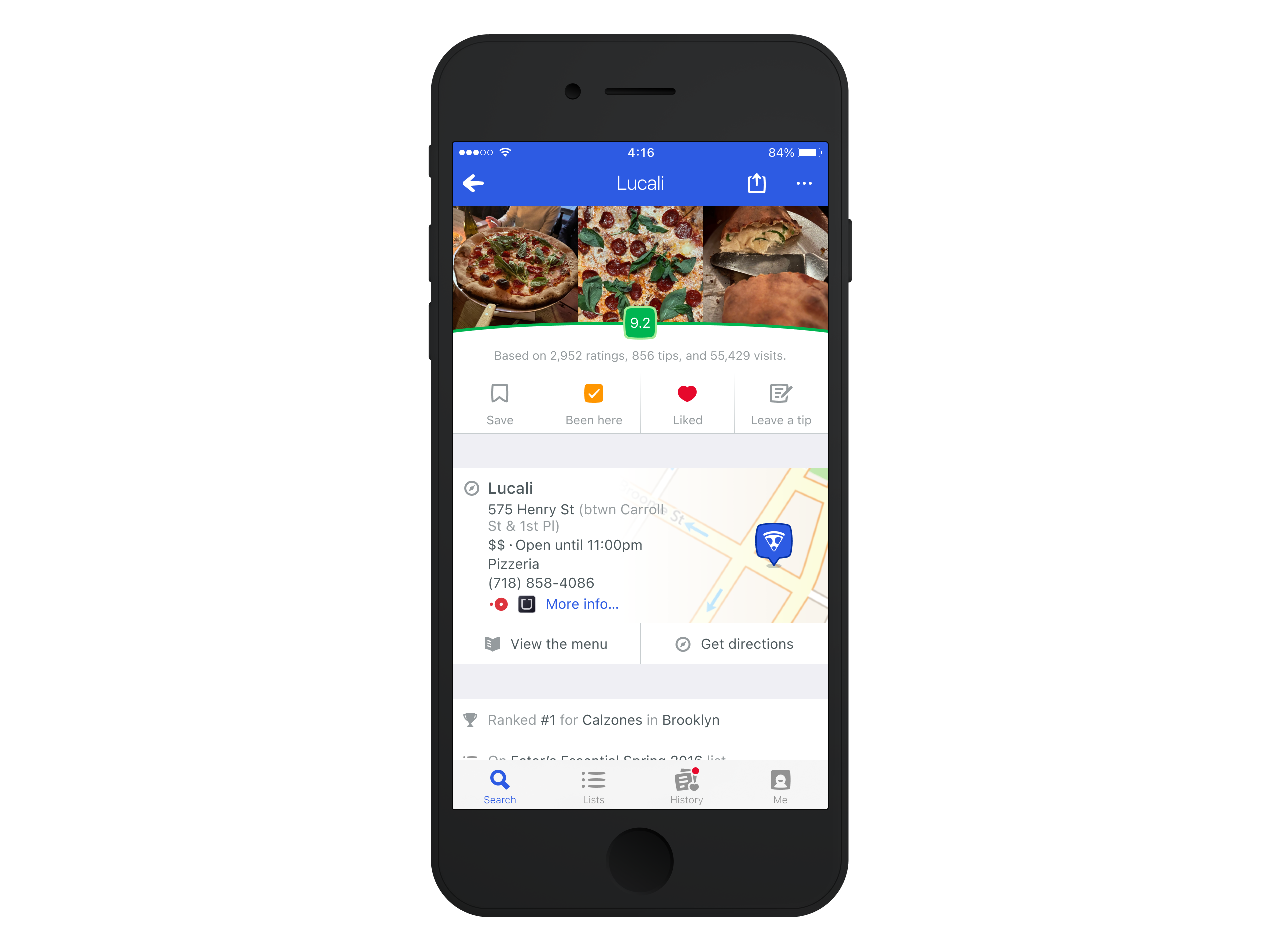
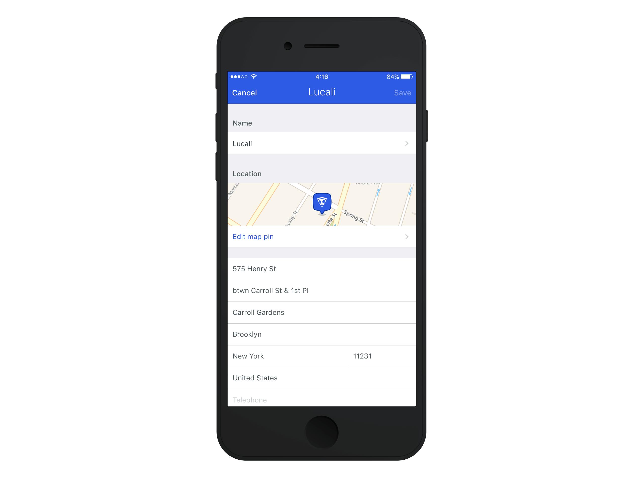
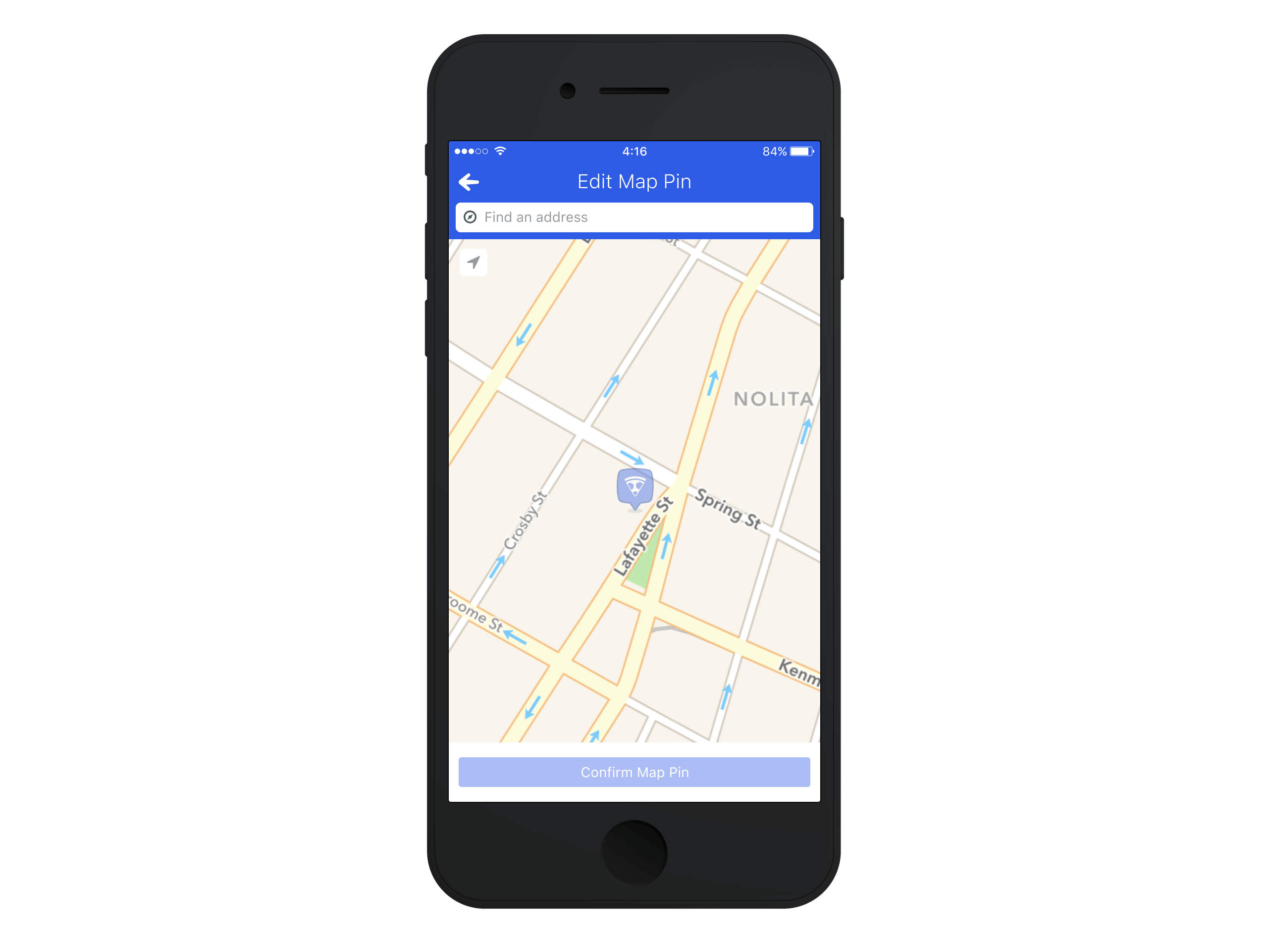
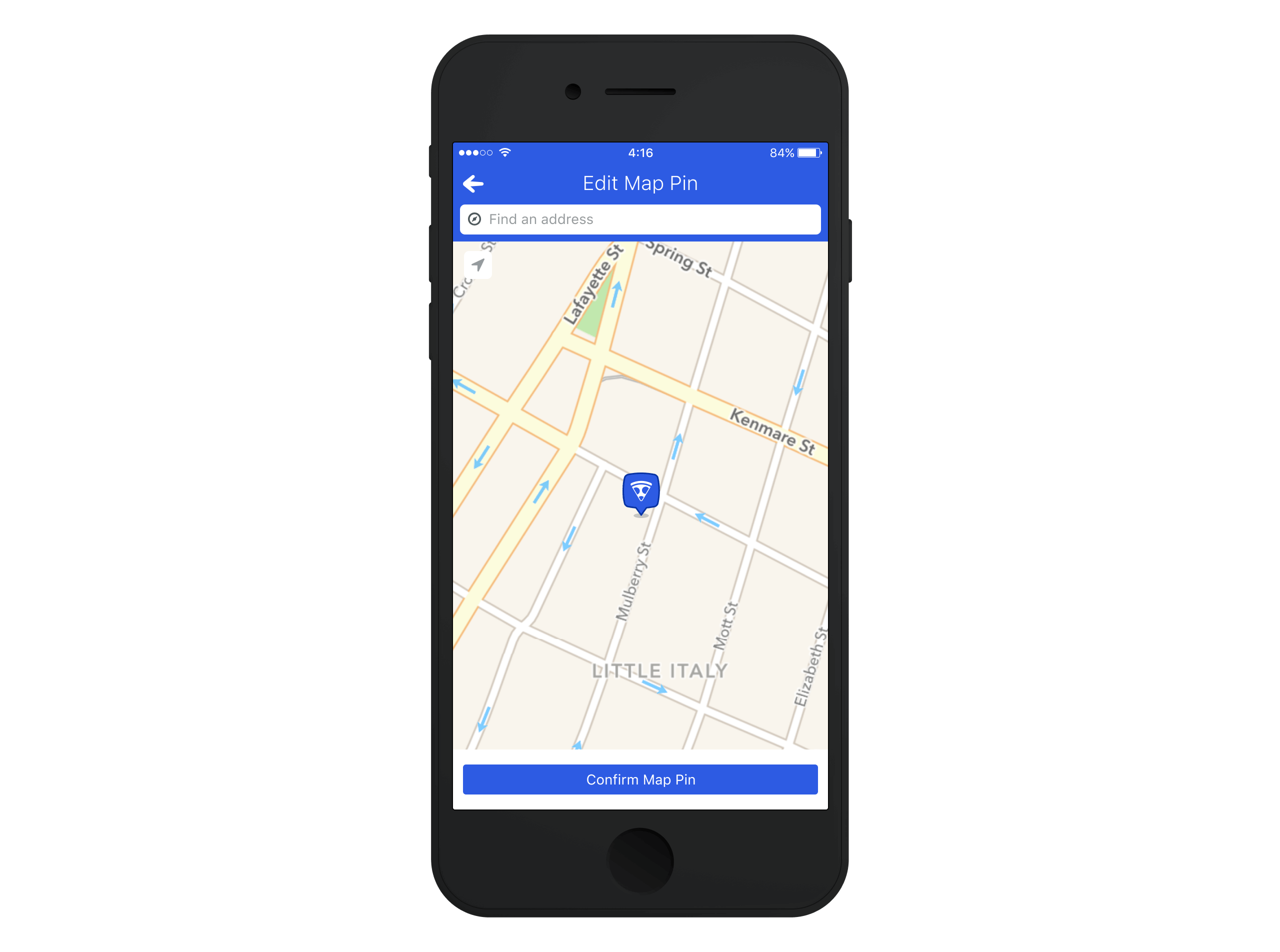
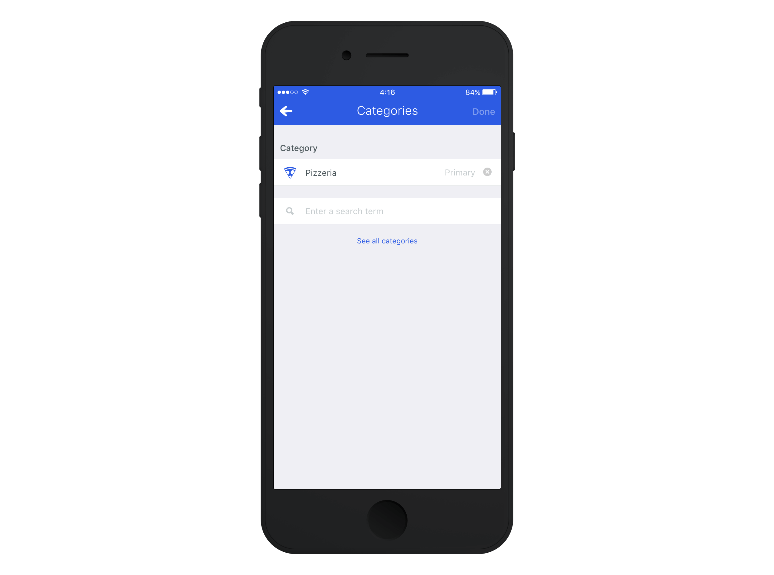
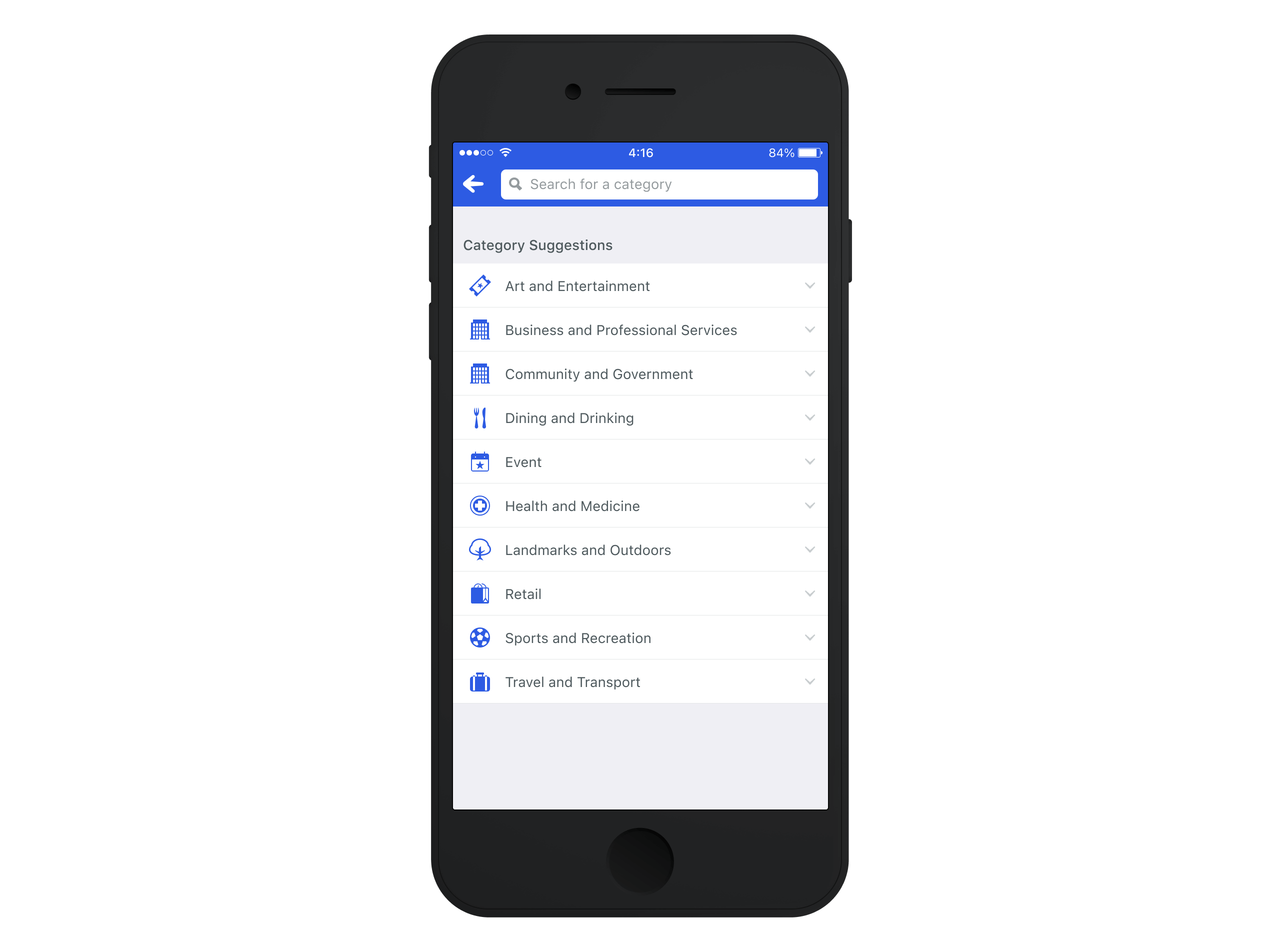
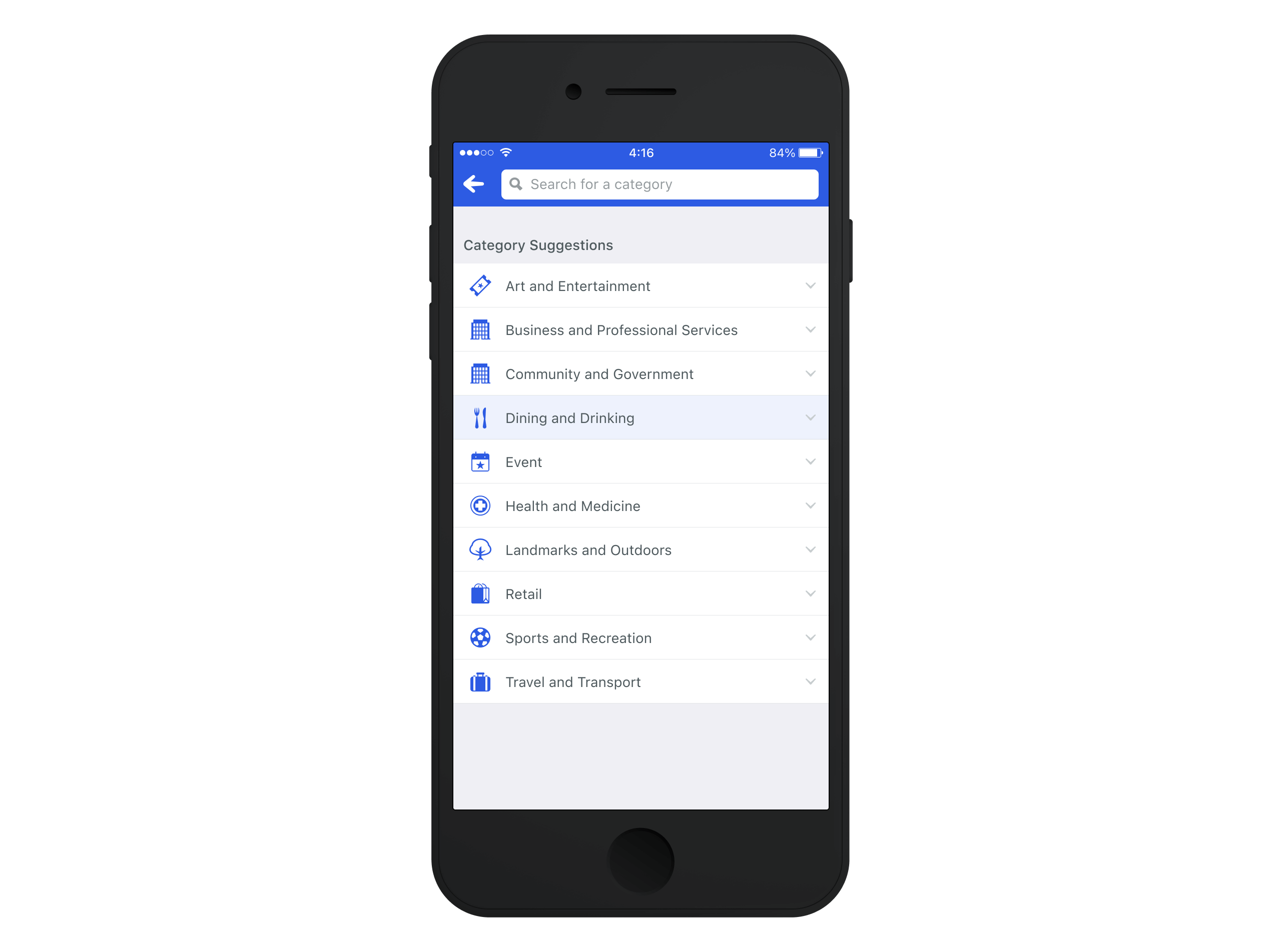
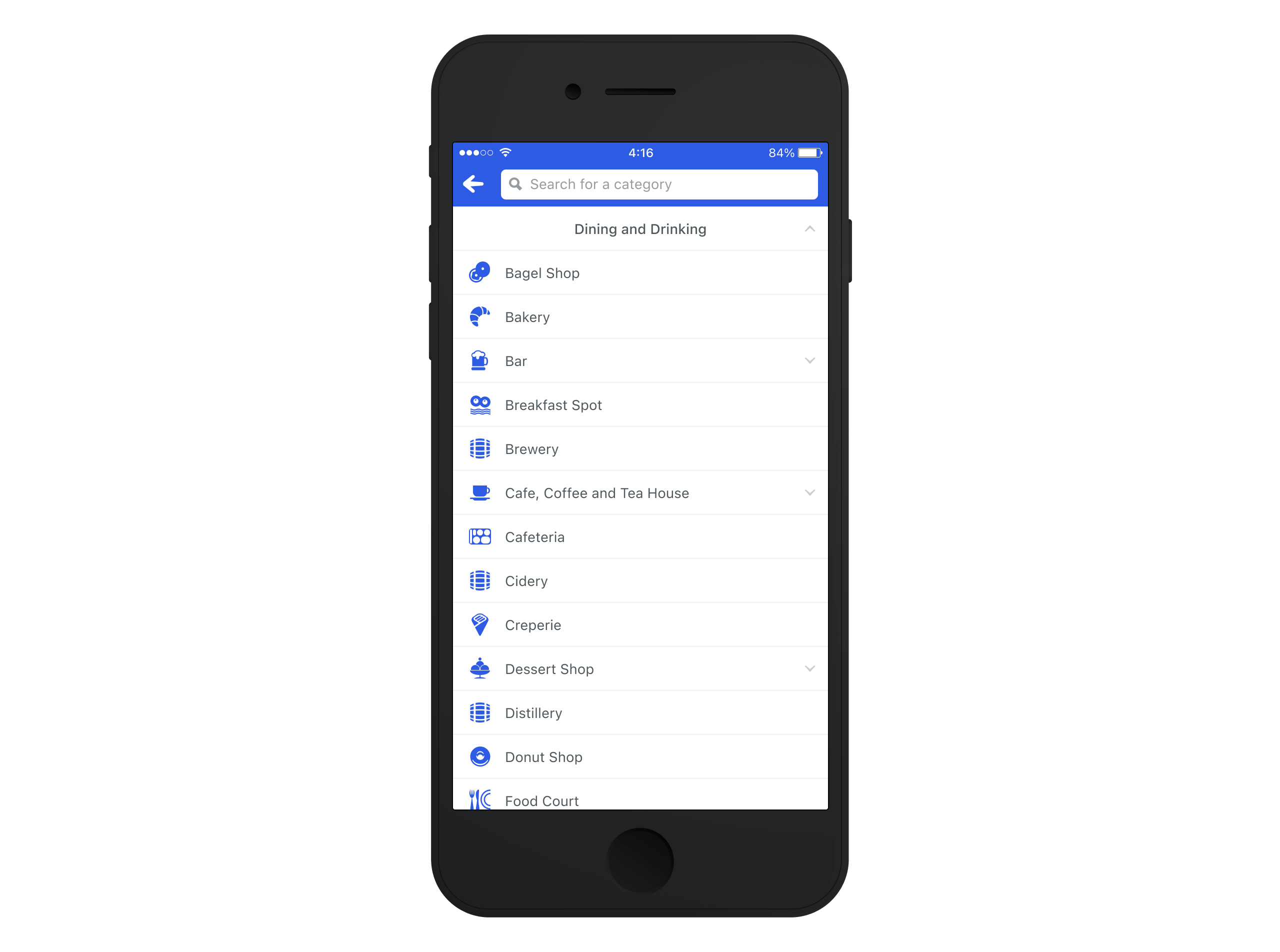
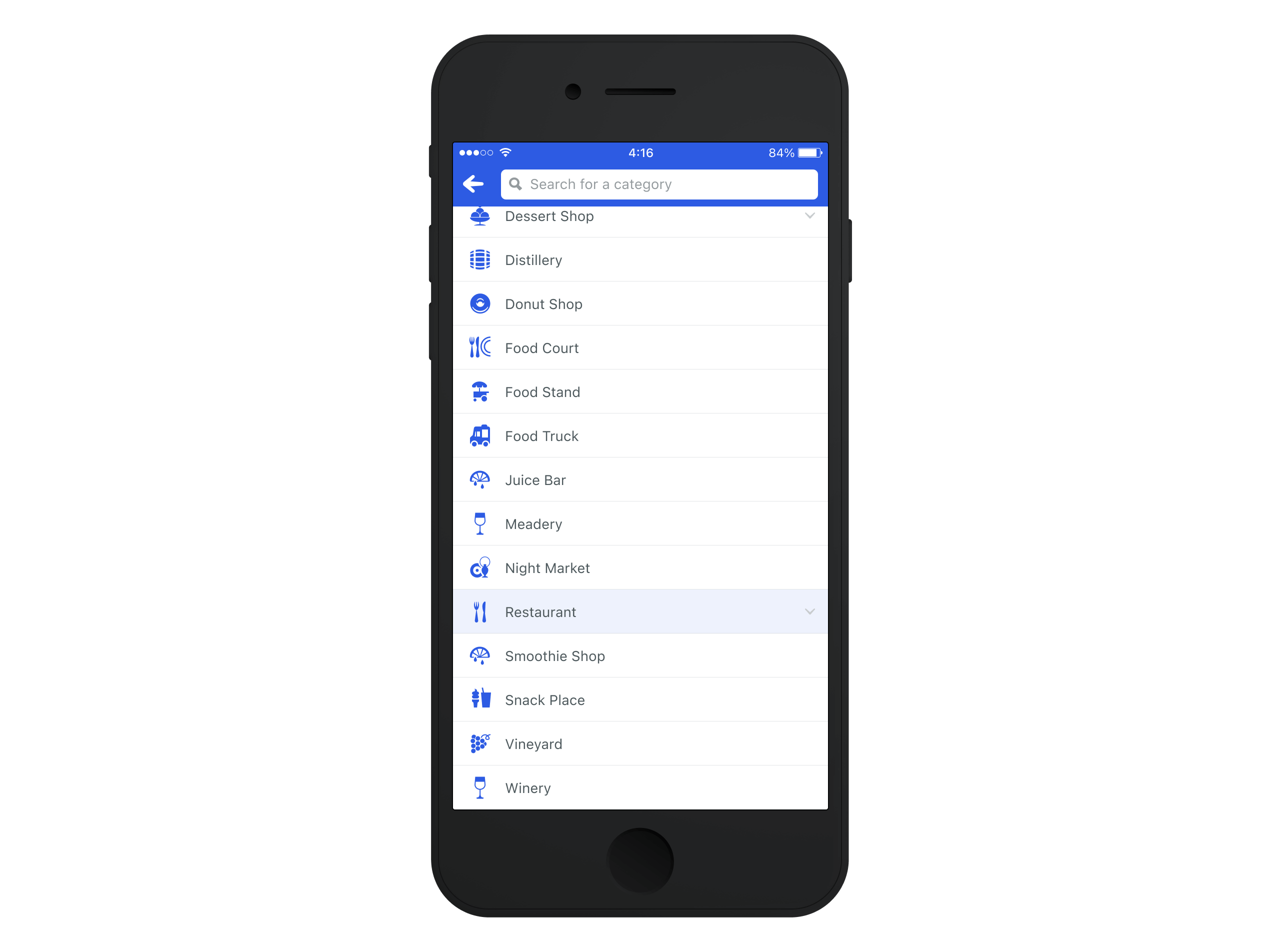
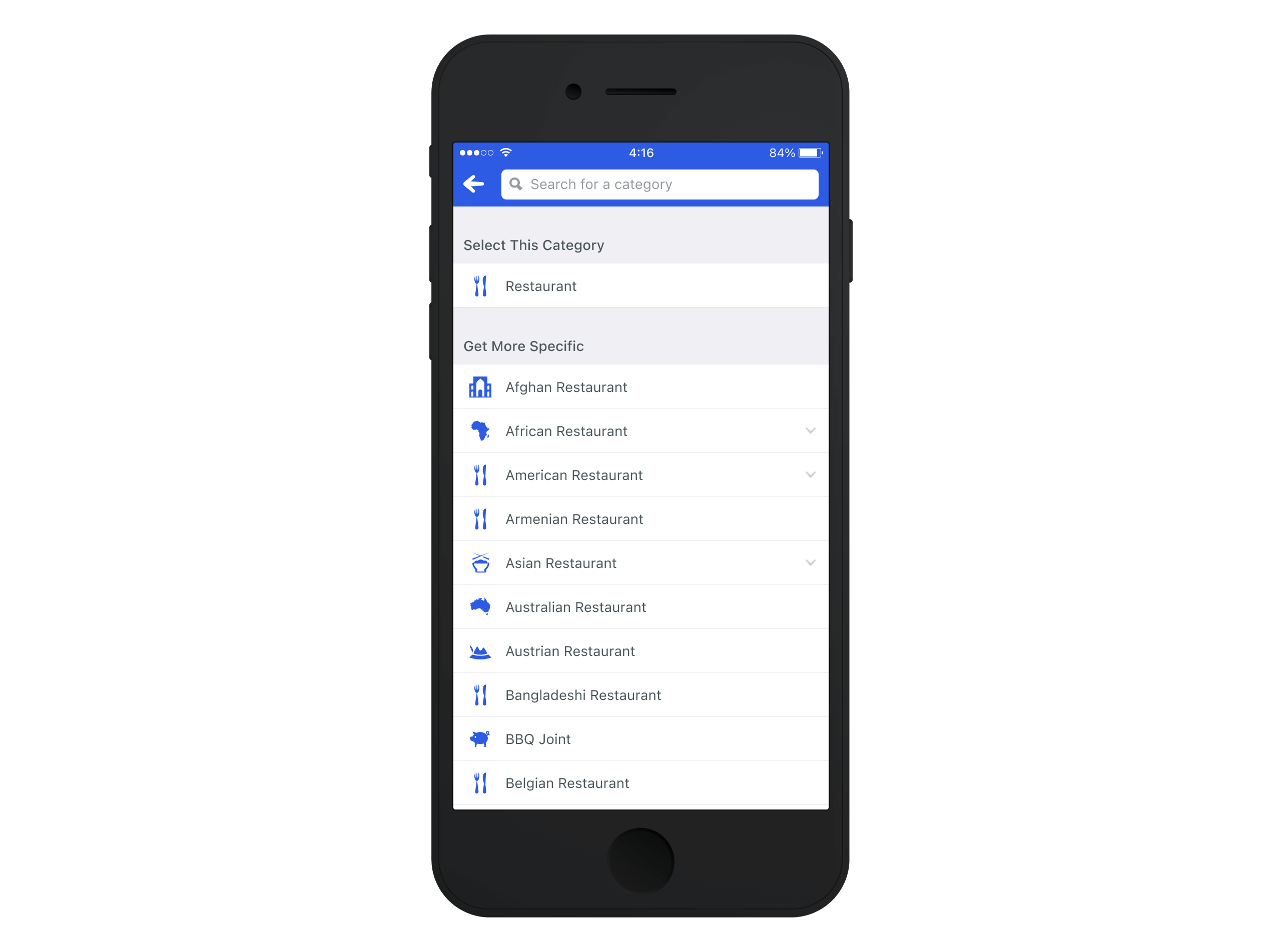
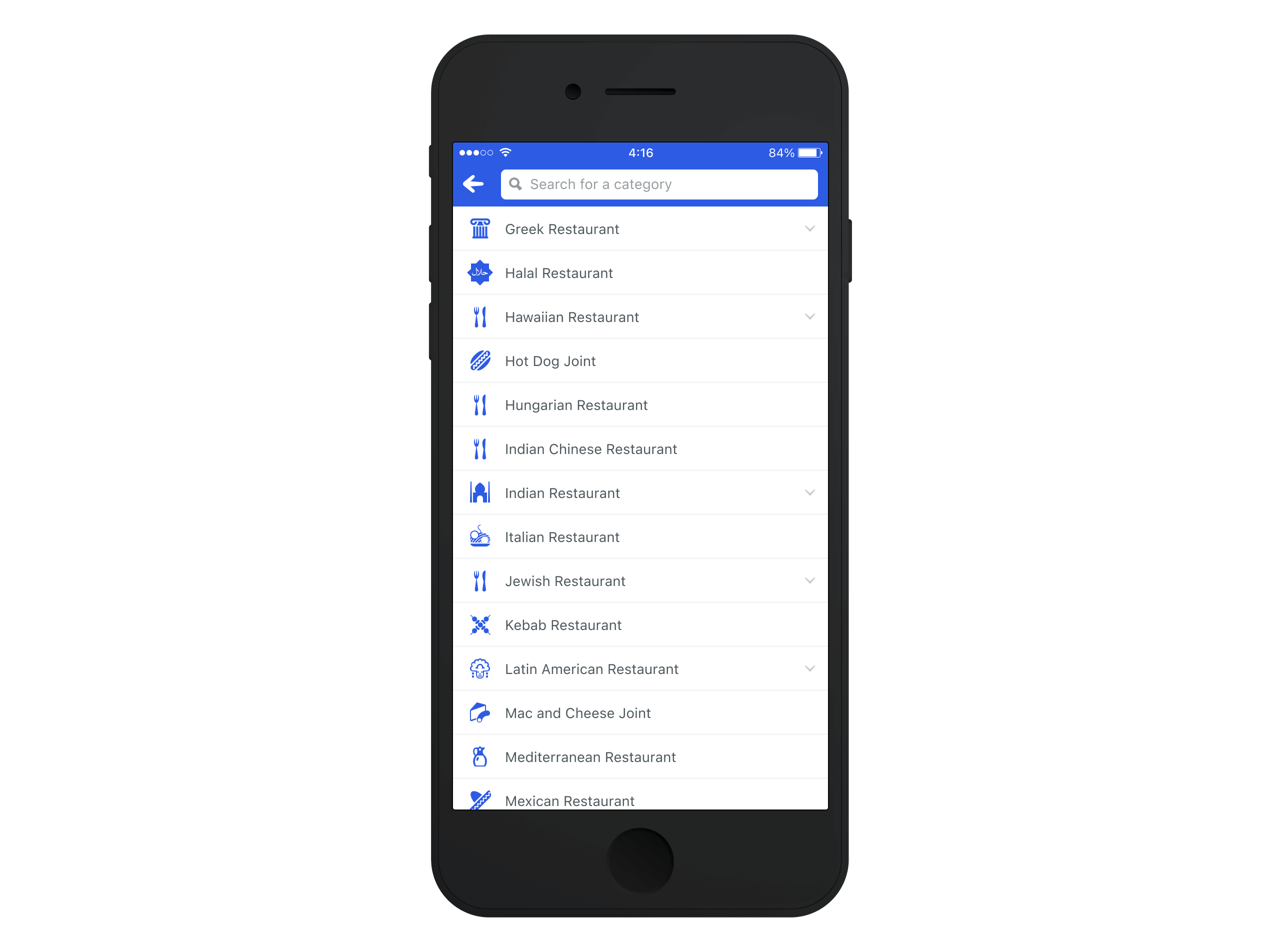
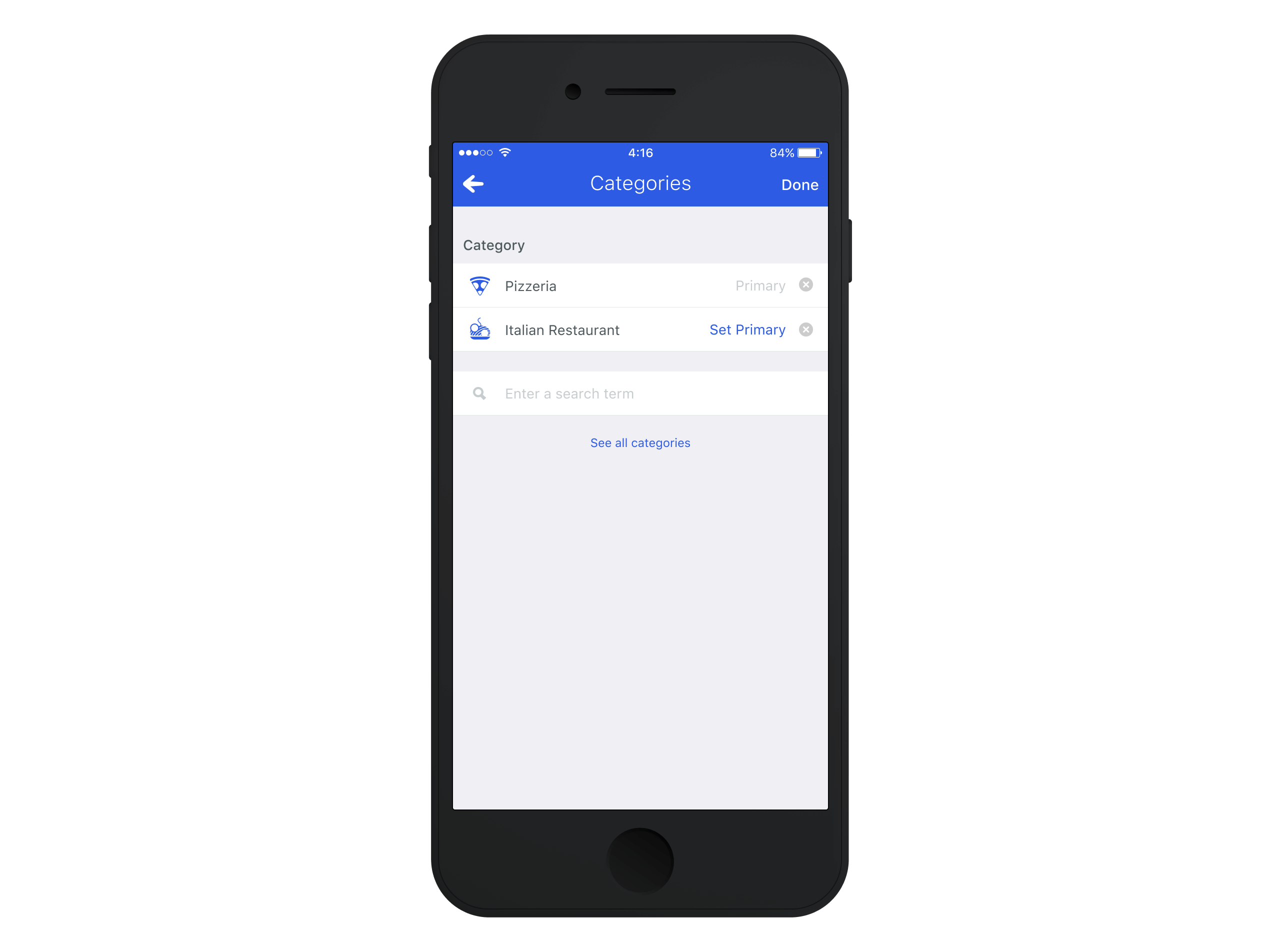
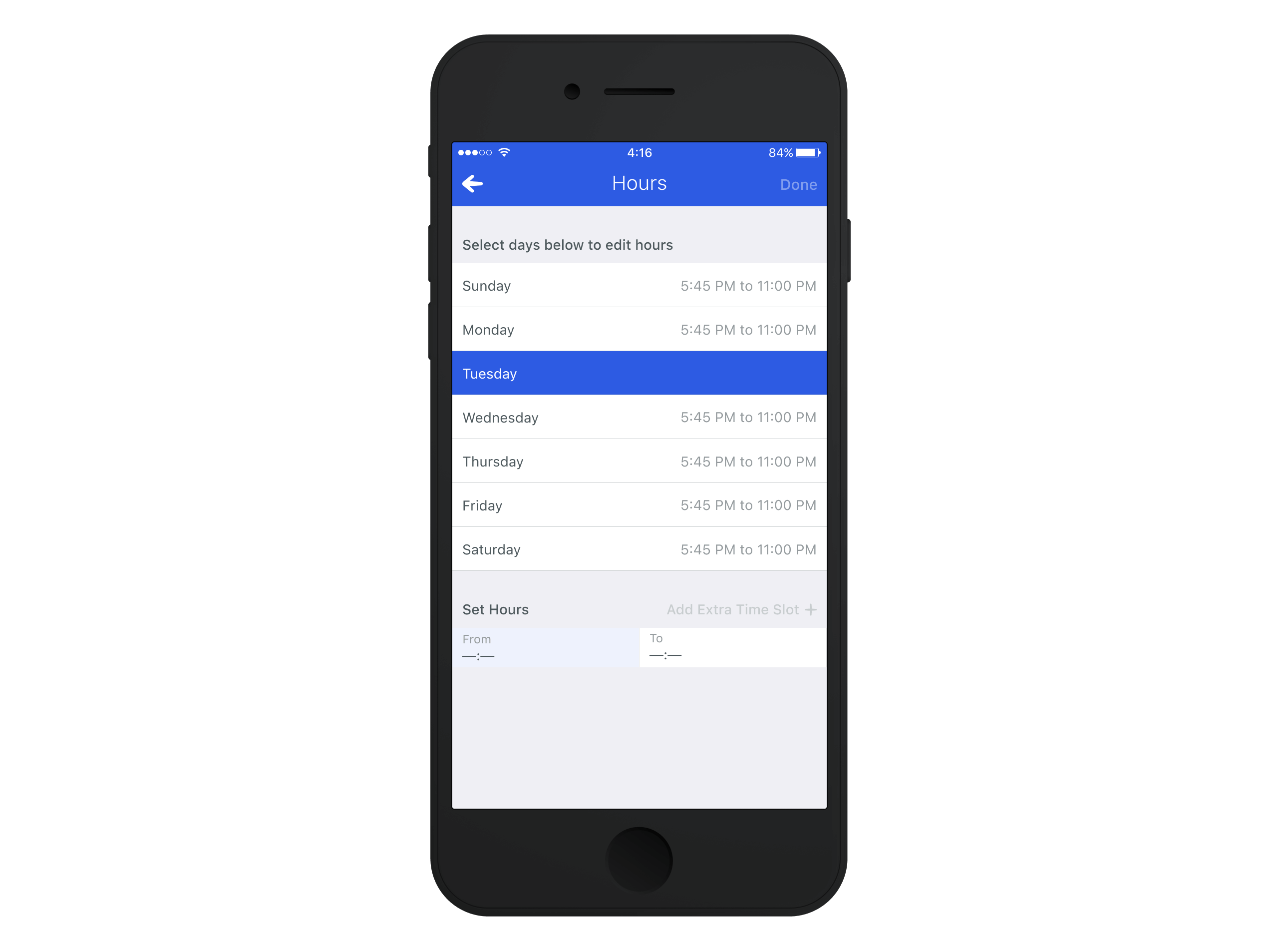
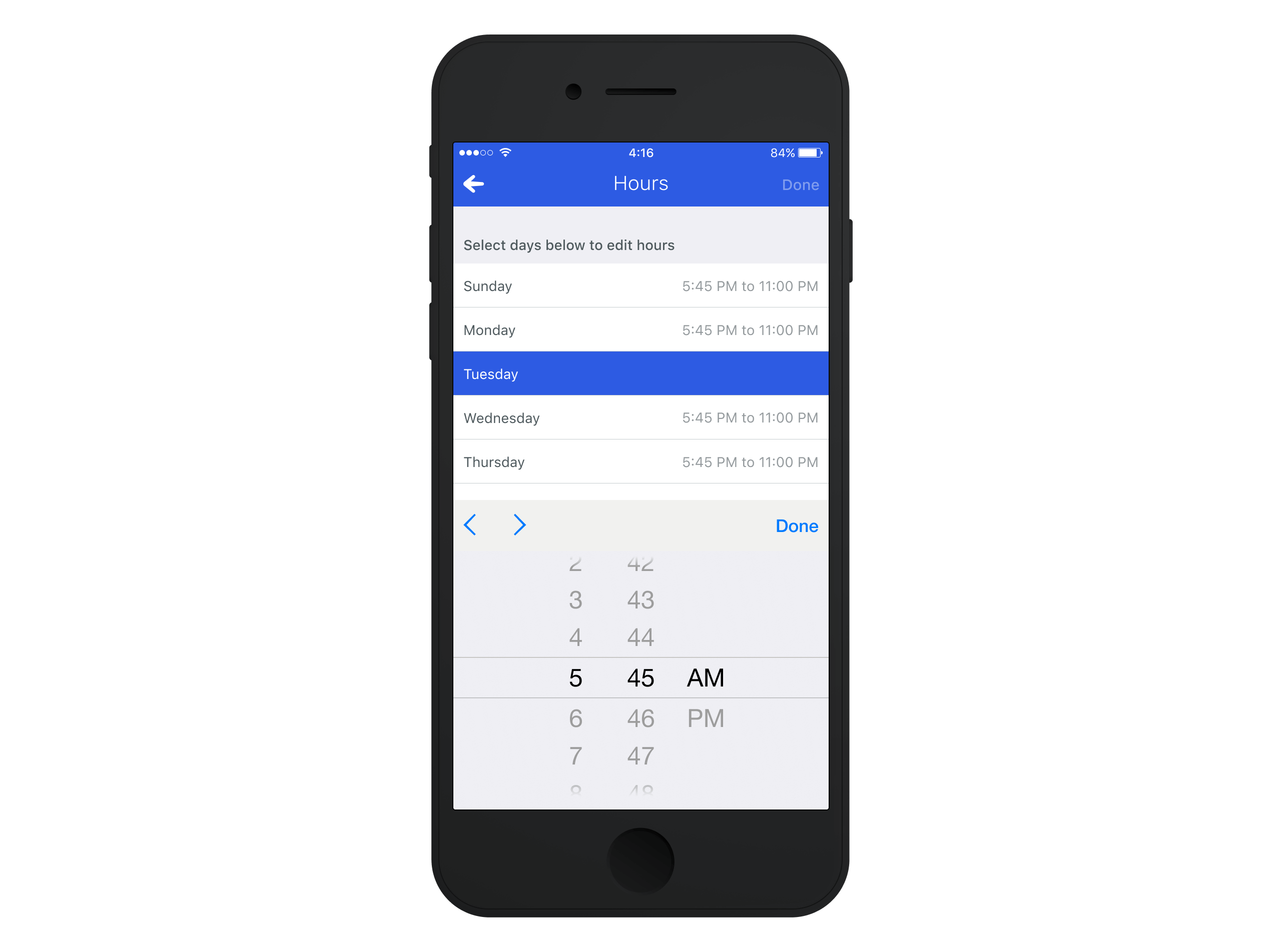
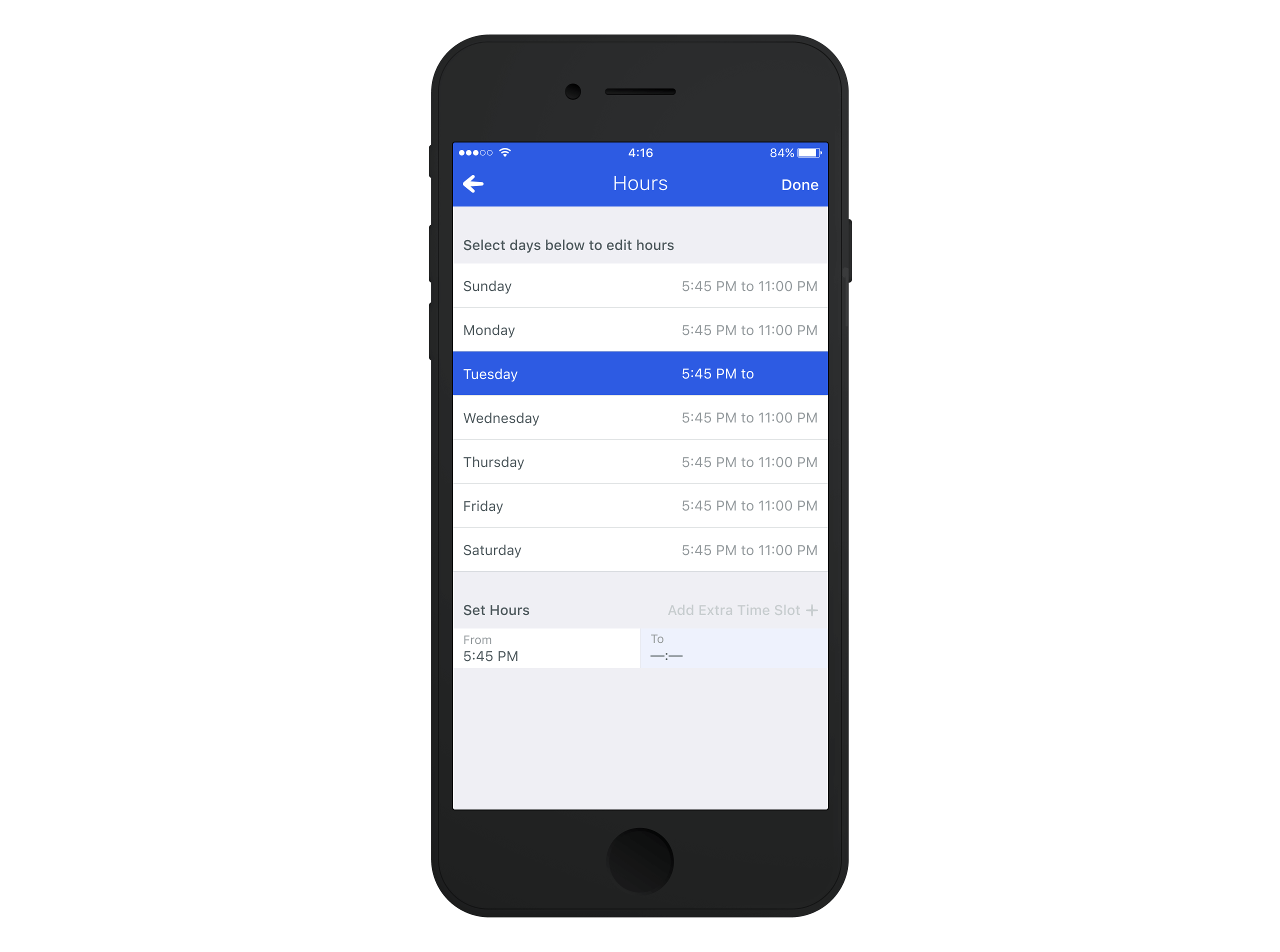
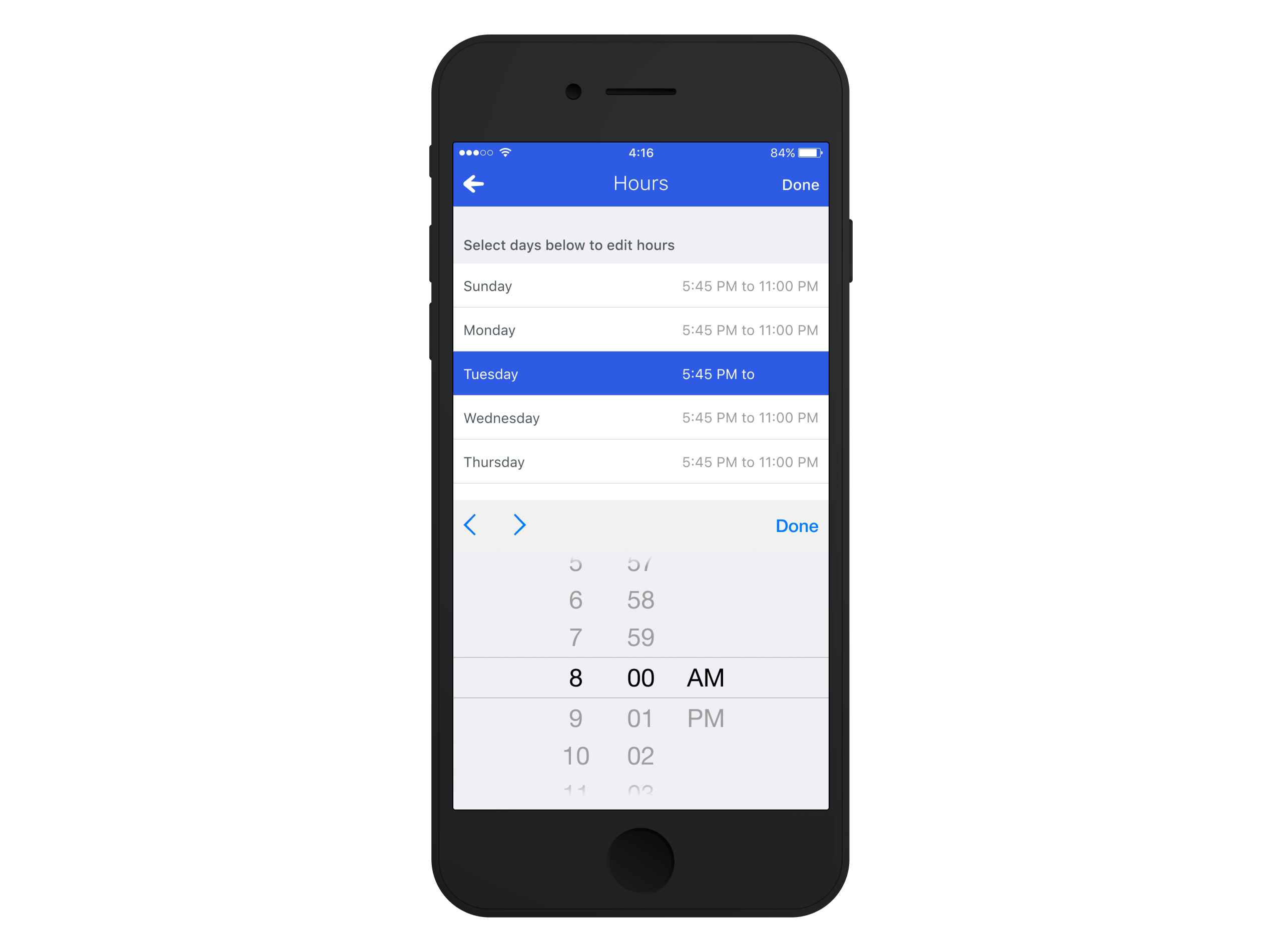
As part of Foursquare's mission to maintain one of the most comprehensive and accurate venue databases, we set out to bring the editing experience from desktop to mobile. This wasn't just about shrinking the interface for smaller screens—it was about rethinking the experience to make it seamless, intuitive, and built for our modern users. Whether someone noticed a missing detail or an incorrect address, the goal was to make contributing to the platform easier than ever, right from their phone.
01—Discover
Understanding the Problem
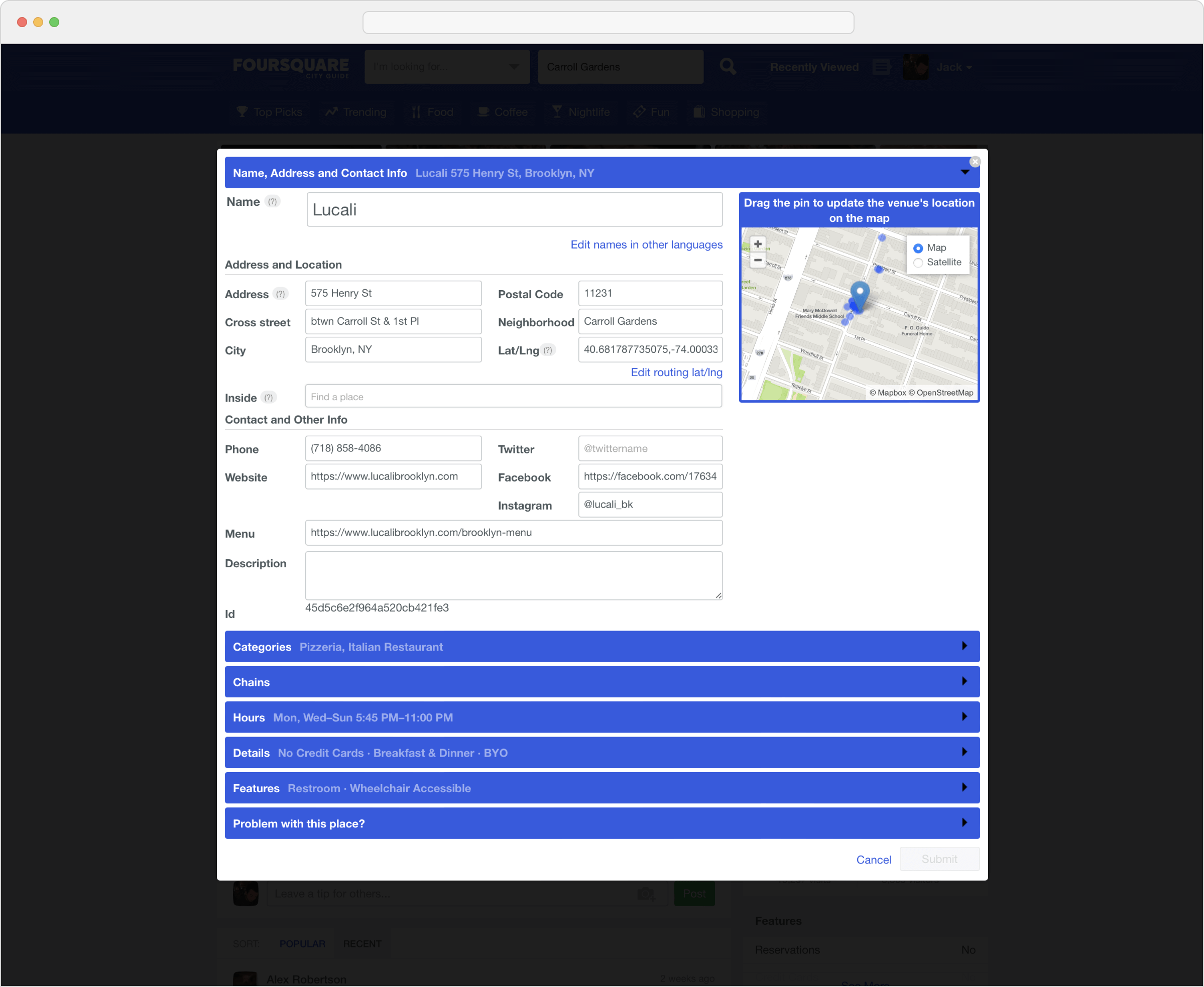
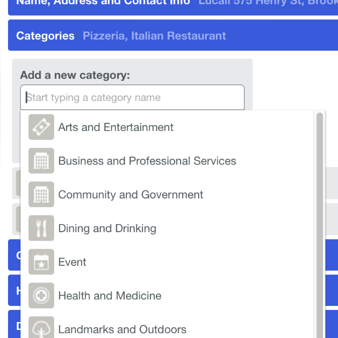
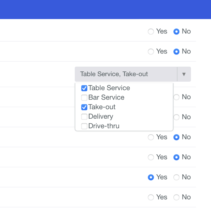
While the existing desktop app offered robust tools for maintaining and creating venue data, it was built when desktop usage still outpaced mobile. For our dedicated Superuser community1, this system was the backbone of their contributions to the platform. However, the lack of a mobile-friendly solution increased friction as mobile usage grew.
These screenshots of the desktop interface highlight the complexity of the existing system. While it worked well for detailed bulk edits, it was cumbersome and impractical for on-the-go use.
02—Define
User Research and Insights
Understanding the challenges of the existing system meant going straight to the people who used it most: our Superuser (SU) community. We organised a series of interviews, both online and in person, to learn about their challenges.
These conversations provided valuable insights into their workflows, frustrations, and aspirations for a tool to better support their contributions. The feedback was clear: although the desktop system was functional, it no longer met the needs of an increasingly mobile-first user base.
-
Often, I'll be out and about when I notice an issue, like an incorrect address or a place that's closed, but I can't fix it until I get home. By then, I've either forgotten, or it's just too much effort to deal with.
-
I've tried to use the desktop tools on my phone, but the interface doesn't scale at all. The text is too small, and I have to constantly pinch and zoom, which makes it really frustrating.
-
I already use the app for everything else, like checking in and finding places, so switching to a completely separate system to make edits feels disconnected. I wish everything lived in one place.
-
I don't always need all the options the desktop interface has. Sometimes, I just want to quickly mark a venue as closed or fix a typo without going through all the extra fields.
While this feedback highlighted key pain points, we also examined behavioural data to understand how people used the add/edit tools. This allowed us to measure the scope of the challenges and refine our approach accordingly.
Measuring Engagement and Defining Key Metrics
Beyond understanding user frustrations through direct research, we also analysed engagement data to quantify how people interacted with the existing flow. As we set out to design a new mobile-first experience, it became clear that the workflows for adding and editing venues needed to be distinct, and the data revealed essential patterns.
In some cases, users weren't setting out to create a new venue; they were trying to check-in. When searching for a location, they couldn't find it in the results, leaving them with no choice but to create it themselves. Since their primary goal was to check in, they prioritised speed over completeness, filling out only the bare minimum required to proceed. This reinforced the need for a lightweight Add Flow that captured only essential details.
In contrast, venue editing behaviour was different. Users focused their updates on entirely different sets of attributes, which tended to be edited in batches rather than making one-off changes.
| Feature | Add Flow | Edit Flow |
|---|---|---|
| Name | Yes | Yes |
| Address | Yes | Yes |
| Category | Yes | Yes |
| Private | Yes | Yes |
| Inside of (Location) | No | Yes |
| Chain | No | Yes |
| Hours | No | Yes |
| Food & Drink | No | Yes |
| Features | No | Yes |
| Socials | No | Yes |
| Report | No | Yes |
03—Ideate
Venue Editing for Scannability and Usability
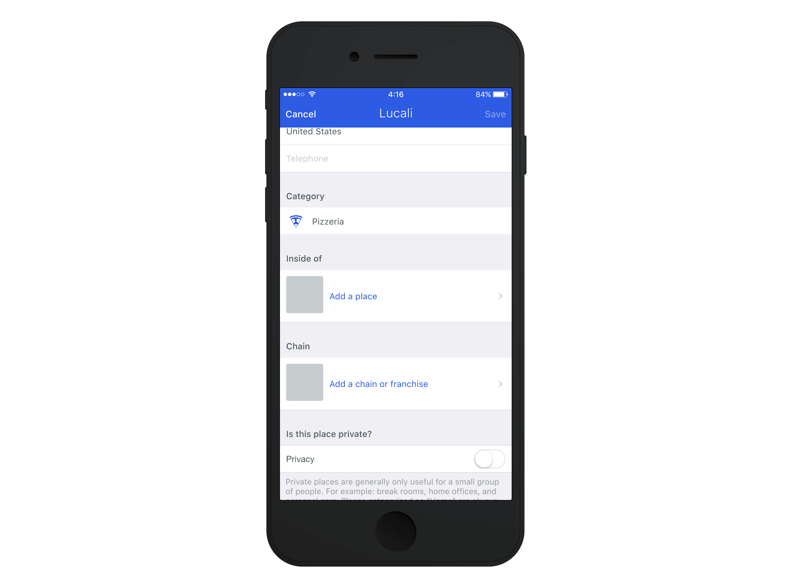
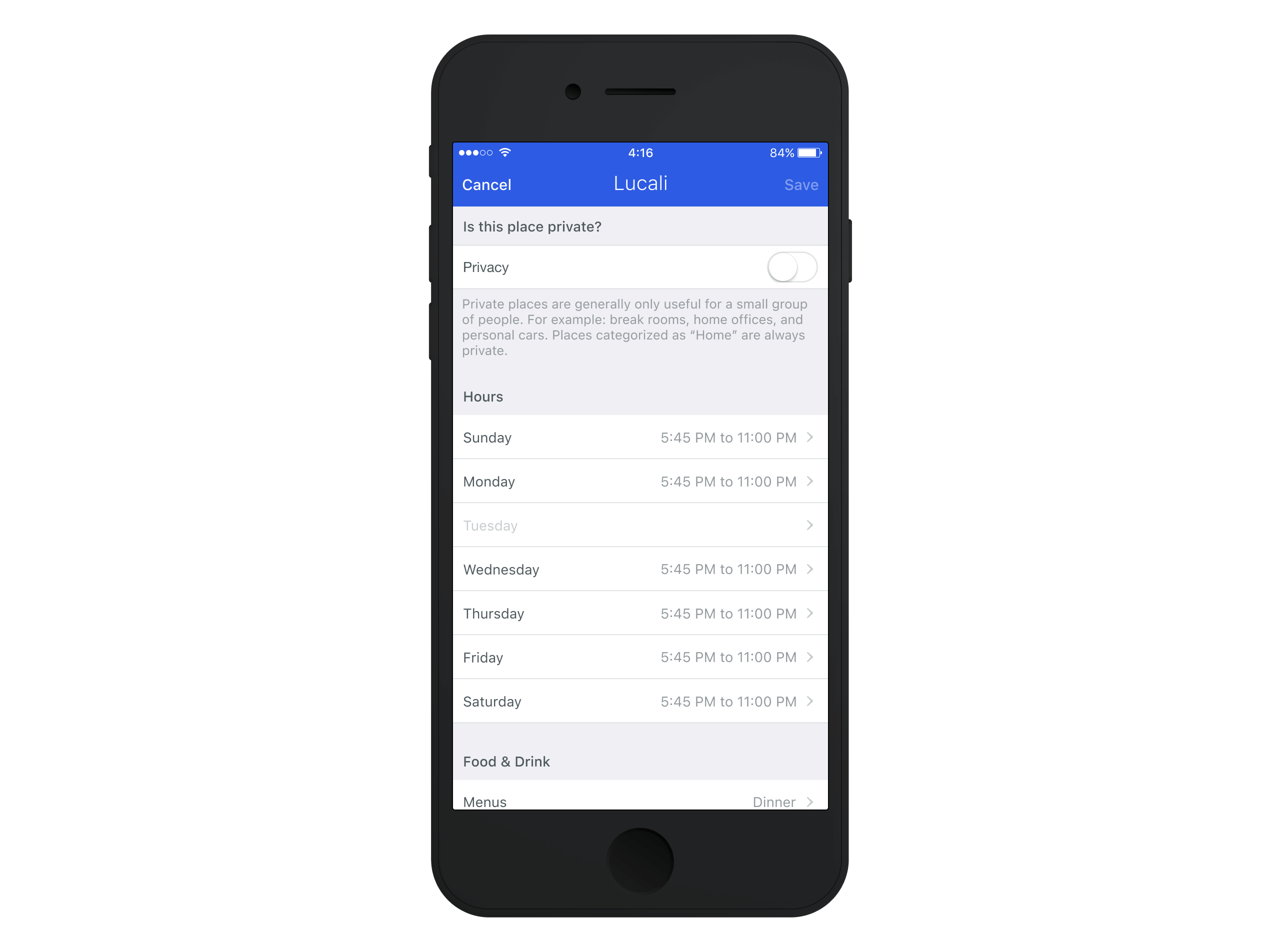
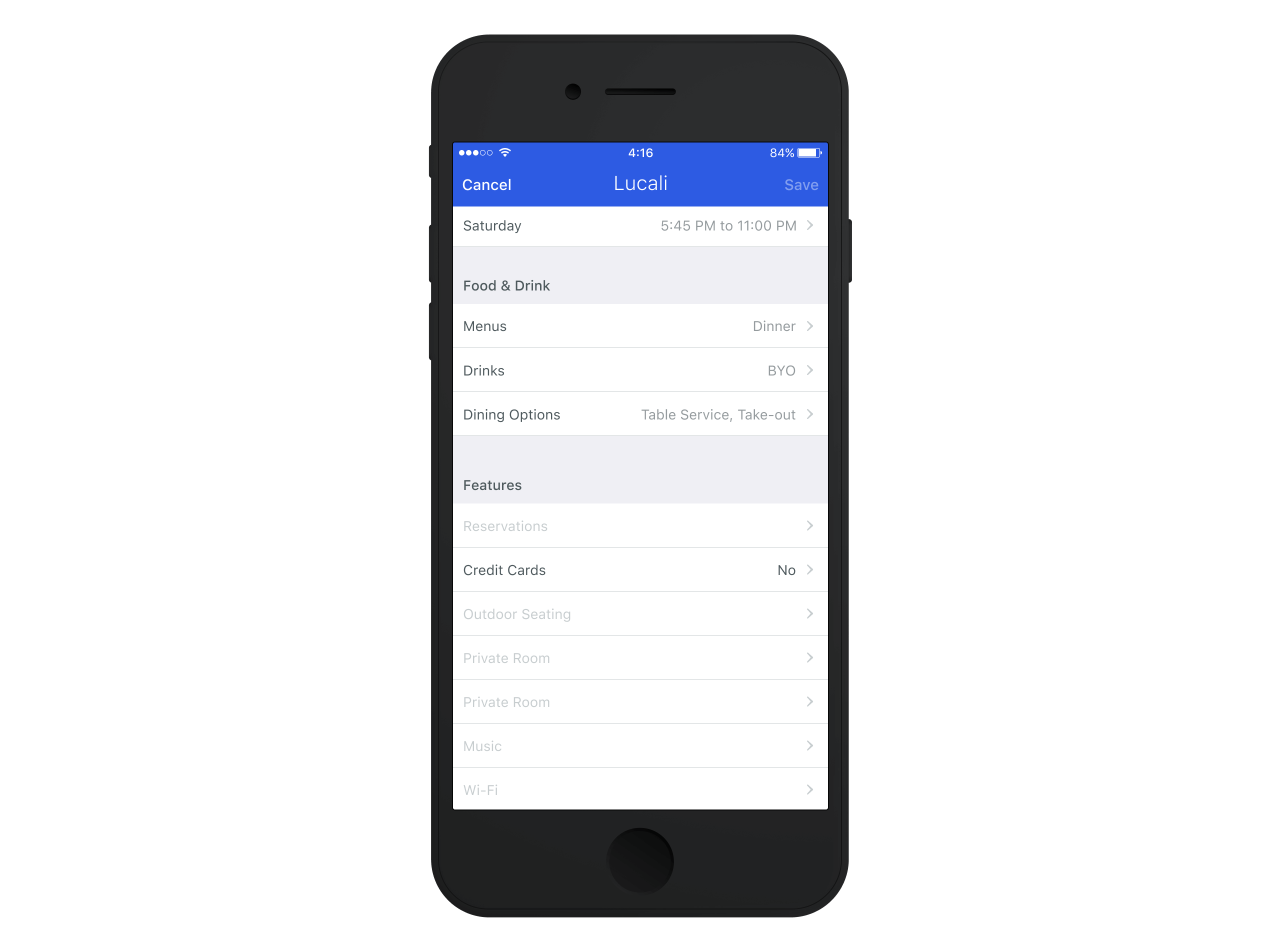
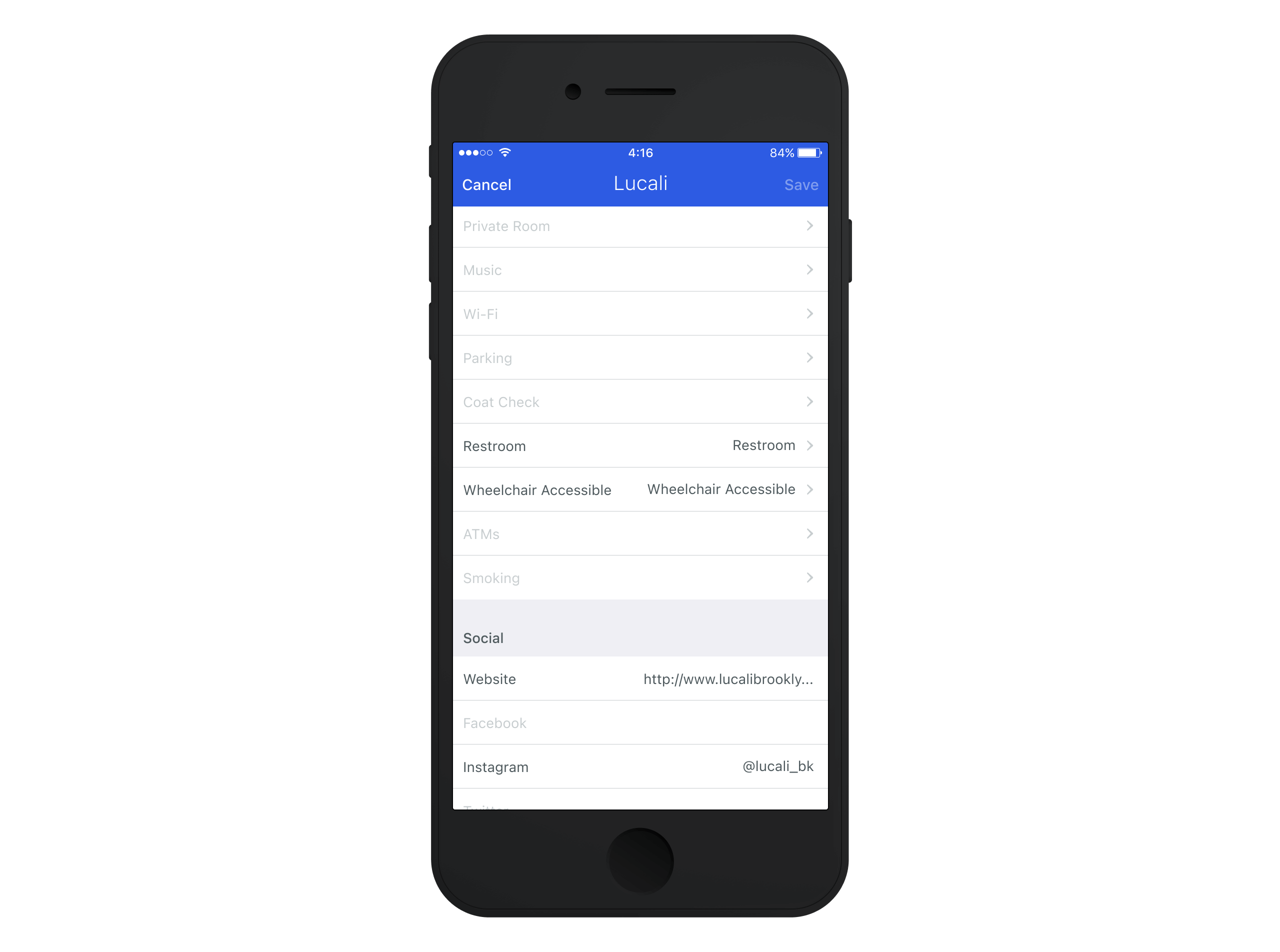
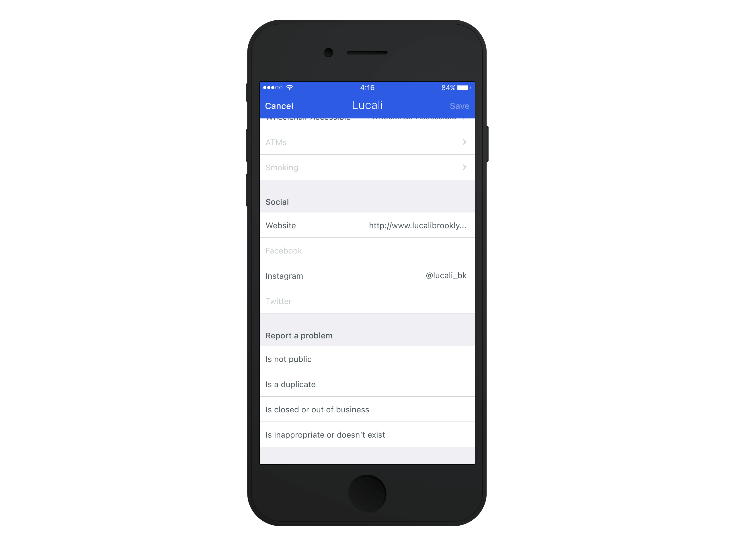
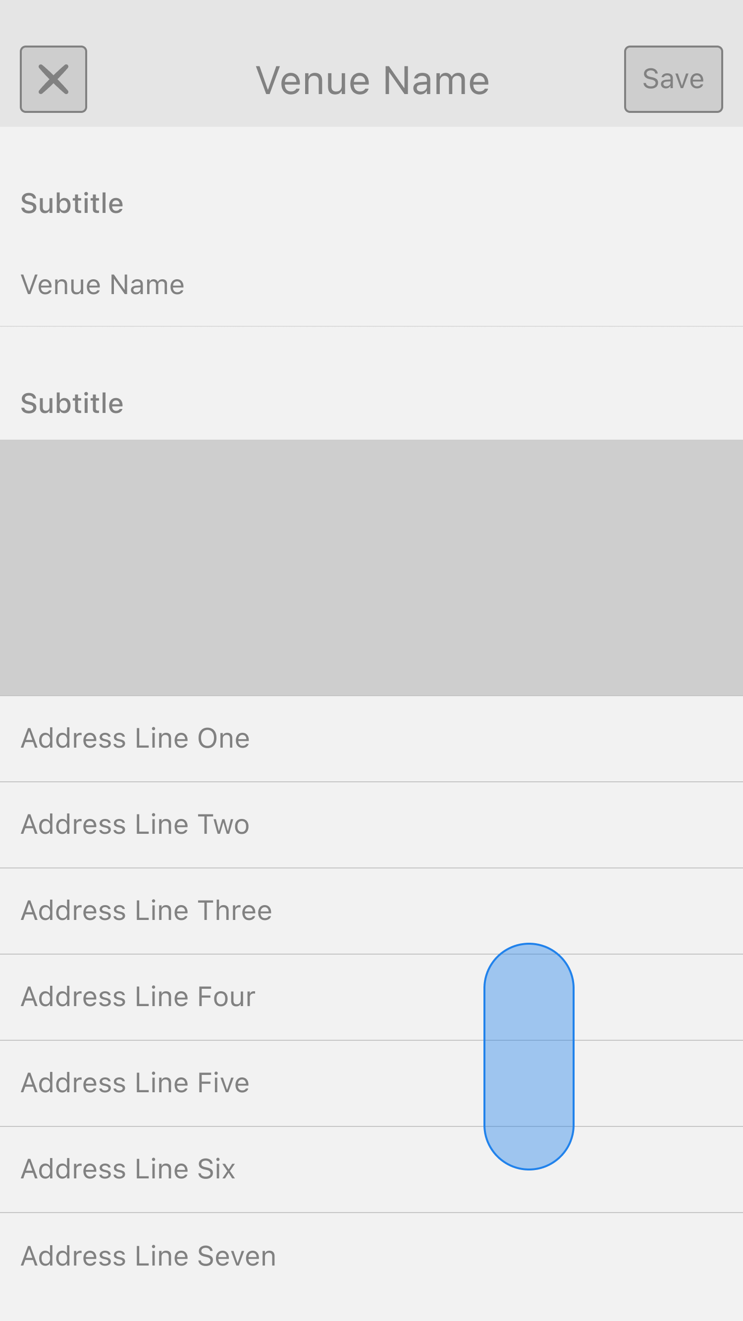
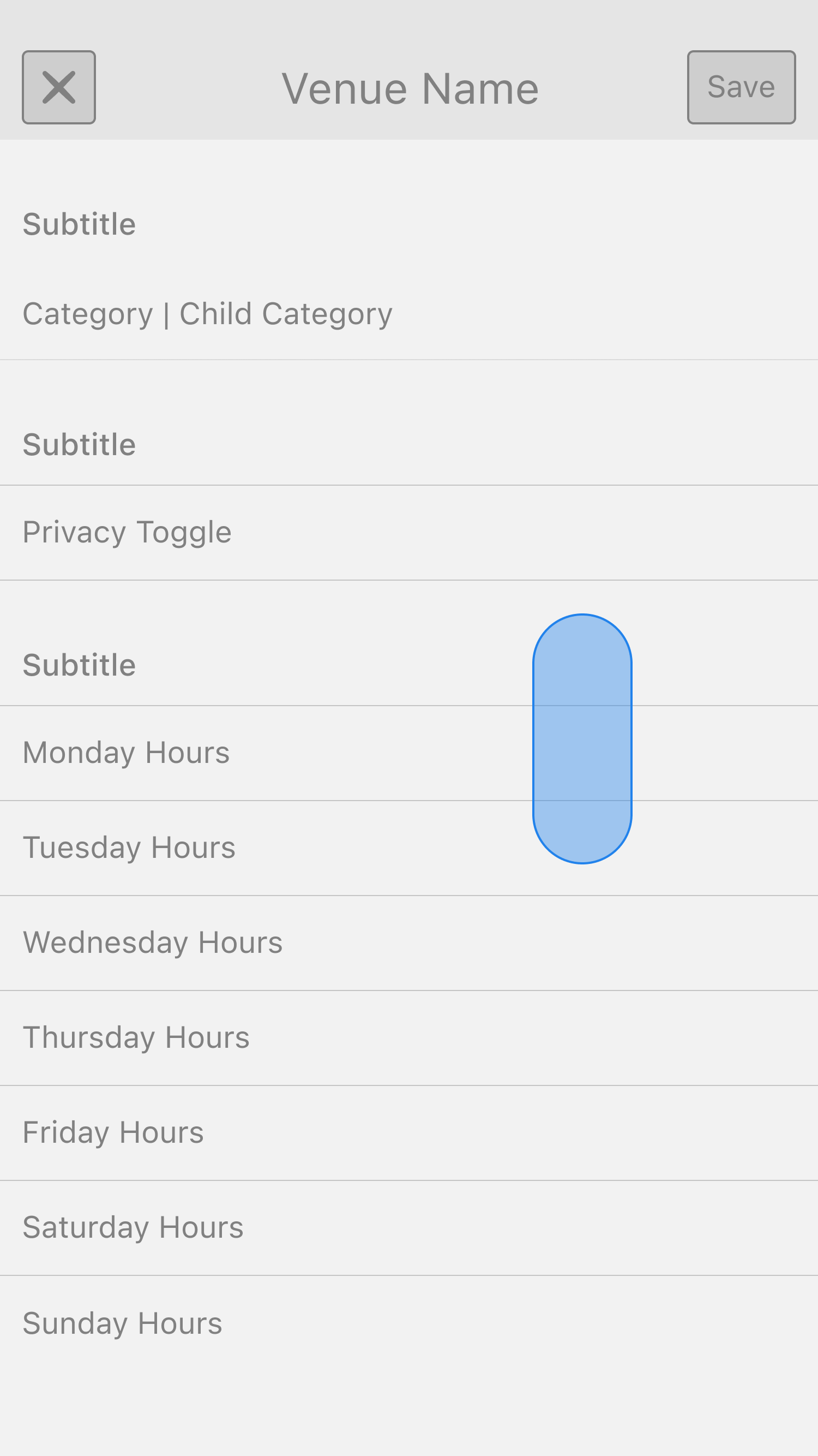
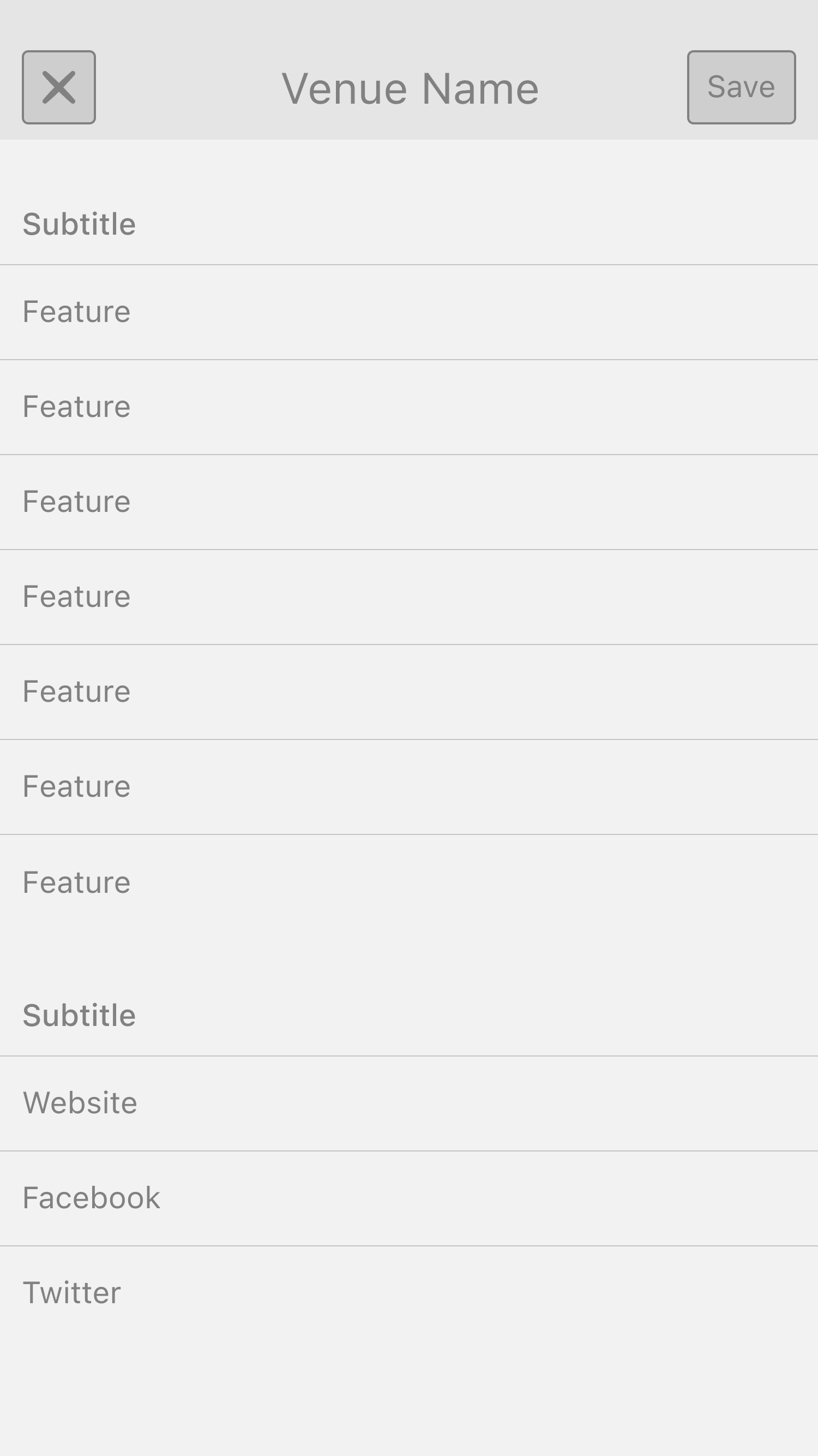
Designing the Edit Flow required balancing scannability, accessibility, and structured input. Users needed to see all available venue attributes upfront for quick reference, but that didn't mean they should be able to edit everything inline.
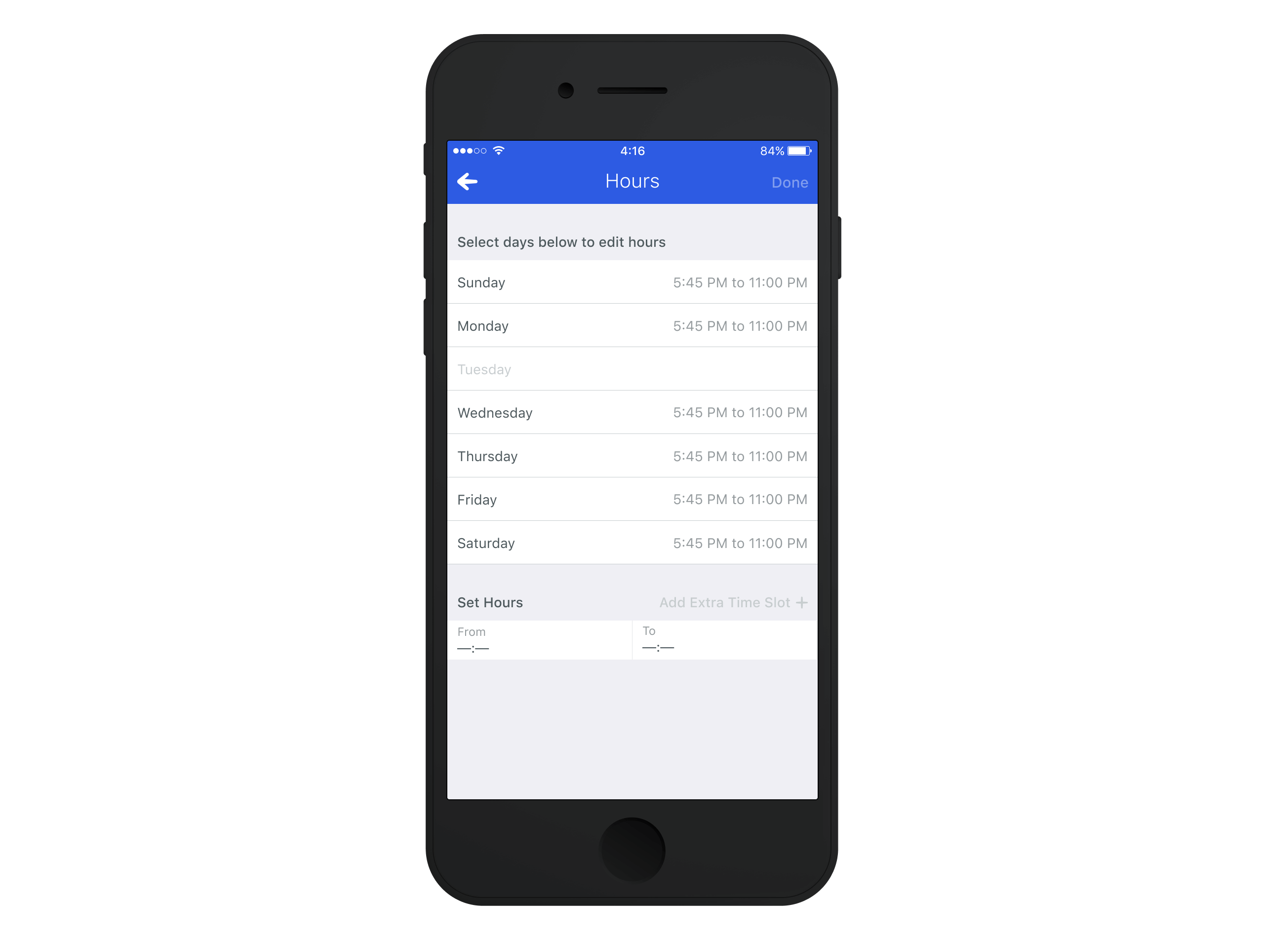
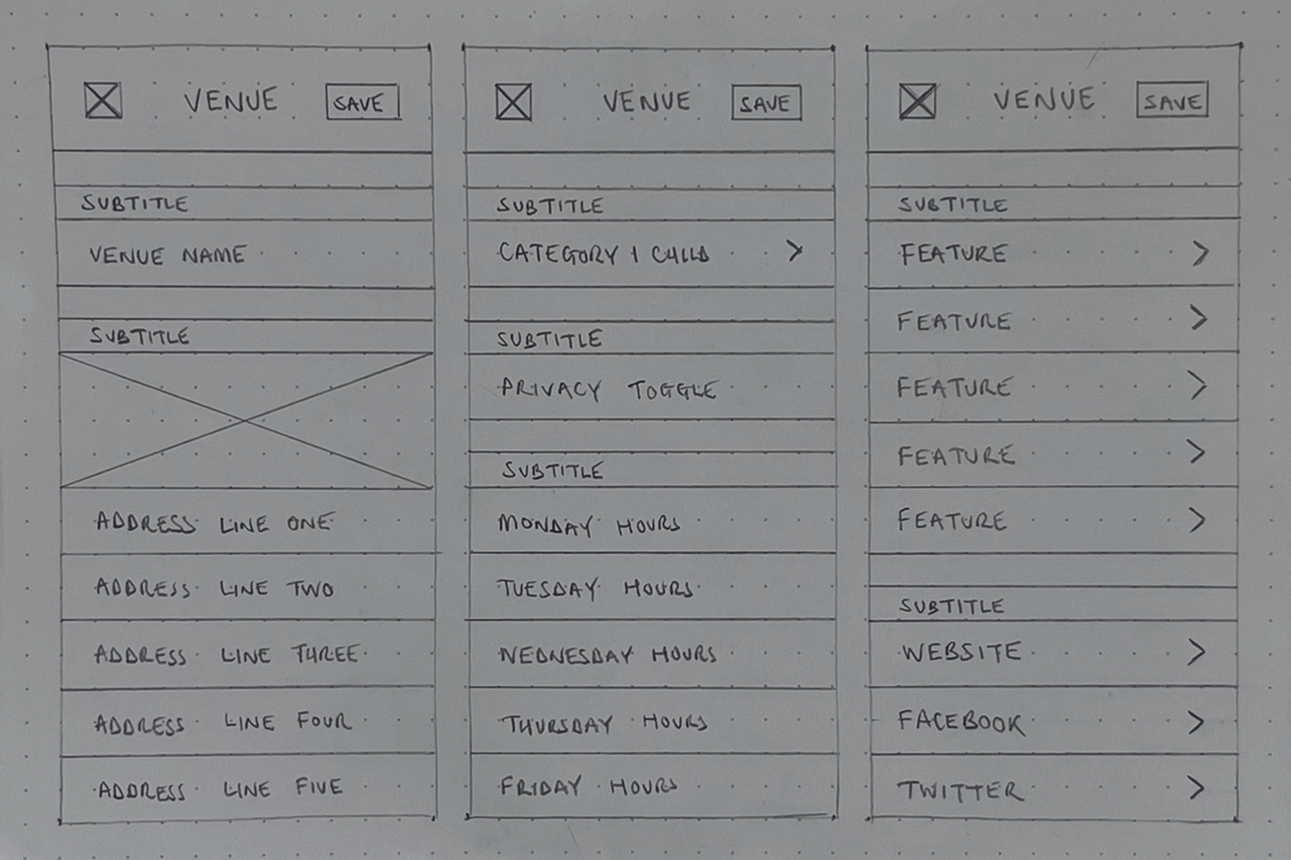
Our research showed that users might not be updating only one field; they could modify multiple attributes in a single session. Because of this, all venue attributes needed to be exposed at the top level of the edit page. However, showcasing immediately editable inline fields created too much visual noise and risked overwhelming users with an overly complex interface. Instead, we looked to design the edit screen using a list structure, where each attribute was presented as a list item that users could tap into for deeper edits.
To enhance clarity, we looked into a visual state system:
- Sections with existing data appeared in standard text.
- Sections without data were visually muted, signalling their inactive state.
- Despite appearing inactive, these sections were still fully tappable, allowing users to edit them as needed.
This approach ensured users could quickly scan all available attributes while preserving a clean, organised layout.
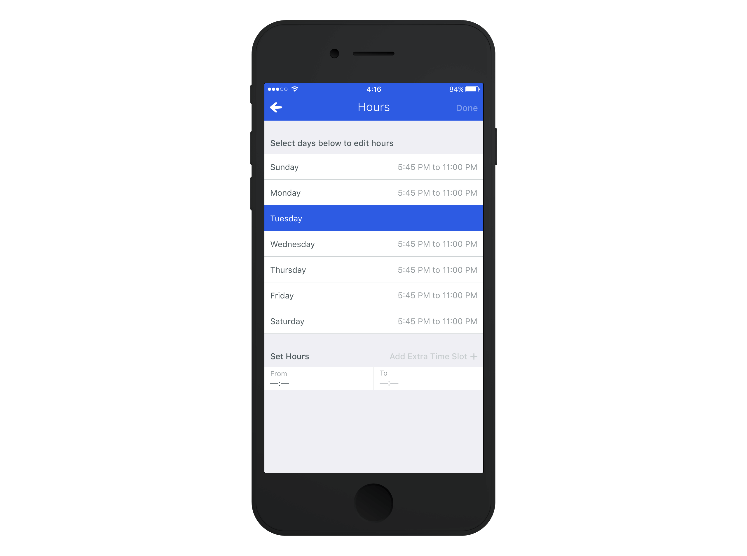
Toggle on to Edit
While we structured the interface to promote scannability, we also needed to ensure efficiency for users making multiple edits in one session.
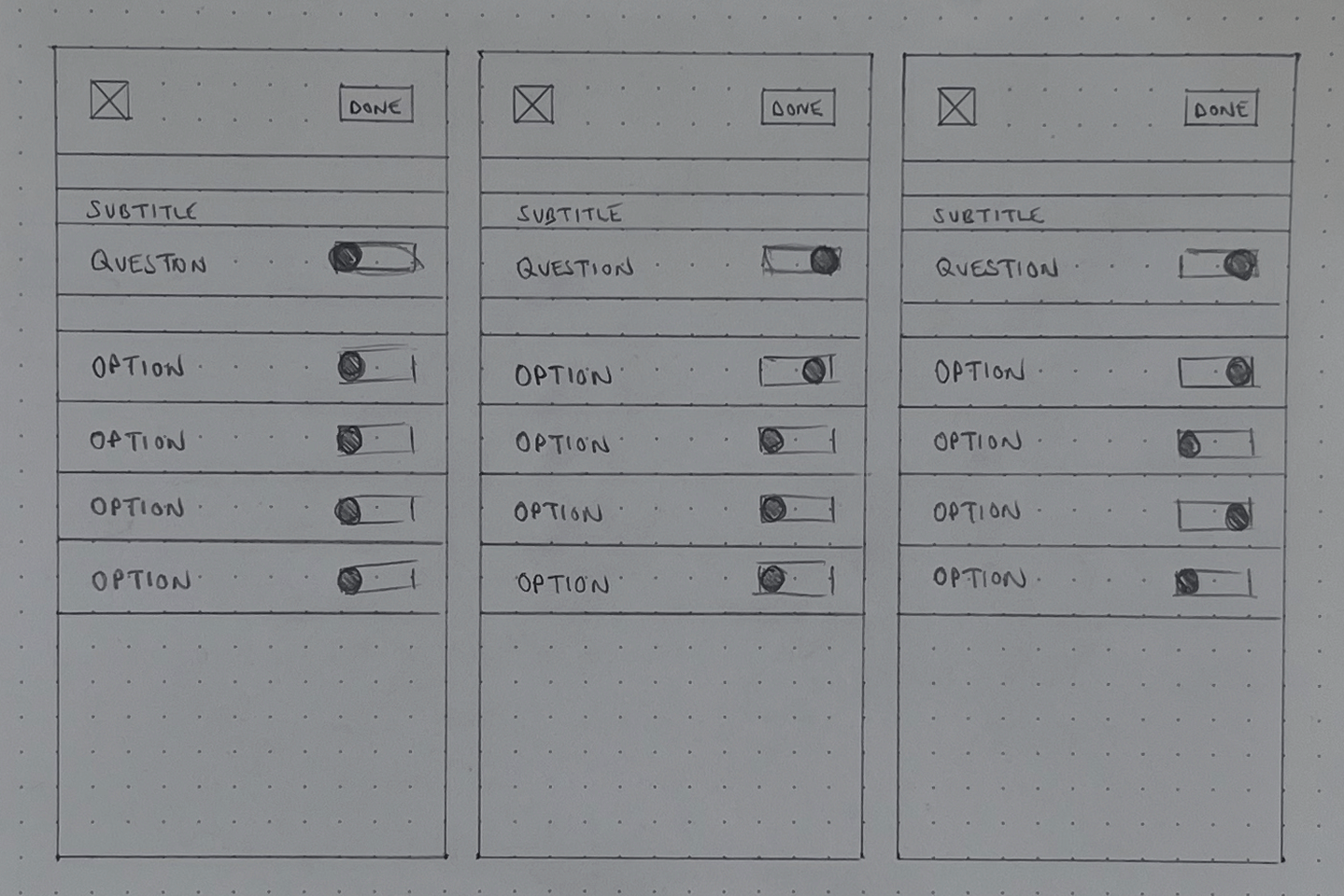
Simply listing all editable fields on the main screen felt cluttered and chaotic, while forcing users to navigate through multiple secondary views added unnecessary friction. We needed a way to balance visibility with control—allowing users to scan all attributes at a glance but edit them in a structured way.
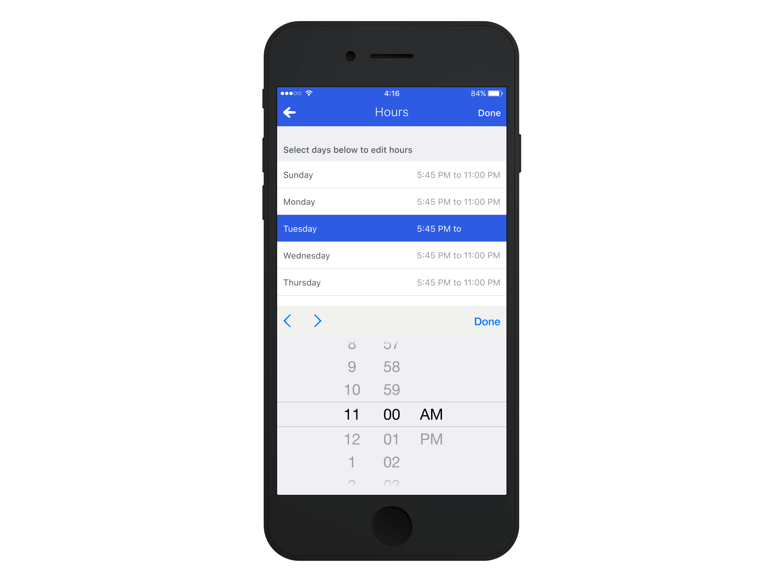
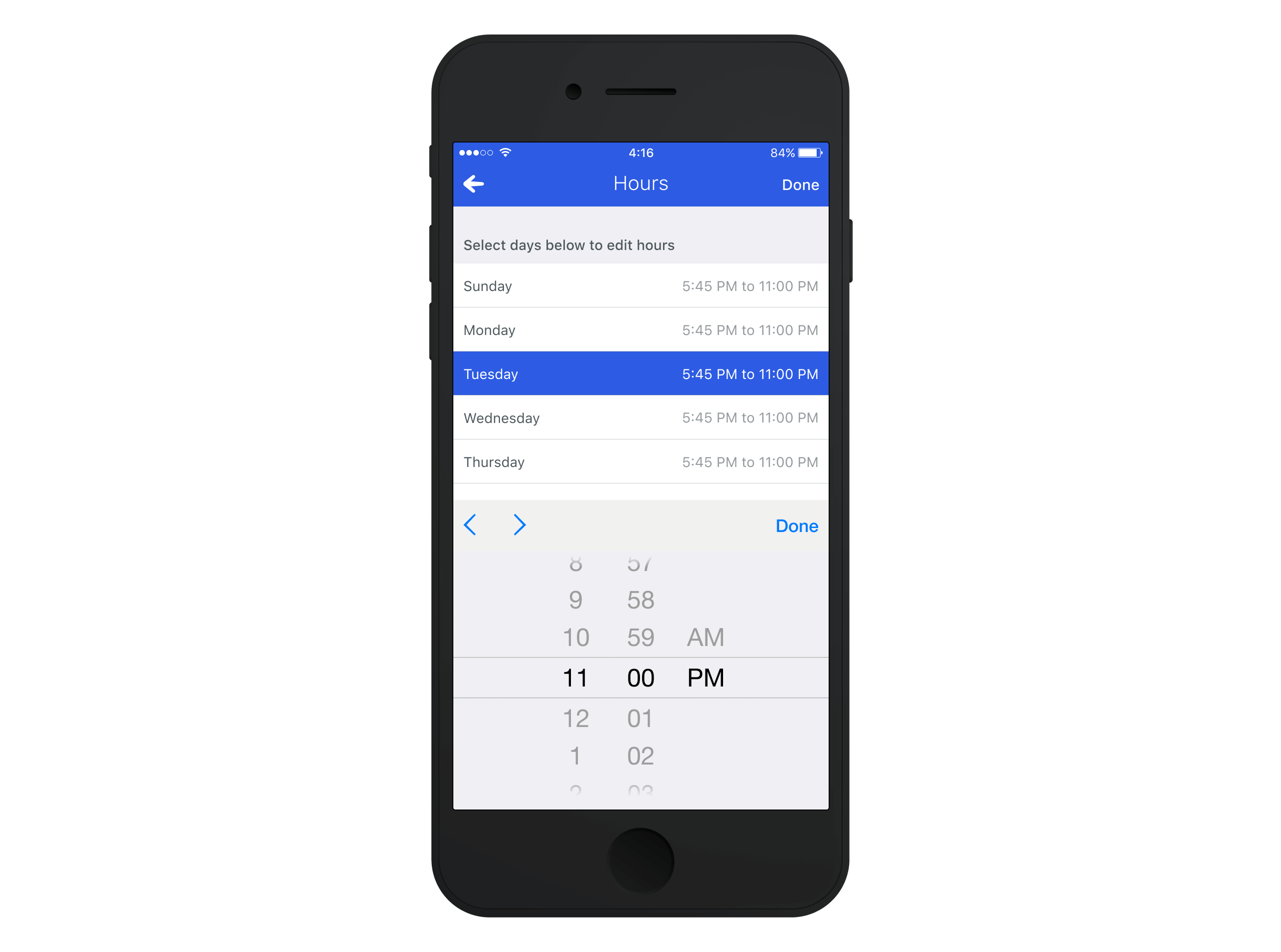
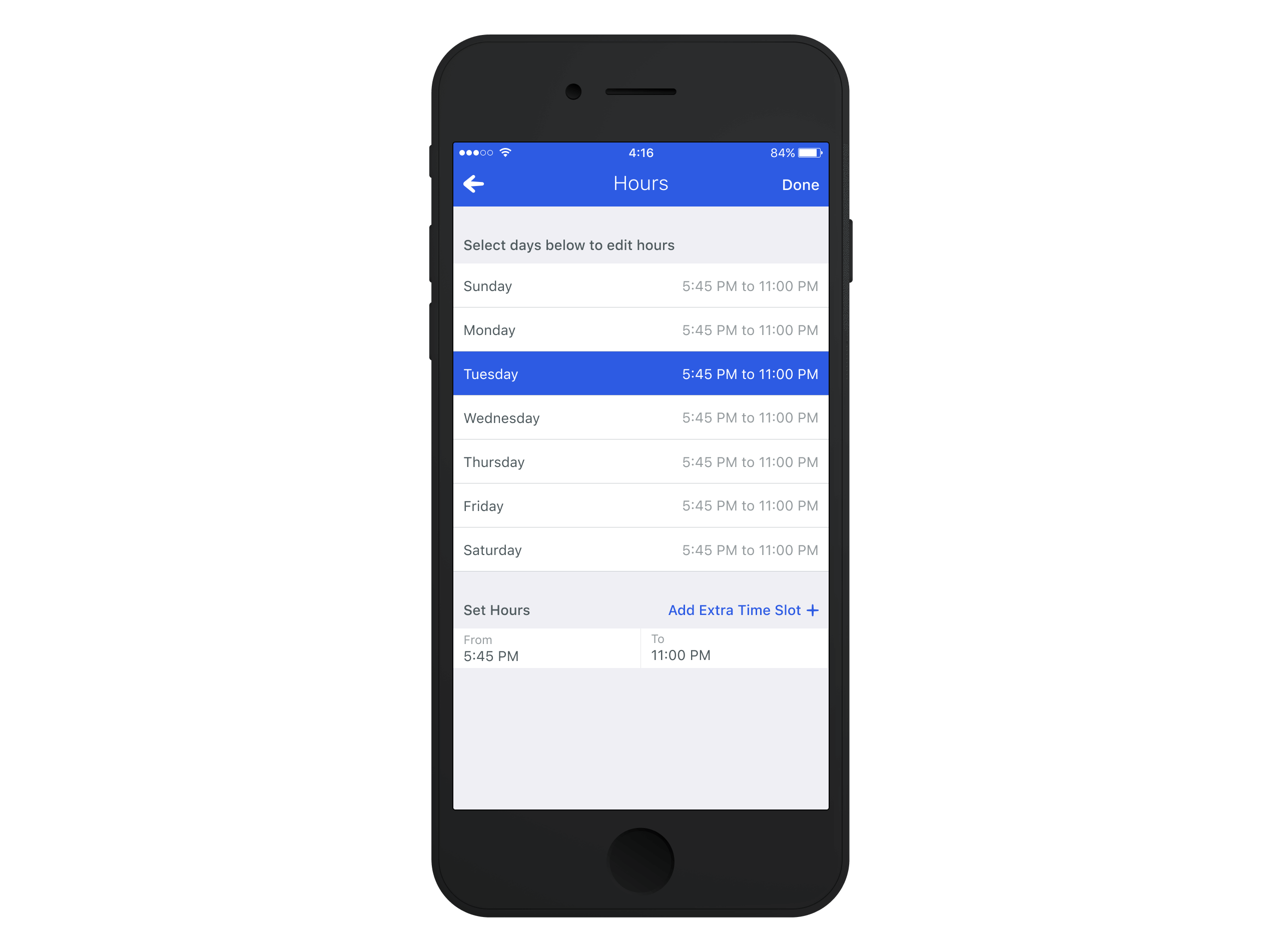
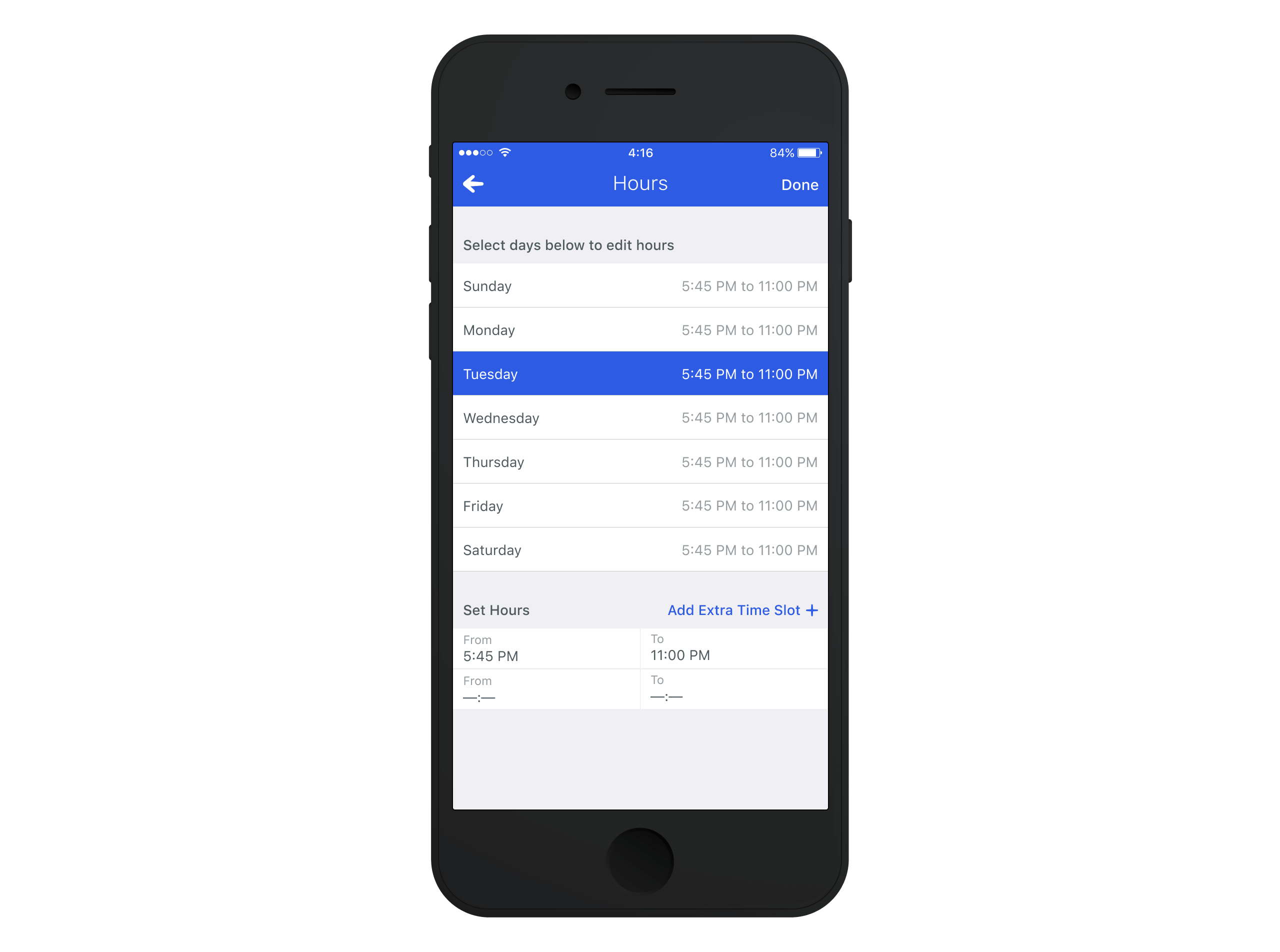
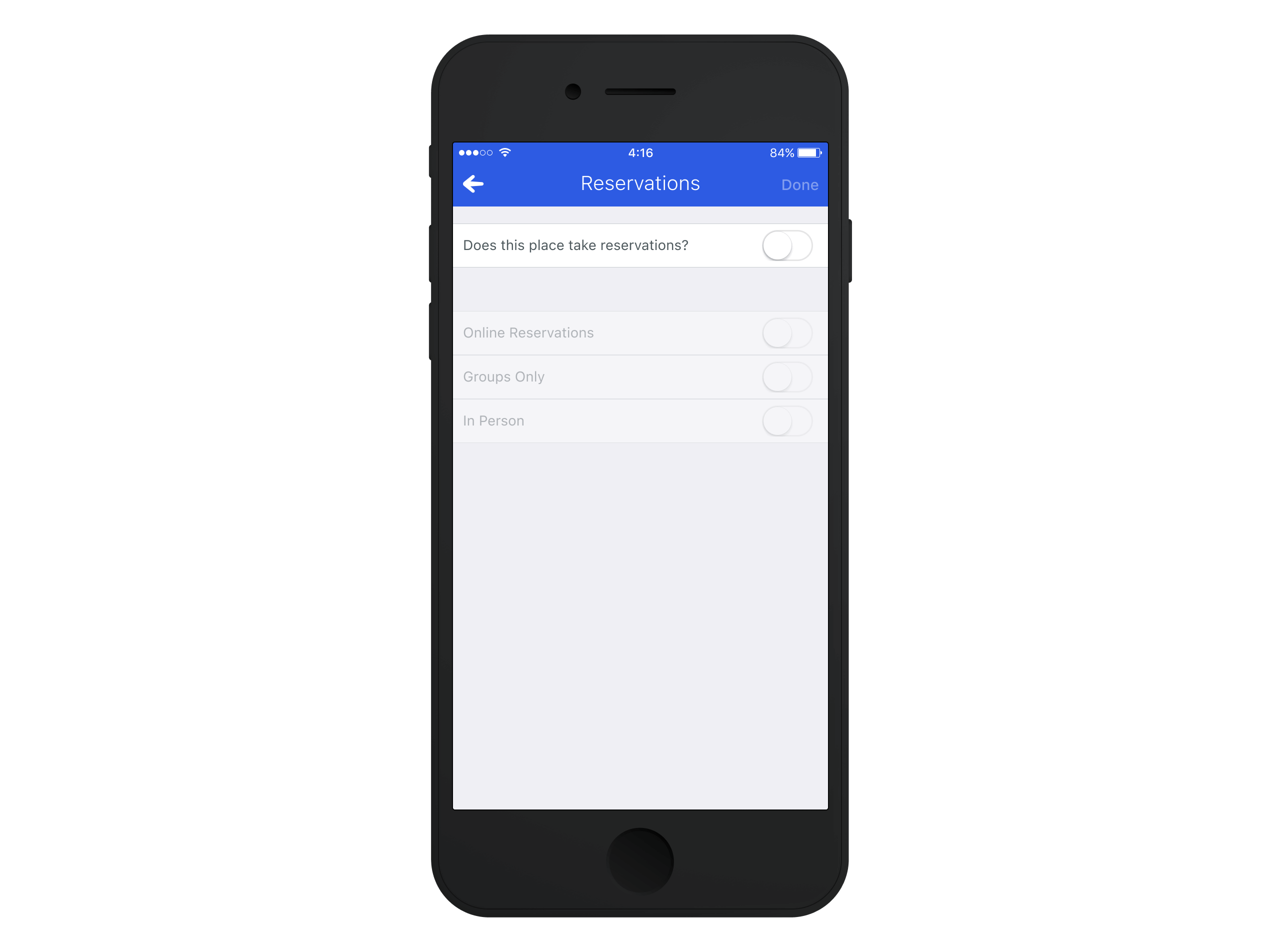
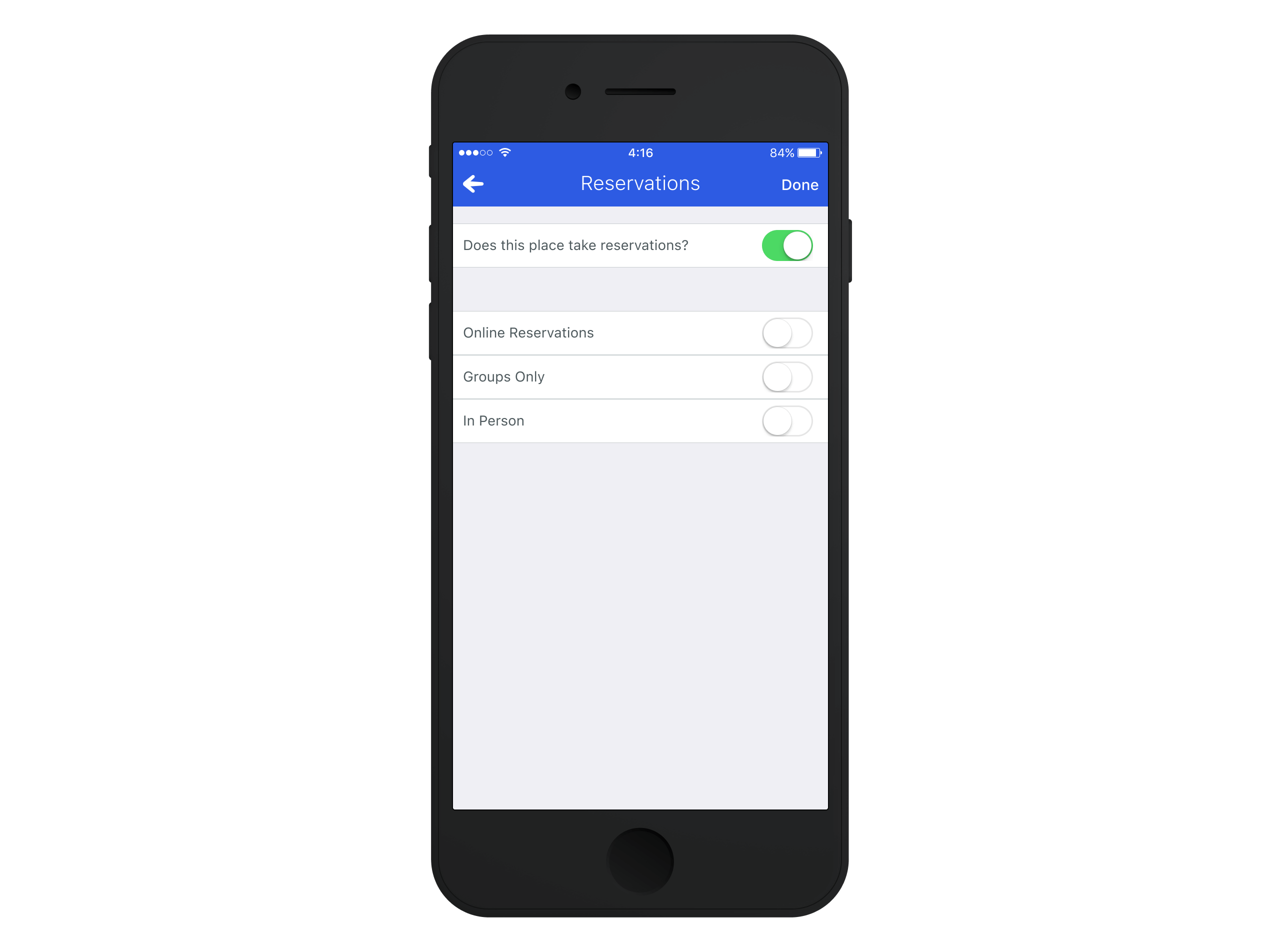
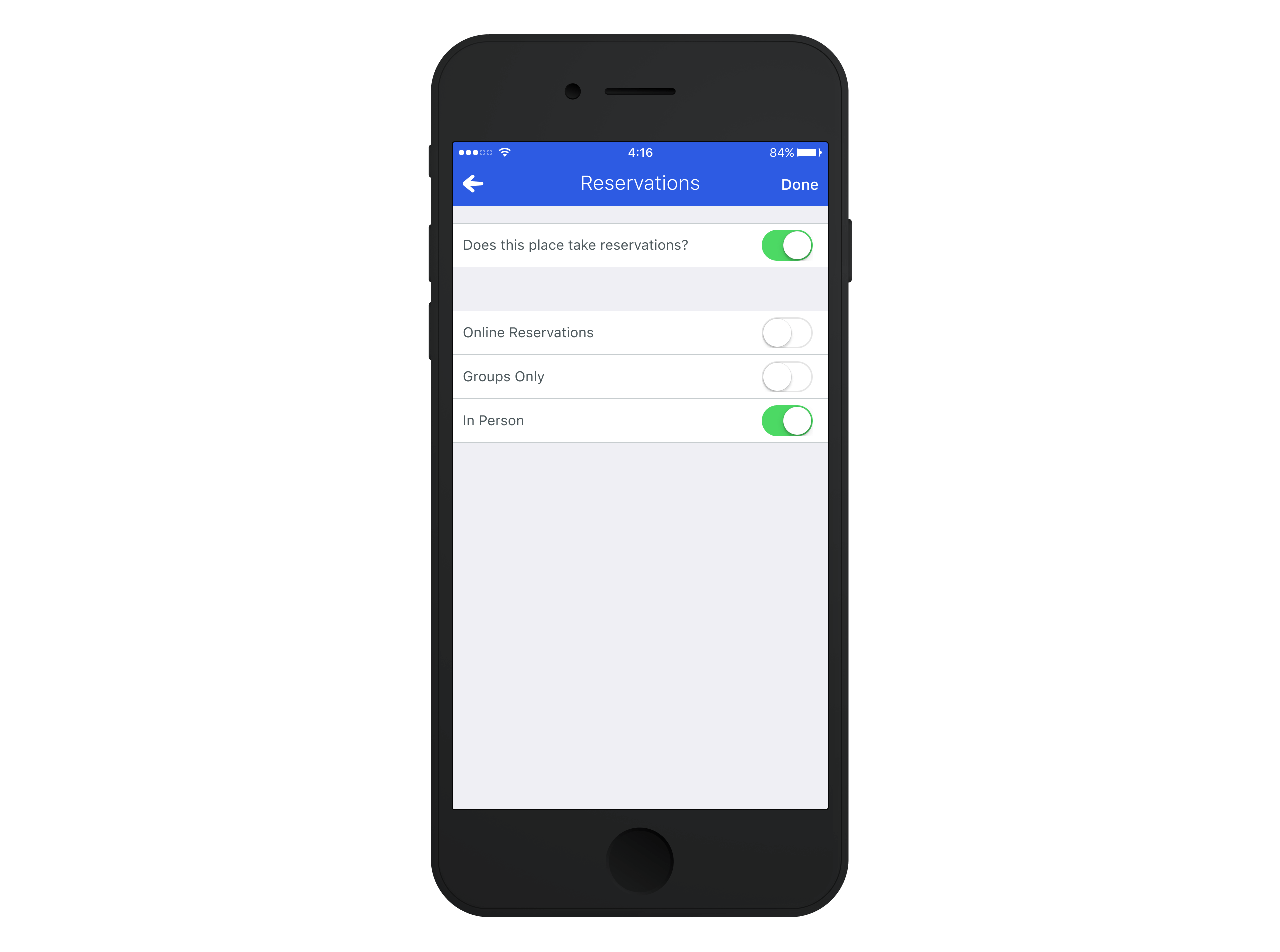
This led us to investigate section-level toggles. Instead of forcing users to enable each field individually, they could tap a section to open it, toggle the section "on" to unlock all its fields for editing and then make multiple changes within that structured dedicated edit view.
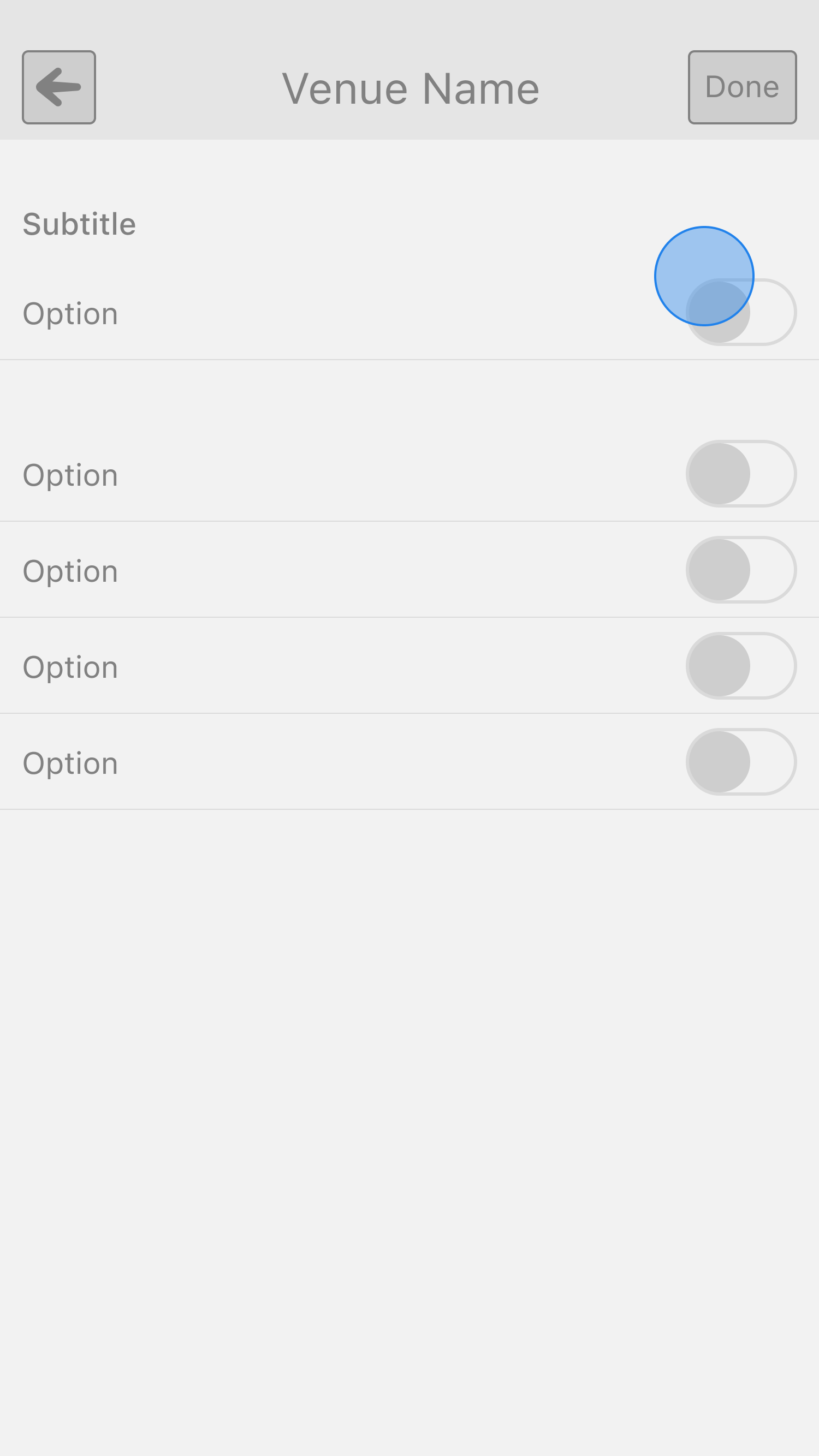
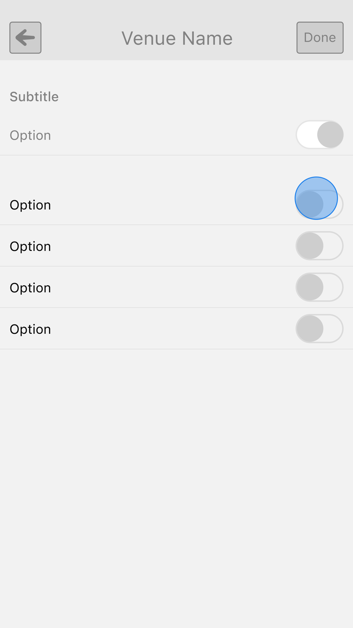
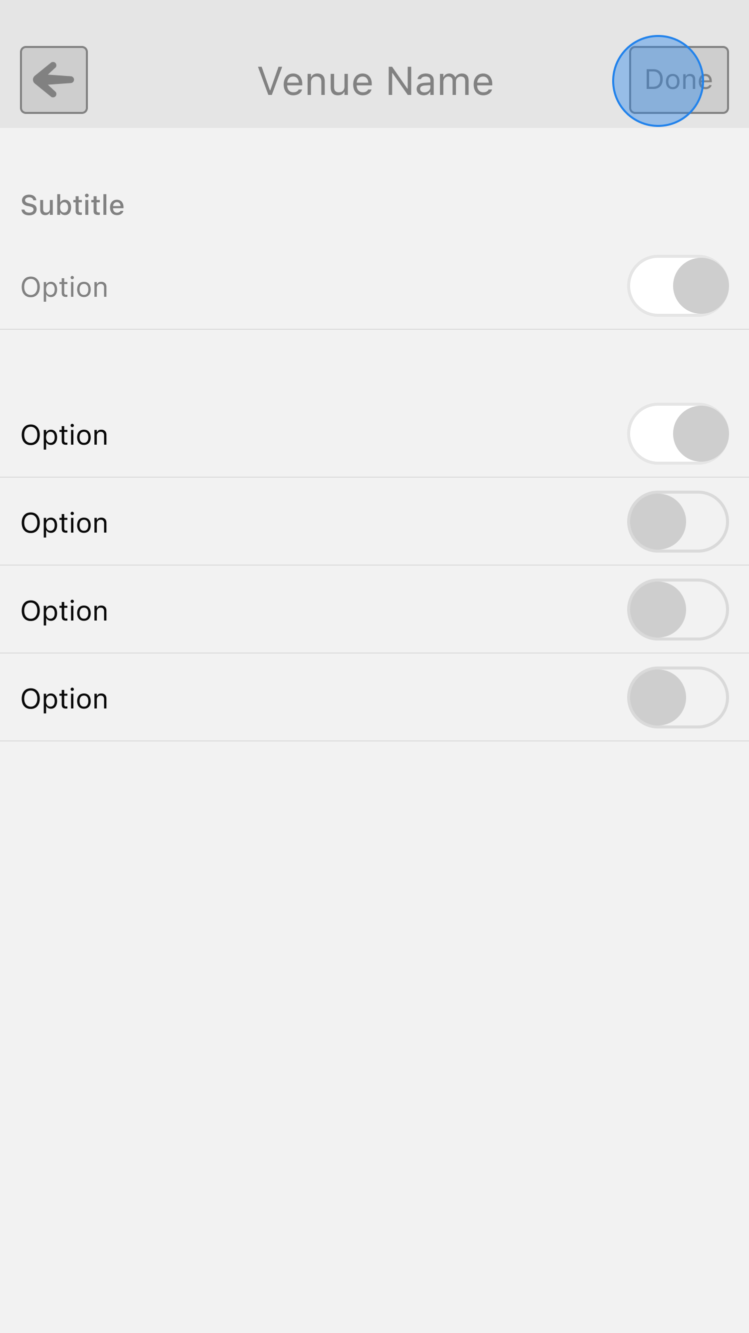
The Add Flow: Expanding on the System
With the Edit Flow designed to handle structured batch edits, the next challenge was different: how could we adapt these same principles to venue creation?
Unlike editing, where users often made multiple updates at once, venue creation was usually driven by a single goal: checking in as quickly as possible. If a venue wasn't found in search, users had to create it, meaning their primary goal was speed rather than detailed data entry. While creating a venue required only a handful of fields, presenting all of them at once could feel overwhelming and potentially result in them dropping out of the process.
This challenge reminded me of an analogy I'd heard years ago about how Disney designs its ride queues to make long wait times feel shorter.
By breaking up the queue experience into several different rooms, Disney prevents visitors from seeing the entire line at once—reducing the perceived wait time and keeping guests engaged.
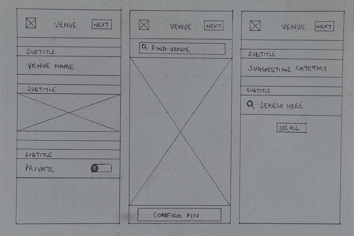
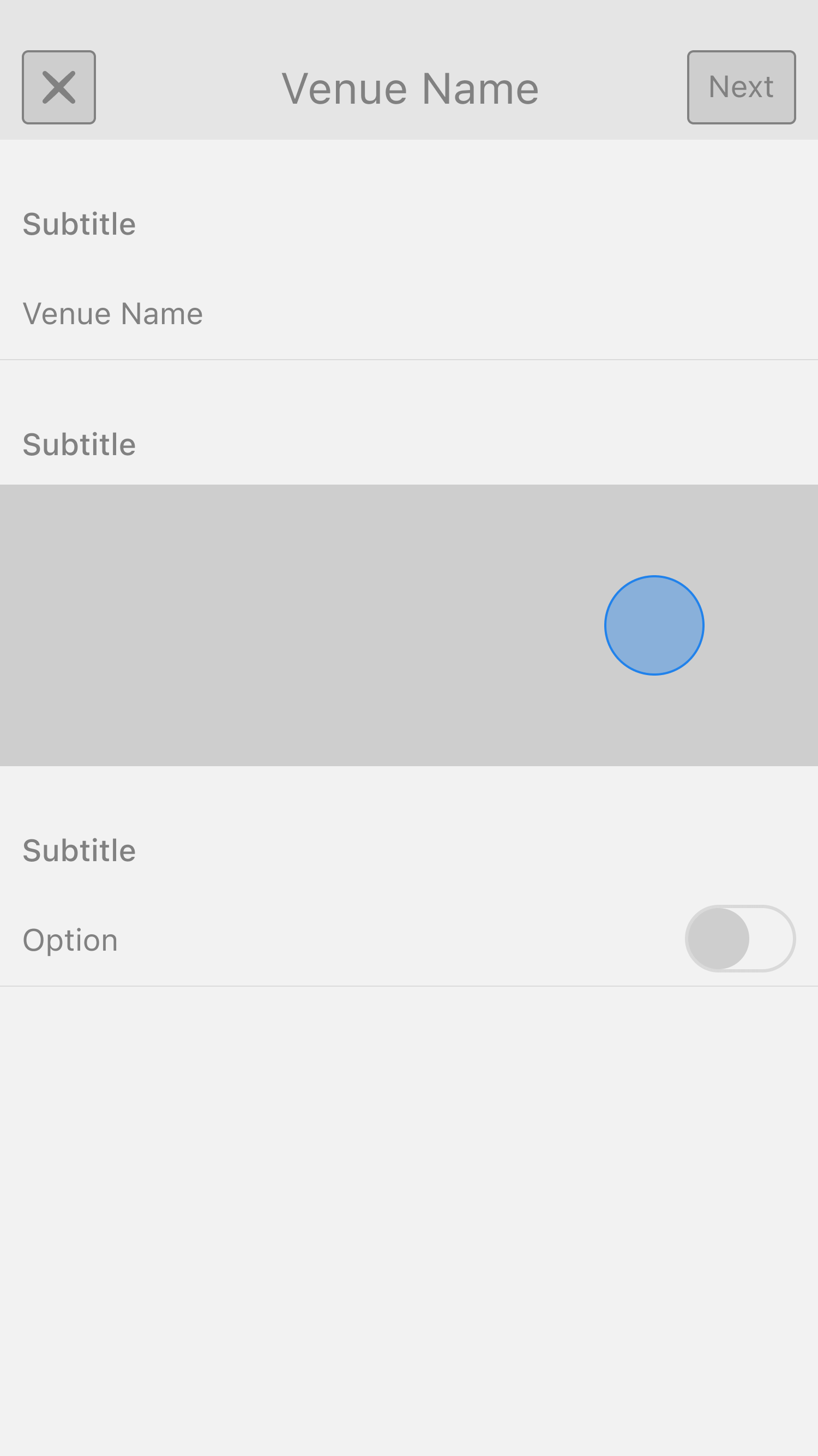
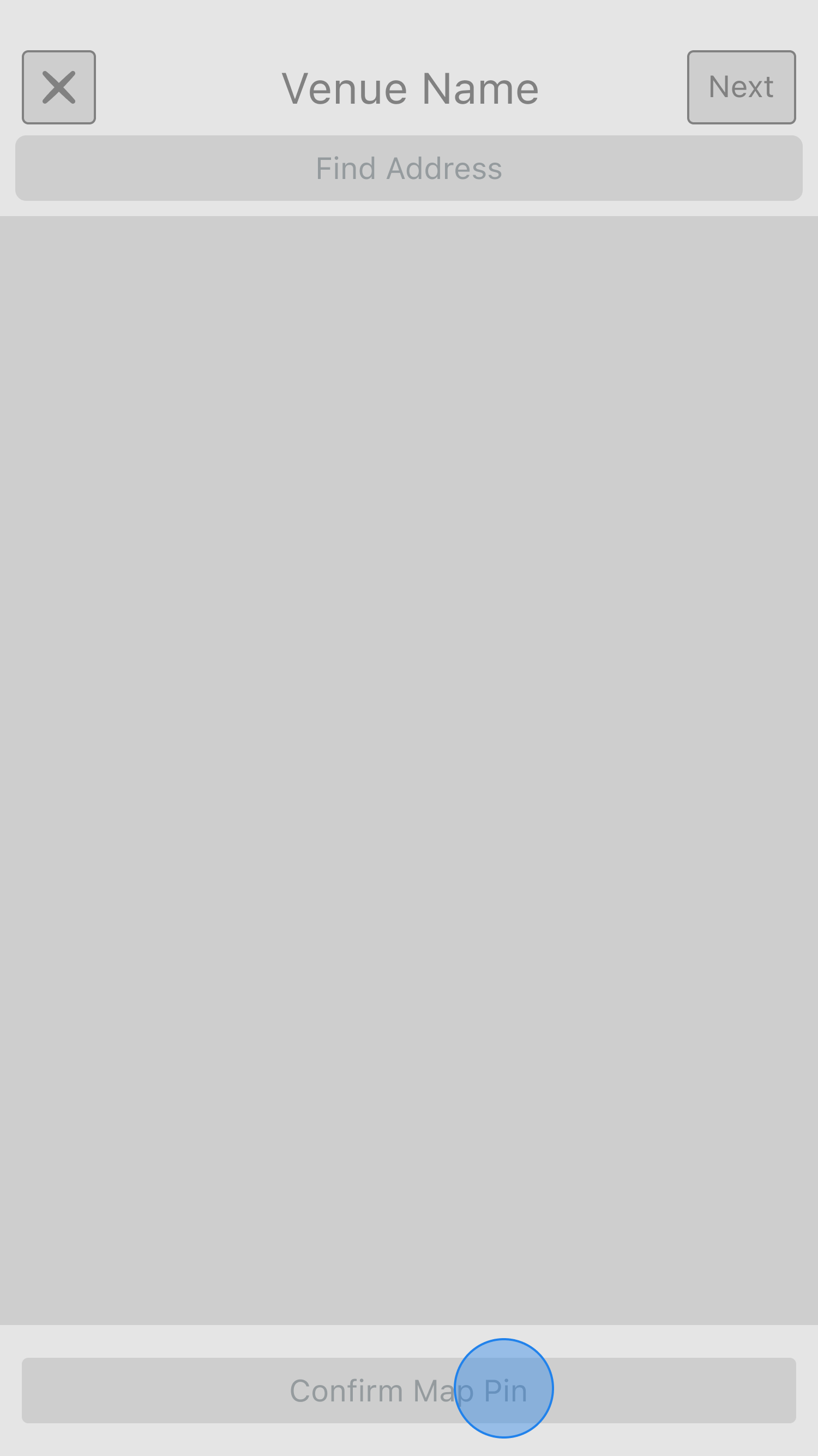
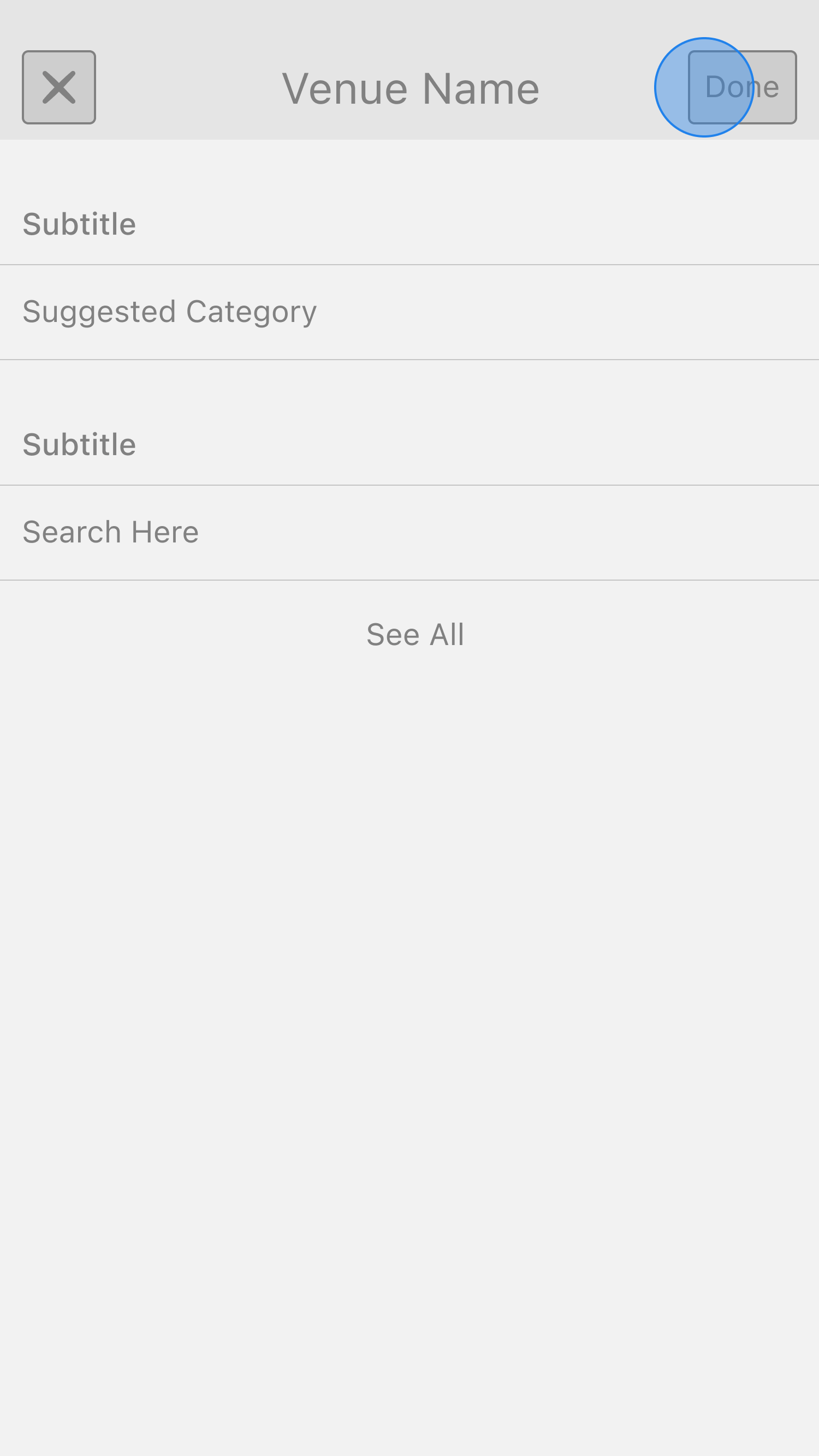
Splitting the flow into individual steps wasn't just a psychological trick; it also had tangible UX benefits:
- Psychological Momentum: Breaking the process into steps made users feel like they were progressing quickly, reducing frustration.
- Progressive Disclosure: Instead of overwhelming users with all fields at once, we revealed them step by step.
- Focused Inputs & Validation: A step-by-step flow allowed for better error prevention and cleaner data entry.
- Higher Completion Rates: We minimised abandonment and increased completion rates by structuring the process in smaller chunks.
Identifying An Entry Point
A well-designed page is only valuable if users can easily find and access it, and without intuitive entry points, even the best UX design remains underutilised. When we evaluated the paths leading into these flows, we realised that similar to how the Add and Edit flows served two distinct user needs, their entry points also needed to reflect different intent.
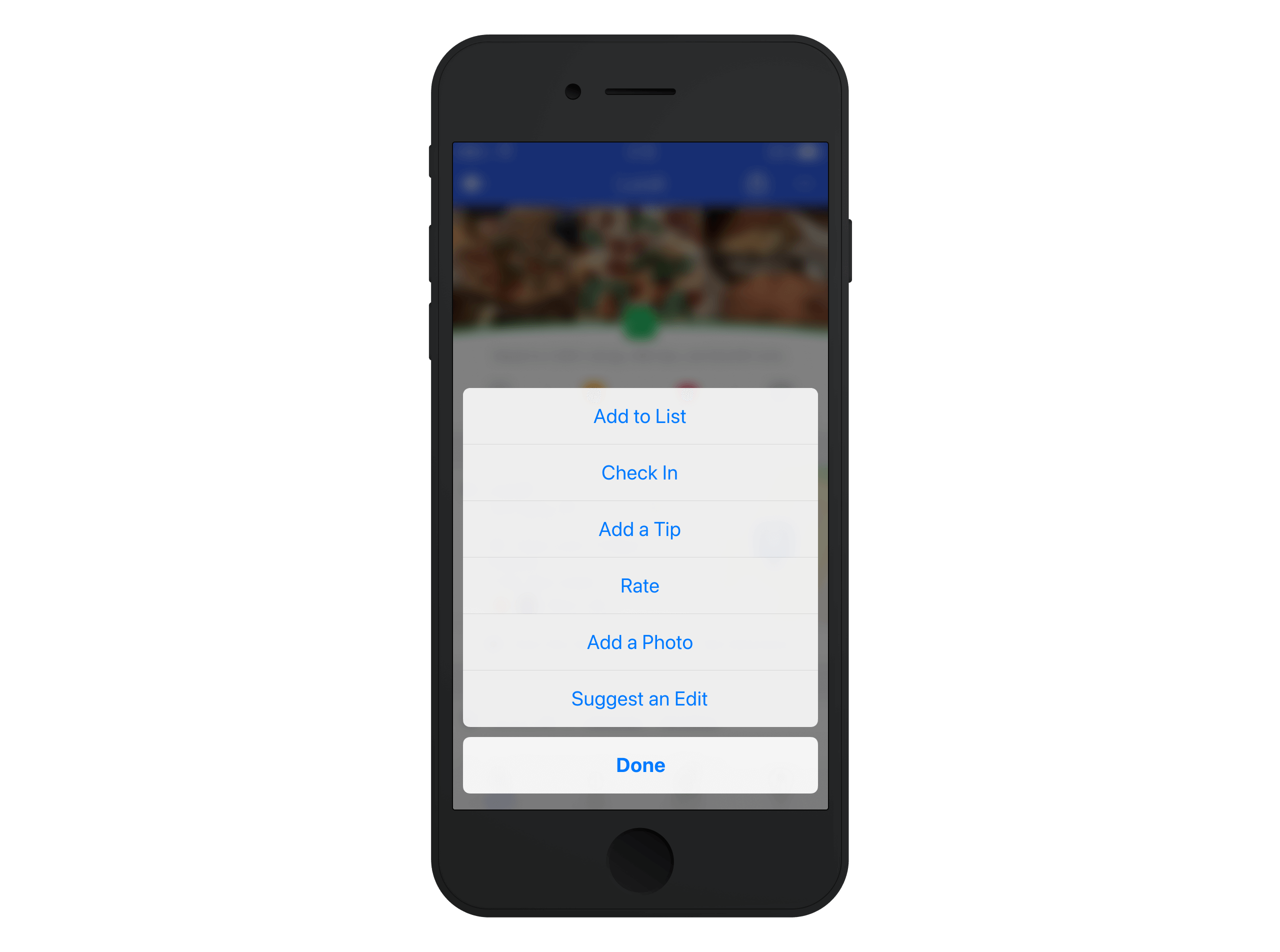
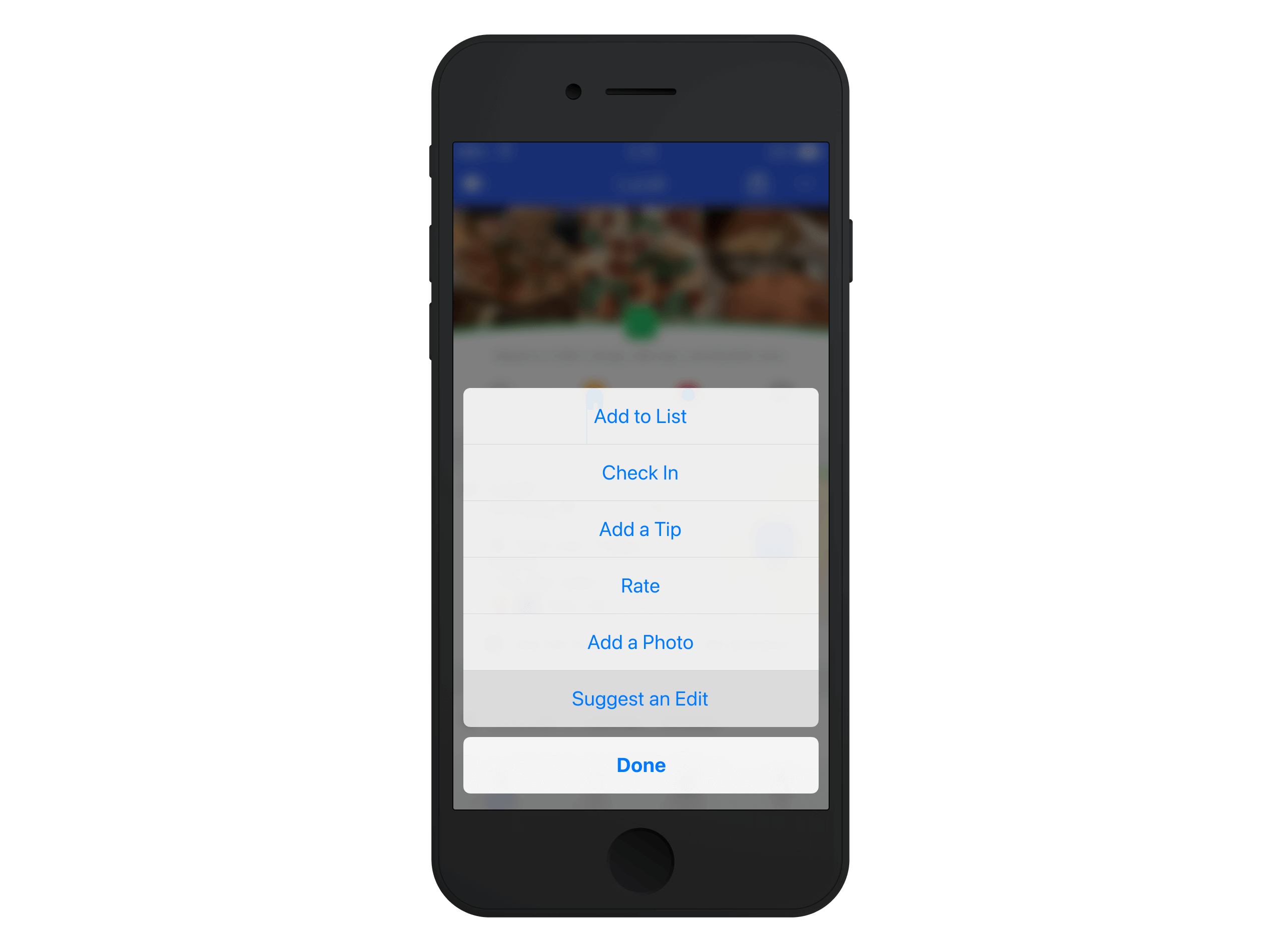
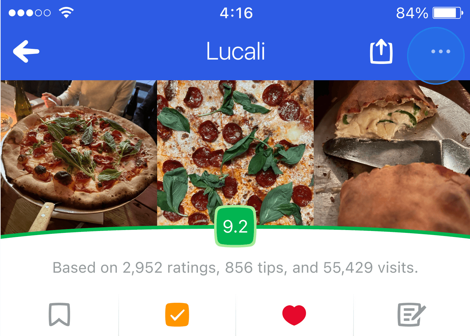
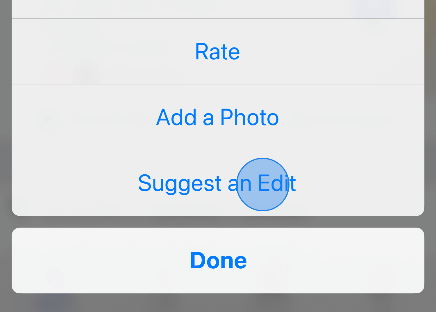
For users looking to edit a venue, the most natural place to access the edit flow was the venue page, where users were already engaging with venue details. To streamline this, we placed the edit option within the existing three-dot overflow menu in the venue page header. This triggered an action sheet where users could suggest an edit.
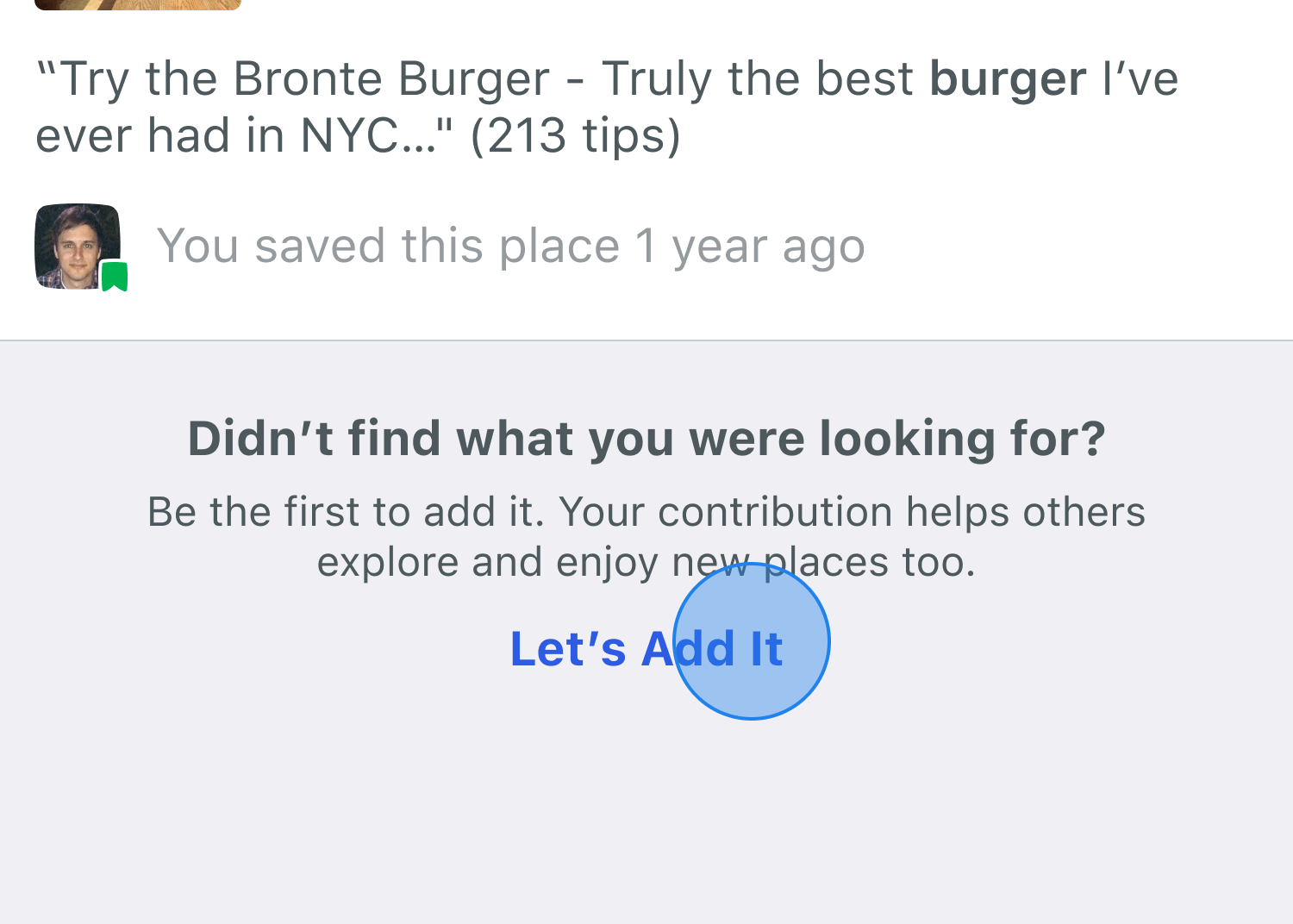
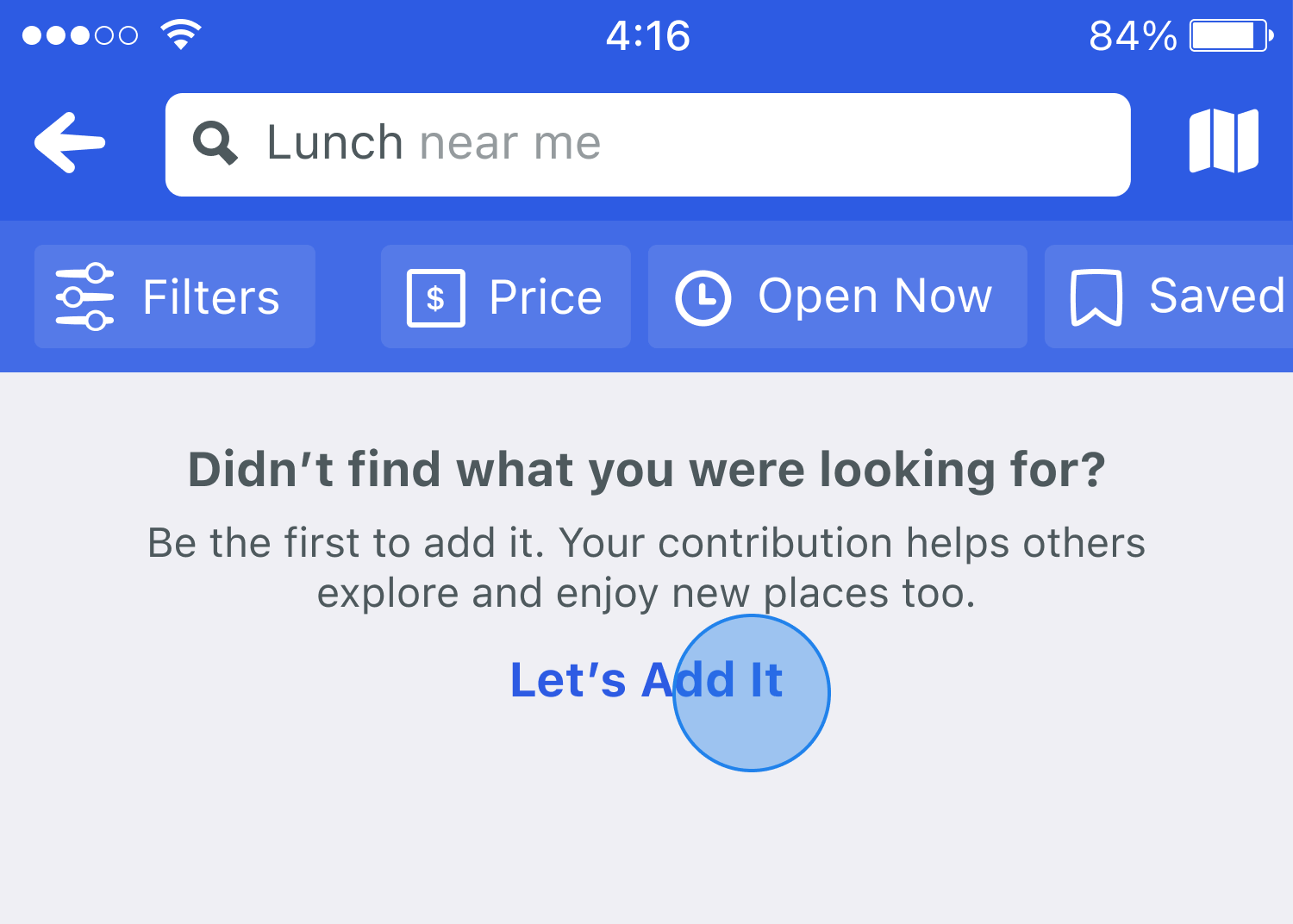
However, as previously outlined, the path to adding a venue was a different challenge, as most users added venues when they were trying to check in but couldn't find the location in search results. To accommodate this, we implemented a CTA within the search results page, ensuring that users always had a straightforward way to proceed if they couldn't find the venue they were looking for. This surfaced in two key ways:
- Empty State Handling: If a search returned zero results, users were presented with a message prompting them to add a new venue.
- Bottom-of-Results CTA: If search returned some results but didn't include what they were looking for, a dedicated "Add Venue" option was placed at the bottom of the list. This ensured users had exhausted their search before being prompted to create a new venue.
Integrating the Add Venue CTA within search could ensure that users had exhausted their search before being prompted to create a new venue.
04—Test
Testing and Feedback
From early concept sketches to live beta testing, we worked with the Superuser community to refine every aspect of the experience. This wasn't just about usability; it was about creating a new system that enhanced their existing workflows rather than disrupting them. We embedded their feedback into every stage of design and development.
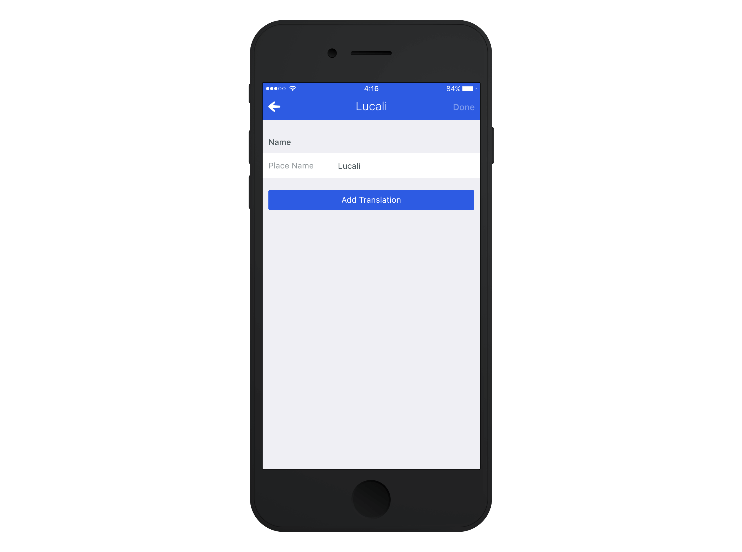
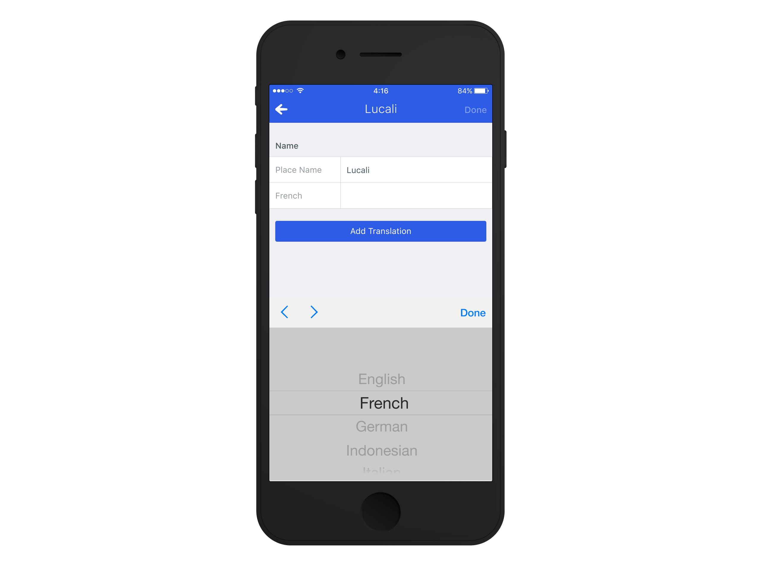
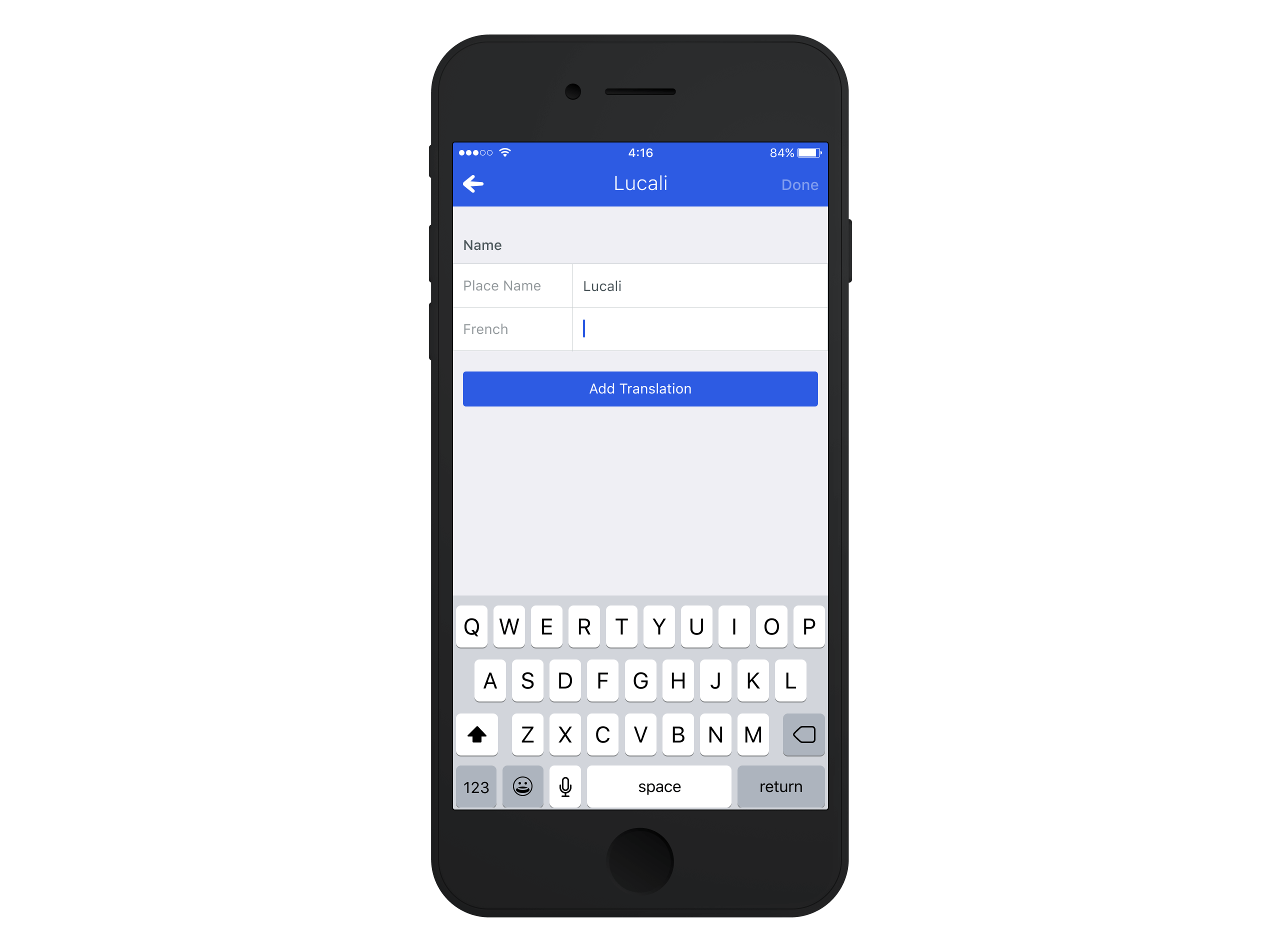
In the early design exploration phase, we focused on validating ideas before committing to high-fidelity designs. We shared wireframes, sketches, and paper prototypes through dedicated Slack channels, internal email lists, and video conferencing sessions. These discussions helped us understand how Superusers thought about content groupings, attribute priority, and language-based workflow challenges.
As we progressed into pre-build testing, we introduced low-fidelity clickable prototypes. This phase allowed Superusers to explore how venue attributes surfaced and where the entry points for adding and editing venues should exist.
The final phase, live beta testing, brought these concepts into a real-world environment through internal app releases. Observing Superusers interact with live data revealed edge cases that slipped through, allowing us to refine the experience before launching further.
Design Revisions
| Issue | Initial Design | Feedback | Change Implemented |
|---|---|---|---|
| Grouping of Venue Attributes | Certain attributes surfaced prominently based on past data trends. | Superusers felt some fields weren't as high a priority as the data suggested. | Adjusted attribute hierarchy based on Superuser workflows. |
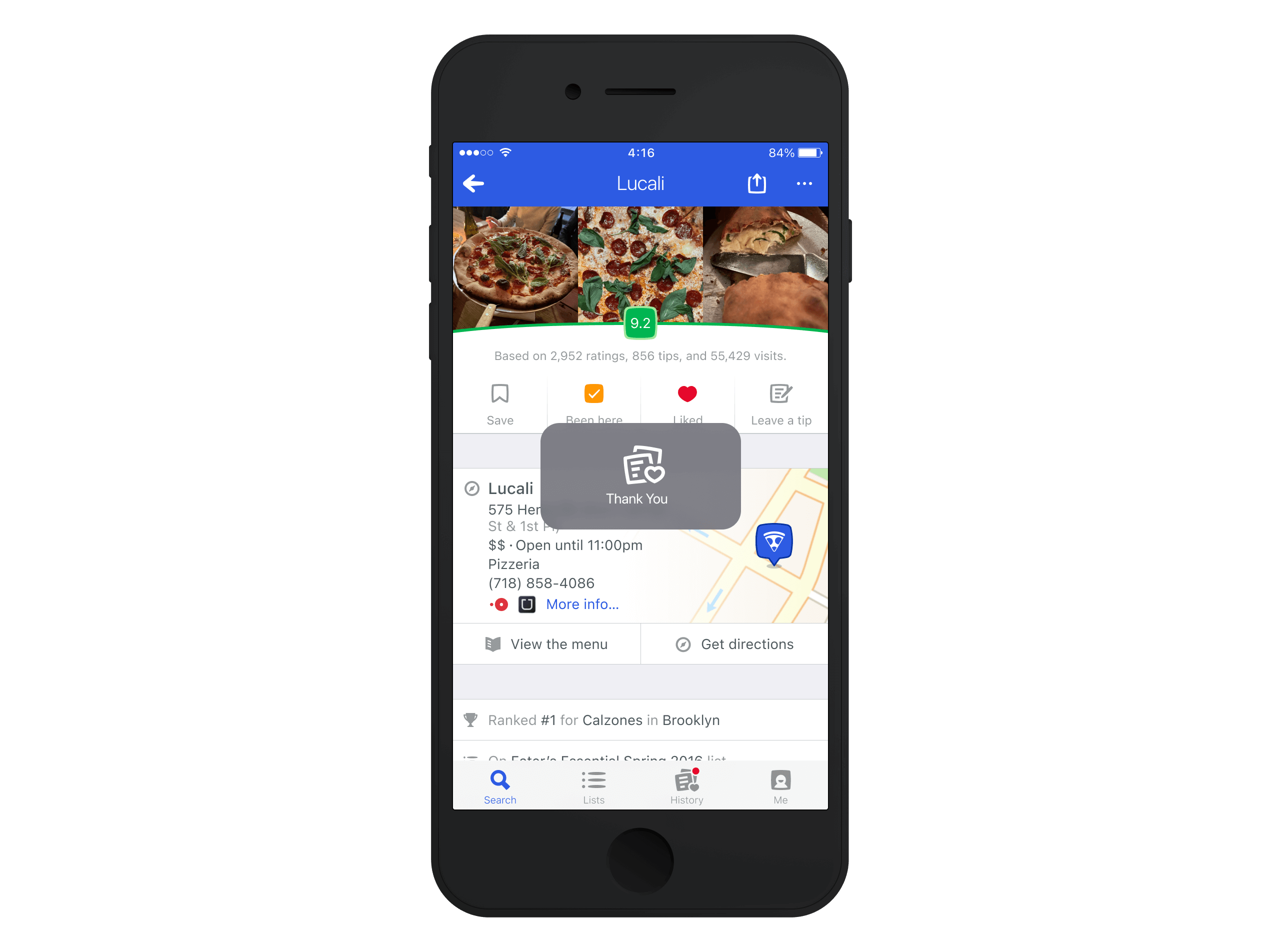
| Form Submission Feedback | Users weren't always sure if their edits had been saved. | lack of clear confirmation led to confusion. | Introduced clearer success/error states for form submissions. |
| Clearer Venue Addition in Search | The "Add Venue" option was always visible. | Users wanted it to surface more often. | "Add Venue" CTA now appears more often in search results. |
05—Release
Room for Improvement
One thing was abundantly clear throughout the design and development of the Add and Edit Flows: no group would rely on these tools more than Foursquare's Superusers. Unlike other features built for the broader user base, this project had a specific audience in mind, making Superusers an integral part of our testing and iteration process. They weren't just testers but co-creators, shaping everything from content hierarchy to error handling to ensure the system fit seamlessly into their workflows.
This project was one of the most profoundly collaborative design efforts we had done with Superusers, and their expertise shaped the product from concept to final implementation. We hope that this project will offer a solid base and that it is something that we will continue to build on top of into the next decade.
Footnotes
- Superusers (SUs) are the unsung heroes of Foursquare, ensuring the database of places stays reliable, detailed, and up to date. ↩
